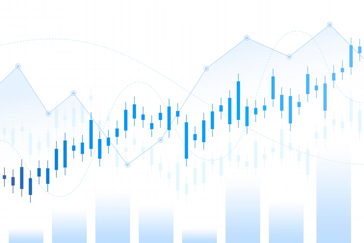
While financial charts are definitely a useful tool to analyze the markets, they can be cripplingly complex to a newcomer. It is quite understandable, when one glances at a chart with a bunch of lines, shapes, and indicators, to feel a little overwhelmed.
Yet, the ability to read financial charts well is a wonderful skill for any entrepreneur, business owner, trader, or investor. This permits you to quickly spot trends, patterns, and potential opportunities right at a glance. The people who can understand their meaning have an advantage when deciding how to use their money strategically.
By following this guide, you will learn the most common ways of reading the most common types of financial charts, such as the three-line break chart, to glean the most essential information. In this post, we'll examine fundamental elements you will see on all charts, words you will find used in relation to charts, and a beginning point when navigating a new chart.
Knowing this will help make you read or interpret important market movements more confidently while also using charts to help improve your business and investment strategies.
The Key Elements of a Financial Chart
Before diving into specific chart types, these universal elements form the basic framework of all financial charts:
Timeframes
All charts depict price action over a set period, whether it be a month, a year, or a decade. Knowing the timeframe gives you context for whether you're looking at short-term fluctuations or long-term trends.
Price Scale
The vertical y-axis displays the price range. The scale can be linear or logarithmic, depending on whether percentage changes or absolute changes are more meaningful.
Tickers/Securities
The asset being charted is most often stocks, bonds, commodities, currencies, or market indexes. The ticker symbol usually appears along the price scale or chart border.
Volume
The volume is the number of shares or contracts that were traded during a certain time duration. Volume confirms whether the trade of price is done with conviction and strength or just isolated. High activity signals investor interest.
Now that we've covered the backbone of financial charts, let's explore some of the most frequently used chart types and popular indicators:
Line Charts
What they show: Closing prices over time connected by straight lines.
Best for: Identifying overall trends and patterns in data. Line charts simplify price action so you can focus on the general direction without getting distracted by intraday swings.
What to look for:
- Uptrends --- a series of higher highs and higher lows signaling bullish sentiment.
- Downtrends --- a series of lower highs and lower lows signaling bearish sentiment.
- Breakouts and breakdowns indicate a shift in momentum when prices push outside established highs or lows.
Candlestick Charts
What they show: Open, high, low, and closing prices for each time period.
Best for: Viewing the relationship between opening and closing prices and the price range over a chosen timeframe. Candlesticks pack more detail into standard trends, patterns, and reversals.
What to look for:
- **Bullish candles **--- green or white candles showing the price closed higher than it opened. The larger the candle body, the more intense the buying pressure.
- **Bearish candles **--- red or black candles showing the price closed lower than it opened. The larger the candle body, the more intense the selling pressure.
- **Wicks --- **the thin lines above and below the candle body represent the period's full price range from high to low.
Bar Charts
What they show: Open, high, low, and closing prices for each period.
Best for: Quickly gauging trading activity and volatility over different time frames.
What to look for:
- Up bars indicate buying pressure. The taller the bar, the greater the intraday price increase.
- Down bars indicate selling pressure. The taller the bar, the greater the intraday price decrease.
- Narrow range bars suggest indecision and consolidation before a breakout.
Point and Figure Charts
What they show: Price movements in columns of stacked X's during uptrends and O's during downtrends.
Best for: Filtering out market noise to focus solely on price direction and momentum. Point and figure charts eliminate time and volume, concentrating purely on supply and demand dynamics.
What to look for:
- New X or O columns that are forming show breakouts in volatility and momentum.
- The height of the columns demonstrates the strength of buyers (X) or sellers (O).
- Trend lines connecting the tops and bottoms of columns define support and resistance.
Overlays and Indicators
The other aspect of the chart analysis is beyond just the fundamentals of the plot of prices over time, so traders also use technical indicators and overlays to add to their analysis. Raw price data is fed into these mathematical formulas, which in turn turn them into actionable trading signals in real-time.
Here are some of the most popular indicators frequently overlaid onto financial charts:
Moving Averages
What they show: The average price over a set period, plotted as a line on the chart.
Why they're useful: Moving averages remove short-term fluctuations that do not necessarily mean anything. A trend change is indicated when a shorter moving average crosses above or below a longer moving average, which is referred to as a crossover.
Bollinger Bands®
What they show: An upper and lower band plotted two standard deviations away from a 20-period simple moving average.
Why they're useful: If the data follows a normal distribution, Bollinger Bands should measure volatility and contain approximately 95% of prices. Widening bands indicate increased volatility, while decreasing bands reflect falling volatility and consolidation. The tags of the bands act as support and resistance levels.
MACD (Moving Average Convergence/Divergence)
What it shows: The relationship between two moving averages plotted against a histogram displaying the difference between the two averages.
Why it's useful: MACD gauges the momentum and strength of the trend. Crossovers of the moving averages trigger buy and sell signals in the direction of the shortest moving average. The histogram visualizes accelerating momentum as histogram bars grow taller.
RSI (Relative Strength Index)
What it shows: An oscillator fluctuating between 0 and 100, indicating overbought above 70 and oversold below 30.
Why it's useful: RSI is used to determine overextended market conditions at extremes and usually reverses to the mean. The divergence between RSI and the price points indicates to us momentum failures and trend changes.
Only these four indicators are a fraction of the hundreds that traders use. Don't feel the need to start with a maze of technical studies. Use indicators sparingly to provide answers to particular questions concerning the state of the market.
Let's now change our focus and discuss how to interpret some less complex types of financial charts.
Demystifying Common Tricky Charts
While line, candlestick, and bar charts typically follow standardized formats, you may encounter more exotic varieties with their own unique traits and nuances.
Here's what you need to know to unravel a few commonly confusing chart types:
Open-High-Low-Close Charts
What they show: Intraday price action depicting the open, high, low, and close for every time segment. For example, a 1-minute OHLC chart will have a candle or bar for each 60-second interval.
Why they're useful: Microscopic OHLC charts spotlight short-term order flow, momentum, and volatility in granular detail. 1-minute, 5-minute, and 15-minute intervals are used by active traders who are trying to identify specific entry and exit levels.
What to look for: Intraday reversal patterns, support and resistance zones, and volume surges. Pay attention to the time of day, as certain sessions tend to exhibit increased ranges and volatility.
Tick Charts
What they show: Price action over a set number of transactions rather than standard time slices. For example, an 1100-tick chart prints a new candle or bar every 100 trades.
Why they're useful: Ultra-short-term traders depend on tick charts to visualize high-frequency price dynamics as trades print in real-time. Tick charts remove time gaps and distortion.
What to look for: Changes in tick speed reflect accelerating momentum. Faster printing candles indicate heightened volatility and swift directional moves.
Renko Charts
What they show: Bricks plotting price movement equivalent to a set pip amount rather than standard times. For example, a 5-pip Renko chart prints a new brick when prices move up/down by 5 pips.
Why they're useful: Renko charts filter out time and noise to isolate true trend direction. By only plotting sustained momentum beyond a minimum threshold, Renko charts reduce false signals and whipsaws.
What to look for: New bricks form when momentum surpasses the Renko box size. Long, unbroken brick patterns signal strong trend continuation. Gaps between bricks reflect consolidation before the next impulsive move.
Kagi Charts
What they show: Connected vertical lines that change direction and thickness depending on the direction and strength of price moves.
Why they're useful: Kagi charts highlight underlying supply and demand imbalances through the varying thickness of the lines. Thicker lines designate the primary trend direction, while thinner lines represent countertrend corrections.
What to look for: Look for thicker lines signaling the dominant trend. Overly choppy, thin lines show consolidation before a breakout.
Point and Figure Charts
What they show: An array of stacked X's during uptrends and O's on downtrends that are filtered out purely by direction and size of price movement rather than standard periods.
Why they're useful: Point and figure charts are noise-free and provide a view of price action and momentum. Point and figure charts filter out time, volume, and smaller price oscillations to show the psychology of accumulation and distribution.
What to look for: Growing columns demonstrate increasing momentum. Reversals form new columns of Os after Xs and vice versa. The height of X or O columns establishes key support and resistance levels.
Tips for Conquering Complex Financial Charts
When faced with less commonly used exotic chart types, keep these tips in mind:
- Note the construction methodology. Is the chart tracking standard periods or unconventional units like ticks, points, or trade numbers?
- Identify the trend direction and momentum. What do the increasing or decreasing chart components signify?
- Pinpoint support and resistance zones. Horizontal areas where the chart components reverse offer clues on potential turning points.
Rather than attempting to master every esoteric chart variation, focus on recognizing their core drivers and mechanisms. Analyze an unfamiliar chart based on the vital trend, support, and resistance insights it offers.
The context and analytical techniques matter more than memorizing immaterial chart construction details. Train your eyes to extract actionable signals.
Let's now summarize the key lessons on taming financial charts so you can leverage their analytical power.
In Summary
Here are the essential takeaways:
- Financial charts are financial charts that present abstract financial data in a way that makes it easier to understand for traders with their psychology and behavior. They are not intimidating at all.
- Learn the most fundamental things like time frames, price scales, tickets, and volume pertaining to all chart types.
- Line charts, candlesticks, bars, and point and figure charts are just a few of the leading chart categories, and a multitude of indicators and overlays are given.
- Every chart type will show different market trend insights, momentum, support and resistance zones, various volatility, and, most importantly, the flexibility and sentiment of the investors.
- Exotic chart varieties follow distinct construction methodologies, tracking unconventional data points like ticks, pips, or trade numbers. Note the rules driving them.
- Extract actionable signals on trend direction, momentum, support, and resistance, no matter the chart pattern or style. Let the charts simplify, not overwhelm.
Financial charts simplify volumes of difficult data and represent them as effortless identifying trends, reversals, breakouts and risk areas, and opportunities. Having now grasped how the major chart type is powered, you will no longer be lost.
With practice, you will be able to use their signals to trade markets at the right time, enter and exit with favorable risk-reward, and make strategic investment decisions. New chart reading skills have the power to lead to greater profits and better money management.