
Spreadsheets are very convenient for working with tabular data. Conditional formatting can help visualize it by leveraging the power of color-coding to intuitively communicate each cell’s meaning. If you are using pandas in Jupyter Notebooks or Labs (or any other HTML backend) you can recreate the coloring available to Excel users.
All you need is a Python installation and pandas.
Let’s start by making a little DataFrame with some random values in it:
import pandas as pd
df = pd.DataFrame([[-1, 2.3, 2],
                   [-1.25, 0, -1.5],
                   [1.8, -2.6, 1.3],
                   [0.5, 2.1, -7]], columns=['A','B', 'C'])
This gives us a not-very-exciting-for-now little table:
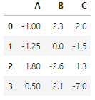
A not very interesting little table
The Pandas Styler Object
Any Pandas DataFrame contains a Styler object which can be accessed by calling .style on it.
pd.style
This returns a pandas.io.formats.style.Styler object which in Jupyter notebooks looks like the below also-not-very-exciting-for-now little table:
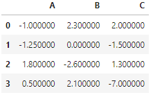
An also not very interesting little table
But notice that the precision of the displayed values has changed. This is because behind the scenes the Styler object is converting the table into HTML and applying certain styles to it. If you are interested, call .style.to_hmtl() on your DataFrame to see the HTML printed as a string.
In fact, the Styler treats the underlying data value different from the display value — the latter is a string representation of the former. When we format the values using the Styler object and its methods, only the display value gets altered (using CSS) so the underlying DataFrame remains untouched. This is good because we don’t want to mess without data; we just want it to be displayed prettily.
Altering Appearances using .apply() and .applymap()
We can alter the appearance of values and cells elementwise using two functions:
.style.applymap(func)where func takes single values and returns CSS style properties.style.apply(func, axis)where func takes a whole row or column and returns CSS style properties. The axis argument determines whether func is applied row- or column-wise
Using these, we can for example color some values above a threshold green, and others red. All we need to do is define a coloring function and pass it to .applymap() like below, and we will get a now-more-interesting little table!
def green_red(value):
    if value < 0:
        return 'color: red; font-weight: bold'
    elif value == 0:
        return None
    else:
        return 'color: green; font-weight: bold'

df.style.applymap(green_red)

A now more interesting little table
Notice also that non-zero values are bold, leaving the threshold value unaltered for contrast. When working with large tables of data this can already help us quickly visualize the gist of the data.
Some conditional formatting will, however, require information about the whole column or row. For example, if we want to highlight the lowest and highest value in each column — in this case, let's highlight the cell background color rather than the font color. For this we can use the apply function, like below, to make another-now-more-interesting little table!
def min_max(col):
    # empty property list to be filled in the loop
    props = ['font-weight: bold;'] * len(col)
    for idx, value in enumerate(col):
        # color max value green
        if value == max(col):
            props[idx] += 'background-color: lightgreen;'
        # color min value red
        if value == min(col):
            props[idx] += 'background-color: lightcoral'

    return propsdf.style.apply(min_max)

Another now more interesting little table
Altering Appearances Using .pipe()
There are many methods which we can call directly on the Styler object itself, for example .set_caption(), .format() which has many optional arguments we can use to customize the table and .background_gradient(). Virtually everything you do with Styler object methods you can also do with .apply() and .applymethod() as above but you would have to write the logic yourself and be a CSS genius and know all the CSS attributes.
Instead, let's try using a couple of styler methods at once which the .pipe() method enables us to do. The function signature has to take an argument and the pipe will pass it to the DataFrame’s Styler object which we can then play around with to create a now-much-more-interesting little table as below:
def color_scales(styler):
    styler.set_caption("Cute Table")
    styler.background_gradient(axis=0, cmap="RdYlGn")
    styler.format(precision=2)
    return stylerdf.style.pipe(color_scales)
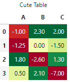
A very good looking little table
For a full list of methods, you can call on the Styler object and check out the pandas documentation.
The End
I showed you how to use pandas in Jupyter notebooks to edit the appearance of cells and values based on rules applying to a column, row, or single value. This way you can directly visualize data tables in a Jupyter notebook without having to export the data into excel and do the conditional formatting there manually.