
Tsup is a TypeScript Bundler, and it helps bundle our TypeScript project. With Tsup, you do not need any other configuration, and it is on esbuild. Tsup takes TypeScript configuration alone.
Esbuild helps you to build a JavaScript project, and Tsup builds your TypeScript project. Both bundles come with the same functionality.
Tsup build uses TypeScript configuration and then builds a TypeScript project.
In the tsup tutorial project, we built a component library using React and TypeScript. Even you can also use Tailwind CSS with tsup.
Why do we require a tsup bundler?
The main reason for using the tsup bundler in TypeScript projects. Because tsup is optimized for TypeScript, it gives the best performance and comes with ease of use.
Source code
All the code is available on GitHub. You can also check out the live demo website.
- https://www.npmjs.com/package/tsup-tutorial
- https://github.com/officialrajdeepsingh/use-tsup-tutorial
Setup
For the first step, we create a Setup for Tsup.
- Create an empty
tsup-tutorialfolder. - Enter
tsup-tutorialan empty folder, run thenpm initcommand, and fill in the basic information about your project. - Lastly, install @types/node, TypeScript, react, react-dom, and tsup package using NPM, yarn, or pnpm package manager.
// Installation

pnpm add  @types/node tsup typescript react react-dom
# or
npm install @types/node tsup typescript react react-dom
# or
yarn add @types/node tsup typescript react react-dom
After your installation is complete, your project structure will look like this.
.
├── node_modules
├── package.json
├── pnpm-lock.yaml

6 directories, 3 files
Our package.json file looks like this:
{
  "name": "tsup-tutorial",
  "version": "1.0.0",
  "description": "demo of tsup tutorial",
  "main": "src/index.js",
  "scripts": {
    "test": "echo \"Error: no test specified\" && exit 1"
  },
  "author": "Rajdeep Singh officialrajdeepsingh@gmail.com",
  "license": "MIT",
  "devDependencies": {
    "@types/node": "^20.2.5",
    "tsup": "^6.7.0",
    "typescript": "^5.1.3"
  }
}
Now, the Setup part is complete. The next step is to run thetsc-init command.
rajdeepsingh@officialrajdeepsingh:~/open-sources/tsup-tutorial$ tsc --init

Created a new tsconfig.json with:
                                                                                                                     TS
  target: es2016
  module: commonjs
  strict: true
  esModuleInterop: true
  skipLibCheck: true
  forceConsistentCasingInFileNames: true


You can learn more at https://aka.ms/tsconfig.json
rajdeepsingh@officialrajdeepsingh:~/open-sources/tsup-tutorial$
The tsc-initcommand creates a bolter palette code for your TypeScript.
Start coding
For example, In the src folder, we create seven different react component files, one for Header, Footer, Button, Headings, and Icons. The Header, Footer, and Button files come with single components and Headings; Icons files come with multiple components.
src
├── Button.tsx
├── Footer.tsx
├── Header.tsx
├── Headings.tsx
├── Icons.tsx
├── index.tsx
└── types.d.ts

1 directory, 7 files
Type
The types.d.ts file contains all types related to your project.
// types.d.ts

import type { ReactNode } from "react";

export interface buttonType {
  children: ReactNode;
}

type items = { url: string; name: string };

export interface headerProps {
  logo: string;
  navItem: items[];
}

export interface footerProps {
  copyrightText: string;
}
Button component

Create a basic button with tailwind CSS that accepts props.children as an argument. You can pass any other component or text.
import type { buttonType } from "./types";

export function Button(props: buttonType) {
  return (
    <button className="text-white bg-blue-500 font-medium rounded-lg text-sm px-5 py-2.5 text-center inline-flex items-center mr-2 mb-2">
      {props.children}
    </button>
  );
}
Header component

Create a basic header component with tailwind CSS, which takes two arguments. Most important, it imports component types from type.d.ts file.
// Header.tsx

import type { headerProps } from "./types";

export function Header(props: headerProps) {
  const { logo, navItem } = props;

  return (
    <nav className="bg-gray-800">
      <div className="mx-auto max-w-7xl px-2 sm:px-6 lg:px-8">
        <div className="relative flex h-16 items-center justify-between">
          <div className="absolute inset-y-0 left-0 flex items-center sm:hidden">
            <button
              type="button"
              className="inline-flex items-center justify-center rounded-md p-2 text-gray-400 hover:bg-gray-700 hover:text-white focus:outline-none focus:ring-2 focus:ring-inset focus:ring-white"
              aria-controls="mobile-menu"
              aria-expanded="false"
            >
              <span className="sr-only">Open main menu</span>
              <svg
                className="block h-6 w-6"
                fill="none"
                viewBox="0 0 24 24"
                strokeWidth="1.5"
                stroke="currentColor"
                aria-hidden="true"
              >
                <path
                  strokeLinecap="round"
                  strokeLinejoin="round"
                  d="M3.75 6.75h16.5M3.75 12h16.5m-16.5 5.25h16.5"
                />
              </svg>
              <svg
                className="hidden h-6 w-6"
                fill="none"
                viewBox="0 0 24 24"
                strokeWidth="1.5"
                stroke="currentColor"
                aria-hidden="true"
              >
                <path
                  strokeLinecap="round"
                  strokeLinejoin="round"
                  d="M6 18L18 6M6 6l12 12"
                />
              </svg>
            </button>
          </div>
          <div className="flex flex-1 items-center justify-center sm:items-stretch sm:justify-start">
            <div className="flex flex-shrink-0 items-center">
              <h1 className="px-3 py-2 text-2xl font-medium text-white">
                {logo}
              </h1>
            </div>
            <div className="hidden sm:ml-6 sm:block">
              <div className="flex space-x-4">
                {navItem.map((item) => (
                  <a
                    key={item.name}
                    href={item.url}
                    className="rounded-md bg-gray-900 px-3 py-2 text-sm font-medium text-white"
                    aria-current="page"
                  >
                    {item.name}
                  </a>
                ))}
              </div>
            </div>
          </div>
          <div className="absolute inset-y-0 right-0 flex items-center pr-2 sm:static sm:inset-auto sm:ml-6 sm:pr-0">
            <button
              type="button"
              className="rounded-full bg-gray-800 p-1 text-gray-400 hover:text-white focus:outline-none focus:ring-2 focus:ring-white focus:ring-offset-2 focus:ring-offset-gray-800"
            >
              <span className="sr-only">View notifications</span>
              <svg
                className="h-6 w-6"
                fill="none"
                viewBox="0 0 24 24"
                strokeWidth="1.5"
                stroke="currentColor"
                aria-hidden="true"
              >
                <path
                  strokeLinecap="round"
                  strokeLinejoin="round"
                  d="M14.857 17.082a23.848 23.848 0 005.454-1.31A8.967 8.967 0 0118 9.75v-.7V9A6 6 0 006 9v.75a8.967 8.967 0 01-2.312 6.022c1.733.64 3.56 1.085 5.455 1.31m5.714 0a24.255 24.255 0 01-5.714 0m5.714 0a3 3 0 11-5.714 0"
                />
              </svg>
            </button>
          </div>
        </div>
      </div>
    </nav>
  );
}
Footer component

Create a basic footer component with tailwind CSS, which takes copyrightText as an argument. It uses an inline TypeScript type for argument.
// Footer.tsx

export function Footer({ copyrightText }: { copyrightText: string }) {
  return (
    <footer className="bg-gray-800 dark:bg-gray-900">
      <div className="w-full max-w-screen-xl mx-auto p-4 md:py-8">
        <span
          className="block text-sm text-gray-300 sm:text-center dark:text-gray-400"
          dangerouslySetInnerHTML={{ __html: copyrightText }}
        ></span>
      </div>
    </footer>
  );
}
Headings component

Create a three-heading H1, H2 and H3 component with tailwind CSS and uses children as props.
// Headings

import type { ReactNode } from "react";

export function H1({ children }: { children: ReactNode }) {
  return <h1 className="text-5xl text-black font-extrabold"> {children} </h1>;
}

export function H2({ children }: { children: ReactNode }) {
  return <h2 className="text-4xl text-black  font-extrabold">{children}</h2>;
}

export function H3({ children }: { children: ReactNode }) {
  return <h3 className="text-3xl text-black  font-extrabold">{children}</h3>;
}
Icons component

Icons
In the icons file, I Created five icon components and designed them with tailwind CSS.
// Icons.tsx

export function IconGithub() {
  return (
    <svg
      className="inline-block w-5 h-5"
      viewBox="0 0 20 20"
      fill="none"
      xmlns="http://www.w3.org/2000/svg"
    >
      <path
        d="M10 2C5.58161 2 2 5.67194 2 10.2029C2 13.8265 4.292 16.9015 7.4712 17.9857C7.8712 18.0611 8.01681 17.808 8.01681 17.5902C8.01681 17.3961 8.01042 16.8794 8.00641 16.1956C5.7808 16.6911 5.3112 15.0959 5.3112 15.0959C4.948 14.1476 4.4232 13.8954 4.4232 13.8954C3.69681 13.3876 4.47841 13.3975 4.47841 13.3975C5.28081 13.4548 5.70322 14.2426 5.70322 14.2426C6.41683 15.4955 7.57603 15.1335 8.03122 14.9239C8.10481 14.3941 8.31122 14.033 8.54002 13.8282C6.76402 13.621 4.896 12.9168 4.896 9.77384C4.896 8.87877 5.208 8.14588 5.7192 7.57263C5.6368 7.36544 5.36241 6.531 5.79759 5.40254C5.79759 5.40254 6.46959 5.18143 7.99759 6.24272C8.59777 6.06848 9.28719 5.96782 9.99941 5.96674C10.6794 5.97002 11.364 6.06092 12.0032 6.24272C13.5304 5.18143 14.2008 5.40171 14.2008 5.40171C14.6376 6.53097 14.3624 7.36543 14.2808 7.5726C14.7928 8.14583 15.1032 8.87874 15.1032 9.7738C15.1032 12.9249 13.232 13.6185 11.4504 13.8216C11.7376 14.0747 11.9928 14.575 11.9928 15.3407C11.9928 16.4364 11.9832 17.3216 11.9832 17.5902C11.9832 17.8097 12.1272 18.0652 12.5336 17.9849C15.7378 16.8608 18 13.8039 18 10.2062C18 10.2051 18 10.2039 18 10.2027C18 5.67175 14.4176 2 10 2Z"
        fill="currentColor"
      />
    </svg>
  );
}

export function IconTwitter() {
  return (
    <svg
      className="inline-block w-5 h-5"
      viewBox="0 0 20 20"
      fill="none"
      xmlns="http://www.w3.org/2000/svg"
    >
      <path
        d="M18.0005 5.02869C17.4116 5.29638 16.7768 5.47229 16.119 5.55642C16.7921 5.15106 17.3122 4.50861 17.5569 3.73615C16.9221 4.11856 16.2185 4.38624 15.4766 4.53921C14.8724 3.88146 14.0234 3.49905 13.0598 3.49905C11.2624 3.49905 9.79399 4.96751 9.79399 6.78013C9.79399 7.04016 9.82458 7.29255 9.87812 7.52965C7.15536 7.39198 4.73089 6.08414 3.11712 4.10326C2.83414 4.5851 2.67353 5.15106 2.67353 5.74762C2.67353 6.8872 3.24714 7.89676 4.13433 8.47037C3.59131 8.47037 3.08653 8.31741 2.64294 8.08797V8.11091C2.64294 9.70173 3.77487 11.0325 5.27391 11.3308C4.79263 11.4625 4.28737 11.4808 3.79781 11.3843C4.00554 12.0363 4.41237 12.6068 4.96111 13.0156C5.50985 13.4244 6.17291 13.651 6.85709 13.6635C5.69734 14.5816 4.25976 15.0779 2.7806 15.0708C2.52056 15.0708 2.26053 15.0555 2.00049 15.0249C3.45364 15.9579 5.18213 16.501 7.03299 16.501C13.0598 16.501 16.3714 11.4991 16.3714 7.16253C16.3714 7.01722 16.3714 6.87955 16.3638 6.73424C17.0062 6.27534 17.5569 5.69408 18.0005 5.02869Z"
        fill="currentColor"
      />
    </svg>
  );
}

export function IconInstagram() {
  return (
    <svg
      className="inline-block w-5 h-5"
      viewBox="0 0 20 20"
      fill="none"
      xmlns="http://www.w3.org/2000/svg"
    >
      <path
        d="M10.0005 6.80556C9.36869 6.80556 8.75107 6.99291 8.22575 7.34392C7.70043 7.69493 7.29099 8.19383 7.04921 8.77754C6.80743 9.36125 6.74417 10.0035 6.86742 10.6232C6.99068 11.2429 7.29492 11.8121 7.74168 12.2588C8.18843 12.7056 8.75762 13.0098 9.37728 13.1331C9.99695 13.2563 10.6392 13.1931 11.2229 12.9513C11.8067 12.7095 12.3056 12.3001 12.6566 11.7747C13.0076 11.2494 13.1949 10.6318 13.1949 10C13.1949 9.15278 12.8584 8.34026 12.2593 7.74119C11.6602 7.14211 10.8477 6.80556 10.0005 6.80556V6.80556ZM10.0005 11.5278C9.69832 11.5278 9.40294 11.4382 9.1517 11.2703C8.90046 11.1024 8.70464 10.8638 8.58901 10.5847C8.47337 10.3055 8.44312 9.99831 8.50207 9.70195C8.56102 9.40559 8.70652 9.13336 8.92019 8.9197C9.13385 8.70603 9.40607 8.56053 9.70243 8.50158C9.99879 8.44263 10.306 8.47288 10.5851 8.58852C10.8643 8.70415 11.1029 8.89997 11.2708 9.15121C11.4387 9.40245 11.5283 9.69783 11.5283 10C11.5264 10.4046 11.3649 10.7922 11.0788 11.0783C10.7927 11.3644 10.4051 11.526 10.0005 11.5278ZM13.3338 2.5H6.66716C5.56209 2.5 4.50228 2.93899 3.72088 3.72039C2.93948 4.50179 2.50049 5.5616 2.50049 6.66667V13.3333C2.50049 14.4384 2.93948 15.4982 3.72088 16.2796C4.50228 17.061 5.56209 17.5 6.66716 17.5H13.3338C14.4389 17.5 15.4987 17.061 16.2801 16.2796C17.0615 15.4982 17.5005 14.4384 17.5005 13.3333V6.66667C17.5005 5.5616 17.0615 4.50179 16.2801 3.72039C15.4987 2.93899 14.4389 2.5 13.3338 2.5V2.5ZM15.8338 13.3333C15.8338 13.9964 15.5704 14.6323 15.1016 15.1011C14.6327 15.5699 13.9969 15.8333 13.3338 15.8333H6.66716C6.00411 15.8333 5.36823 15.5699 4.89939 15.1011C4.43055 14.6323 4.16716 13.9964 4.16716 13.3333V6.66667C4.16716 6.00363 4.43055 5.36774 4.89939 4.8989C5.36823 4.43006 6.00411 4.16667 6.66716 4.16667H13.3338C13.9969 4.16667 14.6327 4.43006 15.1016 4.8989C15.5704 5.36774 15.8338 6.00363 15.8338 6.66667V13.3333ZM14.7227 6.38889C14.7227 6.60865 14.6575 6.82347 14.5355 7.00619C14.4134 7.18891 14.2398 7.33132 14.0368 7.41542C13.8338 7.49952 13.6104 7.52152 13.3948 7.47865C13.1793 7.43578 12.9813 7.32995 12.8259 7.17456C12.6705 7.01917 12.5647 6.82119 12.5218 6.60566C12.479 6.39012 12.501 6.16671 12.5851 5.96369C12.6692 5.76066 12.8116 5.58712 12.9943 5.46503C13.177 5.34294 13.3918 5.27778 13.6116 5.27778C13.9063 5.27778 14.1889 5.39484 14.3973 5.60322C14.6056 5.81159 14.7227 6.0942 14.7227 6.38889Z"
        fill="currentColor"
      />
    </svg>
  );
}

export function IconLinkedin() {
  return (
    <svg
      className="inline-block w-5 h-5"
      viewBox="0 0 20 20"
      fill="none"
      xmlns="http://www.w3.org/2000/svg"
    >
      <path
        d="M15.8338 2.5C16.2758 2.5 16.6998 2.67559 17.0123 2.98816C17.3249 3.30072 17.5005 3.72464 17.5005 4.16667V15.8333C17.5005 16.2754 17.3249 16.6993 17.0123 17.0118C16.6998 17.3244 16.2758 17.5 15.8338 17.5H4.16715C3.72513 17.5 3.3012 17.3244 2.98864 17.0118C2.67608 16.6993 2.50049 16.2754 2.50049 15.8333V4.16667C2.50049 3.72464 2.67608 3.30072 2.98864 2.98816C3.3012 2.67559 3.72513 2.5 4.16715 2.5H15.8338ZM15.4172 15.4167V11C15.4172 10.2795 15.1309 9.5885 14.6215 9.07903C14.112 8.56955 13.421 8.28333 12.7005 8.28333C11.9922 8.28333 11.1672 8.71667 10.7672 9.36667V8.44167H8.44215V15.4167H10.7672V11.3083C10.7672 10.6667 11.2838 10.1417 11.9255 10.1417C12.2349 10.1417 12.5317 10.2646 12.7504 10.4834C12.9692 10.7022 13.0922 10.9989 13.0922 11.3083V15.4167H15.4172ZM5.73382 7.13333C6.10512 7.13333 6.46122 6.98583 6.72377 6.72328C6.98632 6.46073 7.13382 6.10464 7.13382 5.73333C7.13382 4.95833 6.50882 4.325 5.73382 4.325C5.36031 4.325 5.00209 4.47338 4.73798 4.73749C4.47387 5.0016 4.32549 5.35982 4.32549 5.73333C4.32549 6.50833 4.95882 7.13333 5.73382 7.13333ZM6.89216 15.4167V8.44167H4.58382V15.4167H6.89216Z"
        fill="currentColor"
      />
    </svg>
  );
}

export function IconMastodon() {
  return (
    <svg
      className="inline-block w-4 h-4"
      viewBox="0 0 20 20"
      fill="none"
      xmlns="http://www.w3.org/2000/svg"
    >
      <path
        d="m 19.511621,6.5529853 c 0,-4.3325586 -2.858596,-5.62785744 -2.858596,-5.62785744 -2.769261,-1.25063495 -10.183739,-1.25063495 -12.9530035,0 0,0 -2.85859381,1.29529884 -2.85859381,5.62785744 0,5.1811997 -0.31265876,11.6130377 4.73454581,12.9083367 1.7866208,0.491322 3.3499146,0.580654 4.6005495,0.53599 2.277943,-0.134007 3.528578,-0.803981 3.528578,-0.803981 l -0.04466,-1.652625 c 0,0 -1.652625,0.491322 -3.483914,0.446655 -1.7866155,-0.08935 -3.7072318,-0.22332 -3.9752264,-2.41194 l -0.044657,-0.625317 c 3.8412328,0.937976 7.1018194,0.40199 7.9951284,0.312669 2.50127,-0.312669 4.689881,-1.875951 4.957876,-3.260582 0.446654,-2.2332757 0.40199,-5.4491947 0.40199,-5.4491947 z M 16.161703,12.136176 H 14.062424 V 7.0443035 c 0,-2.2332752 -2.858594,-2.3226069 -2.858594,0.312669 V 10.170902 H 9.1492155 V 7.3569732 c 0,-2.5905977 -2.8585926,-2.5459339 -2.8585926,-0.312669 v 5.0918718 h -2.09928 c 0,-5.4491951 -0.223321,-6.6104988 0.8039772,-7.8164697 1.1613071,-1.2952989 3.5732455,-1.3399665 4.6452174,0.2679762 l 0.5359855,0.8933087 0.535986,-0.8933087 c 1.071975,-1.6526252 3.483913,-1.5186297 4.60055,-0.2679762 1.071975,1.2506352 0.848644,2.3672746 0.848644,7.8164697 z"
        fill="currentColor"
      />
    </svg>
  );
}
Now the coding part is finished, the next step is writing the tsup configuration for the project.
Define script in package.json
Tsup supports both format command line and file-based configuration.
// command line based configuration

tsup src/index.tsx src/Button.tsx src/Headings.tsx src/Icons.tsx --watch --dts
In the end, tsup bundles your TypeScript code into dist a folder. But when your project grows, your tsup configuration goes one to ten. Maintaining a tsup configuration in the command takes a lot of work.
The best way to write a configuration is to use a separate tsup.config.ts file before start creating the tsup.config.tsfile. Firstly, set up a script tag in thepackage.json file.
"scripts": {
    "dev": "tsup --watch",
    "build": "tsup",
  },
The --watch flag helps to watch the file. If something changes in the file tsup, automatically rebuild our project again.
Tsup Configuration
The best way to write configuration in tsup is to create a separate tsup tsup.config.ts file in your project root level.
For example, after you add the tsup config, your file looks like this.
// tsup.config.ts

import { defineConfig } from "tsup";
import tsconfig from "./tsconfig.json";

export default defineConfig((options) => ({
  entry: [
    "src/index.tsx",
    "src/Button.tsx",
    "src/Headings.tsx",
    "src/Icons.tsx",
  ],
  dts: true,
  outDir: "dist",
  format: ["esm", "cjs"],
  name: "tsup-tutorial",
  splitting: false,
  outExtension({ format }) {
    return {
      js: `.${format}.js`,
    };
  },
  sourcemap: true,
  clean: true,
  target: tsconfig.compilerOptions.target as "es2016",
  minify: false,
  // minify: !options.watch == Conditional config ==
}));
Tsup config List
Tsup comes with many configurations, but we discuss some important ones.
- Entry
- dts
- outDir
- Format
- Name
- Splitting
- Sourcemap
- Clean
- Target
- Minify
- OutExtension
- Conditional config
Entry
You can specify an entry point file for tsup, and based on the entry point file, it bundles your project.
You can specify single and multiple-entry files in tsup.
Tsup only bundles those specific files in the entry point section; other files and folders are ignored.
import { defineConfig } from "tsup";

// single entry point
export default defineConfig((options)=>({

  entry: [
    "src/index.tsx",
  ],

}));

// multiple entry points
export default defineConfig((options)=>({

  entry: [
    "src/index.tsx",
    "src/Button.tsx",
    "src/Headings.tsx",
    "src/Icons.tsx",
  ],

}));
After running pnpm build or npm run build with the default configuration, your command output looks like this.
rajdeepsingh@officialrajdeepsingh:~/open-sources/tsup-tutorial$ pnpm build

> tsup-tutorial@1.0.16 build /home/rajdeepsingh/open-sources/tsup-tutorial

CLI Building entry: src/index.tsx, src/Button.tsx, src/Headings.tsx, src/Icons.tsx
CLI Using tsconfig: tsconfig.json
CLI tsup v6.7.0
CLI Using tsup config: /home/rajdeepsingh/open-sources/tsup-tutorial/tsup.config.ts
CLI Target: es2016
CJS Build start
CJS dist/index.js    5.21 KB
CJS dist/Icons.js    9.79 KB
CJS dist/Headings.js 1.60 KB
CJS dist/Button.js   1.32 KB
CJS ⚡️ Build success in 9ms
dts
dts help you generate the TypeScript declaration file according to the corresponding file.
import { defineConfig } from "tsup";

export default defineConfig((options) => ({
  entry: [
    "src/index.tsx",
    "src/Button.tsx",
    "src/Headings.tsx",
    "src/Icons.tsx",
  ],

  dts: true,
}));
For example, if you run tsup Button.tsx --dts it generates the two files in the dist folder. The first Button.js and second is Button.d.ts. The Button.js file contains all the JavaScript, and the Button.d.ts file contains all types of TypeScripts.
rajdeepsingh@officialrajdeepsingh:~/open-sources/tsup-tutorial$ pnpm build

> tsup-tutorial@1.0.16 build /home/rajdeepsingh/open-sources/tsup-tutorial


CLI Building entry: src/index.tsx, src/Button.tsx, src/Headings.tsx, src/Icons.tsx
CLI Using tsconfig: tsconfig.json
CLI tsup v6.7.0
CLI Using tsup config: /home/rajdeepsingh/open-sources/tsup-tutorial/tsup.config.ts
CLI Target: es2016
CJS Build start
CJS dist/index.js    5.21 KB
CJS dist/Icons.js    9.79 KB
CJS dist/Headings.js 1.60 KB
CJS dist/Button.js   1.32 KB
CJS ⚡️ Build success in 12ms
DTS Build start
DTS ⚡️ Build success in 1147ms
DTS dist/index.d.ts            343.00 B
DTS dist/Button.d.ts           225.00 B
DTS dist/Headings.d.ts         404.00 B
DTS dist/Icons.d.ts            455.00 B
DTS dist/types.d-fa712377.d.ts 229.00 B
OutDir
The default value of outDir is adist folder, and you can change it according to your project requirements.
import { defineConfig } from "tsup";

export default defineConfig((options) => ({
  entry: [
    "src/index.tsx",
    "src/Button.tsx",
    "src/Headings.tsx",
    "src/Icons.tsx",
  ],

  outDir: "build",
}));
After running pnpm build or npm run build with the outDir configuration, your command output looks like this.
rajdeepsingh@officialrajdeepsingh:~/open-sources/tsup-tutorial$ pnpm build

> tsup-tutorial@1.0.16 build /home/rajdeepsingh/open-sources/tsup-tutorial

CLI Building entry: src/index.tsx, src/Button.tsx, src/Headings.tsx, src/Icons.tsx
CLI Using tsconfig: tsconfig.json
CLI tsup v6.7.0
CLI Using tsup config: /home/rajdeepsingh/open-sources/tsup-tutorial/tsup.config.ts
CLI Target: es2016
CJS Build start
CJS build/index.js    5.21 KB
CJS build/Headings.js 1.60 KB
CJS build/Icons.js    9.79 KB
CJS build/Button.js   1.32 KB
CJS ⚡️ Build success in 9ms
Format
Node comes with two CommonJS and ECMAScript modules.
// ECMAScript ( esm ) Import
import { Header } from "./Header";

// CommonJS ( cjs )
const { Header } = require("./Header");
The format option helps bundle the project in esm, and cjs.
import { defineConfig } from "tsup";

export default defineConfig((options) => ({
  entry: [
    "src/index.tsx",
    "src/Button.tsx",
    "src/Headings.tsx",
    "src/Icons.tsx",
  ],

  format: ["esm", "cjs"],
}));
After running the development command with the pnpm build or npm run build command using format configuration. Your command output looks like this.
rajdeepsingh@officialrajdeepsingh:~/open-sources/tsup-tutorial$ pnpm build

> tsup-tutorial@1.0.16 build /home/rajdeepsingh/open-sources/tsup-tutorial

CLI Building entry: src/index.tsx, src/Button.tsx, src/Headings.tsx, src/Icons.tsx
CLI Using tsconfig: tsconfig.json
CLI tsup v6.7.0
CLI Using tsup config: /home/rajdeepsingh/open-sources/tsup-tutorial/tsup.config.ts
CLI Target: es2016
ESM Build start
CJS Build start
ESM dist/index.mjs    3.62 KB
ESM dist/Button.mjs   304.00 B
ESM dist/Headings.mjs 524.00 B
ESM dist/Icons.mjs    8.42 KB
ESM ⚡️ Build success in 20ms
CJS dist/index.js    5.21 KB
CJS dist/Button.js   1.32 KB
CJS dist/Headings.js 1.60 KB
CJS dist/Icons.js    9.79 KB
CJS ⚡️ Build success in 20ms
Name
Name is an optional property, and if you have a mono repo architecture and multiple projects, run the tsup build command. It helps with basic debugging.
// tsup.config.ts

import { defineConfig } from "tsup";

export default defineConfig((options) => ({
  entry: [
    "src/index.tsx",
    "src/Button.tsx",
    "src/Headings.tsx",
    "src/Icons.tsx",
  ],

  name: "tsup-tutorial",
}));
The show name of the project in [**TSUP-TUTORIAL**] CLI Using tsconfig:tsconfig.json and without name CLI Using tsconfig:tsconfig.json.
rajdeepsingh@officialrajdeepsingh:~/open-sources/tsup-tutorial$ pnpm build

> tsup-tutorial@1.0.16 build /home/rajdeepsingh/open-sources/tsup-tutorial
> tsup && pnpm tailwind --minify -o ./dist/tailwind.css

[TSUP-TUTORIAL] CLI Building entry: src/index.tsx, src/Button.tsx, src/Headings.tsx, src/Icons.tsx
[TSUP-TUTORIAL] CLI Using tsconfig: tsconfig.json
[TSUP-TUTORIAL] CLI tsup v6.7.0
[TSUP-TUTORIAL] CLI Using tsup config: /home/rajdeepsingh/open-sources/tsup-tutorial/tsup.config.ts
[TSUP-TUTORIAL] CLI Target: es2016
[TSUP-TUTORIAL] ESM Build start
[TSUP-TUTORIAL] CJS Build start
[TSUP-TUTORIAL] CJS dist/index.js    5.21 KB
[TSUP-TUTORIAL] CJS dist/Headings.js 1.60 KB
[TSUP-TUTORIAL] CJS dist/Button.js   1.32 KB
[TSUP-TUTORIAL] CJS dist/Icons.js    9.79 KB
[TSUP-TUTORIAL] CJS ⚡️ Build success in 15ms
[TSUP-TUTORIAL] ESM dist/Button.mjs   304.00 B
[TSUP-TUTORIAL] ESM dist/Icons.mjs    8.42 KB
[TSUP-TUTORIAL] ESM dist/Headings.mjs 524.00 B
[TSUP-TUTORIAL] ESM dist/index.mjs    3.62 KB
[TSUP-TUTORIAL] ESM ⚡️ Build success in 15ms
Splitting
Enabling and disabling code splitting in tsup, you can do that with a splitting option in tsup.
// tsup.config.ts

import { defineConfig } from "tsup";

export default defineConfig((options) => ({
  entry: [
    "src/index.tsx",
    "src/Button.tsx",
    "src/Headings.tsx",
    "src/Icons.tsx",
  ],

  splitting: false,
}));
By default, it is enabled in esm format. For the cjs format, code splitting comes with an experimental feature.
To allow you to need to add splitting:true in tsup.config.ts or --splitting flag in the command line.
Sourcemap
When enabling the source map, it generates the sourcemap dist/index.js.mapfile in your project.
A source map is a special file containing a special data type. With the help of data, you return to the original state of code.
// tsup.config.ts

import { defineConfig } from "tsup";

export default defineConfig((options) => ({
  entry: [
    "src/index.tsx",
    "src/Button.tsx",
    "src/Headings.tsx",
    "src/Icons.tsx",
  ],

  sourcemap: true,
}));
After running a local development server with pnpm build or npm run build a command with the sourcemap configuration. Your command output looks like this.
rajdeepsingh@officialrajdeepsingh:~/open-sources/tsup-tutorial$ pnpm build

> tsup-tutorial@1.0.16 build /home/rajdeepsingh/open-sources/tsup-tutorial

CLI Building entry: src/index.tsx, src/Button.tsx, src/Headings.tsx, src/Icons.tsx
CLI Using tsconfig: tsconfig.json
CLI tsup v6.7.0
CLI Using tsup config: /home/rajdeepsingh/open-sources/tsup-tutorial/tsup.config.ts
CLI Target: es2016
CJS Build start
CJS dist/Headings.js     1.64 KB
CJS dist/index.js        5.24 KB
CJS dist/Button.js       1.35 KB
CJS dist/Icons.js        9.83 KB
CJS dist/Headings.js.map 897.00 B
CJS dist/Button.js.map   506.00 B
CJS dist/index.js.map    4.90 KB
CJS dist/Icons.js.map    9.10 KB
CJS ⚡️ Build success in 11ms
Clean
The clean option first cleans the output directory before each build. Simply put, when the clean option is true, tsup deletes all files in outDir and bundles the project.
// tsup.config.ts

import { defineConfig } from "tsup";

export default defineConfig((options) => ({
  entry: [
    "src/index.tsx",
    "src/Button.tsx",
    "src/Headings.tsx",
    "src/Icons.tsx",
  ],

  clean: true,
}));
Target
target option is to work similarly to comilerOptions.target in TypeScript. The target option helps to target the browser, browser, and JavaScript language versions.
// tsup.config.ts

import { defineConfig } from "tsup";

export default defineConfig((options) => ({
  entry: [
    "src/index.tsx",
    "src/Button.tsx",
    "src/Headings.tsx",
    "src/Icons.tsx",
  ],

  // it take tsconfig.compilerOptions.target value
  target: tsconfig.compilerOptions.target as "es2016",

  // or

  /*

> target the javascript version
target: 'es2018',

> target the chrome version
target: "chrome58",

> combine the browser and javascript version
target: [ 'es2020', 'chrome58', 'edge16', 'firefox57', 'node12', 'safari11',],

*/
}));
After runningpnpm build or npm run buildwith the target configuration, your command output looks like this.
rajdeepsingh@officialrajdeepsingh:~/open-sources/tsup-tutorial$ pnpm build

> tsup-tutorial@1.0.16 build /home/rajdeepsingh/open-sources/tsup-tutorial
> tsup && pnpm tailwind --minify -o ./dist/tailwind.css

CLI Building entry: src/index.tsx, src/Button.tsx, src/Headings.tsx, src/Icons.tsx
CLI Using tsconfig: tsconfig.json
CLI tsup v6.7.0
CLI Using tsup config: /home/rajdeepsingh/open-sources/tsup-tutorial/tsup.config.ts
CLI Target: es2020
CLI Cleaning output folder
CJS Build start
CJS dist/Button.js       1.35 KB
CJS dist/index.js        5.24 KB
CJS dist/Headings.js     1.64 KB
CJS dist/Icons.js        9.83 KB
CJS dist/Button.js.map   506.00 B
CJS dist/Headings.js.map 897.00 B
CJS dist/index.js.map    4.90 KB
CJS dist/Icons.js.map    9.10 KB
CJS ⚡️ Build success in 17ms
DTS Build start
DTS ⚡️ Build success in 1412ms
DTS dist/index.d.ts            343.00 B
DTS dist/Button.d.ts           225.00 B
DTS dist/Headings.d.ts         404.00 B
DTS dist/Icons.d.ts            455.00 B
DTS dist/types.d-fa712377.d.ts 229.00 B
Minify
The minify option helps to remove all whitespace and lines to reduce the bundle sizes during build time.
// tsup.config.ts

import { defineConfig } from "tsup";

export default defineConfig((options) => ({
  entry: [
    "src/index.tsx",
    "src/Button.tsx",
    "src/Headings.tsx",
    "src/Icons.tsx",
  ],

  minify: true,
}));
After running pnpm build or npm run build with the minify configuration and comparing project size with minify:true and minify:false.
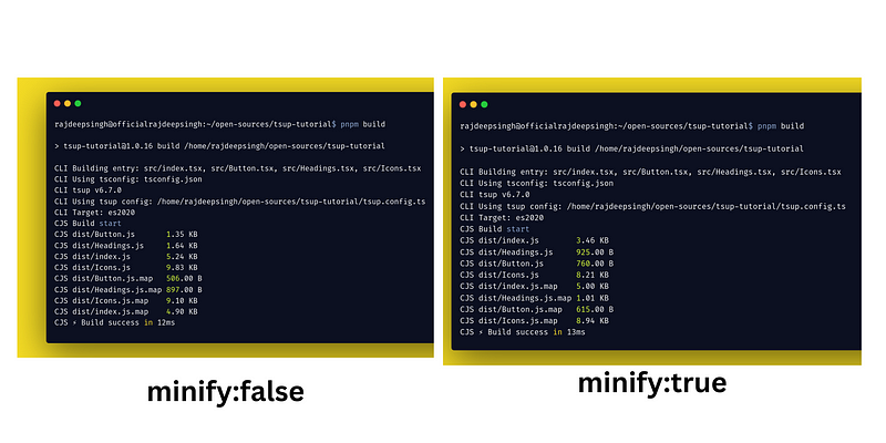
Compare the bundle size.
Out Extension
You can change the file name with the out Extension option. By default, your file name looks like this.
CJS dist/Button.js       1.35 KB
CJS dist/Headings.js     1.64 KB
CJS dist/index.js        5.24 KB
CJS dist/Icons.js        9.83 KB
CJS dist/Button.js.map   506.00 B
CJS dist/Headings.js.map 897.00 B
CJS dist/Icons.js.map    9.10 KB
CJS dist/index.js.map    4.90 KB
With the out Extension, we change the file name format and extension in tsup. The out Extension configuration runs on every file that you mention in entry point.
// tsup.config.ts

import { defineConfig } from "tsup";

export default defineConfig((options) => ({
  entry: [
    "src/index.tsx",
    "src/Button.tsx",
    "src/Headings.tsx",
    "src/Icons.tsx",
  ],

  outExtension({ format }) {
    return {
      js: `.${format}.js`,
    };
  },
}));
After running pnpm build or npm run build with the out Extension, configuration, and command out look like this.
tsup-tutorial$ pnpm build

> tsup-tutorial@1.0.16 build /home/rajdeepsingh/open-sources/tsup-tutorial

CLI Building entry: src/index.tsx, src/Button.tsx, src/Headings.tsx, src/Icons.tsx
CLI Using tsconfig: tsconfig.json
CLI tsup v6.7.0
CLI Using tsup config: /home/rajdeepsingh/open-sources/tsup-tutorial/tsup.config.ts
CLI Target: es2020
CJS Build start
CJS dist/Button.cjs.js       1.35 KB
CJS dist/Icons.cjs.js        9.83 KB
CJS dist/Headings.cjs.js     1.64 KB
CJS dist/index.cjs.js        5.25 KB
CJS dist/Button.cjs.js.map   506.00 B
CJS dist/Icons.cjs.js.map    9.10 KB
CJS dist/Headings.cjs.js.map 897.00 B
CJS dist/index.cjs.js.map    4.90 KB
CJS ⚡️ Build success in 13ms
Conditional config
You can also add a condition base configuration in tsup.config.js.
The best example is tsup watches or --watchopinions are true, and then Minify is disabled.
// tsup.config.ts

import { defineConfig } from "tsup";

export default defineConfig((options) => ({
  entry: [
    "src/index.tsx",
    "src/Button.tsx",
    "src/Headings.tsx",
    "src/Icons.tsx",
  ],

  minify: !options.watch,
}));
Publish on NPM
After successfully bundling the project with tsup, the next step is publishing our project as a package or library on the NPM registry.
Our package.json look like this.
{
  "name": "tsup-tutorial",
  "version": "1.0.16",
  "description": "Demo of tsup tutorial",
  "files": ["dist/*"],
  "types": "dist/index.d.ts",
  "style": "dist/tailwind.css",
  "main": "dist/index.js",
  "exports": {
    ".": {
      "import": "./dist/index.esm.js",
      "types": "./dist/index.d.ts",
      "require": "./dist/index.cjs.js"
    },
    "./Button": {
      "import": "./dist/Button.esm.js",
      "types": "./dist/Button.d.ts",
      "require": "./dist/Button.cjs.js"
    },
    "./Headings": {
      "import": "./dist/Headings.esm.js",
      "types": "./dist/Headings.d.ts",
      "require": "./dist/Headings.cjs.js"
    },
    "./Icons": {
      "import": "./dist/Icons.esm.js",
      "types": "./dist/Icons.d.ts",
      "require": "./dist/Icons.cjs.js"
    }
  },
  "scripts": {
    "dev": "tsup --watch && pnpm tailwind --watch",
    "build": "tsup && pnpm tailwind --minify -o ./dist/tailwind.css ",
    "tailwind": "pnpm tailwindcss -i ./style.css  -o ./dist/tailwind.css "
  },
  "repository": {
    "type": "git",
    "url": "git+https://github.com/officialrajdeepsingh/tsup-tutorial.git"
  },
  "keywords": ["tsup", "tsup-tutorial"],
  "author": "Rajdeep Singh officialrajdeepsingh@gmail.com",
  "license": "MIT",
  "bugs": {
    "url": "https://github.com/officialrajdeepsingh/tsup-tutorial/issues"
  },
  "homepage": "https://github.com/officialrajdeepsingh/tsup-tutorial#readme",
  "devDependencies": {
    "@types/node": "^20.2.5",
    "autoprefixer": "^10.4.14",
    "postcss": "^8.4.24",
    "postcss-cli": "^10.1.0",
    "tailwindcss": "^3.3.2",
    "tsup": "^6.7.0",
    "typescript": "^5.1.3"
  },
  "dependencies": {
    "@types/react": "^18.2.13",
    "react": "^18.2.0",
    "react-dom": "^18.2.0"
  }
}
In the package.json file, when you publish a new package under TypeScript support and when somebody uses your library to build something without losing TypeScript type support.
Some property or option is very important when you publish a TypeScript package on the NPM registry.
{
  "files": ["dist/*"],
  "types": "dist/index.d.ts",
  "style": "dist/tailwind.css",
  "main": "dist/index.js",
  "typesVersions": {
    "*": {
      ".": ["./dist/index.d.ts"],
      "Button": ["./dist/Button.d.ts"],
      "Headings": ["./dist/Headings.d.ts"],
      "Icons": ["./dist/Icons.d.ts"]
    }
  },
  "exports": {
    ".": {
      "import": "./dist/index.esm.js",
      "types": "./dist/index.d.ts",
      "require": "./dist/index.cjs.js"
    },
    "./Button": {
      "import": "./dist/Button.esm.js",
      "types": "./dist/Button.d.ts",
      "require": "./dist/Button.cjs.js"
    },
    "./Headings": {
      "import": "./dist/Headings.esm.js",
      "types": "./dist/Headings.d.ts",
      "require": "./dist/Headings.cjs.js"
    },
    "./Icons": {
      "import": "./dist/Icons.esm.js",
      "types": "./dist/Icons.d.ts",
      "require": "./dist/Icons.cjs.js"
    }
  }
}
Let's discuss
- Files
- Types
- Style
- Main
- Export
Files
The file property is optional in the package JSON file. It is useful when you publish a package on npm. You can add those files that are important for your package.
Files property work like include in typescript. All the files are included when your package is installed as a dependency.
These files download when your package is installed.
{
  "files": [
    "dist/*"
  ],
}
Types
types property in the package.json file is a part of the TypeScript property. In the type property, you add your main TypeScript declarations. In our case, it is a "types”:”dist/index.d.ts” file.
Style
First, export the production CSS file in the package.json file using the exports.
{
  "name": "tsup-tutorial",
  "exports": {
    "./styles.css": {
      "import": "./dist/style.css",
      "require": "./dist/style.css"
    }
  }
  // ...
}
Now you can import it like the JavaScript or TypeScript file.
import "tsup-tutorial/styles.css";
A real-life example is the _app.tsx file in Next.js, where you can import CSS files from the installation package.
// _app.tsx

// import the css file from tsup-tutorial for that you need a css loader.
import "tsup-tutorial/dist/tailwind.css";

import type { AppProps } from "next/app";
import { Header } from "tsup-tutorial";
import { Footer } from "tsup-tutorial";

export default function App({ Component, pageProps }: AppProps) {
  return (
    <>
      <Header
        logo="Tsup Tutorial"
        navItem={[
          { name: "Home", url: "/use-tsup-tutorial/" },
          { name: "About", url: "/use-tsup-tutorial/about" },
          { name: "Contact", url: "/use-tsup-tutorial/contact" },
        ]}
      />
      <div className="mx-auto w-3/6 p-5 my-3">
        <Component {...pageProps} />
      </div>
      <Footer copyrightText={"Copy Right by Rajdeep Singh"} />
    </>
  );
}
Follow the reference articles to learn more about the style property in the package.json:
Main
The main property takes your main or primary file as an entry point for your program.
In our case, the main property "main”:”dist/index.js” file. You can add any "main”:”dist/main.js”file name to the main property index file name is not compulsory,
{
  "main": "dist/index.js"
}
When people import your package, your main file is the import by default.
// CommonJS
const { Header, Footer } = require("tsup-tutorial");

// ECMAScript module
import { Header, Footer } from "tsup-tutorial";
Exports
The export property helps as an entry point if the main property does not exist.
The export work is similar to the main, but the big difference is that the main only takes on one entry file; on the other hand, exports take multiple entry points (file).
{
  "exports": {
    ".": {
      "import": "./dist/index.esm.js",
      "types": "./dist/index.d.ts",
      "require": "./dist/index.cjs.js"
    },
    "./Button": {
      "import": "./dist/Button.esm.js",
      "types": "./dist/Button.d.ts",
      "require": "./dist/Button.cjs.js"
    },
    "./Headings": {
      "import": "./dist/Headings.esm.js",
      "types": "./dist/Headings.d.ts",
      "require": "./dist/Headings.cjs.js"
    },
    "./Icons": {
      "import": "./dist/Icons.esm.js",
      "types": "./dist/Icons.d.ts",
      "require": "./dist/Icons.cjs.js"
    }
  }
}
In the exports . mean default export file excess by import and require. The ./Button, ./Headings, and Icons object has three properties.
- The
importtakes your esm file. - The
requireto take your cjs file. typesis to take your type definition file for the esm and cjs files.
// esm
import { Button } from "tsup-tutorial/Button";
import {
  IconGithub,
  IconInstagram,
  IconLinkedin,
  IconMastodon,
} from "tsup-tutorial/Icons";
import { H1, H2, H3 } from "tsup-tutorial/Headings";
import { Header, Footer } from "tsup-tutorial";

// cjs
const { Button } = require("tsup-tutorial/Button");
const {
  IconGithub,
  IconInstagram,
  IconLinkedin,
  IconMastodon,
} = require("tsup-tutorial/Icons");
const { H1, H2, H3 } = require("tsup-tutorial/Headings");
const { Header, Footer } = require("tsup-tutorial");
There are other properties, so you can use Google to read or direct NPM documents.
Note: In the Publish on NPM section, I only discuss the property which is important when you publish the package on the NPM registry. I’m not discussing common properties like name, version, description, repository, author, homepage, etc.
How to use Tailwind CSS with Tsup?
Adding tailwind CSS with Tsup bundle, There are two methods.
- With Tailwind CLI
- Adding Tailwind With Post CSS
With Tailwind CLI
Using Tailwind CSS in Tsup is a straightforward process. First, install Tailwind CSS using NPM, yarn, or pnpm package manager.
pnpm add -D tailwindcss

# or

npm install -D tailwindcss

# or

yarn add -D tailwindcss
After installing successfully, run the npx tailwindcss init command. The tailwindcss init command creates a tailwind.config.js file in your root level.
// tailwind.config.js

/** @type {import('tailwindcss').Config} */
module.exports = {
  content: ["./src/**/*.{js,ts,jsx,tsx,mdx}"],
  theme: {
    extend: {},
  },
  plugins: [],
};
The next step is to add the Tailwind directives to your CSS.
/* style.css */

@tailwind base;
@tailwind components;
@tailwind utilities;
Lastly, update the script in package.json.
 "scripts": {
    "dev": "tsup --watch && pnpm tailwind --watch",
    "build": "tsup && pnpm tailwind --minify -o ./dist/tailwind.css ",
    "tailwind": "pnpm tailwindcss -i ./style.css  -o ./dist/tailwind.css"
  },
The tailwind command takes the style.css directives file and builds a production-ready tailwind CSS file in the dist folder.
Adding Tailwind With Post CSS
Adding Tailwind CSS with Post CSS, I wrote a detailed article you can check out on Frontend web publication.
Conclusion
Publishing or building a new library or project based on TypeScript. The Tsup bundler is a good choice, and the special feature of tsup is you need less configuration.
Comments
Loading comments…