Introduction
When creating the design of a web page, one of the most important things to be into consideration is user interactivity. A good example of user interactivity is the Modal box.
A modal box mostly appears as a message box in the Browser based on an action performed by a user. The modal box comes in different forms and shapes which includes the Alert box, Flash notification box, Dialog box, Lightbox. Etc.
The unique feature of the modal box is the fact that it disables the main window in the browser but keeps it visible, with the modal window showing as a child window in front of the web page.
Some of the important cases for using a modal in an application include:
- Showing warnings for a certain course of action that may be irreversible.
- Flash notifications on a new piece of information.
- Increase in user interaction and engagement.
Modals have their disadvantages too, in that:
- They can interrupt a user workflow.
- They immediately demand the attention of the user.
- They disable the contents in the background, which could be frustrating in some cases.
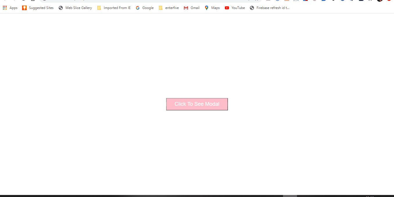
Now let us get started with the creation of the modals.
Sample 1
The flow of the tutorial will see us create three files, the index.html, style.css and app.js files, over four samples. Then we give a detailed breakdown of the code in each of these files.
index.html
index.html
In the index markup page above, we have a Font Awesome script within the head tag, which we will be using inside the modal box to display an icon. We also linked the CSS and JavaScript pages on the index page.
In the body of the index page, we have some important HTML attributes like the id's which will be used later in our JavaScript file to manipulate the page.
Then lastly in our button tag, we have an onclick event attribute which has an Alert function that gives us the functionality to display the modal message on the page.
style.css
style.css
In the style.css file, we set the box-sizing of our page to border-box. This property allows us to include the padding and border in an element's total width and height.
Then we styled our button with the .btn class. This allows us to position the button that allows us to display the modal at the centre of the page.
Lastly, using the #popUpBox, we can position the modal at the centre of the page.
With the z- index property, we can stack the modal in front of the other elements in the page.
The most important thing to take note of in the style.css file is the fact that we set the initial state of the display property as none. The reason for this will be explained in the app.js file.
app.js
app.js
Here, we have a global variable called Alert, which instantiates a function called CustomAlert(). Inside this function, we:
- Accessed the #popUpBox (id). With this, we set the display as block which shows the modal when the button tag is clicked. Remember, the initial state was set as none in the CSS file.
- Closed the modal by accessing the closeModal (id) in the HTML file. With this we able to set an HTML Button tag, with an onclick event attribute. In there we declared a function called ok().
- Finally, referencing the ok() function, we set the CSS properties of the modal to none, when the button gets clicked.
With that, we should have the result below:
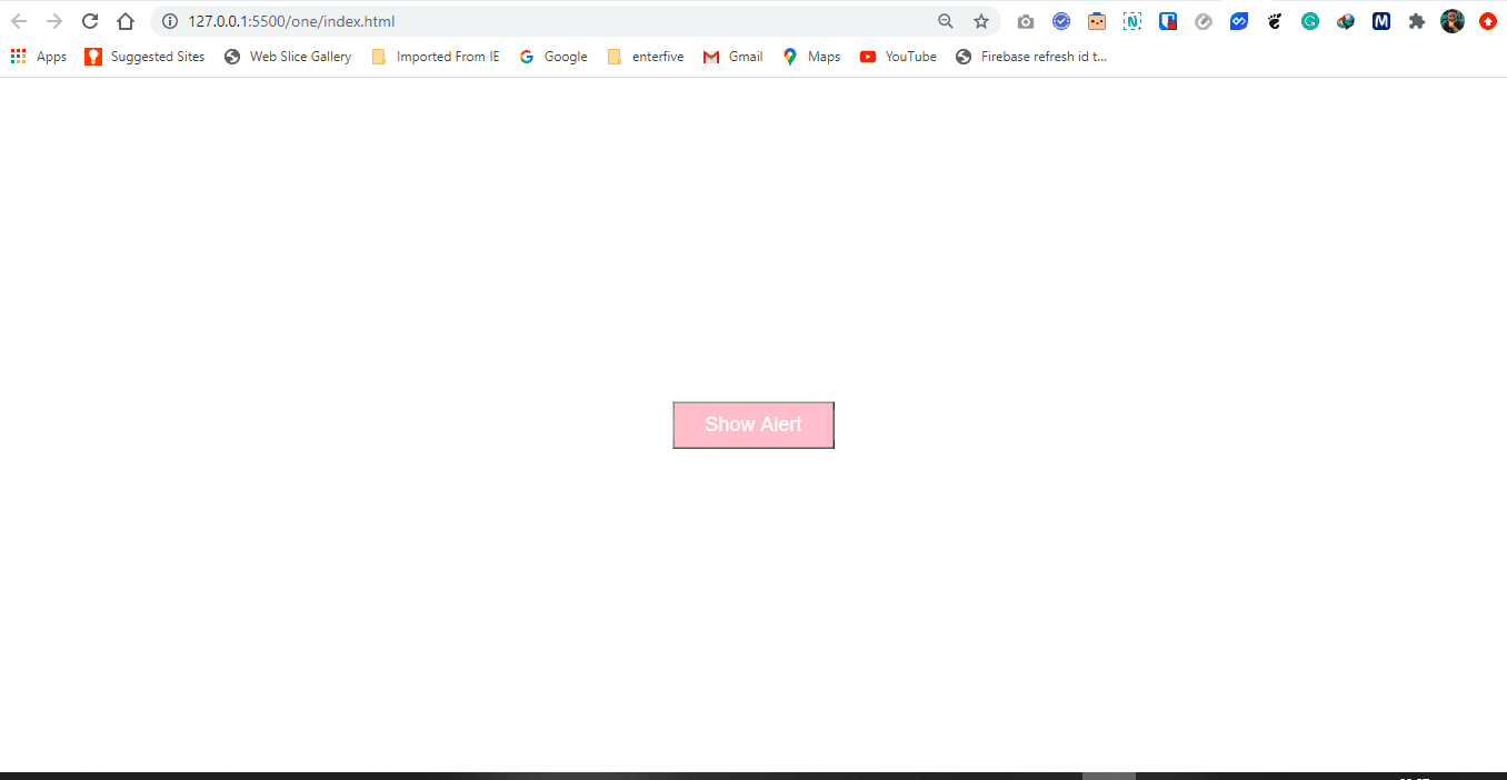
sample 1 modal
Sample 2
We start with the index.html, style.css and app.js files respectively.
index.html
index.html
From the above, we have the relevant links to our CSS and JavaScript files. Then in the body of the index page, we have an input tag with the type of Button.
We also have an onclick event attribute, with an alert() method containing a text that will be displayed in the modal.
style.css
style.css
Here we:
- Styled our button with the .btn class that was declared in the index.html file
- Then we have modalContainer, alertBox, alertBox h1, alertBox p, alertBox, closeBtn ID's. All these are created in the app.js file. A different approach from how we created the modal in Sample 1.
app.js
app.js
Here we break things down into 6 different parts:
- First, we set two global variables called closeModal and titleAlert which both hold the text that will be displayed in the modal box.
- We declared a createCustomAlert() function. This is where we create the body of our modal, displayed on the page.
- Then we created a div inside the body tag, assigned the modalContainer ID to it and then set the height to the scroll height of the page
- The div for the body of the alert box was created next. We assigned the alertBox ID to it. We then set the modal to be at the centre of the page, while also setting the style to be visible.
- Next, we set the title of the modal box by creating an h1 tag. The titleAlert text variable is then appended to the h1 tag to show the “It Pops!!!” message. We did something similar to the body of the modal, by creating a p tag and assigning a text node to it.
- Lastly, we created a function called removeCustomAlert() to close the modal box. We do this by creating an a tag, adding a closeBtn ID to it and creating an onclick event handler that references the function that closes the modal.
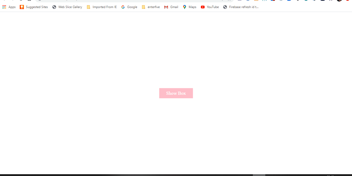
With that, we should have the result below:
sample 2 modal
Sample 3
index.html
index.html
In the index markup page above, we have a Font Awesome script within the head tag, which we will be using inside the modal box to display an icon. We also linked the CSS and JavaScript pages on the index page.
There is also two pop() functions declared in on the page, which we will be referring to in the app.js file.
style.css
style.css
The styling above is straight forward. It is worthy to note that we set our #btn ID to a display of none, at the initial stage. We will be toggling the display property in the app.js file.
app.js
app.js
We start by setting a global variable called modal to null. Then we refer to the pop() function from the index.html page, afterwards, we set the conditional state of the modal.
If the modal is null at first and it gets clicked, we set the display to block and the modal variable to true to show the modal, and if the close button is clicked, we then set the display to none and the modal variable to null to remove the modal.
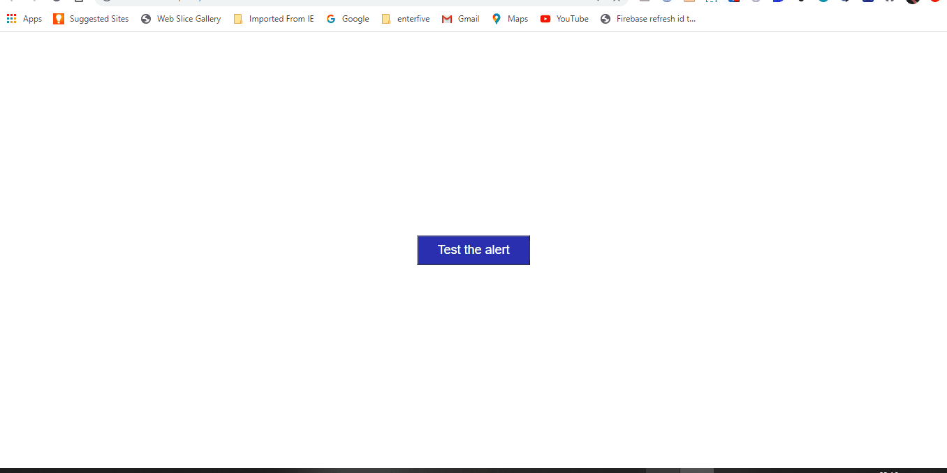
With this, we should have the result below:
sample 3
Sample 4
index.html
index.html
Here we will be making use of CSS classes instead of ID'S to manipulate the state of our modal. We have a button tag to sho the modal and a span with the letter “ X “ to close the modal.
style.css
style.css
Here we styled our button and our modal. The .modal class has an initial state, whose visibility is hidden. We will toggle this with a JavaScript function to show the modal.
app.js
app.js
We are doing three things from the above:
- We get access to our HTML classes through the querySelector. The querySelector() method returns the first element that matches a specified CSS selector(s) in the document.
- Then we created a toggleModal() function that toggles the show-modal class in the CSS.
- Then finally, we added event listeners to our functions to toggle the state of the modal based on a certain condition when the button is clicked.
With this, we should have the result below:
sample 4
Conclusion
So there goes the implementation for our 4 Modals. You can style it however you want and implement it in any project you are working on. I know the design may not be the best, but the goal of the article was more focused on the JavaScript implementation rather than the design.
The link to the code can be found here on Github.
Comments
Loading comments…