Establishing a strong brand identity is crucial for businesses looking to make a lasting impact. A vital component of this branding strategy is to maintain consistent theming across your application's user interface. One way to achieve this is by using a UI library and customizing its components to match your brand's style. One such library is Chakra UI.
Chakra UI is a simple, modular, and accessible component library that provides the building blocks you need to build your applications. One of its key features is its theming capabilities, which allow you to customize your design for brand consistency. This article will guide you on how to create and apply custom themes to Chakra UI components.
Let's dive in!
Setting Up the Project
Before we can start customizing our theme, we need to set up a project with Chakra UI. Follow the steps below to get started:
- Initialize a new React project using Nextjs. You can do this using the Create Next App:
npx create-next-app@latest chakra-theme-tutorial
If you're new to Next.js, check out the Next.js tutorial.
- Inside the project directory, install @chakra-ui/react and its peer dependencies:
npm i @chakra-ui/react@^1 @emotion/react@^11 @emotion/styled@^11 framer-motion@^6
OR
yarn add @chakra-ui/react@^1 @emotion/react@^11 @emotion/styled@^11 framer-motion@^6
These commands install the necessary packages for Chakra UI, including the emotion packages for styling and framer-motion for animations.
- After installing Chakra UI, you need to set up the
ChakraProviderat the root of your application. This could be in your_app.jsfile orindex.jsfile if you're using CRA.
import "@/styles/globals.css";
import { ChakraProvider } from "@chakra-ui/react";
export default function App({ Component, pageProps }) {
  return (
    <ChakraProvider>
      <Component {...pageProps} />
    </ChakraProvider>
  );
}
This provider sets up the context for Chakra UI and allows all components to access the theme
Understanding Chakra UI Theme
The Chakra UI theme is a JavaScript object that provides consistent styling values to be used with UI components. The theme object includes keys for colors, typography (fonts and font sizes), spacing, and more. At its core, Chakra UI's theming is powered by the use of style props and the extendTheme function, which enables you to customize various aspects such as colors, typography, spacing, and much more.
Let's see some of the major components of Chakra UI theming:
- Colors: Define your brand's color palette to infuse every element with a touch of your unique identity.
const theme = extendTheme({
  colors: {
    brand: {
      50: "#f7fafc",
      100: "#edf2f7",
      // Define more shades of your brand color here
    },
  },
});
- Typography: Craft a consistent typographic style that resonates with your brand's voice and persona.
const theme = extendTheme({
  fonts: {
    heading: "Inter, sans-serif",
    body: "Poppins, sans-serif",
  },
});
- Spacing: Establish a uniform spacing system that ensures visual harmony and readability throughout your application.
const theme = extendTheme({
  space: {
    sm: "8px",
    md: "16px",
    // Customize more spacing values as per your brand's guidelines
  },
});
Creating a Customized Theme with Design Tokens
Now that we comprehend the core aspects of Chakra UI theming, let's delve into the process of creating a customized theme tailored to your brand's specific requirements, using design tokens.
Let's say your designer gives you some color schemes( Primary, Secondary, Tertiary brand colors, and so on) exported as a JSON file. These are design tokens --- a way to abstract and define design decisions (colors, typography, spacing, etc.) in a consistent and reusable way. They'll serve as the bridge between your design and development teams, ensuring your app remains visually consistent (and easy to update and maintain) across different platforms/mediums.
How do you add these brand colors as design tokens to your base ChakraUI theme, so you can use them across your website?
Let's say you have them in a file like this.
const colors = {
  primary: "#845EC2",
  secondary: "#FF6F91",
  tertiary: "#00C9A7",
  warning: "#FF8066",
  danger: "#C34A36",
};

export default colors;
Now, you will need to create a new file, preferably under the styles folder (src/styles/theme.js)
// 1. Import the extendTheme function
import { extendTheme } from "@chakra-ui/react";
// 2. Import your design tokens
import colors from "./path-to-your-file";

// 3. Extend the base theme to include your design tokens
export const customTheme = extendTheme({
  colors,
});
After creating your custom theme, the next step is to apply it to your application so you can use these colors in your ChakraUI components like color="primary" or bg="secondary" and so on.
Building SaaS apps? 🚀 Need a component library that is specifically built for the unique needs of SaaS apps, comes with a professional, neutral theme out of the box, and includes a bunch of additions that make it easy to adapt to your brand using design tokens? Try Saas UI 👉.
Built on top of Chakra UI, Saas UI contains 40+ open source components and utilities and a base theme that can be used as is, or customized and extended exactly as demonstrated above. For design inspiration, check out its palette generator here!
Applying Your Custom Theme
Go back to your _app.js file where you wrapped your application with ChakraProvider, and pass your customTheme on to it as the new theme.
import { customTheme } from "@/styles/theme";
import { ChakraProvider } from "@chakra-ui/react";
export default function App({ Component, pageProps }) {
  return (
    <ChakraProvider theme={customTheme}>
      <Component {...pageProps} />
    </ChakraProvider>
  );
}
Our custom theme, with its color values (and other design tokens) is now available to all components within our application.
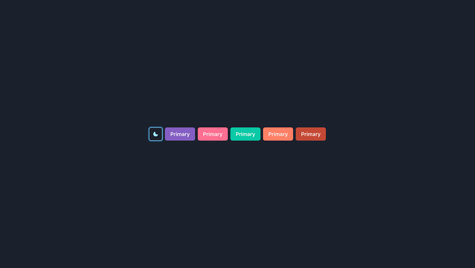
src/pages/custom.jsx
import { MoonIcon, SunIcon } from "@chakra-ui/icons";
import {
  Button,
  Center,
  IconButton,
  Stack,
  useColorMode,
} from "@chakra-ui/react";
const CustomPage = () => {
  const { colorMode, toggleColorMode } = useColorMode();
  return (
    <Center h="100vh" maxW="1200px" mx="auto">
      <Stack direction="row">
        <IconButton
          icon={colorMode === "light" ? <SunIcon /> : <MoonIcon />}
          variant="outline"
          colorScheme="cyan"
          aria-label="Color mode switcher"
          onClick={toggleColorMode}
        >
          Switch Mode
        </IconButton>
        <Button variant="solid" bg="primary">
          Primary
        </Button>
        <Button variant="solid" bg="secondary">
          Primary
        </Button>
        <Button variant="solid" bg="tertiary">
          Primary
        </Button>
        <Button variant="solid" bg="warning">
          Primary
        </Button>
        <Button variant="solid" bg="danger">
          Primary
        </Button>
      </Stack>
    </Center>
  );
};
export default CustomPage;
Customizing Component Styles
Chakra UI provides a unique approach to styling components. The main idea is that most components have default or base styles (baseStyle), styles for different sizes (sizes), and styles for different visual variants (variants). Understanding this approach is crucial for effectively overriding any component style. You're not limited to the component styles that Chakra provides; you can also create your custom component styles.
Here's how you might override the component styles for Chakra's Button component:
src/components/buttonStyles.js
import { dark, mode, light } from "@chakra-ui/theme-tools";
export const ButtonStyles = {
  // style object for base or default style
  baseStyle: {},
  // styles for different sizes ("sm", "md", "lg")
  sizes: {
    xl: {
      h: "56px",
      fontSize: "lg",
      px: "32px",
    },
  },
  // styles for different visual variants ("outline", "solid")
  variants: {
    primary: (props) => ({
      bg: "primary",
      color: "white",
      _hover: {
        bg: "tertiary",
        boxShadow: "md",
      },
    }),
    secondary: (props) => ({
      bg: "secondary",
      color: "white",
      _hover: {
        bg: "danger",
        boxShadow: "md",
      },
    }),
    secondaryOutline: (props) => ({
      bg: "transparent",
      border: "1px solid",
      borderColor: "secondary",
      color: "secondary",
      _hover: {
        boxShadow: "md",
        transform: "scale(1.02)",
      },
    }),
  },
  // default values for 'size', 'variant' and 'colorScheme'
  defaultProps: {
    size: "",
    variant: "",
    colorScheme: "",
  },
};
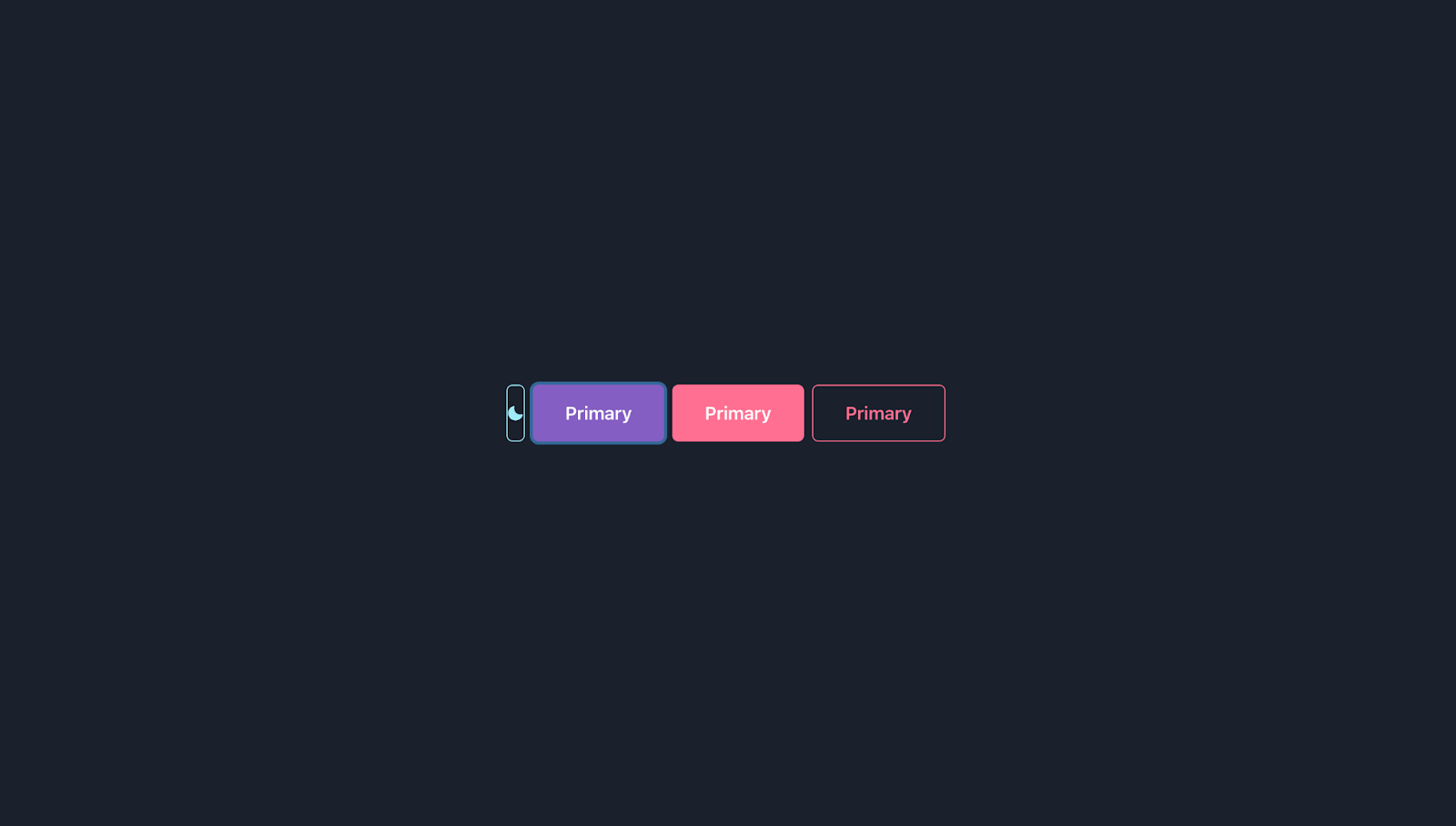
The code above customizes the Button component in several ways. It changes the base style to use a bold font weight, creates a new size xl, and adds new visual variants primary, secondary and secondaryOutline.
For this to take effect, you need to make some changes to the theme.js file.
import { extendTheme } from "@chakra-ui/react";
import { ButtonStyles as Button } from "@/components/buttonStyles";
export const customTheme = extendTheme({
  colors: {
    primary: "#845EC2",
    secondary: "#FF6F91",
    tertiary: "#00C9A7",
    warning: "#FF8066",
    danger: "#C34A36",
  },
  components: {
    Button,
  },
});
The only new changes made were:
- importing the
ButtonStylesand using it as the custom styles for the Button component. - components: { Button }: By adding the custom button component here, the custom button styles will be integrated into the overall theme, affecting the appearance of buttons across the application.
This is how it will look
Responsive Variants
You can also have a custom responsive variant, which means they can have different styles at different breakpoints. This feature is especially useful when you want a component to look different on small and large screens.
To define a responsive variant, you can use the object syntax where the keys are the names of the breakpoints. Let's see how to add a responsive variant for the Button component.
import { dark, mode, light } from "@chakra-ui/theme-tools";
export const ButtonStyles = {
  // style object for base or default style
  baseStyle: {},
  // styles for different sizes ("sm", "md", "lg")
  sizes: {
    xl: {
      h: "56px",
      fontSize: "lg",
      px: "32px",
    },
  },
  // styles for different visual variants ("outline", "solid")
  variants: {
    responsive: {
      bg: { base: "primary", md: "secondary" },
      color: { base: "white", md: "black" },
    },
  },
  // default values for 'size', 'variant' and 'colorScheme'
  defaultProps: {
    size: "",
    variant: "",
    colorScheme: "",
  },
};
In this example, we're defining a responsive variant for the Button component. This variant has different bg (background color) and color (text color) at different breakpoints. On small screens (base), the background color is primary and the text color is white. On medium screens and above (md), the background color is secondary and the text color is black.
Applying the Responsive Variant
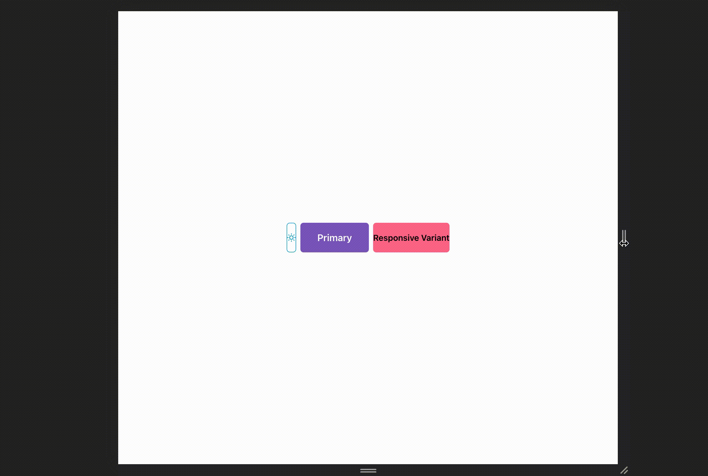
After defining the responsive variant, you can use it in your Button component like so:
import { Button, Center, IconButton, Stack } from "@chakra-ui/react";
const CustomPage = () => {
  return (
    <Center h="100vh" maxW="1200px" mx="auto">
      <Stack direction="row">
        <Button size="xl" variant="primary">
          Primary
        </Button>
        <Button variant="responsive">Responsive Variant</Button>
      </Stack>
    </Center>
  );
};
export default CustomPage;
In this example, variant="responsive" tells Chakra UI to apply the responsive variant that we defined in our custom theme to the Button. When you resize your browser window, you'll see that the Button changes its background and text colors at the md breakpoint. This shows that the responsive variant is working as expected.
Remember that the md breakpoint and other breakpoints (sm, lg, xl, 2xl) can be customized in the theme object. The default values for these breakpoints in Chakra UI are 30em, 48em, 62em, 80em, and 96em respectively.
Customizing Global Styles
In addition to customizing individual components, you can also customize global styles. These are theme-aware styles that can be applied to any HTML element globally. To add global styles, you can update the theme.styles.global key in the theme. Global styles can be a style object or a function that returns a style object:
import { extendTheme } from "@chakra-ui/react";
const theme = extendTheme({
  styles: {
    global: {
      body: {
        bg: "gray.400",
        color: "white",
      },
      a: {
        color: "teal.500",
        _hover: {
          textDecoration: "underline",
        },
      },
    },
  },
});
export default theme;
In this example, we've set global styles for the body and a (anchor) HTML elements.
Final Thoughts
Chakra UI theming provides a powerful and flexible way to style your applications. By customizing your theme and component styles, you can create a consistent look and feel that aligns with your brand. Whether you're extending the default theme or creating your own from scratch, Chakra UI theming gives you the tools you need to build beautiful, accessible, and consistent UIs.
Similarly, using specialized component libraries like SaaS UI that is built on top of Chakra UI can further streamline the development process, enabling faster application creation. All Saas UI components are themeable and can be customized using component styles and theme tokens, offering a similar level of flexibility as Chakra UI. This means you can easily adjust the look and feel of these components to match your brand's style guide.
Remember, a consistent design is not just about aesthetics. It also improves usability and strengthens your brand identity. So, start exploring Chakra UI theming today and see how it can elevate your design to the next level.
Comments
Loading comments…