
Dashboards have a very distinct and standardized look and feel. You don't expect dashboards to be unique or completely different from other dashboards. In fact, if a dashboard were to dramatically innovate on its UI/UX, users would take longer to understand them and to get insight from them (which is ultimately what dashboards are there for).
With that in mind, one would naively assume that building a dashboard is a trivial task, everyone knows what they look like after all, we should have a single tool everyone uses and works for all of them, right?
Wrong.
Not only there isn't "just one" tool, but instead, there are so many that picking the "right" one for your use case can seem like an impossible task.
Lucky for you, I'm here to help!
Let's review the top 5 component libraries you can use to build your own dashboard.
Saas UI
One of the most versatile options on this list is Saas UI, the component library for React that supports NextJS, Remix, Blitz JS, and more, and can help you build any type of UI for your SaaS, not only a dashboard.
Built on top of Chakra UI, Saas UI gives you all the components needed to create all types of interfaces. While there are two options, with the Pro package being the most complete, you can still build a great dashboard with the Core package that is free and open-source (MIT License).
There are components here for all your needs, including but not limited to:
- Layout components, like the classic
Cardor the newAppShellwhich helps you build an application-like UI with ease, or theSimpleGridwhich is what you'd expect: a grid system. - Auth screens, and hooks and Providers to manage Auth --- integrating easily with Clerk, Supabase Auth, and Magic.
- Forms with React Hook Form, tables with React (Tanstack) Table, and charts with Recharts.
See all of Saas UI's components here.
Professionally crafted Chakra UI components
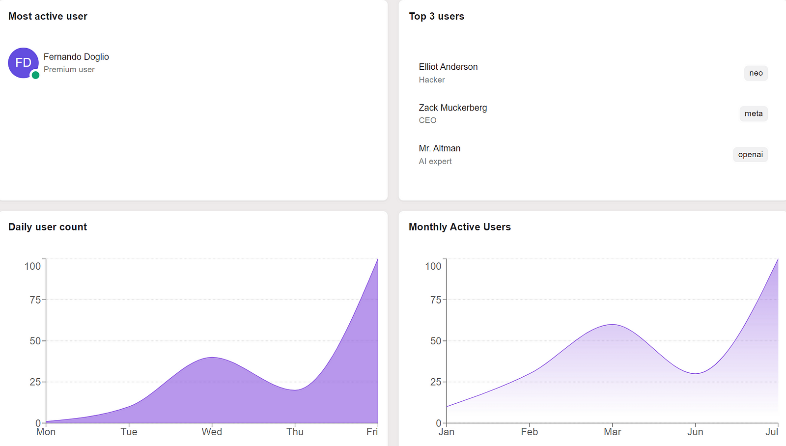
As an example, here is the code required to build the dashboard from the above screenshot:
import {
  CardBody,
  CardHeader,
  Card,
  SaasProvider,
  CardTitle,
  Persona,
} from "@saas-ui/react";
import { LineChart } from "@saas-ui/charts";
import { SimpleGrid } from "@chakra-ui/react";
import { List } from "@saas-ui/react";
import { Tag } from "@chakra-ui/react";

export default function Dashboard({}) {
  //fake data
  const chartData = [
    { x: 1, y: 1, xv: "Mon", yv: 1 },
    { x: 2, y: 10, xv: "Tue", yv: 10 },
    { x: 3, y: 40, xv: "Wed", yv: 40 },
    { x: 4, y: 20, xv: "Thu", yv: 20 },
    { x: 5, y: 100, xv: "Fri", yv: 100 },
  ];

  const mau = [
    { x: 1, y: 10, xv: "Jan", yv: "10" },
    { x: 2, y: 30, xv: "Feb", yv: "30" },
    { x: 3, y: 60, xv: "Mar", yv: "60" },
    { x: 4, y: 30, xv: "Jun", yv: "30" },
    { x: 5, y: 100, xv: "Jul", yv: "100" },
  ];

  const activeUsers = [
    {
      primary: "Elliot Anderson",
      secondary: "Hacker",
      tertiary: <Tag>neo</Tag>,
    },
    {
      primary: "Zack Muckerberg",
      secondary: "CEO",
      tertiary: <Tag>meta</Tag>,
    },
    {
      primary: "Mr. Altman",
      secondary: "AI expert",
      tertiary: <Tag>openai</Tag>,
    },
  ];

  return (
    <SaasProvider>
      <SimpleGrid columns={2} gap={4}>
        <Card>
          <CardHeader>
            <CardTitle>Most active user</CardTitle>
          </CardHeader>
          <CardBody>
            <Persona
              name="Fernando Doglio"
              secondaryLabel="Premium user"
              presence="online"
            />
          </CardBody>
        </Card>
        <Card>
          <CardHeader>
            <CardTitle>Top 3 users</CardTitle>
          </CardHeader>
          <CardBody>
            <List items={activeUsers} />
          </CardBody>
        </Card>
        <Card>
          <CardHeader>
            <CardTitle>Daily user count</CardTitle>
          </CardHeader>
          <CardBody>
            <LineChart
              data={chartData}
              variant="solid"
              limit={100}
              height={290}
            />
          </CardBody>
        </Card>
        <Card>
          <CardHeader>
            <CardTitle>Monthly Active Users</CardTitle>
          </CardHeader>
          <CardBody>
            <LineChart data={mau} variant="gradient" limit={100} height={290} />
          </CardBody>
        </Card>
      </SimpleGrid>
    </SaasProvider>
  );
}
The first thing you have to do is install the library in your project. You can do that with the following line:
npm i @chakra-ui/react @emotion/react@^11 @emotion/styled@^11 framer-motion@^6 @saas-ui/charts
That line will install everything you need, including the @saas-ui/charts package, which is not documented (as of yet) on the official documentation site.
All you have to remember, is to use the SaasProvider component. Here I'm using it inside the same component, but if you have several pages where you want to use Saas UI, then I'd suggest using this component inside the _app.tsx file and wrap the entire application with this provider.
After that, I'm just configuring the layout with a SimpleGrid component with 2 columns. Then you simply have to add Card components inside it and they'll auto-organize accordingly.
For the charts, I'm using the LineChart component configured in 2 different ways, so you can see the difference. The key to using this component, is setting the height parameter. If you don't add that parameter, you won't get an error, but you won't see anything rendered on screen either.
So keep that in mind when using it yourself.
All in all, the Saas UI component library is powerful and versatile enough to meet most of your dashboard-building needs. Here are some of the advantages you get with Saas UI:
- It gives you all the basic building blocks you'll need --- components, hooks, and Providers --- to create sleek, customizable, accessible, data-dense SaaS dashboards, as well as the application around it.
- The documentation site is very detailed with examples --- complete with live editing --- so you understand exactly what each component looks like, what props it uses, and how you can customize it.
- All the components look fantastic out-of-the-box, and you can freely customize everything on a per-component basis, or app-wide. You can even customize Themes with Design Tokens!
- Setting up feature flags is incredibly easy.
Tremor
Tremor is the next component library we'll analyze today.
Their approach is simple: they give you all the building blocks, and you decide how to use them.
You can build a very visually appealing dashboard without having to worry about anything but the data.
They also have this nifty concept of "blocks" which are essentially page templates. With blocks, you can get started on the layout of a given dashboard and then start adding into each widget.
For example, you have:
- Landing zones blocks
- KPI cards blocks
- Charts blocks
- Page shells, which are layouts to have the components pre-selected and pre-positioned.
- Tables and lists, if what you need is to list structured data on your page.
The getting started process is quite straightforward, simply install their CLI tool with
npx @tremor/cli@latest init
That process will ask about the framework you're using and it'll configure everything automatically. You can choose to go with a manual install, but that's not really needed.
Once you're done, all you have to do is pick the component you want and start using it.
Their list of components is quite extensive (24!) and while most of them are around data visualization (as it should be after all), they also have several layout-related ones to help you properly position your widgets.
It should be said that Tremor works with TailwindCSS so if you're not familiar with that framework for styling, you'll have to read up on it.
Volt React
If on the other hand, you're more of a Bootstrap developer (I know I am), you can try Volt React.
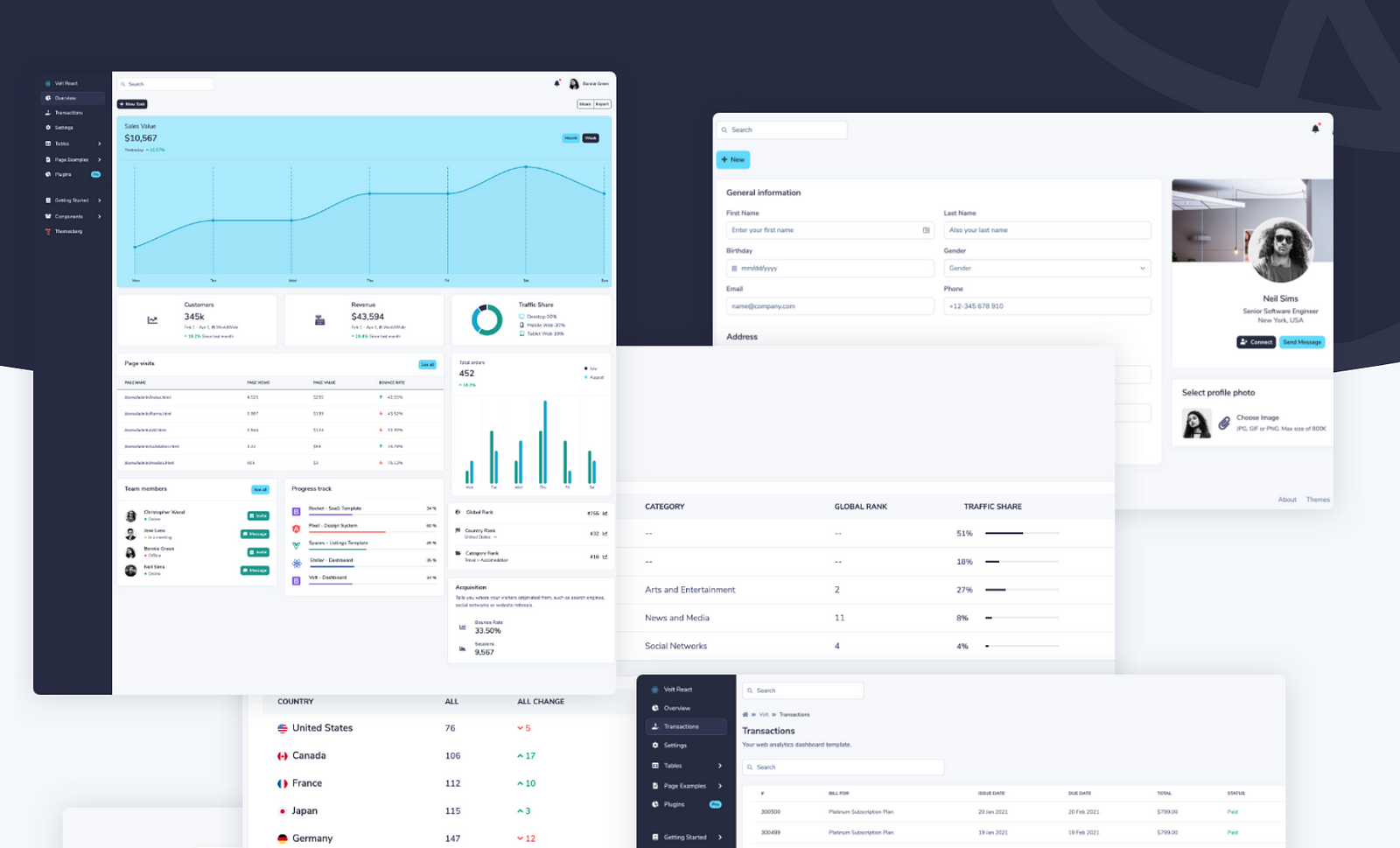
This is a very straightforward template/component library that you can use to build React-based dashboards.
Note that this is not something you add to your project, but rather, you use this template to start your project. You'll be building everything else around Volt.
That said, by installing it, you get access to 10 pre-built pages that go from log-in screens, to dashboards, profile pages, settings, and more. All their components are Bootstrap-based, so if you already know the CSS library, you'll be familiar with them. You have the full list here.
When it comes to using it, all you have to do is:
- Download their project from their download section (you'll have to pick between free and pro plan).
- Then inside the folder, simply run
npm install. And that's it, you can start developing your dashboard now.
Tabler React
If you're looking for a very professional-looking set of components, Tabler React might be the right choice for you.
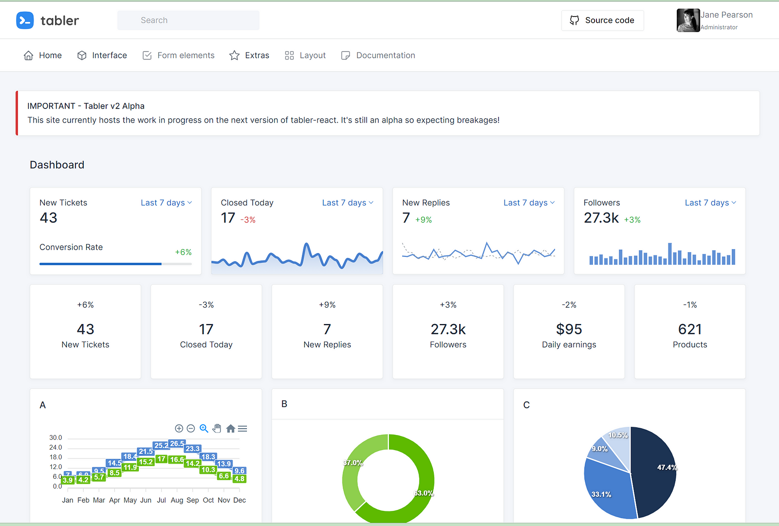
Tabler React provides you with tons of ready-to-use components and over 4.000 (no typo there!) of icons ready for you to add to your dashboard.
To get started with Tabler, you'll need a little bit extra work (compared to the others listed here).
- You'll need NPM + Node installed (no surprise there)
- You'll have to run
npm installfrom within thetablerfolder. - You'll have to have Ruby installed (they recommend you install version 2.5.5)
- You'll have to install bundler with
gem install bundlerand then runbundle install.
But that's it, once you're done, you'll have everything you need to get started. Check out their documentation on how to get started here.
Cumul.io
Up until now, they were all standard libraries or templates you could use either inside an existing project, or start a project around them.
However, most of the work related to putting the dashboard together, getting the data, etc, had to be done by you.
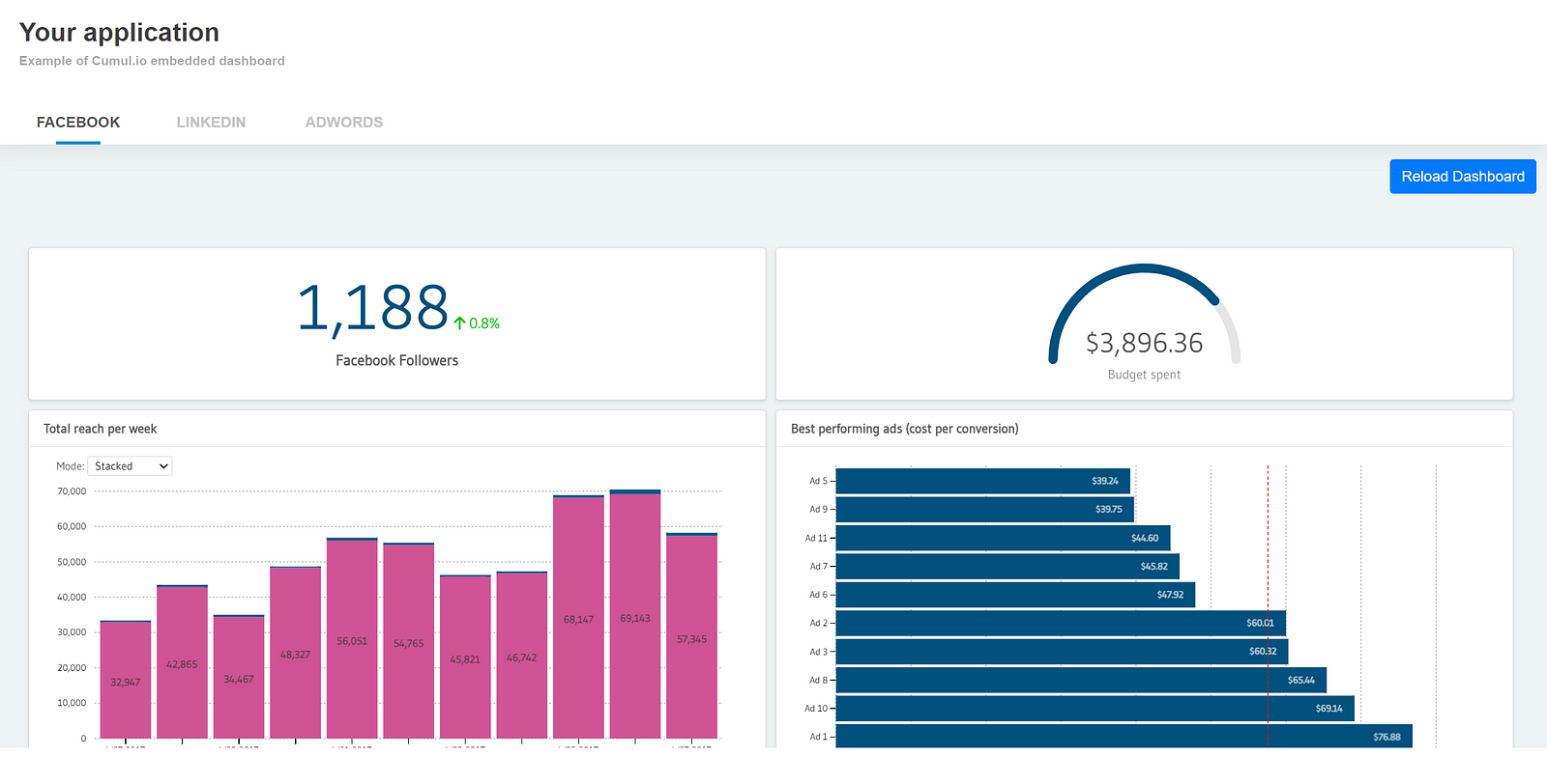
With Cumul.io that is not the case. The approach they take is different. Instead of giving you the lego bricks and hope you manage to build the dashboard you wanted, they do a lot more:
- They connect to your data sources directly
- They give you a visual editor to build your dashboard however you want it.
- They host the dashboard, you just have to embed it into your application.
I have to admit, this is the first product of its kind I've seen in a while, and I can see a lot of people trusting them with their data.
You can check out this example to understand how easy it is to embed the dashboard seamlessly into your app.
In the end, the best option for you is the one that has the tools you need.
I know how that sounds, but there isn't one clear winner here, they all have different approaches and different components, so it's up to you and how compatible they are with your tech stack to make the call.
Personally, SaaS UI seems like the easy choice, given how versatile it is and how easy it is to get started.
What about you? What's your favorite one?
Comments
Loading comments…