
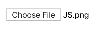
There are often times you want to upload images, videos, pdfs, or other documents from your device. We can easily accomplish this using the HTML input element by setting type="file". This would result in the following element being displayed on the screen.
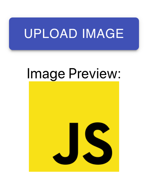
This works but it doesn't look so good in my opinion. Wouldn't you prefer an element with a little more style and possibly a preview of the image being uploaded? How about something like below?
In this article, we will take a look at how to create this file input using React. By the end of the article, you should have an understanding of how to do the following:
-
Create a file input button with Material-UI
-
Store the file data using React
-
Display a preview of the image using the URL object
Set up
For this example, we will be working in a create-react-app project. I have already installed the Material-UI core package. If you are new to using Material-UI, check out the article below to get started. Create a Customized Color Theme in Material-UI Making a custom color theme for your next React project is easymedium.com
To start, I created a component that is rendering a basic input element to the screen. I added type="file" and accept="image/*". These attributes will let the user choose any image file from their device.
const FileInput = () => {
  return <input *accept*="image/*" *type*="file" *id*="select-image" />;
};

export default FileInput;
Create a file input button with Material-UI
The first step will be to create the button. We will need to import the Button component from Material-UI.
import Button from '@material-ui/core/Button';
Then, we will render the Button component inside of the label element for the input. Remember, the htmlFor attribute on the label should match the id of the input.
<>
  <input *accept*="image/*" *type*="file" *id*="select-image" />
  **<label *htmlFor*="select-image">
    <*Button* *variant*="contained" *color*="primary">
      Upload Image
    </*Button*>
  </label>**
</>
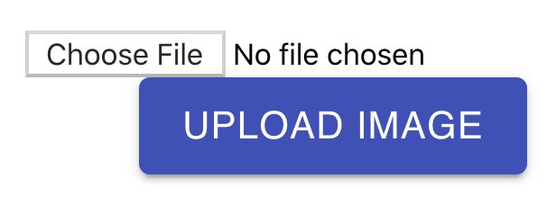
If we check the output, it will not be what we were hoping for. We will see both the input element and the button being rendered to the screen. Also, the button is not working as expected.
There are two things we need to fix.
First, we need to hide the input element. Therefore, the only way to access the input would be through the label. We can achieve this by adding an inline style of style={{ display: ‘none' }} to the input element.
Second, we need to change the component type of the button. Currently, it is a button element, but we need to change this to a span element. We can achieve this by adding a component=”span” prop to the Button component.
<>
  <input
    *accept*="image/*"
    *type*="file"
    *id*="select-image"
    ***style*={{ display: 'none' }}**
  />
  <label *htmlFor*="select-image">
    <*Button* *variant*="contained" *color*="primary" **component="span"**>
      Upload Image
    </*Button*>
  </label>
</>
Now, we will only see the button. If we click on it, our file select screen will open and allow us to select an image.

Store the file data using React
The next step will be to handle the file data. We will use the useState hook from React and create one state variable called selectedImage.
const [selectedImage, setSelectedImage] = useState(null);
Then, we will add an onChange listener to the input element. Whenever the input file changes, we will want to set the selectedImage variable to the file selected. The data will come as an array, so be sure to grab the first item in the array using e.target.files[0].
<input
  *accept*="image/*"
  *type*="file"
  *id*="select-image"
  *style*={{ display: 'none' }}
  ***onChange*={*e* => setSelectedImage(*e*.target.files[0])}**
/>
If we add an image and log the selectedImage variable to the console, we will see the following.
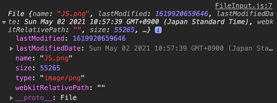
What we have stored in the selectedImage variable is a File object. You can read more about the File object here.
Display a preview of the image using the URL object
The final step will be to display a preview of the image we uploaded. We can achieve this using the useEffect hook from React and the createObjectURL method on the URL object.
We will first need another state variable which we will call imageUrl.
const [imageUrl, setImageUrl] = useState(null);
Then, we will use the useEffect hook and listen for changes on the selectedImage variable. If there is a selected image, then we will want to create an image URL.
We can create a URL from a File object using the createObjectURL method on the URL object. This function takes a File, Blob, or MediaSource object and creates an object URL. You can read more about this here.
useEffect(() => {
  if (selectedImage) {
    setImageUrl(*URL*.createObjectURL(selectedImage));
  }
}, [selectedImage]);
Finally, we will use the img element to display the image by adding the URL we created to the source. To make it look a little nicer, I am also using the Box component from Material-UI to add a top margin and to center the text.
{imageUrl && selectedImage && (
  <*Box* *mt*={2} *textAlign*="center">
    <div>Image Preview:</div>
    <img *src*={imageUrl} *alt*={selectedImage.name} *height*="100px" />
  </*Box*>
)}
Check out the article below if you want to learn more about the Box component from Material-UI. Using the Box Component in Material-UI to Easily Style Your Project Style your app without using CSS files, CSS-in-JS, or inline styleslevelup.gitconnected.com
Our component is now complete! When we upload an image, we will see the preview of the image below the button.
Conclusion
You can check out the full source code for this component below.
import { useState, useEffect } from "react";
import Button from "@material-ui/core/Button";
import Box from "@material-ui/core/Box";

const FileInput = () => {
  const [selectedImage, setSelectedImage] = useState(null);
  const [imageUrl, setImageUrl] = useState(null);

  useEffect(() => {
    if (selectedImage) {
      setImageUrl(URL.createObjectURL(selectedImage));
    }
  }, [selectedImage]);

  return (
    <>
      <input
        accept="image/*"
        type="file"
        id="select-image"
        style={{ display: "none" }}
        onChange={(e) => setSelectedImage(e.target.files[0])}
      />
      <label htmlFor="select-image">
        <Button variant="contained" color="primary" component="span">
          Upload Image
        </Button>
      </label>
      {imageUrl && selectedImage && (
        <Box mt={2} textAlign="center">
          <div>Image Preview:</div>
          <img src={imageUrl} alt={selectedImage.name} height="100px" />
        </Box>
      )}
    </>
  );
};

export default FileInput;
Thanks for reading! I hope this article was helpful for you to create a file input button with Material-UI. I think it is a much better experience for the user to see a styled button, along with a preview of the image they uploaded.
Check out the articles below if you want to continue learning about Material-UI.
What Really Happens When You Use the TextField Component in Material-UI?
The Easiest Way to Style your Material-UI Components: The makeStyles Function
Comments
Loading comments…