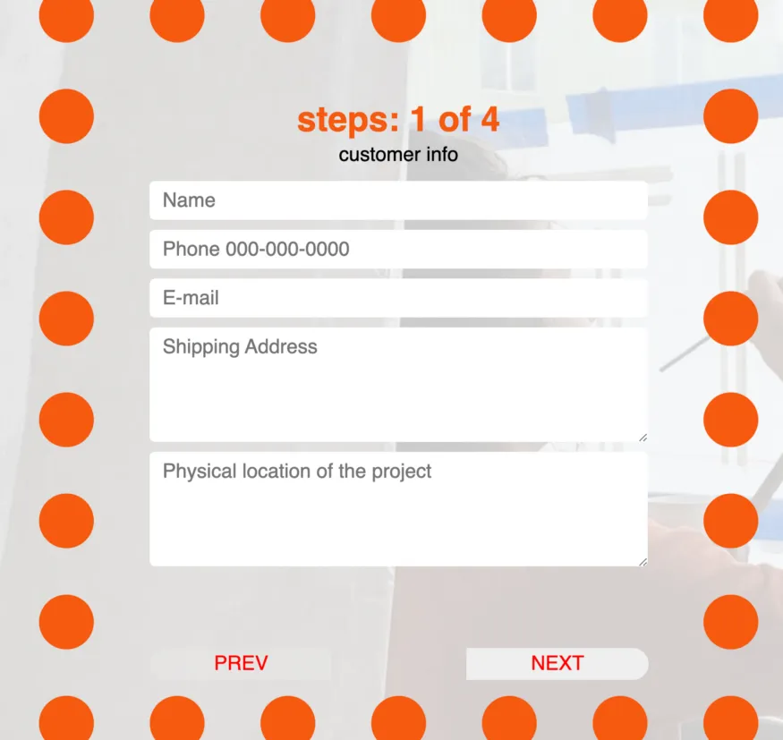
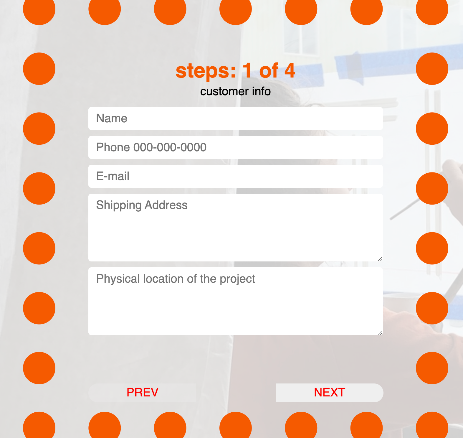
Pictured above: AFTER : our goal for this blog. after styling react form
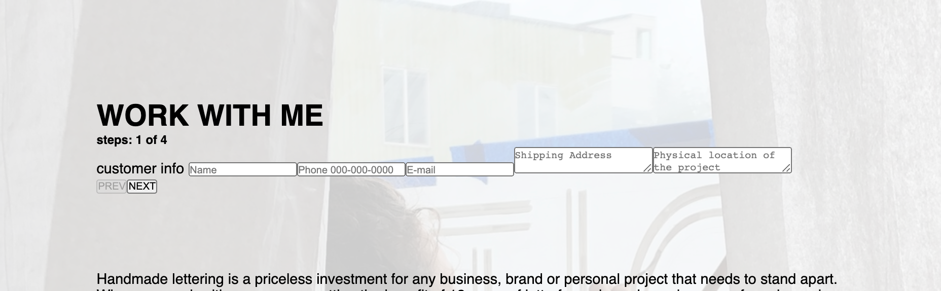
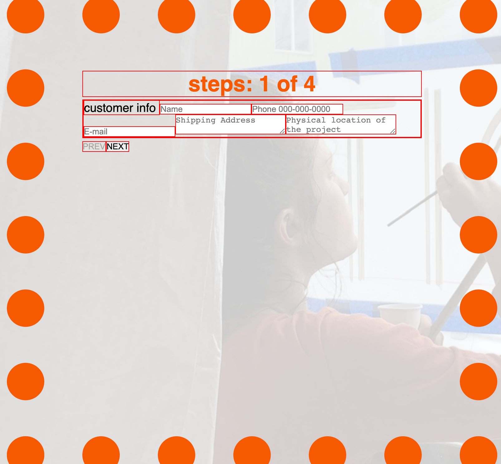
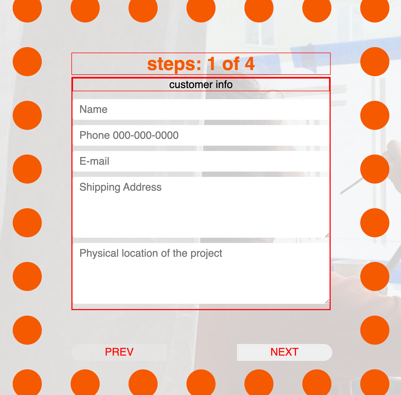
BEFORE: react Form before styling
Your React Form works! Congratulations! But now what? All the div boxes are stacked next to each other horizontally, and it doesn’t look good at all.
Users won’t want to put their information unless they are getting paid to type in the information. We are trying to get paid here so it’s time to add some styling!
We will be using this simple JSX file to style the form. For the full React form code, here is the link.
<div className="form-box">
  <h5 className="form-step">steps: {count} of 4</h5>
  <form>
    <div className="field1">
      <label> customer info </label>
      <input placeholder="Name" />
      <input placeholder="Phone 000-000-0000" />
      <input placeholder="E-mail" />
      <textarea placeholder="Shipping Address" />
      <textarea placeholder="Physical location of the project" />
    </div>

    <button type="submit" id="submitBtn" className="submitBtn">submit</button>
  </form>

  <button className="prevBtn" type="submit">PREV</button>
  <button className="nextBtn" type="submit">NEXT</button>
</div>
-
Create
Form.cssandimport ‘./Form.css’in the React file. -
Name the most parent div class name
<div className = "form-box">. -
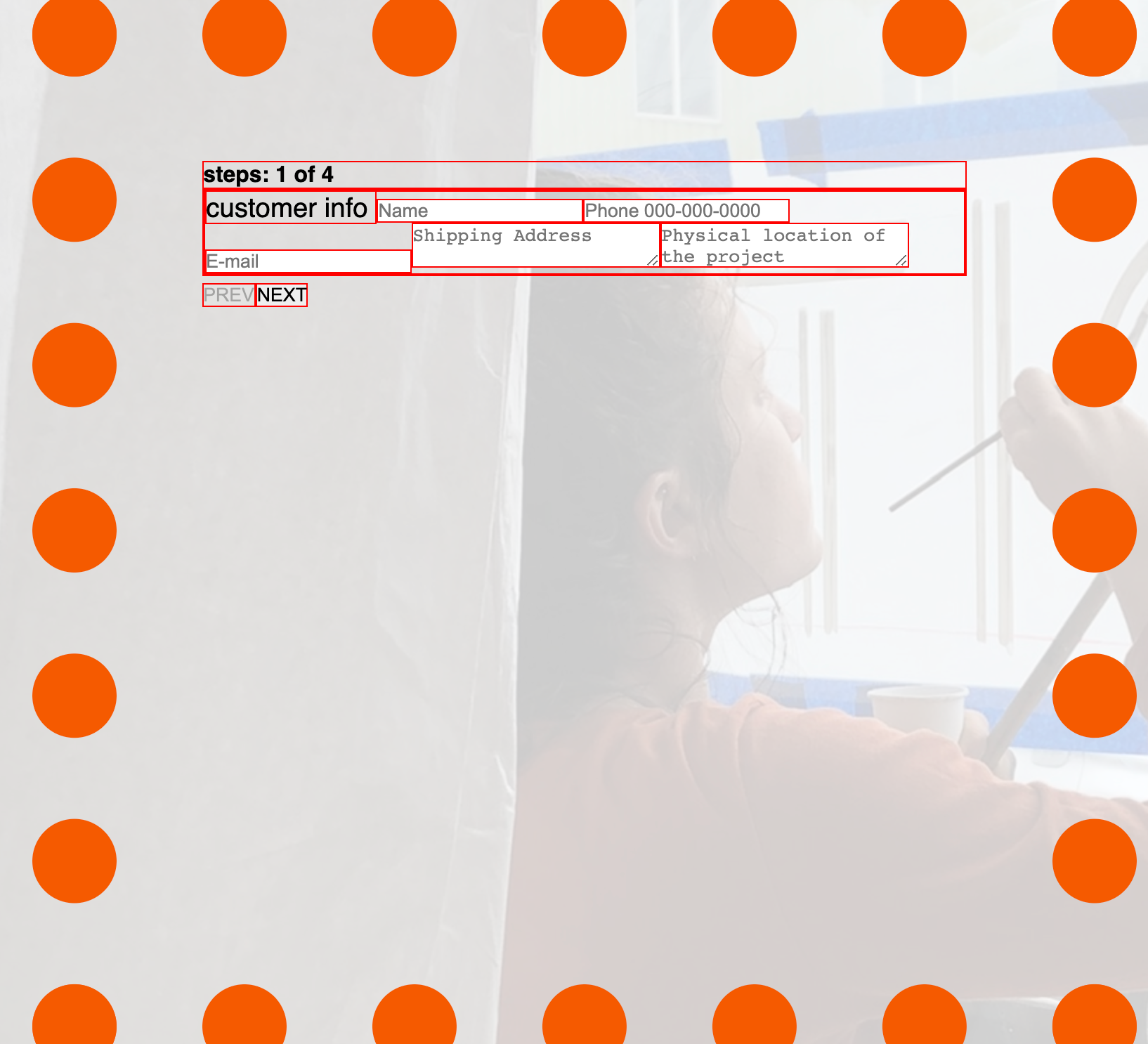
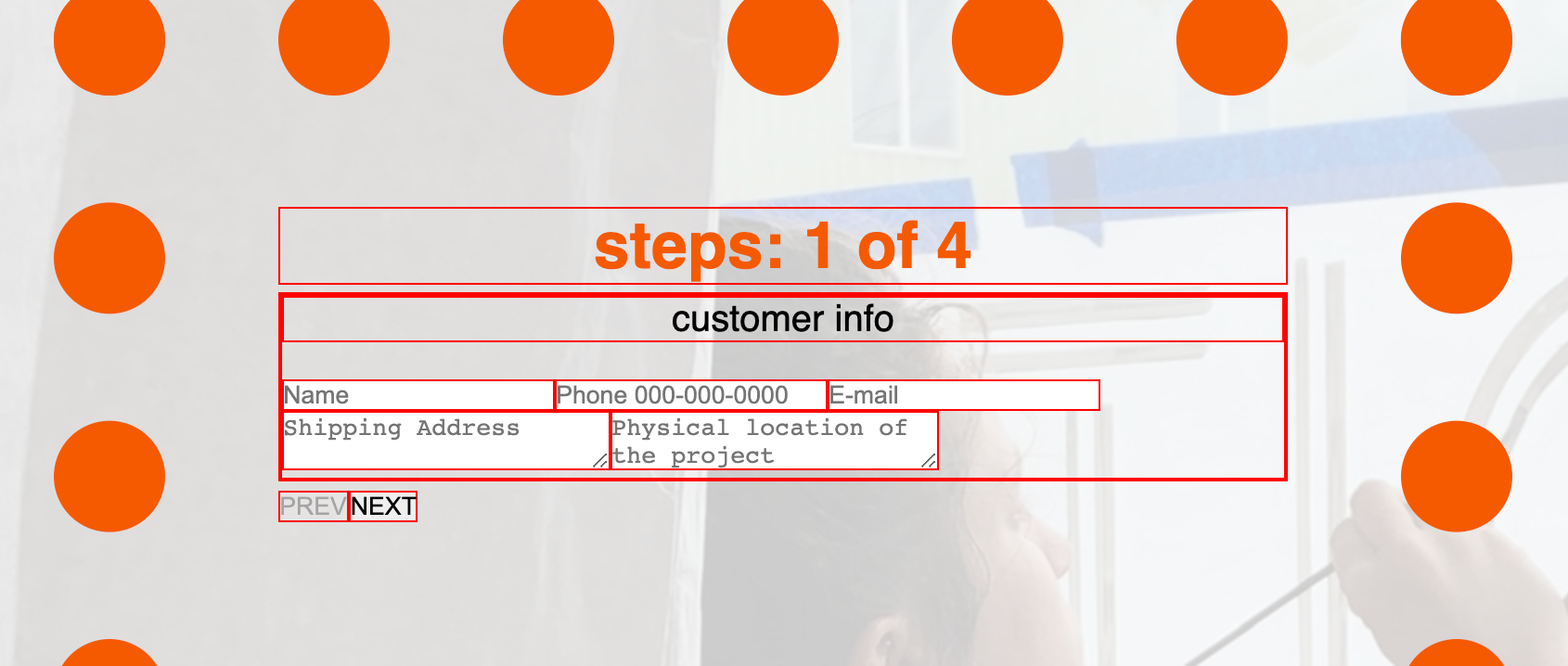
In the CSS file, select all by using and
box-sizing: border-boxso all the boxes are without default margin and padding spaces. Do border: 1px solid red so you can see what you are dealing with.
* {
  box-sizing: border-box;
  margin: 0;
  padding: 0;
  border: 1px solid red;
}
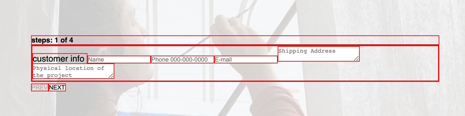
{box-sizing: border-box} and border: 1px solid red
- Define min, max, width, height, border, margin, padding.
.form-box {
  min-width: 100%;
  height: 100vh;
  border: dotted #f55a00 5vw;
  /* border: 1px solid red; */
  margin: 0vw;
  padding: 5vw;
  position: relative;
  /* position:relative for .prevBtn and .nextBtn position:absolute; */
}
5. Style h5. Text-align center so the h5 is in the center, choose the font-size and color. When you deal with margin top right bottom left, you can define them all by listing all four numbers.
margin: top right bottom left;
margin:   0    0    5vh   0;
.form-box h5 {
  font-size: 35px;
  text-align: center;
  color: #f55a00;
  margin: 0 0 0.5vh 0;
}
- Style the label.
The ‘customer info’ is label in this context and it should be right below the step info so let’s display: block, center it and adjust the text size and give some margin spaces.
.form-box label {
  display: block;
  text-align: center;
  font-size: 20px;
  margin: 0 0 2vh 0;
}
- Style input area and the textarea.
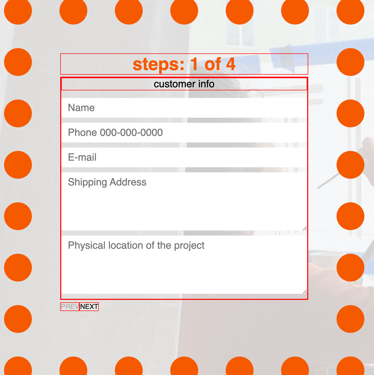
.form-box input,
textarea {
  display: block;
  width: 100%;
  padding: 0.5rem 0.8rem 0.5rem 0.8rem;
  margin: 0.9vw 0;
  border: 0;
  border-radius: 5px;
  font-size: 20px;
}

.form-box textarea {
  height: 15vh;
}
It looks already better styling these input and textarea. When you set the border at 0, the border line disappears so it gives hint of modern look. When you set the display at block, all the input boxes are stacked nicely. Set the width at 100% so it fills up the size of the parent box. Give some nice spacious padding so the input boxes are not too stacked on top of each other.
8. Buttons
Now, let's style buttons. We have prev button, next button and submitbutton. First let's style prev and next buttons. Currently they are too small on the bottom left so if I was a user, I wouldn't want to click. Let's solve this issue.
.prevBtn,
.nextBtn {
  display: inline-block;
  width: 30%;
  height: 2rem;
  color: red;
  border: 0;
  bottom: 0;
  cursor: pointer;
  font-size: 20px;
  position: absolute;
}

.prevBtn {
  margin: 1rem 0 1rem 0;
  border-radius: 20px 0 0 20px;
}

.nextBtn {
  margin: 1rem 0 1rem 8rem;
  margin-left: 52%;
  border-radius: 0 20px 20px 0;
}

.nextBtn:hover,
.prevBtn:hover {
  background-color: rgb(245, 245, 78);
  transition: 1s background ease;
}
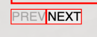
before styling button
button size: Currently the buttons are too narrow and user would click either prev or next button by accident so let’s change the width of the button to 30% of the parent div box . Let’s set height at 2rem so it’s taller.
button placement: These buttons are too close to each other so it’s not good for the flow of the user experience. These buttons are on top of each other so let’s display both button inline-block In order to place the next button all the way on the bottom right, let’s use margin-left: 52% I figure out this number by trying multiple numbers.
/*margin: top right bottom left;*/

.nextBtn{
     margin-left: 52%;
}
.prevBtn, .nextBtn{
     margin: 1rem 0 1rem 0;
     display: inline-block;
}
button css
Done!
Great! Let’s simply comment border: 1px solid red; out of the global selector and see how it looks. Congrats! Now you have a much better user flow React Form.
after styling react form
BEFORE: react Form before styling
Comments
Loading comments…