While learning to make plots with Pandas, I had a lot of early problems in figuring out just how to use the DataFrame.groupby() method to make the plot I wanted. In all the confusion, I found myself pivoting, resetting the index and improperly grouping my data with frustrating results.
This article might help you out if you are new to using groupby and pandas plotting. I will walk you through a few of the techniques I used which finally helped me really understand what was happening and how to get control of grouped plots with DataFrames.
I will be using a dataset from kaggle.com which contains information on video game sales from 1980 to 2015. The dataset columns we will use are: Year, Publisher, Global_Sales, Genre, and Platform. We will show how to make a few interesting plots with the groupby method. We will start easy, and build. I will include some extra lines of code just to discuss step by step what each method is doing for us.
Let's get our data and get started
Make a plot of Global_Sales by Year
I like to think of what it might look like in a SQL Query. Break it down into what data we want to SELECT, and what do want to GROUP BY.
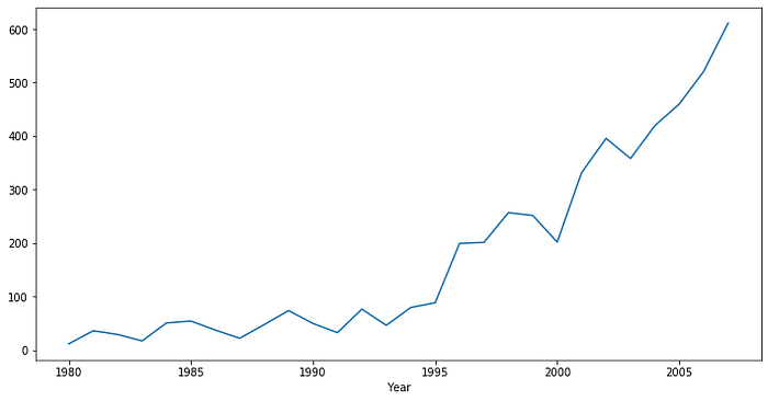
The plot above demonstrates perhaps the simplest way to use groupby. Without specifying the axes, the x axis is assigned to the grouping column, and the y axis is our summed column. I chose sum here, but you can also use other aggregate functions like mean/median, or even make your own with a lambda function.
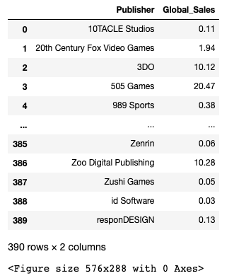
Plot the Sum of Global_Sales by Publisher
This is a bit trickier to work through, but we still start with the same premise.
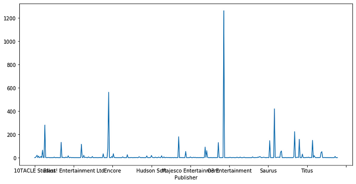
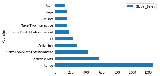
Oh no! That's a mess, but at least our selection was correct. Now we will make a few tweaks to our code to fix the graph. We will change the plot to a horizontal bar graph so we can easily read the Publisher name, and we will only plot the first ten since the plot above has obviously too many.
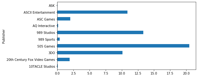
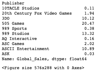
That's better! Now we have something readable again, but this is not the data we want. We were looking for the top 10 by Global_Sales. The groupby method automatically sorts by the grouped column (in our case, Publisher). If we want to sort it by something else, we will need more tools. The data we actually plotted from the groupby was:
Let's try to sort it by Global_Sales instead of Publisher, but we can't just use sort_values like we would on a regular DataFrame object. One thing to understand about grouped objects like the groupby result, is that it has been indexed by the grouped column. It is now “multi-indexed”. We have to think about the level and hierarchy when we sort. For our data above, we already have the columns we want for plotting purposes, but we don't have access to the sorting column we want. We can simply use the reset_index() to keep the same columns, but remove the “level” of the group. Now we are dealing with a traditional DataFrame object (no multi-index). We say we have “flattened” the multi-indexed DataFrame. (We removed the hierarchy imposed by the groupby)
![df.groupby(['Publisher'])['Global_Sales'].sum().reset_index()](https://miro.medium.com/max/525/1*nVKnRYIAU7CHWIquMcbm6A.png)
Now we can put it all together to make my plot. After we reset_index, we can sort_values like any other DataFrame object.
Plot Global_Sales by Platform by Year
Maybe I want to plot the performance of all of the gaming platforms I owned as a kid (Atari 2600, NES, GameBoy, GameBoy Advanced, PlayStation, PS2) by year. Sounds like something that could be a multiline plot with Year on the x axis and Global_Sales on the y. Pandas groupby can get us there.
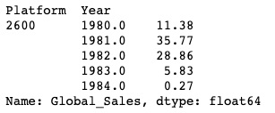

This doesn't look at all like what we wanted. The grouped object uses indexes of Platform and Year as shown above. When we do the df.plot(), it attempts to plot both indexes vs. GlobalSales in tuple format (year, platform). The problem here is our level. We are working with _twice grouped data, but we no longer have access to the Year and Platform columns because they are being used to group. The solution is to “unstack” our grouped object. If we reduce it by one level it would look like this.
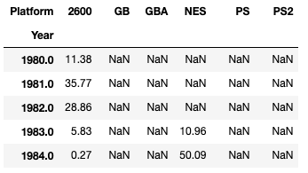
We can see that we would now have a structure with access to Global_Sales for each Platform by Year. That is something we can plot. The one line of code below will plot Year on the x axis, grouped by Platform, with Global_Sales on the y axis.
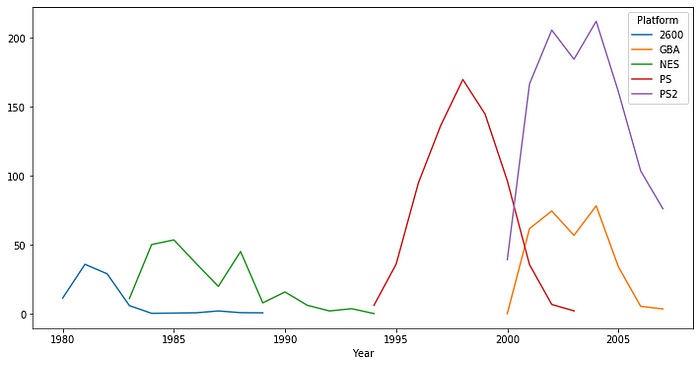
Now that is a plot full of nostalgia for me. Plots of this nature can be pretty simple to make, but you have to understand the structure (index and hierarchy), and what is being done by the DataFrame groupby method.
If you want to learn more about working with multi-indexed structures, you can also investigate: transpose, pivot, levels, and unstack.
Good luck!
Comments
Loading comments…