Rendering Images/cards/elements based on an API response is something common in React. Adding React components in a row responsively is something very common. Have a look at the below example.
All of the items above are loaded in a responsive way. Some of the common use cases where we use dynamic rendering are
-
Rendering a set of products on the home page.
-
Rendering a set of related blogs on your Blog.
-
Rendering results to a search query.
This is not a brainer-type tutorial. But I found it overwhelming to find a clean and proper sample code for those use cases. So I thought of writing a new and sharing.
What we will build
We will build a sample React component to display NBA player data. We will get data from a live NBA API for this task. The data will be rendered inside a card component, for that we use react-bootstrap. The cards are fully responsive so cards will fit the screen sizes respectively.
Getting started
Create a React app using create react app npx create-react-app Dynamics
After initializing the react app create a folder called Components inside the src folder. create a new file inside the Components folder called Dynamic.js
inside Dynamic.js let's call the API and set the data values to a constant.
import React, state hook, and effect hook
import React, { useEffect, useState } from 'react'
create a basic react functional component called Dynamic
Let's initialize the player details using a state hook.
const [playerData, setPlayerData] = useState([]);
If you want to learn about the useState hook read my article on state hook.
Let's add the useEffect hook after that
To learn more on useEffect hook read the below article.
React useEffect Hook Tutorial for Beginners
We have created a function called fetchData to call the API and get data. Inside the function, we have called the API using the inbuilt fetch method.
After that, we have converted the response to the JSON format. Using the useState hook we saved the first 15 elements inside playerData using setPlayerData method.
React-Bootstrap
Install react-bootstrap to create the displaying component responsively.
run below npm command and install react-bootstrap
npm install react-bootstrap@next bootstrap@5.1.0
And add the following import statement inside app.js
import 'bootstrap/dist/css/bootstrap.min.css';
Now it's time to render the API data inside a responsive element. Import Card, Row, Col, Container from react-bootstrap.
import { Card, Row, Col, Container } from "react-bootstrap";
inside the return statement of the react component add the below code.
We have wrapped the entire component jsx part using the Container element and Row. That's how react-bootstrap grid system should implement. To render JavaScript inside jsx we use {} . Inside brackets, we loop the playerData element using .map method.
using the react-bootstrap tag we have given the responsive feature to our component.
More details on the react-bootstrap grid system can be found in the official documentation below.
By using the map function we loop through the API data and use the data to populate the bootstrap Card.
Array.prototype.map() — JavaScript | MDN
Finalized Dynamic.js code Look like this.
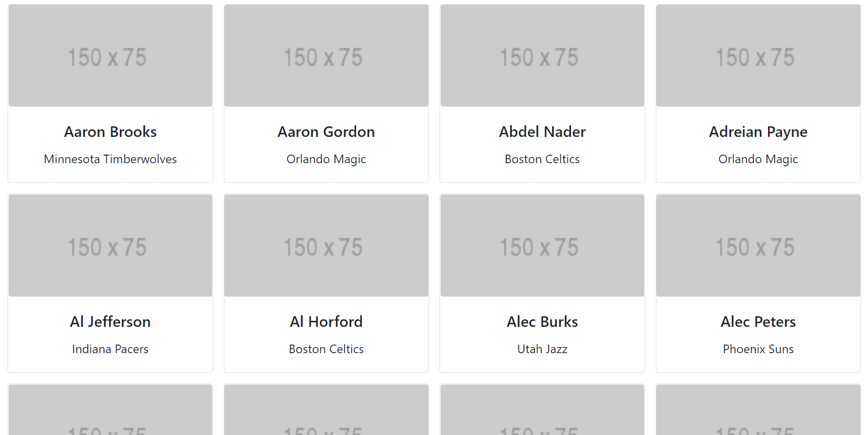
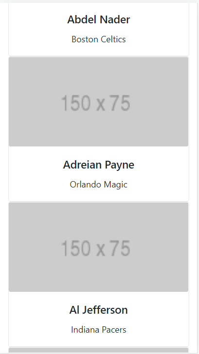
Now the card renders responsively on large, medium and extra small screens. In bootstrap, the entire screen width is considered as 12 units. In medium screens, a card component will get 4 units in width. So there will be 3 cards in a row to fill the entire 12 units. Likewise on each screen, we have given the width a card should take.
Add the Dynamic.js component to the app.js file and run npm start.
The view in Desktop
The view in mobile can be seen like this
Comments
Loading comments…