
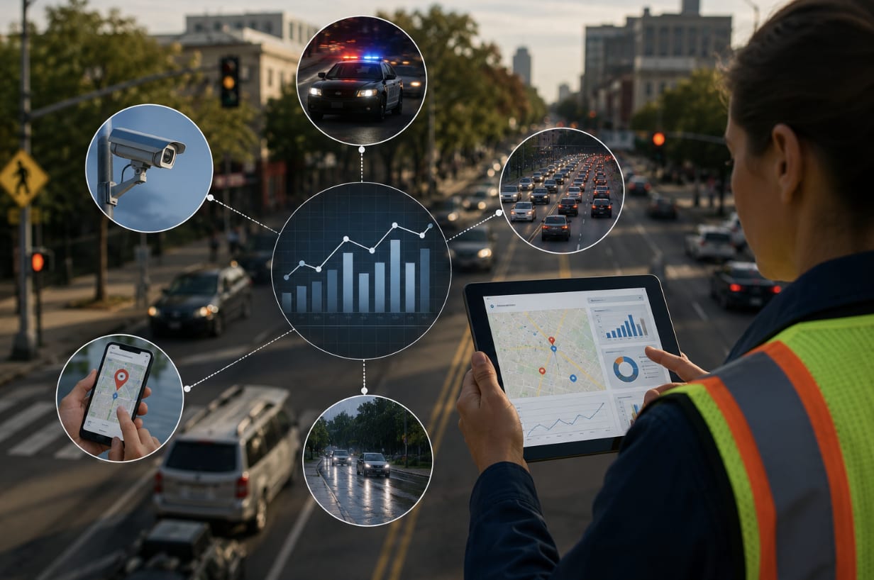
Image Source: AI-Generated
“Roads are built for people who make mistakes, not for perfect drivers.”
A traffic engineer told me that once, while we watched cars slide through a yellow light that was more “suggestion” than command.
If you’ve ever stood at a sketchy intersection and thought, “Someone’s going to die here,” you already get the point: we need better information, not just louder opinions. Let’s walk through five data sources that quietly decide who gets home and who doesn’t.
1. Police Crash Reports
This is usually the first stop for any road safety project. Police reports give you the who, where, and when: time of day, road type, suspected impairment, seat belt use, and more.
NHTSA recorded 42,514 traffic deaths in the U.S. in 2022, and every fatal crash is supposed to have a report behind it, with codes and a sketch trying to explain the chaos of a few seconds.
In Arizona, for example, Phoenix’s wide arterials and westbound sun‑glare approaches show up again and again, alongside heat‑faded markings and long, unforgiving crossings.
Legal teams specializing in car wreck defense mine those reports alongside event‑data recorder pulls, phone‑use timelines, and sight-line photos to reconstruct what truly happened.
When the same sight‑line gaps or timing phases keep showing up across cases, that legal pattern doubles as a field audit—pointing planners to fixable design hazards before the next serious crash.
What Crash Reports Miss
A lot never gets written down.
Fender‑benders in strip‑mall lots, cyclists who wobble away scraped but upright, people who head to urgent care without a call to 911. The official map tilts toward severe crashes and hides the low‑grade danger that still screams “fix this geometry.”
2. Traffic Volume Data
Counts turn crash numbers into rates, and rates reveal risk.
Average annual daily traffic (plus bikes and foot traffic where you’ve got it) helps you see a corridor’s true exposure. A big arterial with steady flow might be safer per trip than a sleepy shortcut that produces a handful of brutal wrecks. The picture shifts once you scale.
Speed Data Highlights Risk Before Crashes Rise
Speed is the accelerant.
Speeding has been tied to about 29% of U.S. traffic deaths, per NHTSA. If your counters show a posted 35 mph street where typical speeds drift into the mid‑40s, you don’t have to wait for the death toll to climb before acting.
3. Speed Monitoring Systems
Fixed radar signs, loop detectors, temporary trailers—they log behavior, not excuses.
You see the midnight surge, the downhill drift where feet lift from pedals, the school‑zone calm that frays by 9:10 a.m. It’s the heartbeat of a road, peaking and settling with the day. Two weeks of this can trump a year of guesswork.
Near-Miss Reports Capture What Crash Data Misses
Near‑miss notes sharpen the picture.
Cyclists record close passes. Bus operators flag hard‑brake corners. Parents report stroller yanks at fast right‑on‑red turns. These are rehearsals for tomorrow’s crash, pointing exactly where physics and attention are already at odds.
4. Public Feedback and Near-Miss Reports
People carry street intel the databases don’t.
Crossing guards, delivery drivers, dog‑walkers—they build mental maps of spots that feel wrong. When three different groups name the same intersection, treat it like a siren. Then ground it with counts and cameras.
Weather and Road Condition Data Complete the Picture
Roads don’t behave the same in July heat and January sleet.
Crash spikes during rain, snow, or fog tell you where drainage, texture, or visibility fail under stress. Agencies already track this to time plowing and salting; safety projects can ride that data to justify guardrails, high‑friction surfaces, or new lighting.
5. Weather and Infrastructure Data
Now pin weather to the bones of the street.
Lane width, shoulder presence, guardrails, lighting levels, pavement type, curve radii, tree setbacks—these details decide whether small mistakes get forgiven or punished.
Add land use, and you’ll see why a rural curve with tight trees behaves nothing like a lit urban arterial, even at the same posted speed.
Better Decisions Begin with Better Data
Let the datasets argue—crash reports, volumes, speeds, near‑miss voices, and weather layered on design. Somewhere in that friction is the pattern you can actually fix. Maybe it’s a raised crossing, or a chicane that drops speeds without a speech.
Either way, if the result is keys in the bowl and nothing to report, the data did its job.
Comments
Loading comments…