A font change can pass a design review and still break a product. A navigation label wraps, a pricing row shifts during loading, or a translated button loses its last word. These problems appear at the boundary between typography, CSS and real content, so they need a small engineering workflow rather than a visual check alone.
Treat a web font as a dependency with a visible failure mode. Define where it belongs, load only what the interface needs, and test the page when it arrives late or never arrives. The goal is readable content and usable controls throughout the loading process, with the intended identity appearing when available.
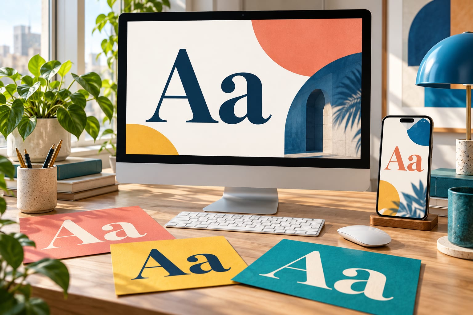
Editorial illustration of typography across screens. It is not a screenshot of a product or a specimen of a particular commercial font.
Start with one page that exposes the awkward cases
Create a small specimen route inside the application. Include a heading, navigation, a form error, a data row and the longest action label you actually use. Add a long name and representative translated content. This route gives design and engineering the same concrete surface to review before a font is applied across the product.
Contents: define the font files; choose loading behaviour; test flexible components; review real brand cases; check licensing; complete the release checks and FAQ.
Declare the files you actually have
Inventory the required styles before writing CSS. If the interface uses regular and bold, begin with those two files. Do not describe a static regular file as supporting every weight: the descriptor should reflect the supplied font. Likewise, only declare a variable weight range when the file genuinely supports it.
The following example uses fictional family and file names. Replace them with licensed webfont assets from your own project. It registers two upright static faces; it does not provide italic files or imply that the sample files are downloadable.
@font-face { font-family: "Product UI"; src: url("/fonts/product-ui-regular.woff2") format("woff2"); font-weight: 400; font-style: normal; font-display: swap; } @font-face { font-family: "Product UI"; src: url("/fonts/product-ui-bold.woff2") format("woff2"); font-weight: 700; font-style: normal; font-display: swap; } body { font-family: "Product UI", system-ui, sans-serif; line-height: 1.5; } button, input, select, textarea { font: inherit; }
MDN’s @font-face reference documents the relationship between the family name, source and descriptors. Keep the registration and the component styles consistent. A misspelled family name can leave the interface on its fallback even when the font request succeeds, so a successful network response is only one part of verification.
Separate a loading failure from a selection failure
First check whether the file request succeeded. Then inspect which font the browser actually rendered on the element. If the request failed, investigate the URL, response and relevant browser errors. If it succeeded but the wrong face appears, inspect the computed family, weight and style, and check whether the file includes the characters being displayed.
A useful review note identifies the element and its content: “The bold account heading uses the fallback” is actionable. “The font looks wrong” is not enough to distinguish a missing file from a cascade override. Keep a screenshot and the browser details with the report so another developer can reproduce the condition.
Choose what users see while the font loads
The font-display descriptor controls the font’s display timeline. MDN describes swap as having “an extremely small block period and an infinite swap period.” In practice, the fallback can appear first and the custom face can replace it later. That replacement is why the fallback layout belongs in the design review.
These are different product choices. For a reading page, accepting a fallback for that visit may be reasonable. For a strongly branded heading, a later replacement may be preferred. Evaluate the actual page rather than declaring one setting universally correct. Browser timing and the network affect what a user sees.
Treat the fallback as a real layout
Disable the custom font request and inspect the page. Check whether a two-line heading becomes three lines, whether a number column still aligns and whether a button remains usable. A fallback family can have different character widths even when the CSS font size is unchanged.
Do not “fix” the difference by hiding overflow on important text. Give components room to grow, reduce unnecessary copy or reconsider the type size. Where precise metric matching is required, investigate font metric overrides using measurements for the actual font pair. Copied percentages from an unrelated project are not evidence that your fallback is correctly matched.
Preload only after identifying a loading problem
web.dev’s font guidance warns that preloading uses resources that other page assets could need. Inspect discovery and request timing before adding hints. A critical face discovered too late may benefit; preloading every weight and language subset can waste bandwidth. Verify the result in a fresh load rather than assuming that more hints mean a faster page.
Run both a cold-cache check and a repeat visit. A warm cache can conceal a slow first experience, while a cold-cache screenshot alone cannot describe returning users. If you compare changes, keep the device, network conditions and page content consistent. Record what changed and avoid attributing every improvement to typography when other assets changed too.
Check layout movement with browser performance tools, not only a final screenshot. The finished page can look perfect after a heading has already pushed the content below it. Record the loading sequence and inspect the affected component; a page-level score is a starting point for diagnosis, not a description of the cause.
Let the component accommodate the text
A button is a text container with an action. Its design should account for padding, multiple lines and larger user settings. Use a minimum height if needed, rather than forcing a fixed height that clips the label. The same principle applies to alerts, navigation items and summary cards.
.action { min-height: 2.75rem; max-width: 100%; padding: 0.75rem 1rem; white-space: normal; overflow-wrap: anywhere; } .amount { font-variant-numeric: tabular-nums; text-align: right; }
Tabular numerals can make equal-length figures occupy consistent widths when the font supports the feature. MDN documents tabular-nums through font-variant-numeric. It does not align decimal points automatically or fix inconsistent number formatting. Review the actual values, currencies and locale conventions alongside the styling.
Check spacing overrides as well as browser zoom
The W3C’s explanation of WCAG text spacing states: “Ensure content adapts to user-defined text settings.” It describes testing line height, paragraph spacing, letter spacing and word spacing without losing content or functionality. These test values are not mandatory default design settings. Use the published criterion for the exact values and applicable script exceptions.
Make this a separate check from zoom. Look for clipped form errors, text crossing an adjacent control and navigation that becomes unreachable. A screenshot with the default spacing cannot answer those questions. When you find a problem, fix the container or layout rule and repeat the same condition to confirm the correction.
Use brand cases to define requirements
Photoroom’s published font case identifies TT Photoroom as a customised TT Interphases Pro, incorporated into the app’s identity. It is a concrete example of adapting a family for a digital product. The useful engineering question is which product requirements the chosen files must satisfy, including character coverage, style availability and delivery formats.
Alibaba’s case lists Alibaba B2B Sans and TT Interphases Pro and describes adapting TT Interphases to the platform’s brand identity and technical requirements. It shows that a custom font brief can include implementation needs as well as visual direction. Neither case publishes evidence here of a faster load or lower layout shift, so those outcomes should not be assumed.
For a smaller product, an existing family may already meet the requirements. Record the necessary scripts, number styles, weights and target environments first. That list makes a retail-versus-custom discussion concrete and gives the implementation team something to verify after the visual choice has been made.
Check licensing before putting assets in the build
When reviewing families at typetype.org, include deployment requirements in the evaluation. A desktop purchase should not be treated as automatic permission to serve the font from a website or embed it in an application. Match the agreement to the output and the people handling the files.
The foundry distinguishes Desktop, Webfont and App licensing. Its webfont pricing depends on monthly pageviews and the selected duration; application licensing considers the applications in which the font is embedded. Confirm the appropriate scope for your deployment instead of deciding from the file extension alone.
Ask about planned domains, collaborators and any intended conversion or subsetting if the agreement is unclear. Use approved webfont files where supplied. Keep proprietary assets out of a public source repository unless redistribution is permitted; an application being open source does not itself grant redistribution rights for every asset it uses.
Frequently asked questions
Does font display swap prevent layout shift
No. It allows a loaded face to replace the fallback, and different metrics can change line breaks or element sizes. Review the fallback, loading sequence and component layout together. A readable early page and a stable transition are related goals, but one CSS descriptor does not guarantee both.
Should every font file be preloaded
No. Start with evidence that an important face is discovered too late. Load hints compete with other resources, and unused styles or subsets add unnecessary work. Recheck the network and page behaviour after each change. The appropriate set depends on the content that the user actually sees.
Is a variable font always smaller than static fonts
Do not assume so. Compare the actual files needed for your interface and confirm which styles the variable file replaces. A product using many weights may have a different tradeoff from one using only regular text. Include supported features, deployment constraints and the licence in the decision, not just file count.
Can one family cover every language in a product
Only if its actual coverage and rendering support meet your requirements. Test complete words and real interface strings in every supported script. A family labelled multilingual may still omit a script you need. Agree on companion fonts and review the combined appearance when one family cannot cover the product.
What belongs in a font handover to engineering
Provide the approved files, intended roles, weight and style mapping, fallback choices, required language coverage and licence information. Add a specimen route or representative layouts. This is more useful than a font name alone because it explains how the family is expected to behave in the product.
Ship a font change as an interface change
Before merging, confirm that the intended face renders, the fallback remains usable and longer content can expand safely. Then check the deployment permissions and save the test evidence. Typography becomes easier to maintain when those responsibilities are part of the same change rather than separate tasks discovered after release.
· Verify the rendered font, not merely the downloaded file.
· Keep the original content visible when text wraps or spacing grows.
· Repeat the checks when files, tokens or supported languages change.
The release is ready when the interface still communicates clearly under the conditions you tested. A distinctive typeface can strengthen the product’s identity, but the implementation must preserve the reader’s ability to understand the page and complete the task.
Further Reading
Discover more articles on similar topics across our network
The Human Fallback: What Software Teams Can Learn From CPR and Emergency Response
Stackademic


How Developers Can Automate Small Business Website Creation and Maintenance
Stackademic
Comments
Loading comments…