A misunderstood point is that most developers think their audience loves tech. They don’t. They love convenience. The moment tech becomes the problem and not the solution, their perceived love affair with tech goes right along with it. Tech needs to get out of its own way.
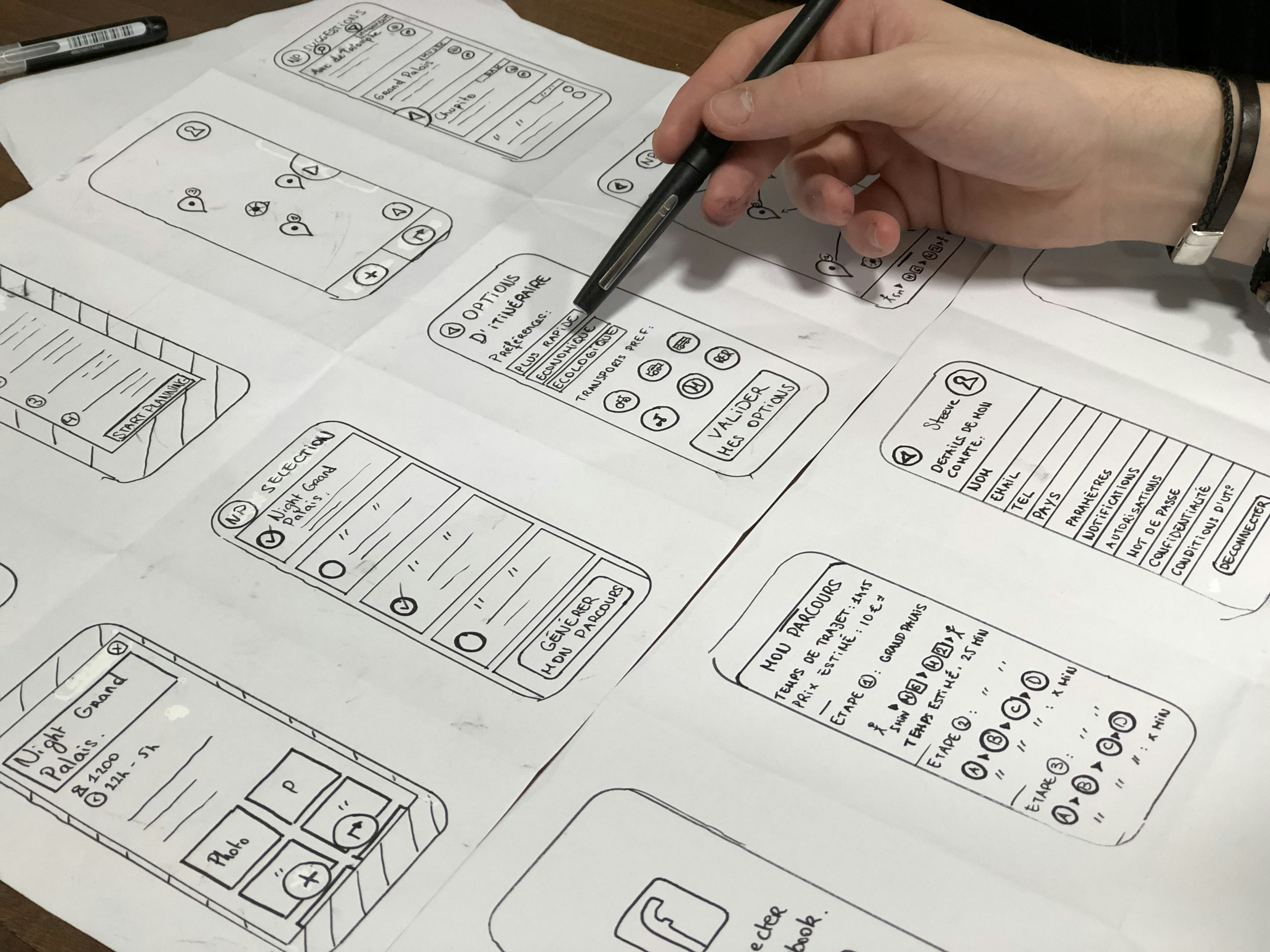
There’s a point where a platform stops being useful and starts getting in its own way. It usually happens after a few updates, a few new features, a few extra menus. What began as something clean with ample whitespace turns into a place where a user has to stop and think, and that’s where things start to break. That costs more than most teams realise. It slows decisions, creates doubt, and turns what should be simple into something that feels heavier than it needs to be.
Complexity Is the Default State of Most Platforms
Most platforms don’t set out to become messy- it just happens.
A feature gets added to solve one problem, then another, and soon there are layers that don’t quite fit together. From the inside, it all makes sense. From the outside, it feels like work. Navigation expands, labels get less clear, and users end up second-guessing basic actions. Nice-and-neat can turn into a Frankenapp with bolt-ons and updates that turn clarity into clutter.
Users don’t care about feature depth if they can’t move through easily and intuitively. A bad experience scan really sour a user’s perceptions. Around 88% of users won’t return after a bad run, and 39% stop engaging when performance drags. That drop-off doesn’t need a major failure. It often starts with hesitation, then confusion, then exit. Many users won’t complain; they simply leave and don’t come back.
The point is it does not need to be a catastrophic failure for users to seek a greener app.
What Happens When You Strip the Journey Back
Cleaner journeys don’t look impressive at first and that’s the whole point. There’s no need to think about what to click or where to go next. The path is obvious, and decisions feel easy instead of forced. A clear layout removes the need to scan endlessly or test different options just to move forward.
That simplicity carries real weight. UX improvements have pushed conversion rates up to 400% in documented cases, and even small improvements in clarity can lift engagement in a measurable way. The gains don’t come from adding more, they come from removing friction and letting users move without interruption.
Fewer steps, clearer actions, and faster feedback all combine to keep people engaged.
Too much choice creates friction. Not because users lack options, but because they have no way to make intuitive sense of them. Structure solves that. Rankings, filters, and consistent layouts do more than organise information. They reduce the effort needed to decide and give users a way to compare without digging through pages.
As a case in point, Casino.org Canada shows that clearly. Instead of leaving users to figure things out from scratch, it lays out Canadian casino options in a way that can be scanned in seconds. Payout speeds, bonus details, and platform differences sit in one place, so a decision feels guided rather than guessed. That kind of structure removes hesitation and replaces it with direction.
Simplification Is Not About Removing Power
Stripping things back doesn’t mean losing capability. It means moving the complexity out of the user’s way. The system still does the heavy lifting, but the surface becomes easier to use. Users interact with what they need, not everything that exists behind the scenes.
That idea shows up in tools where complex workflows get reduced to simple inputs. A process that used to take days can be handled in minutes when the interface is designed properly. The power is still there. It’s just not exposed in a way that slows people down. The result is faster work and fewer errors.
Big redesigns get attention, but small interaction changes often do more. A button placed where it’s expected. A clear next step. Feedback that confirms something worked.
These are small details, but they shape how a platform feels to use and whether someone keeps going or drops off.
Work around user interaction patterns shows that connection improves when the experience lines up with what people expect from it. Engagement doesn’t come from novelty. It comes from familiarity that feels right. When users don’t have to think about the interface, they focus on what they came to do.
Clear Paths Win More Than Clever Design
Clever design can look good in a demo. It doesn’t always hold up when someone is trying to get something done. Users don’t reward complexity, even when it’s well built. They reward clarity. They stay when things feel easy and leave when they don’t.
A platform that removes hesitation will outperform one that tries to impress. Less friction means more movement, and more movement means better outcomes. That shows up in higher engagement, better retention, and stronger conversion performance. None of it feels dramatic, but the effect is consistent.
Clear paths keep people moving, and that is what drives results.
Comments
Loading comments…