
High contrast themes are the most visually striking. As you probably guessed, this genre is characterized by the use of strongly contrasting colors. I have been on the high contrast search for months, and the vast majority of their color schemes are not easy on the eyeballs. That is not necessarily a bad thing.
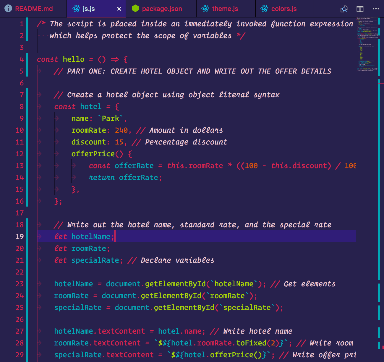
Imagine yourself at the office, an hour has gone by and you haven’t had an espresso shot, so you are feeling awfully tired. Well, if you need help keeping your eyes on the screen, *Lasers *(below) denies you the option to look away. Each element pops out boldly, and the color palette is cool, but I find it difficult to look at for long periods of time.
**💡Also learn how you can manage your todo lists with VSCode:
👉 To read more such articles, **sign up for free on Diffe**r.
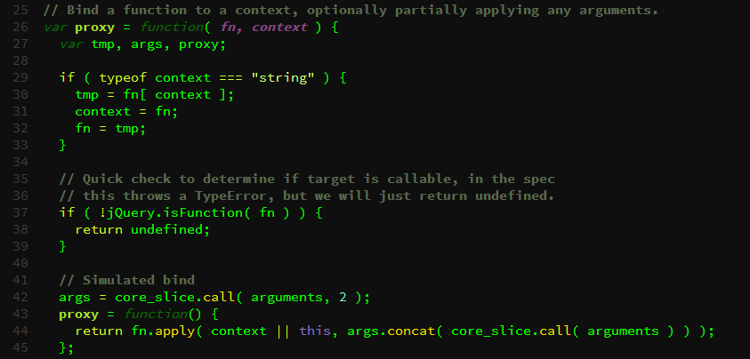
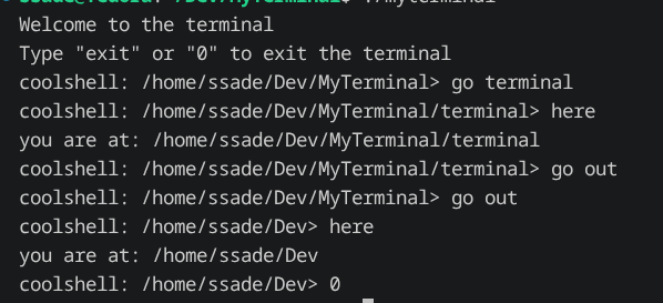
On the opposite end of the contrast spectrum, there is bold simplicity. For example, the classic hacker color scheme (below) is all neon green or pale yellow, so the colors don’t contrast much at all, but the text still pops. This is comfortable to read, but there is a reason why no one uses hacker terminal colors anymore. Over long periods of time, I find that the text blends together, and neither of these themes is easy to look at all day.
Balance
Maybe the themes above are perfect for you, but personally, I prefer a balance between simple and complex. These themes aren’t easy to find, which is my inspiration for this article. I am looking for a good color variance so that my eyes can easily find where to go, but not something so colorful that my eyes burn. Also, it needs to be easy to read even in the sunlight, when I’m sitting on my laptop in public.
My Top VS Code Themes
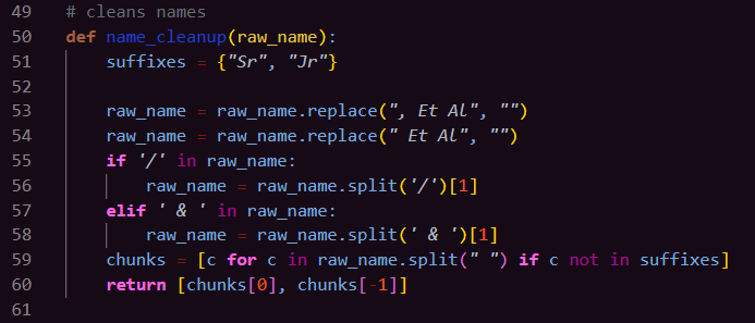
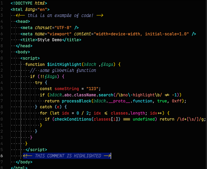
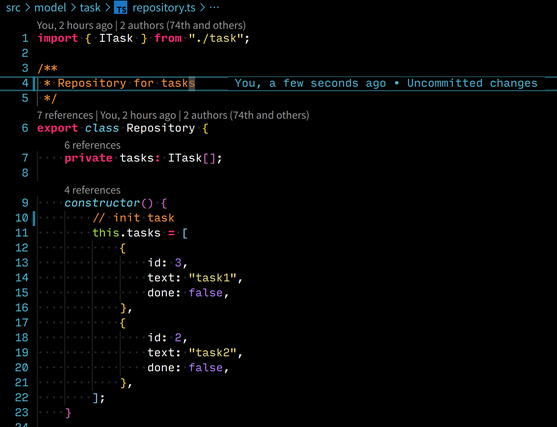
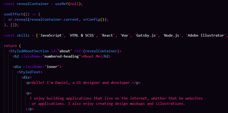
I hope you found a new theme to try out. Honorable mentions:
Further Reading
Discover more articles on similar topics across our network

Comments
Loading comments…