
Build beautiful UIs with this open-source React glassmorphism library. 13 liquid glass components, compound pattern, Vite-powered. Inspired by iOS 26 design language.
Sometimes I get bored with my usual work and want to create something for my soul. This time, I picked up a project that had been gathering dust for over a year, which I had started with a colleague and then abandoned. It’s a UI kit with a glassmorphism effect.
iOS 26 was recently released with a liquid glass effect that I liked, and I wanted to write my own project with an interface similar to that of the iPhone.
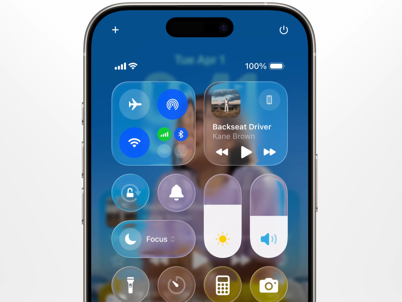
But unfortunately, after doing some research, I couldn’t find the UI kit I wanted that had all the components I needed: buttons, inputs, selectors, etc. I only found a few demos with the effect itself or some very raw solutions.
So I decided to continue with my project. At first it looked really not what I was looking for. The effect appeared more like Frost Glass, the background was blurry and light, borders too bold, there were no animations.
But since I found an open repo with a ready-made effect that was similar to what I expected, I used it.
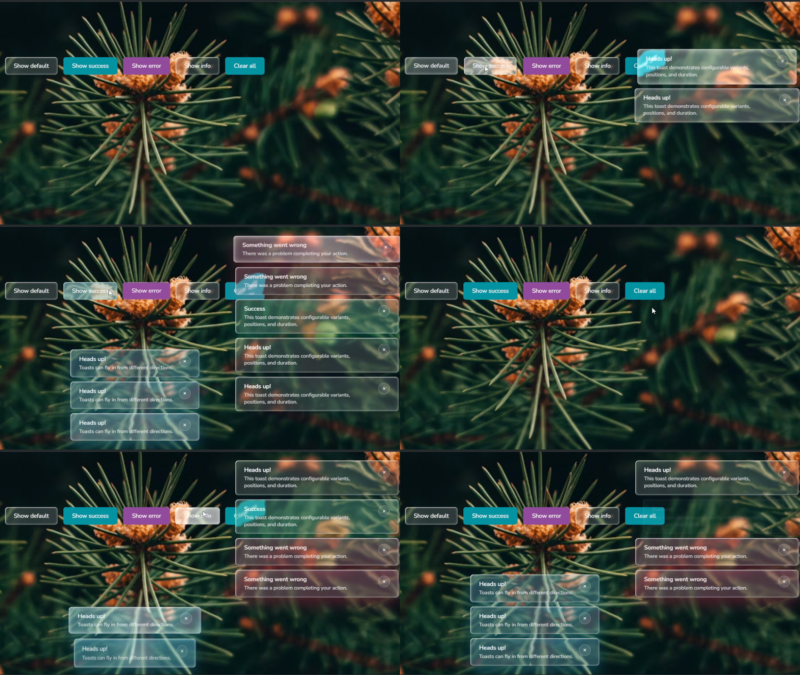
The effect itself is implemented through a reusable component, which is a wrapper for all other components and also allows developers to create their own custom components while maintaining the style of the UI kit. Animations are also attached to this component and can be turned on/off with props.
This base component implements a sophisticated liquid glass effect using SVG filters, specifically leveraging **feTurbulence **and feDisplacementMap to create dynamic distortion effects that simulate liquid-like behavior when users interact with elements.
The Glass component manages multiple layered elements including a filter layer for the displacement effect, an overlay for the semi-transparent background, a specular layer for highlights, and a ripple layer for click animations. This multi-layered approach creates depth and visual richness through carefully orchestrated CSS animations and SVG filters.
The only problem is that the effect is only supported in Chromium-based browsers, making it invisible in Safari and Firefox. I haven’t found a way to get around this yet.
Let’s take a closer look at the code.
The library follows a composition-over-inheritance pattern, where all components are built by wrapping or extending the core Glass component.
Each component is organized in its own directory with a modular structure containing the TypeScript component file, SCSS module styles, Storybook stories for documentation, and unit tests.
src/components/
  └── component-name/
      ├── __docs__/
          ├── <Component>.mdx           # Docs page
          ├── <Component>.stories.tsx   # Storybook stories
          └── Example.tsx               # Usage example for docs
      ├── __test__/                     # Test files
      ├── style/                        # SCSS Styles
      ├── <Component>.tsx               # Main component file
      └── index.ts                      # Export file
I chose the React Compound Component Pattern as the architectural foundation for complex components, and it’s been a game-changer for customization. Instead of wrestling with massive configuration objects or prop drilling through multiple layers, you can compose components declaratively — just like building with LEGO blocks.
Here’s what makes it powerful: you explicitly control which parts to render, pass props directly to the specific sub-components that need them, and rearrange the structure however you want. Need a card with just a header and footer? Include only those. Want to add a custom action button between the title and content? Drop it right in.
For example, instead of this nightmare:
<Component config={{header: {…}, body: {…}, footer: {…}}} />
You write this:
<Component>
 <Component.Header>Title</Component.Header>
 <Component.Body>Content</Component.Body>
 <Component.Footer>Actions</Component.Footer>
</Component>
It’s intuitive, flexible, and the component tree clearly shows the structure. Each sub-component handles its own styling and glass effect, so you’re not fighting against opinionated defaults. This pattern also makes the library more maintainable — adding new sub-components doesn’t break existing code.
For example here is how we create sidebar layout:
<Sidebar rootClassName="sidebar" activeItemId={activeSection}>
    <Sidebar.Header className="sidebar-header">
        <span className="sidebar-title">Components</span>
        <Sidebar.Toggle/>
    </Sidebar.Header>
    <Sidebar.Items>
        <Sidebar.Item itemId="overview">Overview</Sidebar.Item>
        <Sidebar.Item itemId="buttons">Buttons</Sidebar.Item>
        <Sidebar.Item itemId="inputs">Inputs & Forms</Sidebar.Item>
        <Sidebar.Item itemId="feedback">Feedback & Display</Sidebar.Item>
        <Sidebar.Item itemId="layout">Navigation</Sidebar.Item>
    </Sidebar.Items>
    <Sidebar.Footer>
        <span className="sidebar-footer-text">© 2025 Magic UI</span>
    </Sidebar.Footer>
</Sidebar>
The sidebar component also provides a hook useSidebar, using which we can easily get the collapsed state and for example hide our title:
const SidebarTitle: FC = () => {
  const { collapsed } = Sidebar.useSidebar();

  if (collapsed) {
    return null;
  }

  return <span>Magic UI</span>;
};
The build architecture utilizes Vite as the bundler with a library mode configuration that outputs both CommonJS and ES module formats, making it compatible with various JavaScript ecosystems. The library employs CSS Modules with SCSS for component-specific styling, combined with Tailwind CSS for utility classes, ensuring style encapsulation while maintaining flexibility
Currently, the library offers 13 basic components for creating forms, dashboards, and more. Each component have interaction animations that can be toggled using props.
I also created a basic demo site where all variations of components are collected in one place where you can touch them with your cursor or finger.
This is an open-source project, and I’m actively looking for contributors to help take it to the next level. I’ve put together comprehensive documentation in the repository that covers everything you need to get started — from local setup and project structure to PR and issue templates.
I’ll be honest — there are still some rough edges. The effect itself is not ideal, the components lack accessibility, the UX needs improvement, and a lot of refactoring is needed. The documentation is solid but could use more examples and use cases.
That said, this is where the real opportunity lies. There’s enormous potential for growth — new component variants, more customization options, and performance optimizations I haven’t even thought of yet. I’ve built the foundation, but I believe the best ideas will come from the community using it in ways I never imagined.
Thanks for reading! Appreciate any feedback!
Want to add liquid glass effects to your React project? Check out these links:
- NPM package — Install with
npm install react-magic-ui - GitHub repo — Star it if you find it useful!
- Documentation— Complete API reference
- Live Demo — Play with all components
Further Reading
Discover more articles on similar topics across our network

Comments
Loading comments…