Component Design: The Foundation of Scalable Frontend Architecture
“Good developers are not those who develop faster — they are the ones who refactor less.”
If there’s one principle worth internalising before writing a single line of frontend code, it’s this. And the single biggest factor that determines how much you’ll refactor? How well you thought about your component design upfront.
Everything Is a Component
In modern frontend development, everything is a component — from a tiny icon button to an entire application. A small widget is a component. The whole application is a big component that contains smaller ones, enclosed together. This mental model is the foundation.
Component Composition is how these pieces come together. Components talk to each other, share data, and compose into larger structures. The full composition of all your components — that’s your website.
Never Start Writing Code From Day 0
Before writing a single line, think about your component design. This step alone will:
- Help you develop faster
- Dramatically reduce refactoring effort
- Keep your iterations manageable
Skip this step, and you’ll spend more time undoing decisions than building features.
Designing an E-Commerce Website
Let’s apply this thinking to a real example. Here’s how you’d break down an e-commerce page into components:
<AppComponent>
  <Header>
    <Left>
      <Logo>
        <img />
    <Right>
      <MenuContainer>
        <Item />
        <Item />        ← multiple
        <Dropdown />

   <Body>
      <ScrollableRowContainer>  ← multiple
        <Card />
A useful rule of thumb for deciding when something deserves its own component: If it has its own data, its own behaviour, or could be reused elsewhere — it’s a component.
At the top level, there is always a single root component. Everything flows down from there.
Case Study: Designing YouTube’s Layout
Now let’s apply the same thinking to something more complex. Consider YouTube’s interface and ask yourself: where does the left navigation bar live?
This is a question that trips up a lot of developers. Let’s walk through the common answers.
❌ Mistake 1: Keeping the NavBar Inside the Header
It looks like it belongs there — the hamburger icon is in the header, right? But the left navigation panel itself spans the full body height. If you keep it in the header, you’ll fight CSS forever, likely reaching for float hacks that create new problems downstream.
❌ Mistake 2: Managing Collapsed and Expanded States in One Component
Some developers keep one <LeftNav> component and toggle between states inside it. This feels manageable early on, but it becomes unscalable because:
- The collapsed and expanded menus are structurally very different
- Bundling them makes the component less reusable and harder to test
✅ The Right Solution
<Header>
  <MenuBtn />   ← toggles isMenuExpanded state

<Body>
  <LeftNavContainer>
    <CollapsedMenu>   ← rendered when isMenuExpanded = false
      <Item />
      <Item />
    <ExpandedMenu>    ← rendered when isMenuExpanded = true
      <Section>
        <SectionHeading />
        <ExpandedItem />
        <ExpandedItem />
Why separate components for CollapsedMenu and ExpandedMenu? Because they're genuinely different:
- Collapsed Menu — ~5 icon-only items
- Expanded Menu — multiple sections, each with a heading and several labeled items
They have different structure, different data shapes, and different rendering logic. Trying to merge them into one component violates the most important design principle we have.
The Single Responsibility Principle (SRP)
SOLID is an acronym for five design principles — Single Responsibility, Open/Closed, Liskov Substitution, Interface Segregation, and Dependency Inversion. While these principles originate from object-oriented programming, they translate powerfully to component design. The most directly applicable one is the S — Single Responsibility Principle.
Give each component a single responsibility. That’s it.
A practical rule: if your component file crosses 150 lines, it’s doing too much — break it down.
Applied to our YouTube example:
<Header>is responsible for top-bar UI and the menu toggle<CollapsedMenu>is responsible for rendering the icon-only nav<ExpandedMenu>is responsible for rendering full nav sections
Each one is independently testable, reusable, and readable.
Higher-Order Components (HOCs)
Sometimes you have a component that works perfectly, but in certain contexts you need to decorate it with additional behaviour or UI.
Consider YouTube cards. Most cards are standard. But some cards have a “New” badge. Some have a “Promoted” label.
You have two options:
- Add conditional logic inside
<Card>— messy, violates SRP - Use a Higher-Order Component
A HOC takes a component as input and returns a new, enhanced component:
// HOC
const NewCardComponent = (Card) => {
  return (
    <div>
      <NewLabel />
      <Card />
    </div>
  );
};
Now responsibilities are clean:
<Card>— displays product data<NewCardComponent>— adds the "New" label to any card
This is readable, maintainable, and testable.
When not to use HOCs: HOCs add an abstraction layer and wrapping cost. Use them only when the decorating behaviour is genuinely reusable across multiple components. Don’t reach for a HOC just because you have one variation — a simple prop works fine for that.
Naming Conventions Matter
You emphasised readability, and naming is a direct part of that. Inconsistent naming is one of the most common sources of confusion in large codebases.
Some guidelines:
- Be descriptive and consistent:
MenuContainer, notMenuorNavorNavBarin different files - Use the same naming pattern across similar components: if it’s
CollapsedMenu, the other should beExpandedMenu— notFullNavorOpenSidebar - Name components after what they are, not what they do —
<UserCard>, not<ShowUserDetails>
Good naming means a new developer can read your component tree and understand the structure without opening a single file.
Prop Drilling — Know the Problem Before It Hits You
When components are nested deeply, passing data from a parent down through multiple layers becomes painful. This is called prop drilling.
Component design doesn’t solve this by itself, but good component design makes it visible early. If you find yourself passing the same prop through three or four components that don’t use it themselves, that’s a signal your component hierarchy needs revisiting — or you need a shared state solution.
Being aware of this at the design stage saves you from discovering it mid-build.
Code Quality Standards: The Four Pillars
Every component you write should pass this test:
Modular: Can be developed and tested in isolationReusable: Works in more than one context without modificationReadable: A new developer understands it without needing contextTestable: Has a clear input/output contract
Always think from this perspective. Write test cases. Keep components small. Clean code is not a luxury — it’s how you move fast without breaking things.
Lazy Loading and Code Splitting
On large applications — think MakeMyTrip, with separate Flights and Hotels sections each containing hundreds of components — loading everything upfront is wasteful and slow.
Good component design makes lazy loading straightforward.
When components are well-isolated with clear boundaries, they can be split into separate bundles without rewriting your import structure. If your components are tightly coupled or responsibilities are mixed, code splitting becomes painful.
The principle: design components cleanly first, and chunking/splitting becomes a configuration detail rather than an architectural challenge.
Config Driven UI: Let the Backend Drive Your Frontend
Have you ever noticed that the Amazon homepage you see looks different from what your friend sees? Not the products — the layout. The order of sections, the banners, the promotional cards — they can all be different for different users.
This isn’t magic. It’s Config Driven UI — and it’s one of the most powerful patterns in modern frontend architecture.
The Problem It Solves
Let’s take a basic e-commerce homepage — Ecom.com.
Header
  └── Logo, User, MenuItems, Dropdown

Body
  └── Image Carousel
  └── Card Layout
Simple enough. But now your PM walks in with requirements:
- “Show a Sale banner — but only for users in India.”
- “Show a different layout for first-time users.”
- “Show a special promotional section — but only for people in Delhi.”
If you hard-code each of these as conditional logic in your frontend, you’ll end up with a tangled mess of if/else blocks that grows with every new campaign. Every change requires a frontend code change, a PR, a review, a deployment.
There has to be a better way. There is.
What Is Config Driven UI?
Also known as Backend Driven UI or Dynamic UI, the idea is simple:
A config file — typically a JSON — decides how your UI looks. The backend drives the frontend.
As soon as a page loads, an API call is made. The response is a config object that describes the layout. The frontend reads this config and renders accordingly.
[
  {
    "type": "carousel",
    "data": { "images": [...], "autoScroll": true }
  },
  {
    "type": "scrollable_cards",
    "data": { "title": "Deals of the Day", "cards": [...] }
  },
  {
    "type": "promo_banner",
    "data": { "imageUrl": "...", "targetRegion": "IN" }
  }
]
The backend decides what goes on the page. The frontend decides how to render it.
The business value: Product and marketing teams can change the entire layout — add a section, remove a banner, reorder cards — without a single frontend deployment. That’s the real power.
A Real-World Proof Point: Swiggy
Open this URL in your browser:
https://www.swiggy.com/dapi/restaurants/list/v5?lat=12.891595239264637&lng=77.6602634915915&is-seo-homepage-enabled=true&page_type=DESKTOP_WEB_LISTING
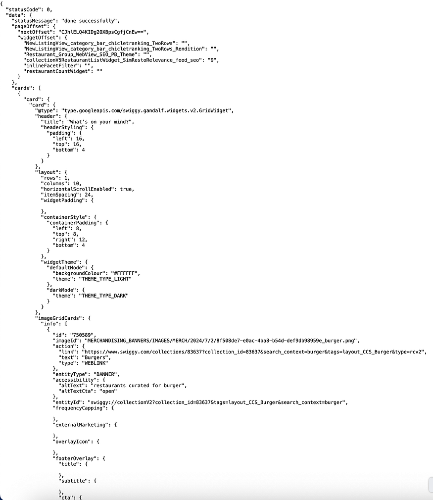
Every single element you see on Swiggy’s homepage — the banners, the offer cards, the restaurant sections — is coming from this API response. Change the lat and lng to a different city, and you'll get a completely different layout with different offers and sections.
Whether it’s Amazon personalising by region or Swiggy targeting by GPS coordinates — it’s the same pattern underneath. One codebase, infinite layouts.
“UI code is written once. It generates different types of websites for different users. It feels magical.”
The BE–FE Contract
For this to work, the backend and frontend teams must agree on a contract upfront — both sides sit together and define it before either starts building.
The contract is straightforward. Every section in the config must have:
type— tells the frontend which component to renderdata— the props that component needs to render itself
{
  "type": "carousel",
  "data": {
    "images": ["url1", "url2"],
    "autoScroll": true,
    "intervalMs": 3000
  }
}
If both sides agree on this structure, the frontend and backend can be built independently and plugged together seamlessly.
How the Frontend Actually Renders It
This is the engineering heart of the pattern — and the part most explanations skip.
You maintain a component map: a dictionary that maps each type string from the config to an actual React component.
const componentMap = {
  "carousel":        <CarouselComponent />,
  "scrollable_cards": <ScrollableCards />,
  "promo_banner":    <PromoBanner />,
  "sale_section":    <SaleSection />,
};
Then you loop over the config and render dynamically:
const HomePage = ({ config }) => {
  return (
    <div>
      {config.map((section, index) => {
        const Component = componentMap[section.type];
        if (!Component) return null;
        return <Component key={index} data={section.data} />;
      })}
    </div>
  );
};
That’s it. The frontend doesn’t know or care what the page looks like. It just maps types to components and passes data down. Add a new section type? Add one entry to the componentMap. No other code changes required.
A/B Testing and Feature Flags
Config Driven UI is the foundation of two patterns you’ll encounter constantly at scale.
A/B Testing Different user segments receive different configs. 50% of users get layout A, 50% get layout B. The frontend code doesn’t change — only the config returned by the backend differs. This is how every large product team runs experiments without frontend deployments.
Feature Flags The same config can carry feature toggles:
{
  "type": "checkout",
  "data": { "showNewCheckout": true }
}
Roll out a new checkout flow to 10% of users. If something goes wrong, flip the flag on the backend. The frontend responds instantly — no rollback, no deployment.
Always Handle the Fallback
What happens if the config API fails, is slow, or returns null?
A production-grade config-driven system always has a safety net:
- Default config — hardcode a minimal fallback config on the frontend that renders a basic, safe layout
- Skeleton loaders — show placeholder UI while the config is being fetched
- Error boundaries — if a component receives unexpected data, it should fail gracefully rather than crash the whole page
This is a common follow-up in system design interviews. Always think about what the user sees when things go wrong.
Design Considerations When Building This
Before writing code, align on these:
- Research your layout types — what sections does your app need? Define the full set of
typevalues upfront with your backend team. - Keep the contract strict — every config object must have
typeanddata. Enforce this with TypeScript interfaces or PropTypes. - Design components to be data-agnostic — each component should only care about its own
dataprop, nothing about where it came from or what surrounds it. - Version your config schema — as your product evolves, configs will change. Plan for backward compatibility early.
Comments
Loading comments…