A popular way of visualising GIS data is by means of hexagons. With a group of hexagons you can cover a region of your choosing and style them based on the properties of that location.
Hexagon maps provide a visually pleasing and insightful way of presenting your data. And it is well worth the time of any data scientist to study how these kind of maps can be created.
In this tutorial I will show you how you can create hexagon maps yourself using Python!
So why a hexagon?
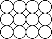
In principle circles would be the best object to use however circles do not neatly cover a surface.
Circles do not fully cover a region:
So what geometries are able to fully cover a surface? Triangles, squares and hexagons can do the trick. However geometries with more angles can no longer be used to completely cover a region.
Hexagons fully tessellate a surface:
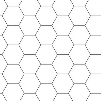
With hexagons being as close to a circle as you can get people mostly use hexagons.
The hexagon is the best circle-like shape that can neatly cover a region.
Preliminary work
I will be using the geopandas, ellipsis and h3pandas module. I can install these using:
pip install ellipsis
pip install geopandas
pip install h3pandas
Creating our hexagon cover
Ok, so let’s get to work! In this tutorial I will create a hexagon heat map based on historic hurricane occurrences over the USA.
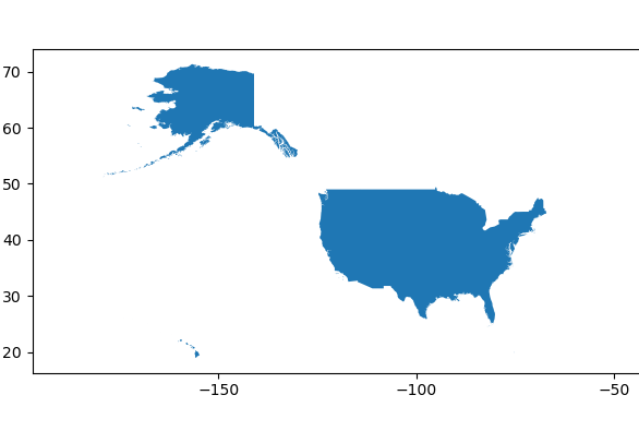
The first step is to get a geometry describing the outline of the USA. I can either fetch a file from my own disk or use a file that I have hosted on Ellipsis Drive. To keep the code reproducible for the reader, I choose the later option and retrieve a shape file of all country borders
import ellipsis as el

pathId = '1a24a1ee-7f39-4d21-b149-88df5a3b633a'
timestampId = '45c47c8a-035e-429a-9ace-2dff1956e8d9'

sh_countries = el.path.vector.timestamp.listFeatures(pathId, timestampId)['result']

sh_usa = sh_countries[sh_countries['NAME'] == 'United States']
sh_usa.plot()
The result gives me a geopandas with the USA:
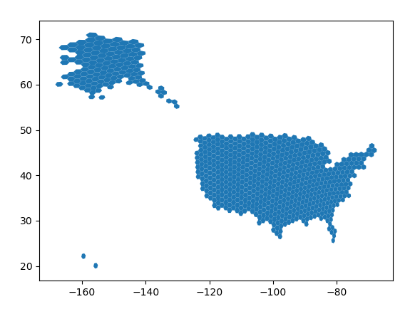
The next step is now to cover this region with hexagons. I can use the h3-pandas module to do this.
import h3pandas
resolution = 3
hexagons = sh_usa.h3.polyfill_resample(resolution)
hexagons.plot()
Here I can use the resolution parameter to use larger or smaller hexagons.
I end up with a geopandas dataframe covering the USA
Doing my analysis
With my hexagon cover of the USA at my disposal, I can now construct the values that I’m looking to build a visualisation with. I should calculate these values for each hexagon and simply place the calculated values in the respective columns of the geopandas dataframe.
In this example I will be colouring my hexagons based on the frequency of hurricanes. To this end, I start with retrieving hurricane occurrences from Ellipsis Drive. (alternatively I could load some local file from my disk).
pathId = '632aeb3f-ca77-4bdd-a8cd-5f733dbd87ee'
timestampId = 'da3bb83d-8cc0-45e4-a96d-e6db0f83616b'

sh_hur = el.path.vector.timestamp.listFeatures(pathId, timestampId)['result']
sh_hur_relevant = sh_hur[ sh_hur.intersects(sh_usa['geometry'].values[0])]
sh_hur_relevant.plot()
As you can see, I loaded all hurricane locations and selected only hurricanes within the borders of the USA. I obtain the following result:
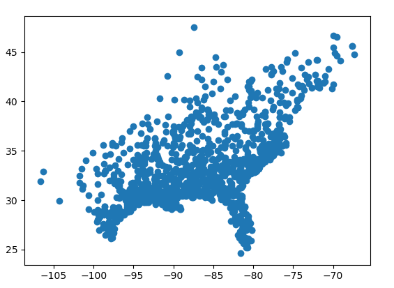
From which we can easily distinguish the American East Coast.
I now create a count column in the hexagons dataframe and loop over the hurricane locations to increase the count. For each hurricane within a hexagon I increase the count with 1.
hexagons['count'] = 0
for i in range(sh_hur_relevant.shape[0]):
    earth_quake = sh_hur_relevant['geometry'].values[i]
    update_bools = hexagons.intersects(earth_quake)
    hexagons.loc[update_bools, 'count'] = hexagons.loc[update_bools, 'count'] + 1

hexagons['count'] = hexagons['count'] * 10000

hexagons[['geometry', 'count']].head()
Granting me a geopandas dataframe with hexagons and the respective count I’m after:
 geometry  count
h3_polyfill
832995fffffffff  POLYGON ((-113.17694 36.28332, -112.74716 36.8...      0
83266dfffffffff  POLYGON ((-85.04131 38.81478, -85.64464 38.439...  60000
8326c3fffffffff  POLYGON ((-98.62273 34.18805, -98.13903 34.697...  10000
8344cafffffffff  POLYGON ((-83.29475 35.10886, -82.80356 35.523...  60000
8326c2fffffffff  POLYGON ((-99.72728 34.89533, -99.24328 35.407...      0
Visualising my results
With the hexagons and their respective properties prepared I can now create a map. I will publish my hexagons within an Ellipsis Drive layer as follows:
token = el.account.logIn('demo_user', 'demo_user')
pathId = el.path.vector.add('Hexagon covering', token = token)['id']
timestampId = el.path.vector.timestamp.add(pathId, token)['id']

el.path.vector.timestamp.feature.add(pathId, timestampId, hexagons, token)
The above piece of code creates a layer and a timestamp within that layer. When that is done, I place the hexagons within that timestamp.
If I open the viewer I can see the result:
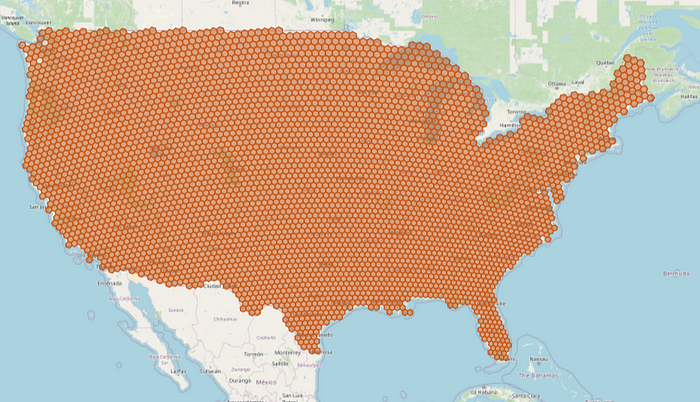
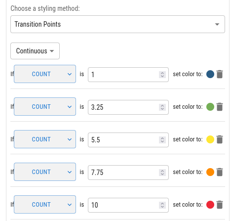
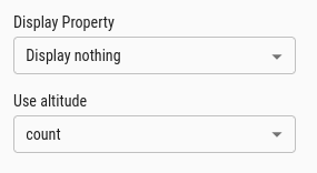
Alright, so my hexagons are there! However I still need to apply some styling. I can easily do this in the layer details pane. I choose the styling transition points and I apply it to the property count.
Once I submit this, I get the following result:
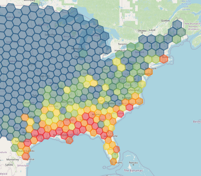
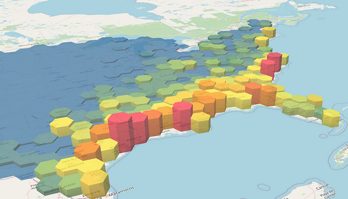
Exactly what I was hoping for! I can even use extrusion height to uplift my created hexagons.
When I choose the property count to uplift my hexagons I get the following result:
Final thoughts
Hexagon coverings are very useful to make appealing and meaningful maps. They create a sharper visual when compared to displaying your data on a raster and they also have the added advantage of supporting the storage and visualisation of multiple (string) properties, the creation of trigger events in your dashboards, and the use extrusion height.
So, with geopandas, h3pandas and ellipsis you can create hexagon maps very quickly and use them in your dashboards or apps. In this article I introduce how you can display maps in Power BI and leverage location data to create dynamic dashboards. Here I introduce how maps can be created and rendered in any of your apps/tools of choice.
Good luck!
Comments
Loading comments…