
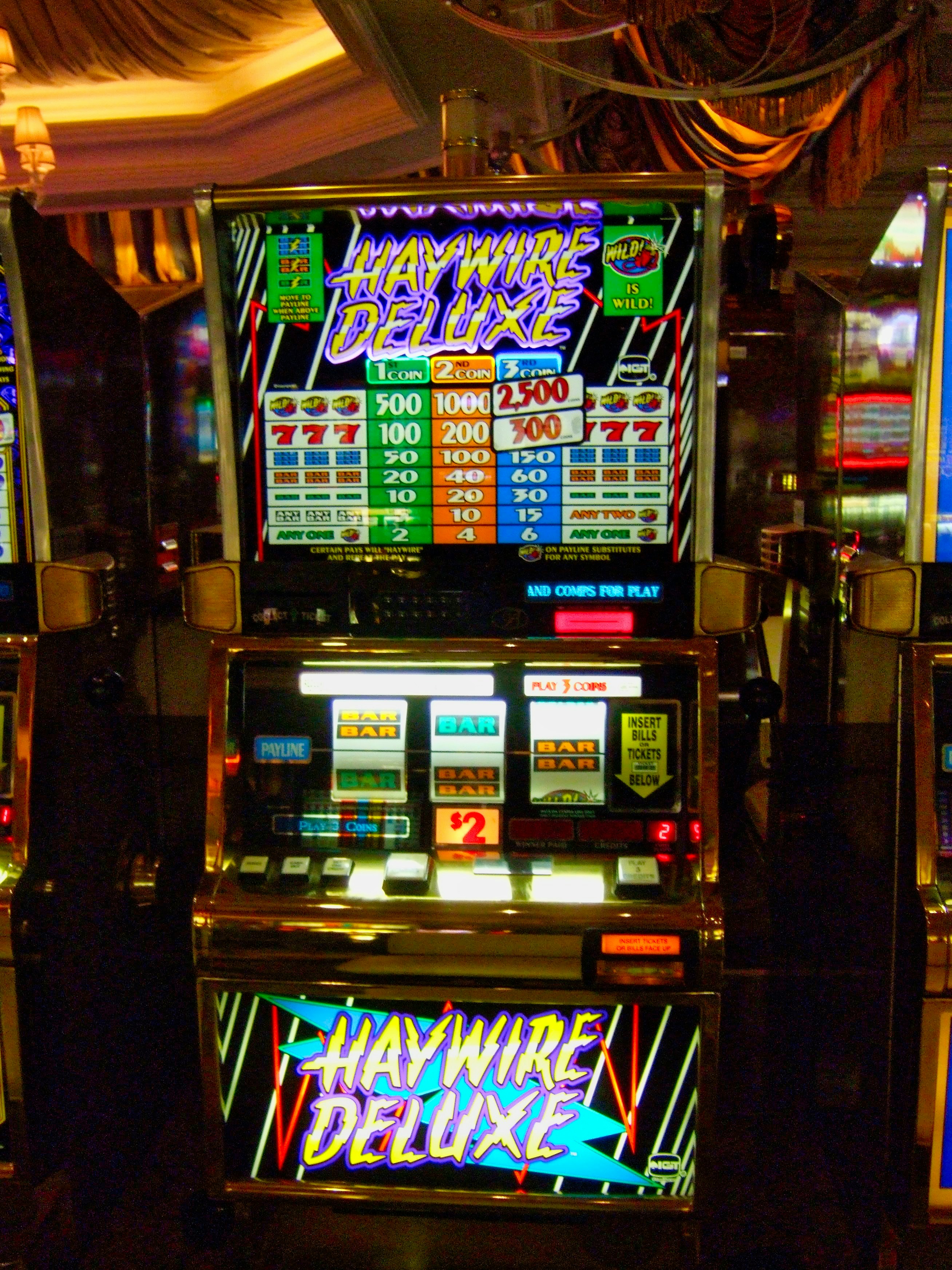
A slot can get surprisingly crowded once a bonus feature starts doing its thing. Extra symbols need somewhere to live without turning the screen into a mess, especially when their state keeps changing. Giving those symbols their own space sounds simple, but it opens an interesting design problem for developers.
A bonus symbol does not always have to sit inside the reels. Some games give it a fixed position of its own, usually beside or above the main grid, where it can change state without moving with every spin. From a developer’s point of view, that turns the symbol into a separate interface component with its own behaviour. The player gets one dependable place to watch, and the game gets a cleaner way to manage feature information.
A Bonus Symbol Becomes Its Own Interface Component
A normal reel symbol belongs to the grid. Its position is part of the result, so the game draws it and clears it as the reel state changes. A dedicated glyph works differently because the position itself can remain active even when the symbol inside it changes. In code, that gives the feature a stable address instead of treating it as another temporary reel cell.
For New Zealand players, the Casiny NZ casino covers 5,000-plus game catalogue and the way its weekly free-spin offer works. That range gives useful context for feature-led pokies, where a bonus element may need to stay visible while the reels continue doing their normal job. The same NZ-facing material covers Casiny’s loyalty programme, keeping the destination firmly inside the product environment being discussed.
For a developer, the benefit is separation. Reel state can handle the symbols that belong to each spin, while the glyph component keeps its own value and visual state. That makes the feature easier to reason about because one part of the interface has one clear job.
Stable Screen Regions Reduce the Search for Information
Screen position carries information before the player has read a label or watched an animation. Once a feature always appears in the same region, the eye learns where to go when something changes. That is useful in a game screen because the player is already watching the reels and account information. Adding another moving target increases the amount of visual searching needed after each event.
Yufei Cao and Penny Sweetser’s 2026 CHI PLAY study tracked 32 players across six functional areas of a game interface and found measurable differences in selective attention and transitions between those regions. Their work was not about casino games, but the design point transfers cleanly: players use screen regions as part of the way they organise attention.
Game UX/UI artist Han Ngoc made the same practical point in a June 2026 interview: “Users need to quickly understand how the feature works and how to use it.” A dedicated glyph position helps because the player does not have to rediscover the feature after every spin. The contents can change while the location stays dependable.
Local State Changes Should Stay Local
A small visual change should not force the rest of the interface to do unnecessary work. Game UIs can become expensive when one changing component causes a much larger render update. A dedicated glyph area gives developers a sensible boundary: update the feature component and leave unrelated parts of the screen alone.
Unity’s April 2026 UI Toolkit performance update gives a sharp example. Its earlier WebGL path could upload 64,000 vertices when a change affected a quad containing only four vertices. The same update reported a 73% reduction in UI Builder allocations, from 3,531 to 929. Some WebGL mesh-update tests improved by 20 times.
Those numbers show the cost of treating a small update as a large one. A bonus glyph may change value or run a short animation several times during a feature. Keeping that work local gives the renderer less to touch and creates a cleaner boundary between the reels and the feature display.
Mobile Layouts Make Fixed Function More Important Than Fixed Coordinates
A dedicated position does not need to mean the same pixel coordinates on every screen. On a desktop display, the glyph may sit beside the reels. On a phone in portrait orientation, the same component can move above the grid and keep the same role. What stays consistent is the function: this is where the game reports the feature state.
Mobile UX work already treats smoothness as an engineering problem rather than polish added at the end. Excessive re-rendering and heavy UI-thread work can make an interface less responsive when several visual elements update together. A dedicated component gives the layout engine a smaller region to resize or redraw when the screen changes.
That fits Casiny’s browser-based mobile access, where the pokies catalogue is presented without relying on a dedicated native app. The useful design goal is functional consistency across screen sizes. A player can move from a larger display to a phone and still find the bonus state in a predictable part of the interface, even though the layout has been rearranged.
The Glyph Still Has to Share the Rendering Budget
Giving a feature its own space does not give it free rendering time. The glyph still uses textures and draw calls, so it needs to fit inside the same performance budget as the rest of the game. Developers can keep that cost under control by treating the component as a small, reusable piece of the interface instead of rebuilding a larger scene whenever it changes.
A few practical gains come from that approach:
- Independent state handling keeps feature logic away from the ordinary reel cycle.
- A predictable screen region reduces visual searching when the feature updates.
- Local animation limits the amount of interface data that needs to change.
- Responsive rules can move the component without changing its job.
- Visual priority can be controlled without making every update louder.
The difference becomes clearer when the two approaches are placed side by side.
The table captures the engineering trade. A dedicated glyph is useful because its behaviour can be isolated without divorcing it from the rest of the game.
More Space Creates More Responsibility
Extra UI space only earns its place when the player can read it quickly. Permanent flashing or repeated movement can turn a useful feature region into another distraction. The component needs a clear visual hierarchy and sensible timing, with enough emphasis to signal a state change without competing with the reels every second.
That becomes especially relevant around feature-heavy products. Casiny’s Drops & Wins content adds extra game states that the interface has to communicate clearly, while its loyalty programme sits outside the base spin and carries a different kind of information. Keeping those layers visually distinct helps the player understand what belongs to the current round and what belongs to the wider casino experience.
Dedicated glyph positions are a small design decision with a useful technical payoff. They give one feature one dependable home, which makes the interface easier to read and the underlying code easier to control.
Gambling is for adults and should be treated as entertainment, not as a way to make money. Only gamble with money you can afford to lose.
Comments
Loading comments…