We can all agree that React continues to dominate the web development world a decade after its initial release. While there is a lot of competition from Angular, Vue, and a couple of others, React still stands strong as the popular developer choice.
Over the years, many React component libraries have been designed to help developers constantly search for ways to improve their projects and streamline their workflow. These libraries not only save time and effort but also offer a wide range of high-quality, customizable components that can elevate the user experience of any project.
With 2024 just around the corner, we''ve compiled a list of the best React component libraries to enhance your development process and deliver top-notch results. These component libraries have been carefully put together based on the following criteria:
- Performance
- Customization and Theming
- Documentation
- Compatibility with the latest React versions and browsers
- Accessibility
- Mobile Responsiveness
Whether you''re a seasoned pro or starting with React, these libraries are a must-have for any project in the coming year if you want to keep being competitive. Without further ado, let’s dive right into them.
Saas UI

The first component library on our list is SaaS UI, an extensive React component library built atop the popular Chakra Ui library. With over 40 fully tested open-source components, SaaS UI is designed to help developers quickly build SAAS apps without sacrificing quality or performance. This library is optimized and lightweight, as opposed to other bulky libraries that negatively impact your application''s loading time and performance.
SaaS UI components include authentication screens with Clerk, Supabase, and Magic. It also has fully functional forms with React Hook Form, data tables with React Table, modals, feedback components, date pickers, and many others.
All SaaS UI components are built with Typescript, helping catch errors during development and improve code quality. They are easily customizable/themeable and are compatible with the latest versions of React and browsers.
SaaS UI components are mobile-friendly and meet WCAG guidelines, so you don’t have to worry about accessibility issues and Google’s mobile-first indexing if you build your application with SaaS UI components. They also have great documentation, complete with live editing, so you can play around with the components before adding them to your project.
There’s a SaaS UI Pro plan that gives you prioritized feature requests from SaaS UI, as well as priority support for any problems you may face when using SaaS UI. Spending on the plan you choose, you can have an unlimited number of developers working with one account if you’re a startup, significantly streamlining your workflow.
Getting started with SaaS UI is easy. First, you’ll have to install Chakra UI into your React project, then install SaaS UI, like this:
npm i @chakra-ui/react @emotion/react@^11 @emotion/styled@^11 framer-motion@^6\
npm i @saas-ui/react
If yarn is more your jam, you can do this instead:
yarn add @chakra-ui/react @emotion/react@^11 @emotion/styled@^11 framer-motion@^6\
yarn add @saas-ui/react
Once you’re done, you just have to set up the SaasProvider at the root of your application for Saas UI to work. The SaasProvider will deal with the Chakra UI setup, and add the Saas UI base theme, CSS reset, and global styles. You’ll then have access to one of the best component libraries any developer can have in 2024.
MUI / MaterialUI
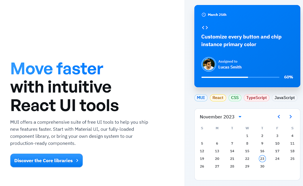
MUI is a popular React UI framework that provides a set of pre-designed React components following the principles of Google''s Material Design, a design language that emphasizes a clean and intuitive user interface with a focus on usability and accessibility. MUI simplifies the process of building responsive and visually appealing web applications by offering a wide range of ready-to-use React components. These components cover a wide range of UI elements, including buttons, forms, navigation bars, cards, and more.
The components in MUI are designed to be responsive out of the box, and this helps create applications that work well on various screen sizes and devices. The components come with built-in support for various accessibility features, making it easier to create web applications that are usable by a wide range of people.
MUI’s greatest strength is its large and active community, so you can find a lot of resources, tutorials, and community support when working with the library. Since MUI is built specifically for React, it seamlessly integrates with all versions of React in the React ecosystem. You can easily incorporate it into existing React projects or use it when starting a new project.
To get started with MUI, you can install it in your React project using npm or yarn.
npm install @mui/material @emotion/react @emotion/styled
Once installed, you can directly import and use the components in your application.
import Button from ''@mui/material/Button'';

function MyButton() {
  return (
    <Button variant="contained" color="primary">
      Click me
    </Button>
  );
}
PrimeReact
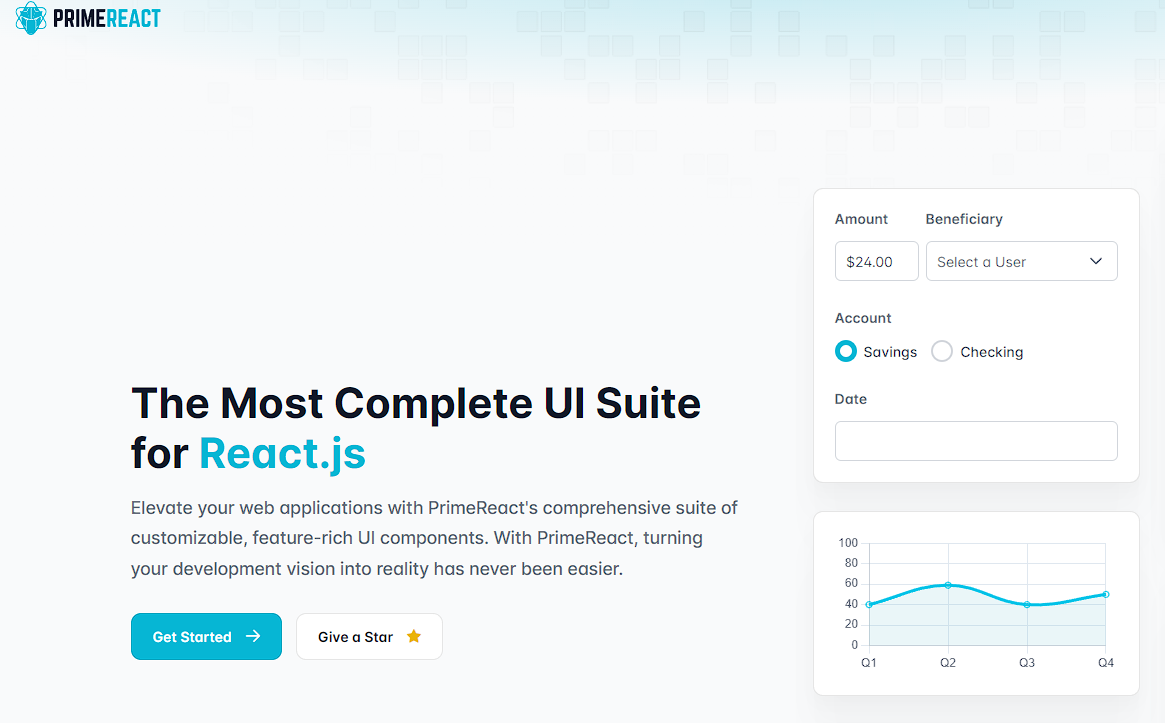
Next up is PrimeReact, an open-source UI component library for React applications. PrimeReact is part of the PrimeTek Informatics suite, which includes other UI libraries for different frameworks, and it provides a set of rich and customizable components that can be used to build modern and responsive user interfaces.
This library offers a comprehensive collection of components for building various parts of a web application, including buttons, forms, data tables, charts, dialogs, and more. These components are designed to be feature-rich and can be easily integrated into React projects.
PrimeReact provides a consistent and well-maintained set of UI elements for building modern web applications with React. Like SaaS UI, PrimeReact supports theming and customization, enabling developers to adapt the appearance of components to match the overall design of their applications.
PrimeReact is distributed under the MIT license, which is a permissive open-source license that allows developers to use, modify, and distribute the library in their projects.
To use PrimeReact in your React project, you can install it via npm or yarn.
npm install primereact primeicons
Then you can easily import the component you need into your project, like this:
import { Button } from ''primereact/button'';

function MyButton() {
  return (
    <Button label="Click me" />
  );
}
Grommet
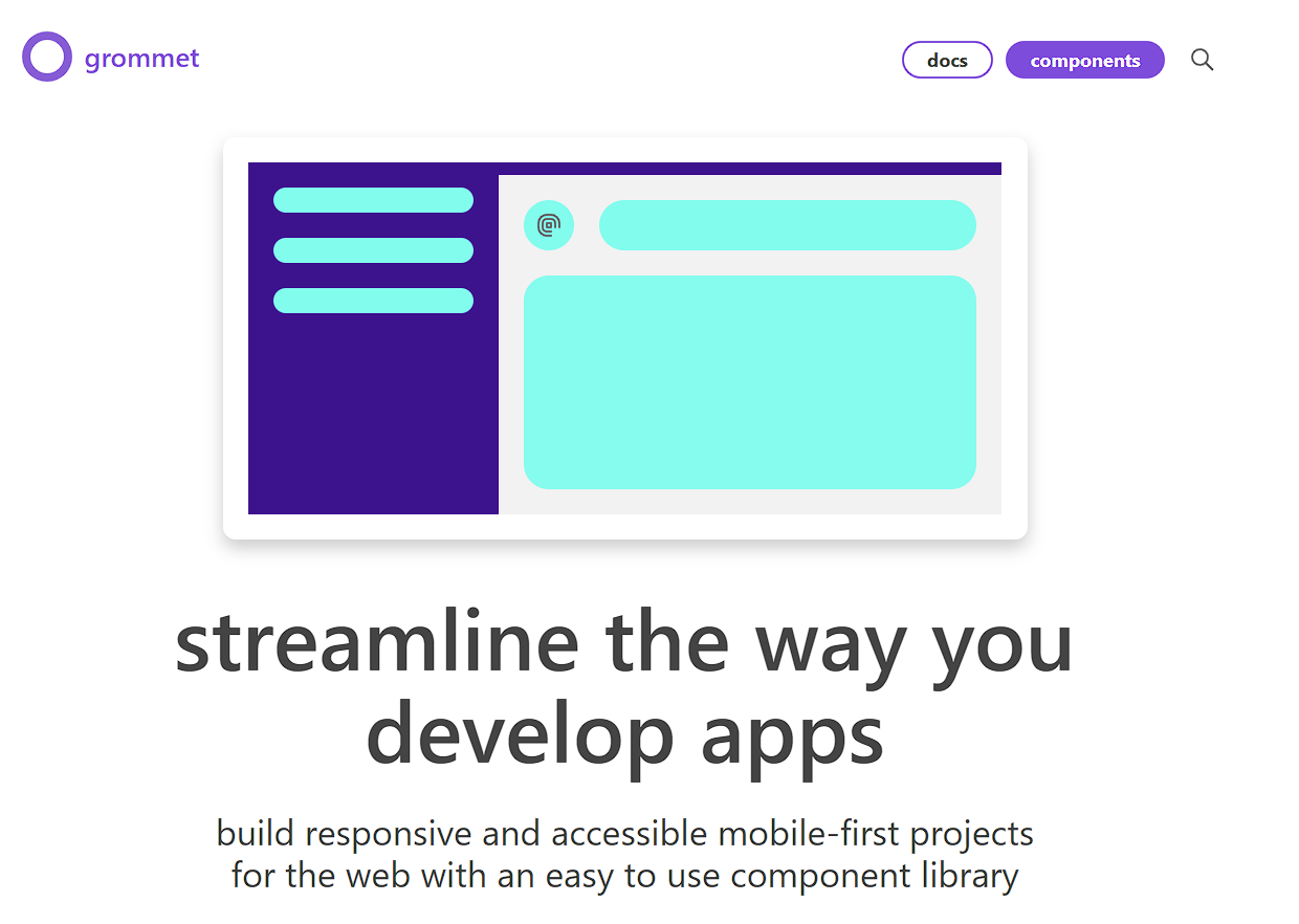
Compared to the rest of the React component libraries on this list, Grommet is a lot less popular, yet it has enough tricks up its sleeves to rank as one of the best component libraries for 2024. Grommet is a mobile-first React component library designed to simplify the creation of modern and responsive user interfaces by placing an emphasis on accessibility and responsive design.
Whether you are building a business application or a consumer-facing website, Grommet provides a comprehensive set of pre-designed components to create a seamless and visually appealing user experience. Accessibility is a core focus of Grommet, and the library provides built-in support for various accessibility features, ensuring that your applications are inclusive and usable by individuals with diverse needs and abilities.
Grommet also allows for easy theming and customization that allows you to create and apply themes to match your brand or design requirements. The theming system in Grommet is based on a design language called "aragon," and you can easily customize colors, typography, and other aspects of the components.
Grommet’s documentation is not as extensive as other component libraries like SaaS UI and MUI, and it also does not allow for editing. However, their docs are sufficient enough for seasoned developers to work with, and as they continue to grow, they’ll likely fix this particular chink in their armor soon.
To get started with Grommet, you can add it to your React app via NPM:
npm install grommet grommet-icons styled-components --save
Next, you can import Grommet into your App.js file and include it as one of your top level nodes, like this :
import { Grommet } from ''grommet'';


<div className="App">
 <Grommet full>
  <header className="App-header">
    <p>
      Edit <code>src/App.js</code> and save to reload.
    </p>
    <a
      className="App-link"
      href="https://reactjs.org"
      target="_blank"
      rel="noopener noreferrer"
    >
      Learn React
    </a>
  </header>
 </Grommet>
</div>
Ant Design
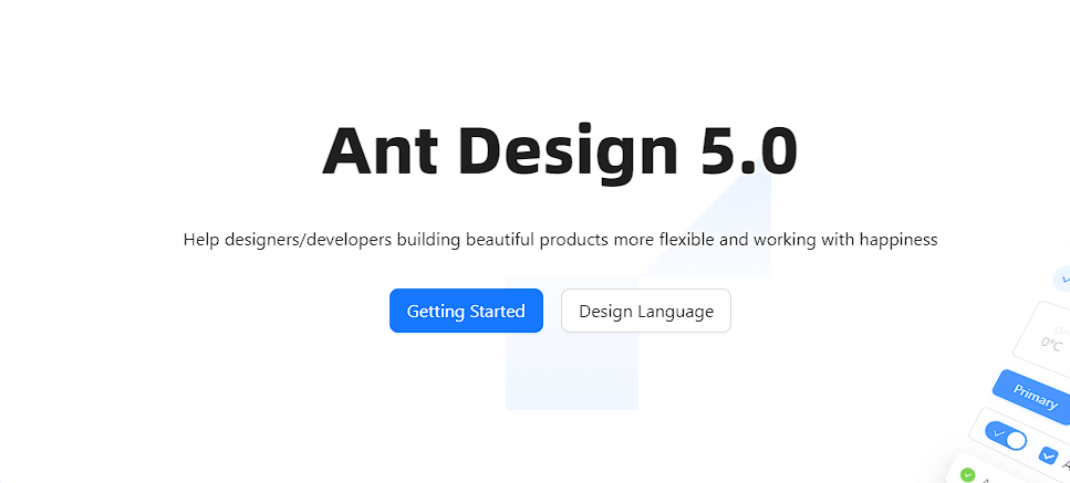
Last on our list but by no means the least, is Ant Design. Ant Design is a widely-used React UI library that provides a comprehensive set of components and design principles for building modern and visually appealing user interfaces. Developed by Ant Financial, the design system was originally designed to be used for only financial applications, but due to the sheer quality and versatility of its feature-rich components, it’s being used in different domains today.
Ant Design components follow a consistent design language based on the principles of simplicity, clarity, and usability. This ensures that all components have a cohesive look and feel, contributing to a seamless user experience. It supports all versions of React, and all its components are responsive and themeable.
Ant Design also has built-in support for internationalization, making it easy to create applications that cater to a global audience. i18n support allows for the translation of text content within components, including labels, messages, and any other textual elements that are part of the user interface. Instead of hardcoding text in a single language, developers can use mechanisms provided by the library to dynamically load translations based on the user''s preferred language or locale.
To use Ant Design in your React project, you can install it via npm or yarn.
npm install antd
Once done, you can import and use components in your React application
import React from ''react'';
import { Button } from ''antd'';

function MyButton() {
  return (
    <Button type="primary">Click me</Button>
  );
}
Conclusion
There are hundreds of React component libraries in the market today, but the above libraries stand head and shoulders above the rest. By utilizing these libraries, you can save time and effort by not having to build each component from scratch, allowing you to focus on other aspects of your project and streamline your workflow.
All of these libraries have their strong points, so picking one may be a bit difficult. Grommet is great for mobile applications, PrimeReact has an ecosystem that’s great for various frameworks, MUI has visually appealing components, and SaaS UI components are the best for building and deploying SAAS apps.
However, if you’re looking for a component library that ensures consistency in design, great performance, thorough documentation, and a cohesive and visually appealing UI, SaaS UI is the answer. It has the easiest learning curve out of all the libraries mentioned above, and a wide range of pre-built, customizable components that can elevate the user experience of any project.
But you don’t just have to take my word for it, you can give SaaS UI a try today. Many developers are doing that already, and as we head into 2024, many more developers are going to jump on this train.
Comments
Loading comments…