 Let’s be honest, themes are a really nice little feature to have, and play with, in any application. Take VS Code for example or even GitHub. They give their users the freedom to customise the application the way the user wants. Do you want a dark theme? Okay! Oh no, I want a high-contrast theme… Well, you have it! And as much as it is fun to have different themes to choose from, this little feature is actually a crucial accessibility feature. Right?
 Before getting started with adding an alternative theme to our React application, I would like to point out that, even though there are various libraries (like MUI and Antd) that can be used to add themes, it is always a good idea to know how to make something from scratch.
As always, you can find the complete code for this article in the supporting GitHub repository here:
Before getting started with adding an alternative theme to our React application, I would like to point out that, even though there are various libraries (like MUI and Antd) that can be used to add themes, it is always a good idea to know how to make something from scratch.
As always, you can find the complete code for this article in the supporting GitHub repository here:
Looking Under The Hood 🔍
How do themes actually work in any application anyway? Not the whole in-depth working but on a high level? To keep things very, very simple, let us imagine that our application is just a simple index.html page, with a single style.css stylesheet. When the page is loaded, so is the stylesheet, with all the predefined styles and properties. Now, I decide to change the theme to a darker version (the light theme is the default), which means I, somehow, change all the light colours to a darker colour — dynamically. And as long as the page is not refreshed, I have my dark theme in place.
Let’s Simplify Even Further 💁♂️
- We know that on page refresh, we will lose our dark theme, which means there should be some state management in place, right? After all, our application must constantly know that the user changed the theme from light/default to dark.
- Then we must also have some way to provide this input — a button or a switch.
- And definitely, CSS is defined for the dark version.
Setting Up Our Project 💻
- To get started, we need a React app. I use TS with React and so I will run
npx create-react-app <app-name> --template typescriptto get a basic react app with typescript. If you do not use TS, run the same command; just remove--template typescript. - Once the basic app is done, go ahead and clean up your project directory, if you want — remove unwanted files and switch to the ES6 way of defining components (what I prefer to do).
- The 2 default files that we will work the most with will be
App.tsxandApp.css. - For managing a global theme state (let’s call it that), we’ll use Context API that ships with React. We will later create a
ThemeContext.tsxfor this. There can be disagreements as to if Context should be used or not. For me, it is Context for state management in React.
Time To Code 🚀
To keep things simple, we will begin by adding a Button in our App.tsx file, which will also be the button that we use to change between light (default) and dark theme.
ThemeContext.tsx
Let us first create our ThemeContext and then use it in our application. Here we declare isDarkTheme state and set it to false by default. Then we have a toggleTheme() function that essentially flips the value of isDarkTheme flag. This state is what will be responsible for all theme-related magic in the application as all related css will be applied/removed based on it.
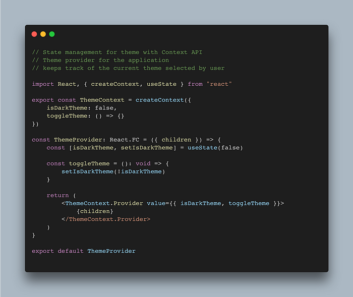
ThemeContext.tsx — global state management for theme using React’s Context API
index.tsx
To use our isDarkTheme flag and toggleTheme() function, we must first wrap the App component with the ThemeProvider component.
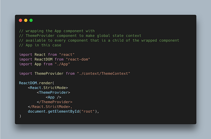
index.tsx — Wrapping the highest component with ThemeProvider
App.tsx
Now we bring in the useContext hook, and pass in the ThemeContext as an argument to the hook to consume our global state variables.
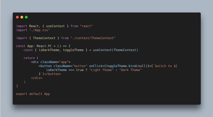
App.tsx — simple setup, a button with dynamic label
App.css
Final step, adding styles for light and dark mode. By default, light theme will be loaded and once we change isDarkMode to true, dark-mode CSS will override the default values.
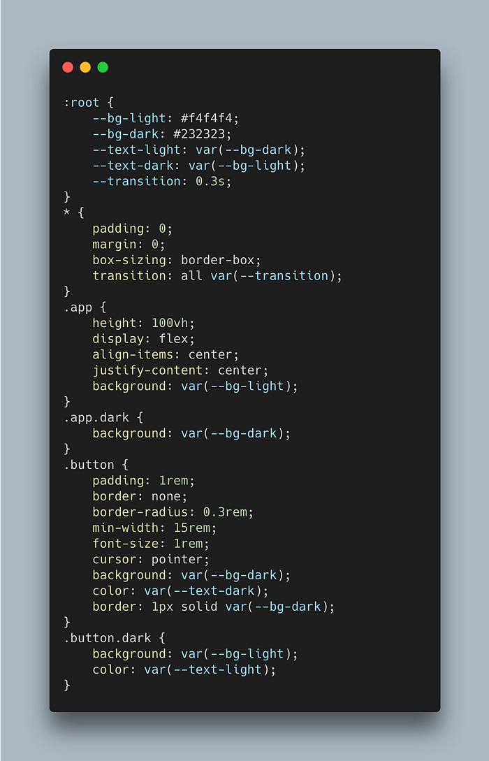
App.css — chaining .dark class to .app and .button class overrides values on theme mode change.
Final Result
 Even though this was a fairly simple example, adding theme is nothing more than this. All we need to do is somehow communicate to the entire application about which CSS (or part of CSS) has to be loaded and changed, depending upon what theme did the user choose.
If you wish to see a full project with this implementation, you can check out my portfolio — https://www.thedevdesigner.com where I have used exactly same approach to add themes.
If you enjoyed this project and found it interesting, make sure to check out my other articles where I talk about React, TypeScript, and Node.js.
Even though this was a fairly simple example, adding theme is nothing more than this. All we need to do is somehow communicate to the entire application about which CSS (or part of CSS) has to be loaded and changed, depending upon what theme did the user choose.
If you wish to see a full project with this implementation, you can check out my portfolio — https://www.thedevdesigner.com where I have used exactly same approach to add themes.
If you enjoyed this project and found it interesting, make sure to check out my other articles where I talk about React, TypeScript, and Node.js.
Comments
Loading comments…