If you browse the web for long enough you might come across a neat little feature called a dark mode toggle switch. You can usually find it at the top right corner of an application or a website such as the Redux documentation or the W3Schools docs. It always makes me happy to see this feature on sites where I may do a lot of reading since my eyes can be pretty sensitive to bright lights, so today we’re going to be building our own!
Building a dark mode toggle with JavaScript and localStorage
We’ll mainly be focusing on the JavaScript code for building a dark mode toggle in this article but to show you what we’ll be working with on the HTML side check out the following code.
<!DOCTYPE html>
<html>
  <head>
    <title>Dark mode toggle</title>
    <meta charset="UTF-8" />
    <link rel="stylesheet" href="./src/styles.css" />
  </head>

  <body>
    <div id="theme">
      <button id="toggle-btn" class="dark-mode-toggle">Toggle dark mode</button>
      <h1>Theme!</h1>
      <p>
        Lorem ipsum dolor sit amet consectetur adipisicing elit. Maxime
        mollitia, molestiae quas vel sint commodi repudiandae consequuntur
        voluptatum laborum numquam blanditiis harum quisquam eius sed odit
        fugiat iusto fuga praesentium optio, eaque rerum! Provident similique
        accusantium nemo autem. Veritatis obcaecati tenetur iure eius earum ut
        molestias architecto voluptate aliquam nihil, eveniet aliquid culpa
        officia aut! Impedit sit sunt quaerat, odit, tenetur error, harum
        nesciunt ipsum debitis quas aliquid. Reprehenderit, quia.
      </p>
    </div>
    <script src="src/index.js"></script>
  </body>
</html>
And on the CSS side of things, we’ll keep it simple with some basic styling and classes we’ll use called dark-mode-toggle and dark-mode-theme for help with switching between the default and dark mode themes.
body {
  font-family: sans-serif;
  margin: 0;
}

#toggle-btn {
  padding: 0.5em;
  font-weight: 800;
}

#toggle-btn:hover {
  cursor: pointer;
  opacity: 0.8;
}

.dark-mode-toggle {
  background: #000;
  color: #fff;
}

#theme {
  width: 100vw;
  height: 100vh;
}

.dark-mode-theme {
  background: #000;
  color: #fff;
}
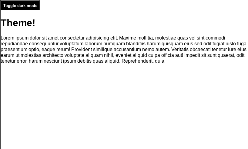
So far our project is currently looking like the following.

To configure our toggle we’ll add JavaScript to listen for a click event when the user toggles to the dark mode theme or back to the default. To save the theme setting that the user switched to we’ll use localStorage to store whether the dark mode is currently enabled or disabled.
const toggleBtn = document.getElementById("toggle-btn");
const theme = document.getElementById("theme");
let darkMode = localStorage.getItem("dark-mode");

const enableDarkMode = () => {
  theme.classList.add("dark-mode-theme");
  toggleBtn.classList.remove("dark-mode-toggle");
  localStorage.setItem("dark-mode", "enabled");
};

const disableDarkMode = () => {
  theme.classList.remove("dark-mode-theme");
  toggleBtn.classList.add("dark-mode-toggle");
  localStorage.setItem("dark-mode", "disabled");
};

if (darkMode === "enabled") {
  enableDarkMode(); // set state of darkMode on page load
}

toggleBtn.addEventListener("click", (e) => {
  darkMode = localStorage.getItem("dark-mode"); // update darkMode when clicked
  if (darkMode === "disabled") {
    enableDarkMode();
  } else {
    disableDarkMode();
  }
});
In the above code, we first grab the elements we’ll need from the dom and the current state of dark mode from localStorage. We then have two functions enableDarkMode() and disableDarkMode() . To enable dark mode we add the class called dark-mode-theme and remove dark-mode-toggle then set the dark mode in localStorage to have a value of enabled. To disable dark mode we do the exact opposite, removing the class dark-mode-theme and adding the class dark-mode-toggle then setting dark mode to disabled.
On line 17 we check for what the current state of the dark mode is when the page is loaded and set it if it’s enabled, this gives us the ability to save the theme we last selected. In the event listener, we reset our darkMode variable to reflect whatever the current state of it is, either enabled or disabled before checking it and taking action to enable or disable dark mode based on its value.
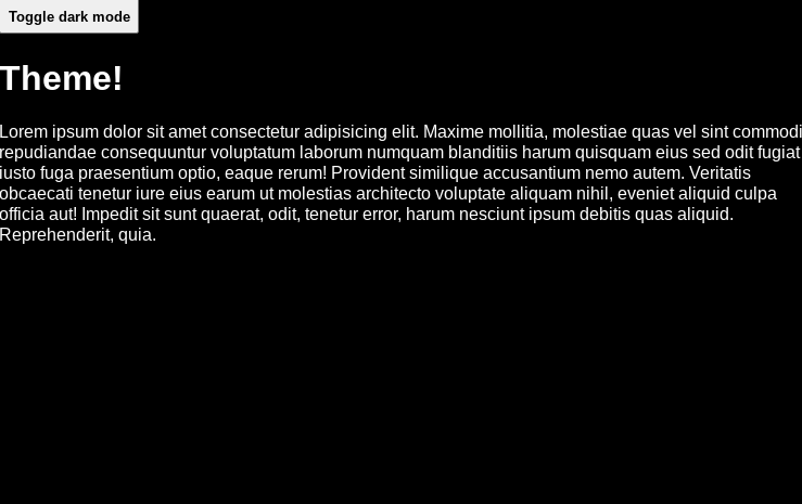
Now when we enable the dark mode theme we’ll get the following.

Summary
This was a quick and easy way to build a toggle switch for enabling dark mode on your website or application. There are many other ways this can be done, check out a guide to learn more about them here!
And if you’d like to interact with our new dark mode toggle switch check out the finished product on code pen here.
Comments
Loading comments…