For SaaS apps, it's common knowledge that UI design is king. The UI design of many SaaS apps is a vital part of customer satisfaction and retention and is responsible for the success/failure of most apps. According to a recent study, 88% of website visitors are less likely to return to a site after a bad user experience.
Fortunately, building a great UI for a SaaS app is not rocket science. You can be as creative as you want, but a few essential things still have to be in your SaaS app for its UI to be great. In this article, we'll dive into the building blocks of great SaaS UI designs, and discuss how Saas UI makes it easy and intuitive to build your SaaS app using them.
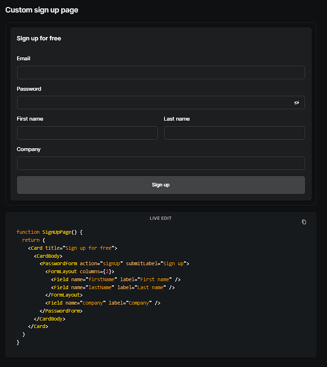
Simplified Registration & Login
First impressions matter.
The first interaction your customers will have with your SaaS app is the login/sign-up process, and making this easy and intuitive often makes the difference between them signing up for your SaaS app, and being turned off and navigating away. Painless registration/logins improve conversions.
With the Saas UI Auth component and the AuthProvider, you can quickly set up a great login/sign-up system in a matter of minutes. Auth comes with premade, accessible, and customizable forms and buttons, and the AuthProvider includes state management and hooks that simplify auth managent. Using the two together, you can add support for Supabase, Magic, and Clerk auth in seconds. Even if you'd prefer building a custom login page, or OTP/magic link sign-ins, Saas UI has got you covered.
Visualization of data that doesn't overwhelm users
Unlike the popular movie, no one wants to come to your SaaS app and see everything everywhere all at once. Displaying data in your SaaS app needs some thought behind it. You need to prevent cognitive overload. Give your users the information they need to improve their decision-making, but don't make it invasive.
Saas UI's DataGrid - using react-table V8 internally, with all useTable props - fixes this problem by providing an advanced data grid component that supports sorting, selections, filters, and pagination. With this, you can accurately display any amount of data you want without having your SaaS app look cluttered, or one giant infodump.
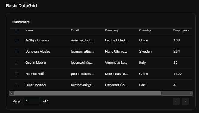
Saas UI's DataGrid lets you create data grids with clickable rows while still being able to access internal state and remote data.
There's also a DataTable - for when you need to display high-density data in a tabular form in your SaaS apps while still being lightweight, and maintaining accessibility.
You'll notice that Saas UI places a lot of importance on these accessibility concerns, and for good reason. Ignoring a11y may very well ruin the UI of your app for a large demographic of users with different abilities or impairments.
👉Accessibility is a part of Saas UI's core design principles. Learn more here.
Effective onboarding flows, and tutorials
A key building block of all great SaaS apps is intelligent onboarding, and to to this end most SaaS apps use tutorials, steppers and highlighters to implement their onboarding process. A good onboarding flow familiarizes new users, and minimizes user confusion.
Creating good tutorial slides can be tough, but not if you're using Saas UI. There are a lot of different tools and premade components that Saas UI offers that can make the onboarding process of your SaaS app easier, like :
- Saas UI Tour: With the Saas UI tour component, you can introduce people to your app and its features quickly while maintaining user engagement. Statistics show that short tours have always helped improve users' perception of a SaaS app.
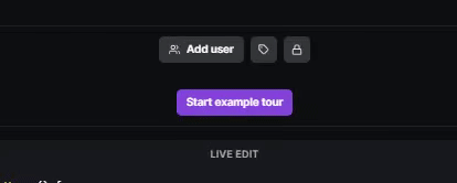
- Saas UI benefit modals: A benefit modal is a quick pop-up card you can use to introduce a new feature or development in your SaaS app, ad it can also serve as a great entry point for implementing the tour component we just talked about.
- Saas UI stepper: The stepper is by far the most popular onboarding tool in the world, and features in almost every great SaaS app. With Saas UI you can implement vertical and horizontal steppers easily in your SaaS app because, well, they've done most of the work for you.
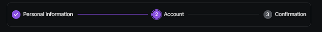
Saas UI stepper
- Saas UI timeline: If you want to go the extra mile, you could implement a timeline to show your users the steps they need to take to get to a certain point. With the timeline and banner, this can be easily implemented in a way that improves the aesthetics of your app and improves customer satisfaction.
Saas UI timeline
The bottom line is this - confused users don't sign up for your SaaS platform, and don't make you money. Building good onboarding flows pays off. It cuts down on customer churn, improves the brand perception, while also increasing user engagement and minimizing support requests during the onboarding stage.
Consistency is key
For a SaaS app to truly stand out among others, there has to be a strong consistency in design language and colors across the board. User recognition is a critical part of any SaaS app, and so is maintaining a strong brand identity, but above all - consistency in design makes it easier to build familiarity, enhance user experience, and establish a lasting impression.
With Saas UI, you can easily maintain the core brand design of a SaaS app using its theme feature. It comes with some themes out of the box, but Saas UI is extremely customizable, allowing you to use design tokens to build a theme.
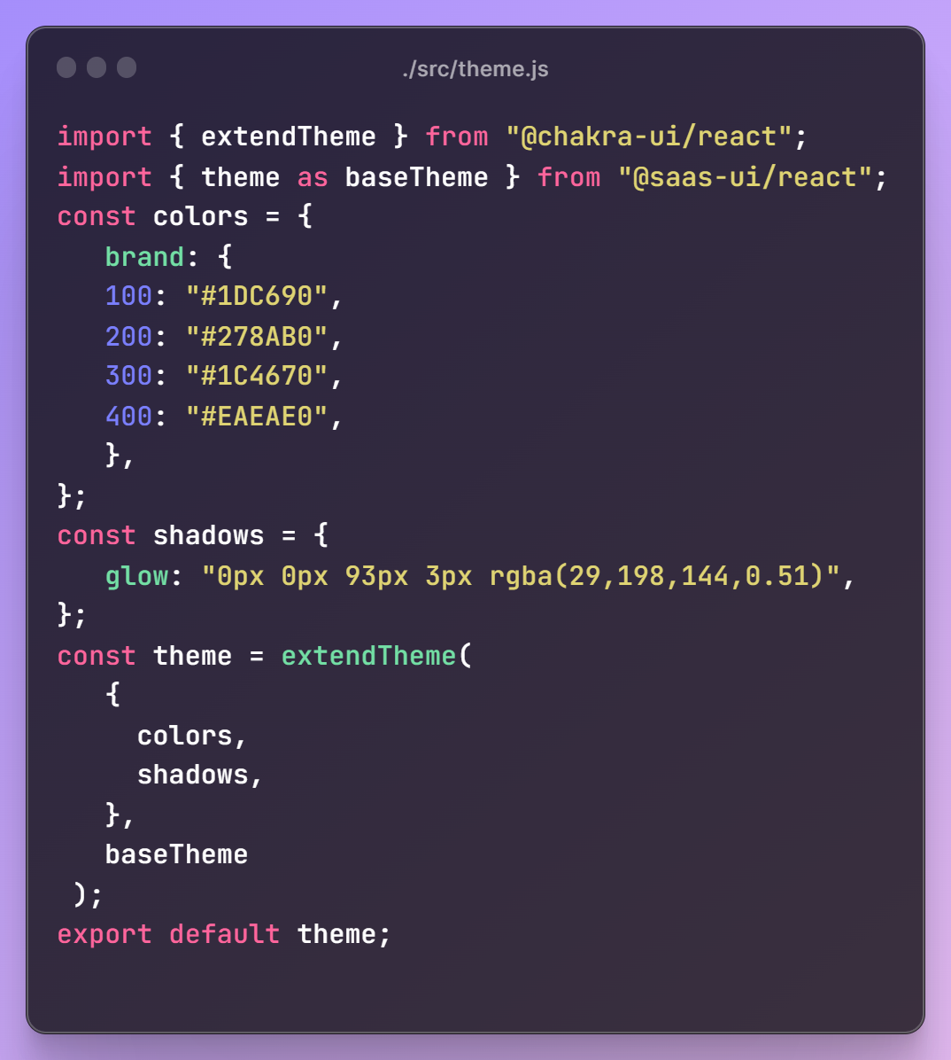
Theming with design tokens sets a single source of truth for all visual attributes, app-wide, so if you wanted to switch up your app's visual language - say, new brand colors - all you have to do is update the value/design token in one place, instead of having to refactor your entire CSS.
To learn more about theming SaaS apps with design tokens, check out this article.
Using Design Tokens to Easily Theme Your SaaS Application
*What design tokens are, how to set up a system to use them in your app, and an example of how design tokens can be used...*javascript.plainenglish.io
Intuitive layouts
Everyone loves a visually appealing UI, but few people actually realize how vital layouts are to the success or failure of SaaS apps - or how difficult building intuitive layouts actually is.
Saas UI's core is built on Chakra UI's sensibilities, which means when you use SaaS UI to build your SaaS app, you'll have access to all the prebuilt components from Chakra UI - including its battle-tested layouting with the Box, Grid, Stack, Flex components, and more. Saas UI sprinkles further DX on top, incorporating SaaS best practices by default.
This is a powerful combination whose impact is twofold:
a) It gives your users familiar interface patterns and conventions, logical placement of controls, and clear visual hierarchy. Building intuitive layouts is a science - and when done right, it flattens out the learning curve for your users.
b) It gives your devs the ability to rapidly prototype clean, modern UIs and good UX on core SaaS features, out of the box, without thinking about it.
A polished, performant UI design enhances the perceived quality of the app, and extensive tutorials and handholding helps, sure, but the best tutorial is one you don't have to code at all.
Accessibility
Accessibility ensures that individuals with disabilities can access and use the app on an equal basis with others. For SaaS apps, especially in 2023, it's important to build products that eliminate barriers that may prevent people with visual, hearing, motor, or cognitive impairments from fully utilizing the app's features and functionalities.
All of Saas UI's components are built to be WAI-ARIA compliant, meaning you don't have to worry about accessibility problems or legal compliance when using Saas UI components now or in the future. Meeting accessibility guidelines is the ethical responsibility of all SaaS app developers, and it also helps give your product a positive brand image.
Easy, consistent feature flagging across the app
As your SaaS app evolves, there'll be features that you'll want to release to only a subset of users or specific user segments(paying users), or you may need to roll out new features or updates. To reduce the risk of breaking your app or messing with your UX, you need a strong feature flagging system in place for managing risks or bugs associated with any new features or changes.
Saas UI's feature flags facilitate rapid iteration and continuous deployment by decoupling feature releases from the underlying codebase. This allows SaaS apps to deploy code changes while keeping the features hidden or disabled until they are ready for release, resulting in faster iterations and shorter release cycles. Using this approach makes it easier to manage and maintain the feature flag configuration as the app evolves and grows in complexity.
Conclusion
When it comes to SaaS UI/UX design, these seven agreed upon best-practices that I've covered today will instantly make a difference. So yes, designing a good SaaS app is not rocket science...but without the right tools, it may as well be.
This is why a component library like Saas UI can be so helpful. While there are plenty of React UI libraries out there (MUI, Mantine, and so on) they are all focused on general use cases - while SaaS apps often have very specific requirements. SaaS UI understands that, and is purpose built to make your app look good, but work well for everyone. Make a good first impression, but retain users as well.
You can have your cake and eat it, too.
Comments
Loading comments…