
Back when the first time I learned Flask to create a functional dashboard, it was so difficult to find tutorials or documentation that really matches what I need. Frequently they are too simple which makes me should find another 10–15 tutorials to be able to make a functional “simple” dashboard or sometimes they are too complex which contains a lot of features that I don’t really need. So, to get along with this article, I expect that you already have basic knowledge of Flask, HTML&CSS, Bootstrap, and also convenient using python plotting libraries.
Perhaps some of you questioning why I am not choosing more familiar python libraries such as Matplotlib and Seaborn for plotting. The answer is that it's not really convenient using those libraries if I want to use them on the web dashboard. As far as I know, with those libraries, I must convert the plot to some image type file (.jpg, .svg, or .png), save it, and then call it again in the .HTML file, also we can’t make it interactive.
With Altair and Plotly, all I need is to dump the plot into a JSON variable and then parse it to our .HTML file. If you’re not familiar with Altair (Plotly is pretty similar to Seaborn or Matplotlib), they have a good demo repository here, and also Jake VanderPlas has made an amazing presentation here about how to use it.
How about Chart.js? Personally, I think that Chart.js is pretty simple (for basic purposes) even if you don’t know Javascript or personally hate it like me. Also, by using all these plotting libraries I expect to cover imperative visualization (Matplotlib, Seaborn, Plotly, etc.), declarative visualization (Altair), and basic web visualization with Javascript library (Chart.js).
I summarized all of the processes to create this dashboard in these five steps:
-
Think about the looks
-
Project structure
-
Data and insights
-
Visualization
-
Putting it all together
 Photo by myself (Alpsee, Bayern)
#1. Think about the looks.
I think this is the easiest part. For simplicity, you can choose the basic Bootstrap navbar with its layout grid which you can find here.
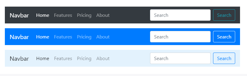 Official navbar from Bootstrap.
But if you want more fancy looks like AdminLTE (below) as a front-end boilerplate, you can also download it for free here, and clean all the stuff that you don't need. I will use AdminLTE in this article because I promise you a “not too simple” dashboard. Though eventually, I’ll remove more than 90% of its features. Also, there are more complex options here with more specific Flask backend-ed dashboard — boilerplates.
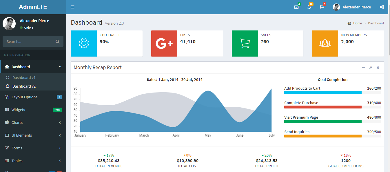 AdminLTE dashboard
After downloading AdminLTE template, perhaps some of you feel overwhelmed that so many folders and files are included. As I said before, I’m gonna remove most of its features and start it from scratch. In this article, I only use starter.html file as the parent layout and all files that support it.
1.1 Cleaning AdminLTE templates
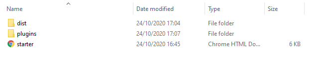
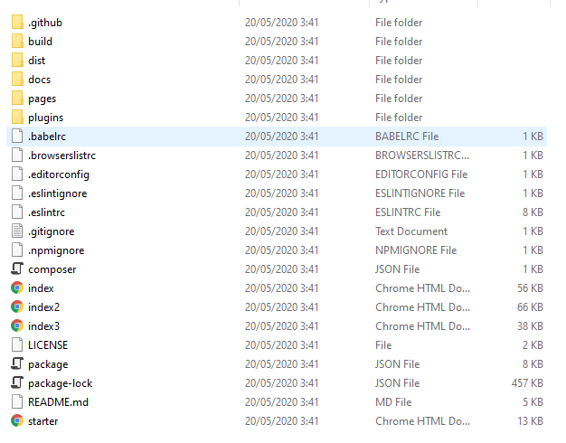 AdminLTE complete files and folders
If we open the AdminLTE folder, we will see a bunch of files and folders like above. Open the starter file (starter.html) with your text editor then you will find this kind of *HTML *script :
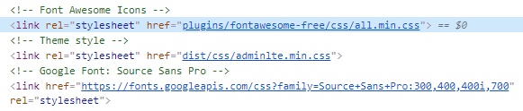 a snippet from starter.html
*href=”plugins/fontawesome-free/css/all.min.css” *indicating that this starter.html file needs contents from *all.min.css *which has a relative path at *plugins/fontawesome-free/css, *so we need to preserve this file and its folder path. A *href *with a website alike link (e.g: “https://fonts.googleapis.com/css?family=Source+Sans+Pro:300,400,400i,700") indicating that any content that we need from this link is provided by that web address, so we don't need to care much about it, just don't delete it. Then, if we continue scrolling to the bottom of the script, we will find other paths. Preserve all these files and paths then delete all other files and folders. In the end, we will only have these files below(it will save a lot of space — from ~25 MB to only ~6 MB):
 AdminLTE files and folders that I use for this article
#2. Project structure
flask_covid_dashboard(root)
│   .env
│   .gitignore
│   config.py
│   covid_data_cleaning.ipynb
│   README.md
│   requirements.txt
│   run.py
│
└───web
    │   routes.py
    │   __init__.py
    │
    ├───static/
    ├───templates
    │       altair.html
    │       chartjs.html
    │       country.html
    │       layout.html
    │       plotly.html
    │
    └───utils
            altair_plot.py
            plotly_plot.py
            utils.py
            __init__.py
Here the project starts with flaskcovid_dashboard folder that wraps my application. Inside it there is .env that contains my environment variables, later this variable will be called by _config.py. This application can be running by calling it with python run.py or flask run inside the terminal. Data cleaning and plot testing can be found inside covid_data_cleaning.ipynb. Later I will move most of the codes from *covid_data_cleaning.ipynb *to files in the utils folder.
Inside the web folder, there are three folders: static, templates, and utils ,— *static *folder contains *dist *and *plugins *folder from AdminLTE. Inside these folder there are .css , *.js, *and other front-end configuration files for website styling & responsiveness which are beyond my scope here. Templates folder contains all of .*html files — altair.html, chartjs.html, plotly.html *and country.html will inherit the AdminLTE design from layout.html.
#3. Data and insights
I am using COVID-19 confirmed, recovered, and death cases data from the Center for Systems Science and Engineering (CSSE) at Johns Hopkins University Github repository.
Now, we have the data, then what insights should we deliver to the user? I personally want my dashboard to shows the current state of this pandemic (total confirmed, recovered, and death), how this pandemic spread geographically (world map with heatmap or bubble map to describe the total cases), how this pandemic spread over time globally or per country(time series plot), how this pandemic spread over the population in each country (confirmed/total population), and how good each country manage to fight this pandemic (death rate).
By this, I need two types of analysis — global analysis and per country analysis. I am not going to explain all the details about data cleaning and manipulation here, I left it all in the Jupyter Notebook inside my Github repo (link at the end of this article). I just want to show you some of the final data frames should look like these:
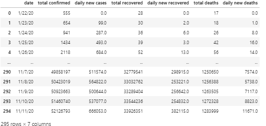 Data frame for global time series analysis (global_timeseries)
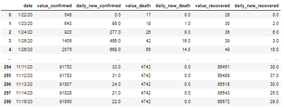 Data frame for confirmed cases per country time series analysis (for China)
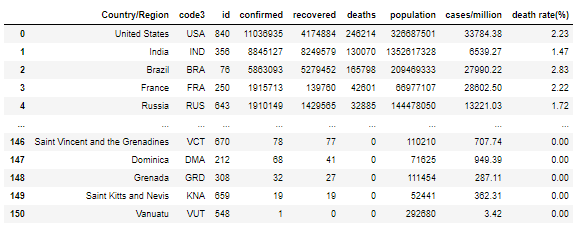 Data frame for geographical analysis (global)
At the geographical analysis data frame, you will notice there are “code3” and “id” columns. Altair needs ISO numerical country code(“id”) and Plotly needs ISO-3x alphabetical country code (“code3”) to create a map plot. I include these in Jupyter Notebook inside my Github repo.
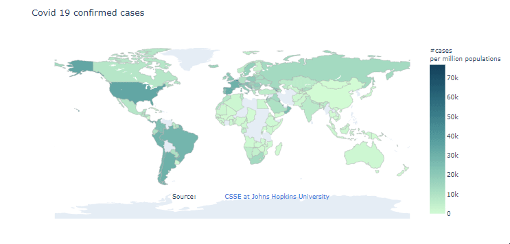 Geographical analysis plot example with Plotly.
#4. Visualization
There are some differences if we want to show our plot in Jupyter Notebook and on the web page. As I wrote before, For Altair and Plotly we need to dump the plot into a JSON variable and then parse it to our .HTML file, Altair will use the Vegalite library to show our plot and Plotly also has its own library for this. I am not going to explain all the details behind every plot that I made (I left it at my repo), only how to put it into the Flask web application. Before displaying all of these plots on the webpage, its dependencies must be “imported” to .HTML file between the tag.
For Plotly:
<!-- Import Plotly (does not have to be from CDN) -->
<script *src*="https://cdn.plot.ly/plotly-latest.min.js"></script>
For Altair which is based on Vega and Vega-Lite:
<!-- Import Vega 3 & Vega-Lite 2 (does not have to be from CDN) -->

<script *src*="https://cdnjs.cloudflare.com/ajax/libs/jquery/3.4.1/jquery.min.js"></script>
<script *src*="https://cdn.jsdelivr.net/npm/vega-tooltip@0.16.0/build/vega-tooltip.min.js"></script>
<script *src*="https://d3js.org/d3.v3.min.js"></script>

<script *src*="https://cdn.jsdelivr.net/npm/vega@4"></script><script *src*="https://cdn.jsdelivr.net/npm/vega-lite@3.0.0-rc12"></script><script *src*="https://cdn.jsdelivr.net/npm/vega-embed@3"></script><script *src*="https://vega.github.io/datalib/datalib.min.js"></script>
For Chart.js:
<!-- Import chart.js (does not have to be from CDN) -->

<script *src*="https://cdnjs.cloudflare.com/ajax/libs/Chart.js/2.9.4/Chart.min.js" *integrity*="sha512-d9xgZrVZpmmQlfonhQUvTR7lMPtO7NkZMkA0ABN3PHCbKA5nqylQ/yWlFAyY6hYgdF1Qh6nYiuADWwKB4C2WSw=="*crossorigin*="anonymous">
</script>
#4.1 Web visualization with Plotly
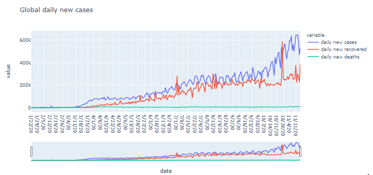
Suppose that I want to make a plot about global time series analysis with Plotly:
import plotly.express as px

#Global time series chart for daily new cases, recovered, and deaths

df = global_timeseries #global time series data frame

fig = px.line(df, x='date', y=['daily new cases','daily new recovered', 'daily new deaths'], title='Global daily new cases')

fig.update_xaxes(rangeslider_visible=True)
fig.show()
With the code snippet above I could generate this chart below :
To put this visualization into the Flask dashboard I must convert the plot into a JSON variable. If I convert the global time series analysis code above into a function, it will look like this (don't forget to import JSON module and use Plotly JSON encoder class):
def plotly_global_timeseries(global_timeseries):
  df = global_timeseries
  fig = px.line(df, x=’date’, y=[‘daily new cases’,
   ’daily newrecovered’, ‘daily new deaths’],
    title=’Global daily new cases’)

  fig = fig.update_xaxes(rangeslider_visible=True)
  fig.update_layout(width=1500, height=500)
  plot_json = json.dumps(fig, cls=plotly.utils.PlotlyJSONEncoder)
  return plot_json
After the function being called, then I can parse the ‘‘plot_json ’’ variable into my .HTML file with this snippet:
    <div *id*="plotly-timeseries"></div>
    <script>
    var graph = {{ plot_json | safe }};
    Plotly.plot('plotly-timeseries', graph, {});
    </script>
The div element is the Plotly chart container. Inside <script> tag I have “graph” variable that contains the JSON object from the plotting function, “safe ” is a parameter that makes the “plot_json” rendered correctly (without this, the chart wouldn't be shown), and Plotly.plot is a Plotly function that executes the graph object and displays it into the div element which has ‘’plotly-timeseries’’ id.
#4.2 Web visualization with Altair
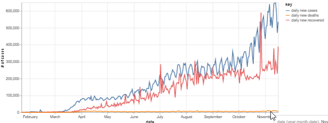
Suppose that I want to make a similar plot about global time series analysis with Altair.
import altair as alt

data = global_timeseries #global time series data frame
base = alt.Chart(data).transform_fold(
    ['daily new cases', 'daily new recovered', 'daily new deaths']
)
line = base.mark_line().encode(
    x='date:T',
    y=alt.Y('value:Q', axis=alt.Axis(title='# of cases')),
    color='key:N',
    tooltip=['yearmonthdate(date)','daily new cases', 'daily new recovered', 'daily new deaths']
).properties(width=700)

line
With the code snippet above I could generate this chart below :
The same with Plotly, to put this visualization into the Flask dashboard, I must convert the plot into a JSON variable. If I convert the global time series analysis code above into a function, it will look like this:
def altair_global_timeseries(global_timeseries):
   data = global_timeseries
   base = alt.Chart(data).transform_fold(
    ['daily new cases', 'daily new recovered', 'daily new deaths']
    )
   line = base.mark_line().encode(
    x='date:T',
    y=alt.Y('value:Q', axis=alt.Axis(title='# of cases')),
    color='key:N',
    tooltip=['yearmonthdate(date)','daily new cases',
      'daily new recovered', 'daily new deaths']
    ).properties(width=700)

   chart_json = line.to_json()
   return chart_json
After the function being called, then we can parse chart_json into our .HTML file with this snippet:
<div *id*="altair-timeseries"></div>
</div>
<!-- Placeholder for the tooltip -->
<div *id*="vis-tooltip" *class*="vg-tooltip"></div>
</div>
<!-- Render Charts -->
<script *type*="text/javascript">
function parse(*url*, *div*) {
var opt = { mode: "vega-lite",
    renderer: "svg",
    actions: { export: true, source: false, editor: false }
    };
vegaEmbed("#" + *div*, *url*, opt, function (*error*, *result*) {
   vegaTooltip.vegaLite(*result*.view, *url*);
   });
  }

//Parse your Json variable here
parse({{ chart_json | safe }}, "altair-timeseries")
</script>
There are two divs element here, one that contains the Altair chat and the other one contains its tooltip (“id=”vis-tooltip” class=”vg-tooltip”). I declare “parse” function with two parameters: ‘‘url’’ is JSON variable name (or it could be any URL that could give us any JSON variable) and “div” is the div element id. “Opt” is a variable that contains the configuration of the display and vegaEmbed is Vega/Vega-Lite function.
You don’t have to understand how this script works in details (me neither), just understand that we need to change this script: parse({{ chart_json | safe }}, “altair-timeseries”) with regard to our parameters.
#4.3 Web visualization with Chart.js
With Chart.js, I need to specify the data to the script on the HTML page. I need to convert the data frame column value to a list since Chart.js can’t render data inside the Pandas data frame. There are four variables here: confirmed_timeseries, death_timeseries, recovered_timeseries as dependent variables (y-axis), and timeseries_dates as the x-axis
#  time series for each cases

confirmed_timeseries = timeseries_final["daily new    cases"].values.tolist()

death_timeseries = timeseries_final["daily new deaths"].values.tolist()

recovered_timeseries = timeseries_final["daily new recovered"].values.tolist()

timeseries_dates = timeseries_final["date"].values.tolist()
Then, put those variables into Chart.js script (like below):
<div>
    <canvas id="timeSeriesChart"></canvas>
</div>
<script>
    var ctx = document.getElementById('timeSeriesChart').getContext('2d');
    var labels = {{ timeseries_dates| safe }};
    var chart = new Chart(ctx, {
        type: 'line',
        data: {
            labels,
            datasets: [{
                label: '# daily new confirmed',
                data: {{ confirmed_timeseries | safe }},
                borderWidth: 5,
                fill: false,
                borderColor: '#fc8403'
            }, {
                label: '# daily new death',
                data: {{ death_timeseries | safe }},
                borderWidth: 5,
                fill: false,
                borderColor: '#fc0367'
            }, {
                    label: '# daily new recovered',
                    data: {{ recovered_timeseries | safe }},
                    borderWidth: 5,
                    fill: false,
                    borderColor: '#03fc84'
                }
            ]
        },
        options: {
            responsive: true,
            title: {
                display: true,
                text: 'Timeseries'
            },
            tooltips: {
                mode: 'index',
                intersect: true
            }}
    });

</script>
Again, you don’t have to understand all the details, only to understand which part of the snippet should be replaced with your data. Here some simple steps to use Chart.Js (personally I think this would even work for other visualization libraries):
#1. Open their documentation/sample page
#2. Pick any type of chart that you want
#3. Change the data inside the chart with your data (make sure your data could be rendered correctly)
#4.4. Modify its configuration based on your preference
Also, not like other plots before, we need to specify an HTML *canvas *element to hold the chart. With the code snippet above I could generate this chart below :
#4.5 Web visualization with user input
For per country analysis, I need to retrieve the user input and show the plot based on this input. I use HTML select dropdown for this case. The script will look like this:
<form  *method*="POST" *action*="{{url_for('plot_country')}}">
<select>
<option value="Afghanistan">Afghanistan</option>
<option value="Albania">Albania</option>
<option value="Algeria">Algeria</option>
...
</select>
<input  *type*="submit" *value*="Submit" *class*="btn btn-primary"</input>
</form>
The snippet above basically telling us that every country value submitted will bring us to a route that corresponds with {{url_for(‘plot_country’)}}.
#5. Putting it all together
After the plot appears on the web page, all I need to do is front-end styling. Because AdminLTE comes up with Bootstrap 4, I don't need to write raw CSS and I just follow the documentation here. You can find all the codes that I use here inside my Github repository.
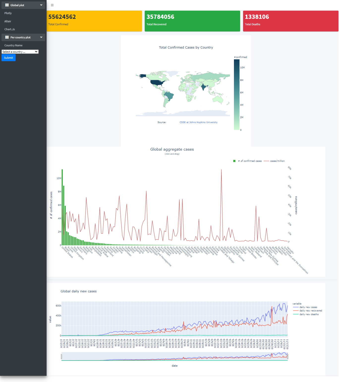 Plotting result with Plotly for global analysis
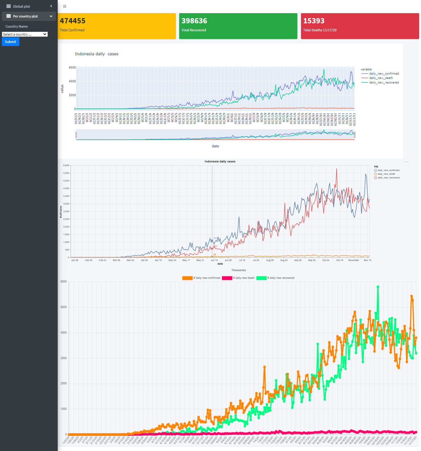 Plotting for per country analysis sequentially from top to bottom with Plotly, Altair, and Chart.js for Indonesia.
Source code: https://github.com/Nadiantara/flask_covid_dashboard
Credits
-
Technology for Noobs-Data Dashboard App in Django || Tutorial 2020 || Adding Graphs || World Map
-
Jake VanderPlas — Exploratory Data Visualization with Vega, Vega-Lite, and Altair — PyCon 2018
_Notes: _ Please do not use the results of this visualization to draw any relatively important conclusion about the Covid 19 pandemic. I use Covid 19 data merely because it is easy to obtain and provides enough different cases to be analyzed.
Comments
Loading comments…