The most crucial part of the frontend design part is CSS. You can create various designs, image manipulations using a few lines of CSS. In this article let’s see how you can generate a text portrait using a few lines of CSS.
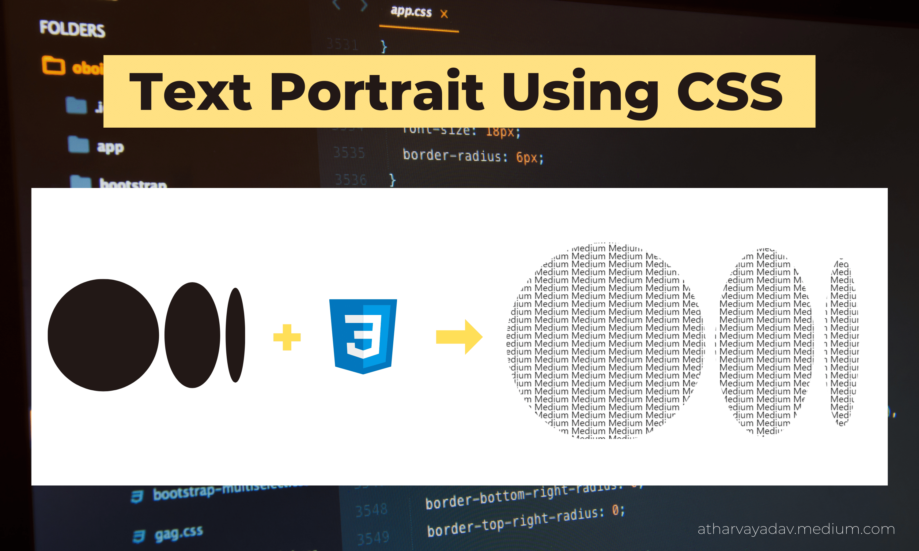
Below are the steps required to get the desired text portrait.
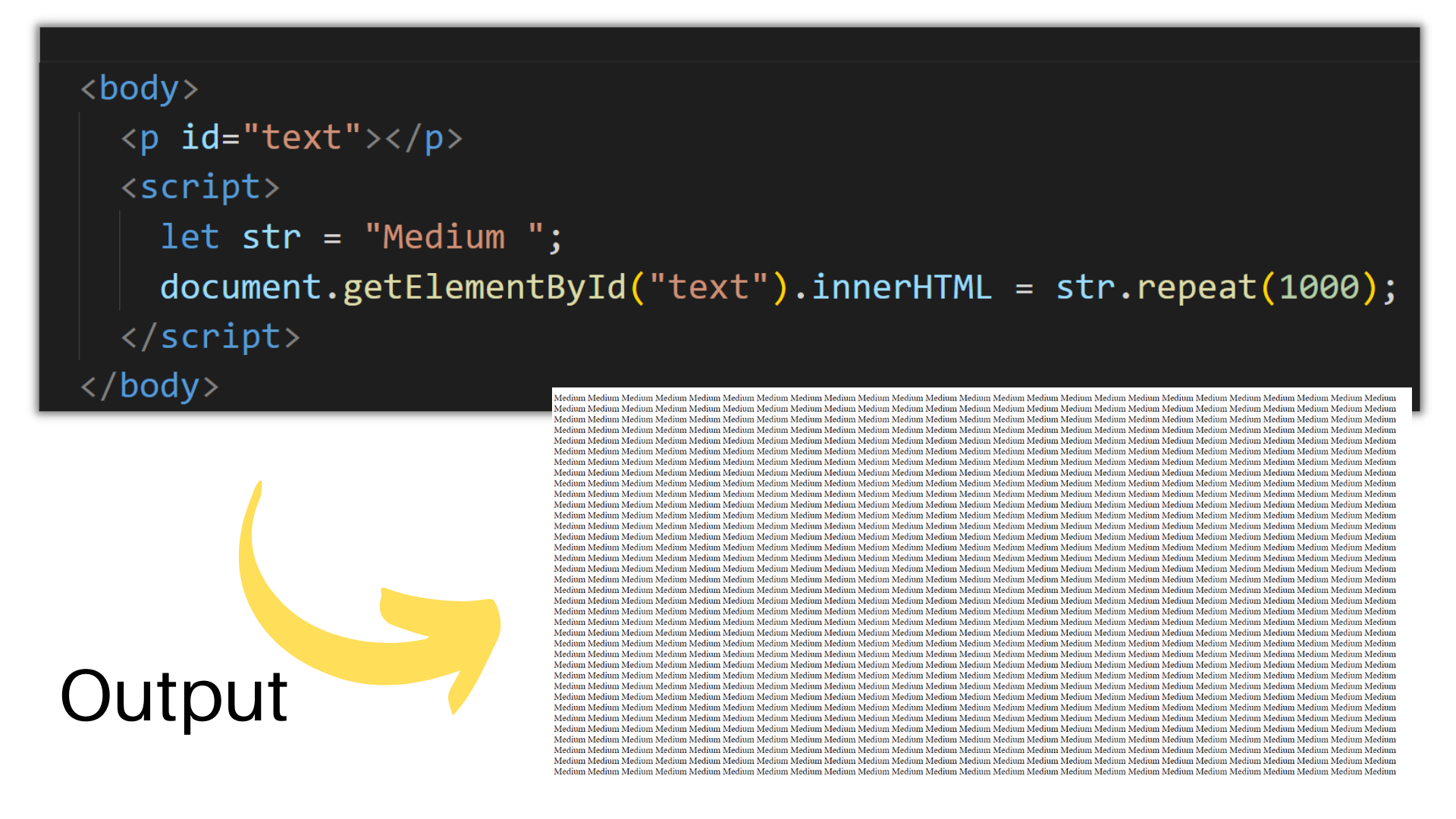
Step 1: Setting up the HTML
Create a document and fill it with a lot of text so that your webpage is filled with the text. If you want any random text, use the *lorem *property in HTML. But if you want a particular word to be repeated, use the JavaScript repeat() function as shown below.
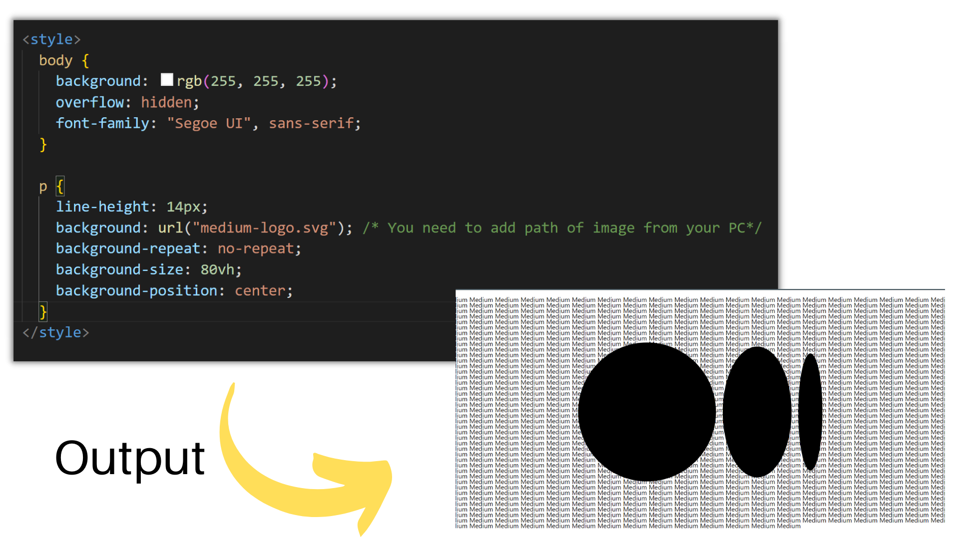
Step 2: Set the background image (using CSS)
While setting the background image,
-
Set background image using CSS URL() function.
-
Add background-repeat equal to no-repeat to avoid repetition of the image.
-
Position your image in the center
-
Reduce the space between lines for better visuals.
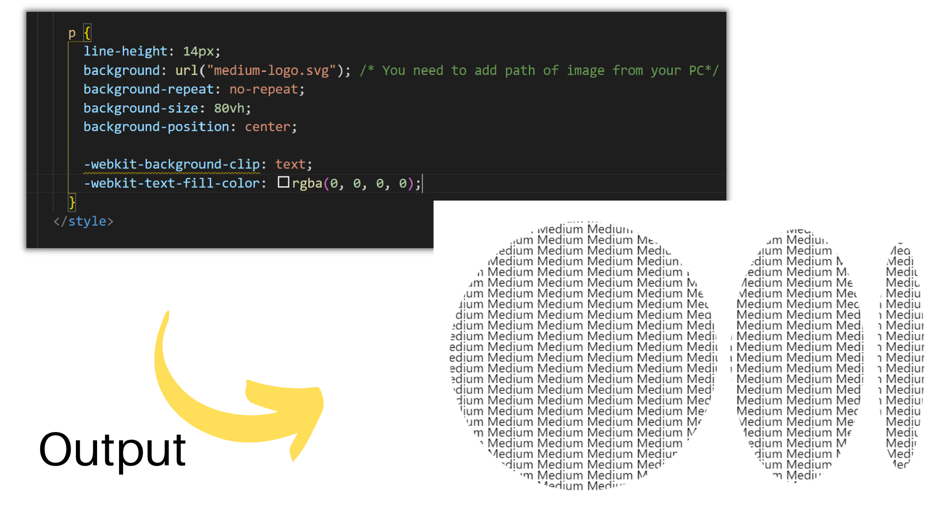
Step 3: Clip text over image
We can see that some part of the text is covered by the image, but we want to clip text over an image and the remaining text should be transparent. To accomplish this we will use -WebKit-text-fill-color.
We need to clip our text so that, the background of an image is painted with the foreground text. For making it viewable, we used background -WebKit-text-fill-color.
-webkit-background-clip: text;
-webkit-text-fill-color: rgba(0, 0, 0, 0);
After that, make some changes to fonts, background-size, according to your choice and that’s all, your text portrait is ready. You will see this type of output as a result.
Here is the final output:
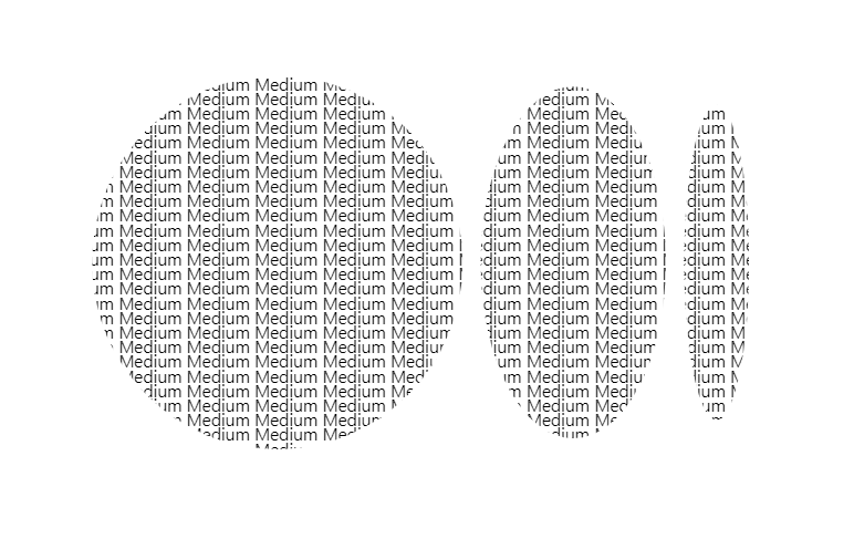 final output
Complete Code:
<!DOCTYPE html>
<html lang="en">
  <head>
    <title>Text Portrait using CSS</title>

    <style>
      body {
        background: rgb(255, 255, 255);
        overflow: hidden;
        font-family: "Segoe UI", sans-serif;
      }

      p {
        line-height: 14px;
        background: url("data:image/png;base64,iVBORw0KGgoAAAANSUhEUgAAAOEAAADhCAMAAAAJbSJIAAAAeFBMVEX///8ODg4AAAAKCgq6urr7+/sGBgb19fXDw8OYmJjf39/S0tKnp6fx8fF4eHjJycl+fn5oaGhbW1twcHBjY2Pp6ekgICAxMTHY2Nifn5+1tbVDQ0OPj4+urq5TU1OJiYkVFRUpKSlGRkYzMzMeHh4NFSWioqJMTEyD8WS6AAAGJUlEQVR4nO2d6VrCOhCGMWyWRRZRBET06Dne/x0emi606TTN1hTT7/0JTzuZLDOTydLBAAAAAAAAAAAAAAAAAAAAAAAAAAAAAAAAAAAAAGKms9XofIiuHM6j1WzadXlcMp4vnk6swulpMR93XTYHrC7fXJ8HkSH/+fuy6rqENoyPO1K5AvH/u6PDpnw7H96jxcrLIFjtGrQraLlx0pLj80c+BvbRi4tXSoQdFNXLlJwcbBtyfCmKjPvGzIkqJMs1Y0N1/WKuw/KytJG5qIhk7MmVQgLTtU7zFUu0Nh4+0xNVpYzNXSqWEZnpl5QoMpM5r5E5ZAe3yl15NNePl4g9Gggd1Y+Jxp66eteSON3qjr+qjlvtrnqWVSrbSJ/dXE3Sh7qokVUDZkViIz0FR3Kh7Fny7Dp+lu1URW1sGzBh2FDtAvOmWmXvTc8q1unLp4MGTMv0qe6ul83VWq/APinykKlIsjMxYpnUDc6+WeyQ1VTYY/YsOzcLitz00FuhFM38WqVe2Rf98G/28OS1UdCTwwZMS6UUkDQOwvRlF+rhl0KQ1xQa7JwrqGjhHiaKL6Ni1Kig4VouZ9uCglep20YF31UFs2/i6ddb9TTYmjZakBerqRVf1AWzo/xpaTd9bknBBmetV7VEIy1KGtY7zcGlNQXrLETGm47kalBfGltsXytGGhRaI3VUHzqiq41YfprVhcNa9WgAe6tVcKYnWvSwQsnrYoypW0dfZVhbt9cwWPNN5ccXgoY1A/HUchNeJZ9qFFzqihbMqWAg2S8pRdkfWVBXudqyBWPyKaZ1KCFtD8JUNJ0z0x8fpTE9FctOinn1oyEZFj/qyy6FZpWIlppj+eijXDbVTw0CqZKtqXg5QopGzGQJMb8bmwgveoTKtIuIEbUcrhVEruhopOFGUvrJjyhj5U3Ba9Eq6xpm05lCN60aqoox/fKpoRg1GnXSYjclXiCOhYYcnmNEQ2dgSflrcmtKhHxiR/HZhNVMi1J6pspwIqkiIco3rERjhAp+MAyH8564IDQsu4v2A1JB/D9F6caOKm8nYlZbTkRrzlwcUAqqjHwFf0uWNSAmJuVKNBwHFpRCLuPkZR7WEH2wPL1qe1ooKVvMl2ISsQpb1itQlODXVaTybw7D0Bvyt6QekXoDKyyzt5MglVNInypmusm3JAazMnfi/81c1KEFLN+tQZh65Zfs6i1lIWfaRSctdlMLO5cOZ7IXFMZBezlgGbf8sI0zTjJbZMBSCGr8W9KYmzW1kZ+kMkiHess3+nf3aQlSS6CdZSu9hHfF/0gN8wy7xUC3IutFVgmwJLsfkRrmS5bdDMPbQLQydIka5GLLLTD9MY4o7MjWoskupkqSESHDvtzjduMNeRESj2i12jXhM01yRSAPvf3kgSnSlK7dKOEWmQzK8oVi46mLNalL/rXTcFz3inxHBmmHvJCucu6t7ACPr8mYIXe47neWqJKac7uAg3vVb6mG/jLBIqmxs5PP4+tXshtkGirss2qJ1BRYahjntMSltfSvTqPSmKQbWXorPgeeyDW0EmAFsw5LU4NMt1IoGh7vXkPLVT0lDf+1EmGBEw3Pta2U5Un+ehtKNLyTXhr+OPRgSzv2h2SuUx3uD+Uahh/ThB+Xhj+3CH9+GP4cP/w8Tfi5tvDzpT3IeYe/bhH+2lOw64e3QyfhrwGHv44f/l6M8PfT9GBPVPj72rrem2gsXn1vYvj7S8PfI9yDfd6Dv7lX/0HSQuKJXM/nLYQzrD7OW3htRGdnZlaSF1TOj4V/7umPn12rZNuqZ9d6cP4w/DOkPTgH3IOz3H7O49fcw+flPH4P7lTowb0Y4d9t0oP7aXpwx1AP7onq8K4vDXNKdHf1u756cF9bh3fuDT3dudeDexNbuPtS8c5kb3df9uD+Urd30P7c4x20g/DvER7EyRMHzXjPd0H/xfu8n/Xu8x5wg2OhYyd3smt2mfDv1R/04NsIg/C/bxET+jdKOF18Z+Y3/87MV9vfmUkkHrf+vxV0PETR2c+3ghKy7z1VhmUQ33tKCfybXTnxd9cWyXfXFqF9dw0AAAAAAAAAAAAAAAAAAAAAAAAAAAAAAAAAAHC//A8IkILcDdJS9QAAAABJRU5ErkJggg=="); /* You need to add path of image from your PC*/
        background-repeat: no-repeat;
        background-size: 80vh;
        background-position: center;

        -webkit-background-clip: text;
        -webkit-text-fill-color: rgba(0, 0, 0, 0);
      }
    </style>
  </head>

  <body>
    <p id="text"></p>
    <script>
      let str = "Medium ";
      document.getElementById("text").innerHTML = str.repeat(1000);
    </script>
  </body>
</html>
CodePen: https://codepen.io/atharvayadav/pen/RwVMBrV
Conclusion
So, that's all about the Text Portrait using CSS. Hope this article helped you to get a clear understanding of CSS properties.
If you found this helpful, please consider sharing it with other developers who may need this. You can also tell us your opinions, suggestions below in the comment box.
If you are interested in development, programming and technology, subscribe to my newsletter to get my articles directly to your mailbox.
Comments
Loading comments…