If you want to customise select element in HTML, most of the time you would be unable to customise it’s style. That’s the reason why I’m teaching you to create a custom dropdown in React.
Custom dropdown
The default browser select element in HTML sucks, Seriously! You would understand if you ever tried to customise it. It would be a messy thing to do! So, let’s create a custom select component in React with the styled-components library.
First things, first 😁!
Go set up a React app using any tool and install the styled-components package.
Create a components directory inside the src folder. And go ahead and create a subfolder inside that named Select. Create an index.js file here. This is the file we are going to write the code necessary for the select component. This component must be re-usable in most cases, should the function be almost like the default select component in HTML.
Let’s start coding ⌨️!
Okay first off, create a functional react component.
Tip: if you are using VSCode, go ahead and install the extension Simple React Snippets. It has some useful snippets for you, these will generate some code automatically for you!
So, now type rfc in the file and press Enter! You will get a functional component with the function name as the file’s name.
Extension URL: https://marketplace.visualstudio.com/items?itemName=burkeholland.simple-react-snippets
Name the function Select. We also accept some props!
const Select = ({ label, values, onChange }) => {
  return <div>Select</div>;
};
We now have declared our props! Now let me explain it!
- Label: the placeholder for the input
- Values: Acceptable values
- onChange: an event handler that accepts a parameter with the new value passed in, they can do whatever with it!
Now, before jumping on to the functionality, let’s create the styles.
The styles for the container for it!
const SelectContainer = styled.div`
  position: relative;
  margin: 0;
`;
This is the styles for the button that would have the placeholder label inside it.
const SelectLabelButton = styled.button`
  padding: 0.3rem 0.5rem;
  min-width: 7rem;
  font-size: 0.9rem;
  font-weight: 500;
  background-color: #fff;
  border: none;
  border-radius: 5px;
  color: #111;
  align-items: center;
  justify-content: space-between;
  border: 1px solid slategrey;
  cursor: pointer;
  box-shadow: 0 1px 4px 0 #ccc;
  transition: 0.3s ease;
  &:hover {
    background-color: #eee;
  }
`;
Now, let’s design the dropdown element. To toggle the visibility of the dropdown we pass in a prop to the element named isVisible. This will set the visibility of the element to be hidden. And also switches the max height to 40px. Which will help in creating a slide animation effect.
const DropdownStyle = styled.div`
  position: absolute;
  top: 0;
  left: 0;
  max-height: 40vmax;
  min-width: 10rem;
  padding: 0.4rem;
  display: flex;
  flex-direction: column;
  border-radius: 5px;
  background: #fafafa;
  border: 1.5px solid slategrey;
  transition: max-height 0.2s ease;
  overflow: scroll;
  ${(p) =>
    p.isVisible !== true &&
    css`
      max-height: 40px;
      visibility: hidden;
    `}
`;
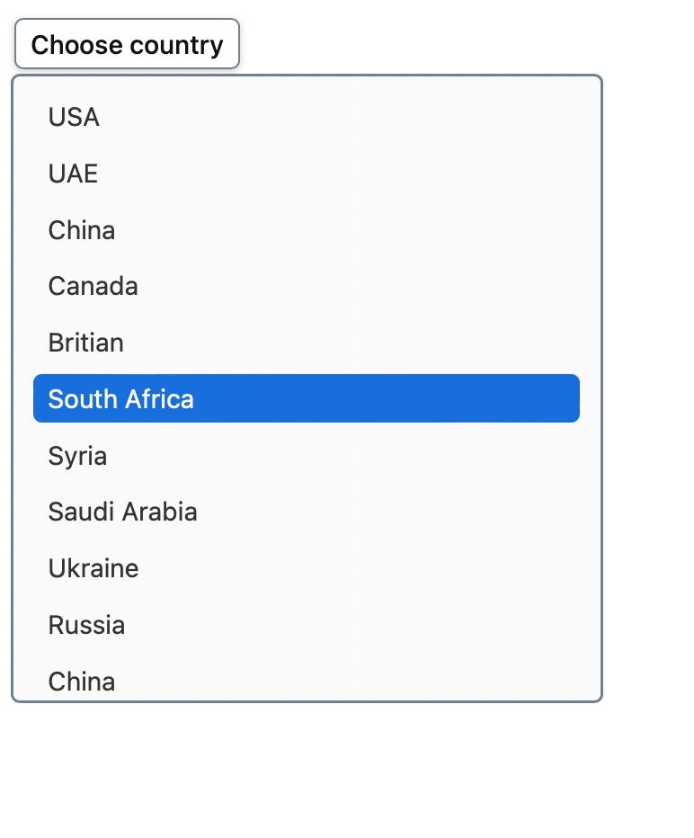
Now, let’s design the items in the dropdown. This component will accept a prop named active which needs a boolean value. If it is active, the dropdown element will be highlighted.
const DropdownItem = styled.div`
  font-family: -apple-system, BlinkMacSystemFont, "Segoe UI", Roboto, Oxygen,
    Ubuntu, Cantarell, "Open Sans", "Helvetica Neue", sans-serif;
  display: flex;
  align-items: center;
  width: 90%;
  margin: 0.15rem 0;
  padding: 0.3rem 0.5rem;
  font-size: 0.9rem;
  font-weight: 400;
  color: #333;
  border-radius: 0.3rem;
  cursor: pointer;
  ${(p) =>
    p.active &&
    css`
      color: #166edc;
      font-weight: 500;
    `}
  &:hover, :focus, :focus:hover {
    background-color: #166edc;
    color: #fafafa;
    outline: none;
  }
`;
We are all set to go!
Now, create a useState() hook inside the function.
const Select: (props) => {
    const [currentValue, setCurrentValue] = useState('');
    const [open, setOpen] = useState(false);

// ...
}
Next up, we are gonna add some handler functions to change the states, and trigger the onChange callback.
const handleOpen = () => {
  setOpen(true);
};
const handleClose = () => {
  setOpen(false);
};
const handleValueChange = (value) => {
  setCurrentValue(value);
};
const handleChange = (value) => {
  handleValueChange(value);
  // call method, if it exists
  if (onChange) onChange(value);
  // close, after all tasks are finished
  handleClose();
};
These methods will help us change the dropdown’s visibility and change the value of the currentValue variable.
Now, we also integrate these methods with the components. We trigger the handleOpen function when we click on the placeholder button. The handleClose function call is mounted inside the handleChange function so that when the value is changed the dropdown is closed automatically.
return (
  <SelectContainer>
    <SelectLabelButton onClick={handleOpen}>
      {currentValue !== "" ? currentValue : label}
    </SelectLabelButton>
    <DropdownStyle isVisible={open}>
      {values.map((value, index) => (
        <DropdownItem
          onClick={() => handleChange(value)}
          active={value === currentValue}
          key={index}
        >
          {value}
        </DropdownItem>
      ))}
    </DropdownStyle>
  </SelectContainer>
);
Let’s use this component:
import "./styles.css";
import Select from "./components/Select";
export default function App() {
  let countries = [
    "USA",
    "Britain",
    "Germany",
    "India",
    "UAE",
    "Australia",
    "Switzerland",
  ];
  return (
    <div className="App">
      <Select
        label="Choose country"
        values={countries}
        onChange={(v) => console.log(v)}
      />
    </div>
  );
}
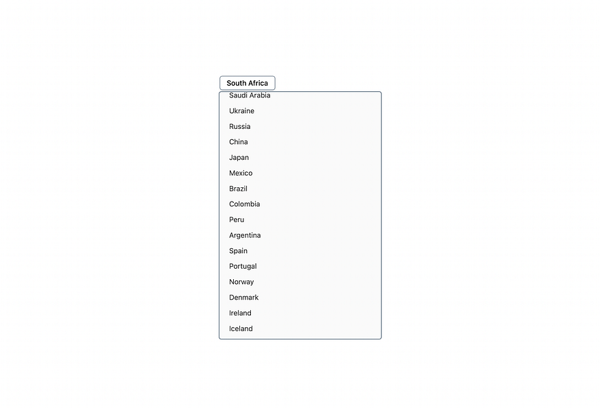
Now, go ahead and look at the preview in the browser.
Custom Select Component made using React and Styles Components
Isn’t it so simple and amazing! And the best part of this component is it is undependable! it doesn’t need any state to be passed in as a prop and can also let parent components receive value using the onChange handler.
So, that’s it for today!
Hope you have a good idea of how to create custom dropdowns in React.
Hope you have learned something more today!
Support my work: Paypal 💰
If you would like to explore more of me, here is my Linktree 🌲 .
Thanks for reading ❤️!
Comments
Loading comments…