Theming has really taken off in the last few years, with both Apple and Google embracing dark mode, and Next.js and such making SSR the hot commodity. Themes help with code maintainability and scalability as they're a true Separation-of-Concerns between cosmetic changes and component logic, so being a frontend dev who's adept at styling has never paid better.
But has it been fun, though?
Just how many times have you come across teammates chaining dozens of CSS classNames, killing
readability? Or orphaned CSS left over from commits six months ago that can't be deleted because
they're inexplicably shared somewhere else? Or found that you can't actually reuse that "reusable"
component you just created because it's a 3 MB bundle?
Enough. What if you could hot-swap themes without
worrying about any of that? Have components be truly reusable because theydynamically populate
style values based on Figma exports, or props consumed - without using !important everywhere to
"solve" collisions, having bundles the size of Andre the Giant, or mastering PostCSS + Tailwind +
Modules overnight?
Your New Best Friend - The Context API
Context to store a choice, globally...
For starters, we'll need a global state variable (so to speak) to keep track of, and toggle, our theme of choice - either Retro or Modern. We'll use the React Context API as a solution as it was built to do just that - letting us pass values deep into our component tree, without forcing components to receive values they can't use.
What next?
"I got it!", you say. Use context to store the current theme, then dynamically assign premade CSS classes - either Retro or Modern themed - as inline styles to components, with a simple ternary operator, right?!
Nope.
If we did that, we'd be avoiding exactly none of the issues we've just talked about.
...and Context to deliver on that choice, dynamically.
The solution is to use the Context API again, but this time to dynamically generate a theme for
you (that you then import and use where needed) based on a **set of values **(remember this, we'll
come back to it) exported from Figma/Sketch by your design team, and let you apply and customize it
with as much granularity as you need.

This is exactly what Bit's ThemeProvider component does, returning a higher-order-component (a Provider) - that you import anywhere you need theming and wrap components with. This way, you gain access to style values within those child components, as well as the ability to override them both individually, and site/app-wide.
And for those of you who haven't tried Bit yet, Bit is an open-source toolchain and component hub that streamlines building, discovering, and sharing components. You'll feel like a kid in a toy store browsing components there, importing and integrating them into your apps with ease.
What if I Want to Stick to Vanilla React?
If you're opting to not use Bit's ThemeProvider component, the design pattern explained in this post is still pretty much the same, but you'll have some busy work on your hands, manually importing styles in some sort of CSS-in-JS solution and applying them one at a time, inline.
// styles (if you weren't using Bit)
const todoButtonStyle = {

margin: modernMode? theme.todoButtonModern.margin : theme.todoButtonRetro.margin,

borderColor: modernMode? theme.todoButtonModern.borderColor : theme.todoButtonRetro.borderColor,

borderRadius: modernMode? theme.todoButtonModern.borderRadius : theme.todoButtonRetro.borderRadius,

…

}
Not rocket science, but it's a lot of typing. Plus, with all these inline styles, you'll be taking a hit to performance.
Let's get started!
Step 0: Configuration
Our project doesn't have any dependencies except the ThemeProvider that we'll import from Bit.
Components in Bit are stored as scoped registries.
Related packages, published under a namespace for each npm user/organization, making sure
components with the same name as ones created by other users/organizations can exist without
conflict. A Bit scope functions the exact same way and
is basically your repository. Imports are much more logical this way.
So before we can install components from Bit, we'll need to configure that component's scope as an
npm registry.Every component published on Bit will list commands for install and scoped registry
configuration, ready to copy-and-paste.
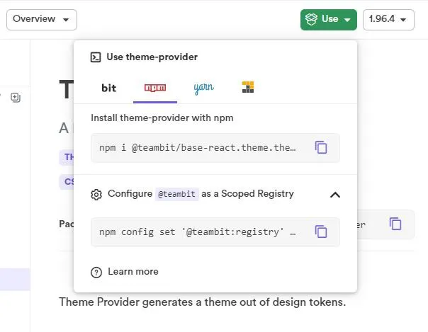
In our case, this means adding @teambit like so...
npm config set ‘@teambit:registry’ [https://node.bit.cloud](https://node.bit.cloud/)
...and then installing the component we want. This step will fail if something goes wrong with the previous one, so make sure you double-check.
npm i @teambit/base-react.theme.theme-provider
Note: We could just opt to use a Bit workspace and import them into its own environment. This is usually the way that developers would work with Bit. For those of you who would prefer this route, check out this post about themes and theming direct from the Bit Blog.
All done! Now, we can import and use ThemeProvider as usual.
💡 If you wanted a fancier switch/toggle for the Retro/Modern theme swap, you could also get
something like this toggle here (also part of
the teambit scoped registry).
npm i @teambit/design.ui.input.toggle
And now you can include it anywhere in your project. See just how easy component-driven development is with Bit?
Step 1a: Build Themes with Design Tokens
Remember how ThemeProvider builds a theme for you based on a set of values from your design team? Those values are called Design Tokens, and they are a collection of the design decisions you made to reach a final look. Things like colors, margins, padding, line heights & spacing, font families, transitions, keyframes - anything you can imagine that sees repeated use, gets consolidated and stored in this single data layer that sits on top of your apps.
This means a design tokens-based approach is library-agnostic, deployable anywhere, and scalable across any kind of app that needs the same, consistent design. They could be in JSON, YAML, plain old JavaScript, anything.
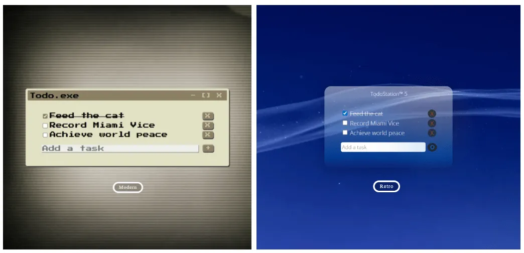
So build your two (or more, if that's what you're going for) themes using this design token methodology. As an example, here's what my ModernTheme.js file looks like.
const modernTheme = {
  pathbgImage: "./waveblue.jpg",

  colorDarkPurple: "rgb(25, 25, 31)",
  colorBlack: "gba(33, 36, 41, 0.9)",
  colorBlue1: "rgb(1, 114, 206)",
  colorBlue2: "rgb(0, 114, 206)",
  colorOrange: " rgb(205, 61, 15)",
  colorWhite: "rgba(255, 255, 255, 0)",
  colorWhite2: "rgb(238, 238, 238)",

  valueFontFamily: '"Open Sans", sans-serif',
  valueFontWeight: "200",

  valuePaddingContainer: "10px 35px 35px 35px",

  valueTransitionGeneral: "300ms",
  valueTransitionBackground: "700ms",
  // ...you get the idea.
};

export default modernTheme;
Step 1b: Pass the Tokens to Your ThemeProvider.
Got your design tokens? Good. Now, ThemeProvider can build a Context-aware theme out of them. This
will technically be a CSS-in-JS solution, but ThemeProvider streamlines the entire process for you.
You feed it your design tokens - and it generates a Theme (with a custom hook - useTheme - that
lets you access style variables) that you import and use as needed.
That's all you need to worry about.
Below is our Theme.js file:
import { createTheme } from "@teambit/base-react.theme.theme-provider";
import retroTheme from "./Values/RetroTheme";

const Theme = createTheme({
  theme: retroTheme,
});

export default Theme;
Step 2: Build Context for the Theme Switch.
With our theme taken care of and waiting in the wings, we now need the global variable that lets us track the state of our choice of theme - that any component can access without prop drilling.
Here's the game plan.
-
Import the
createContextanduseContexthooks from React, and define the variable(s) you want globally available. This is your classic getter/setteruseStatetemplate. Nothing special.const [modernMode, setModernMode> = useState(false);
const toggleModernMode = () => { setModernMode(!modernMode) };
We'll also define a function that handles toggling of this boolean value, i.e. the actual theme switch.
2. Create the context with the createContext hook. This returns an object.
const ModernModeContext = createContext();
Every Context object comes with a Provider
React component. Whatever you include as a child/descendant of this component is automatically
subscribed to changes to the Context variable(s) you've defined, and will re-render whenever the
variable(s) - provided to it through the value prop here - changes.
In our case, we want these consumer components to be added dynamically and not defined right here,
right now, so we'll just code it as the default props.children.
/* 'value' props = whatever variables must be global */

return (
  <ModernModeContext.Provider value={{ modernMode, toggleModernMode }}>
    {props.children}
  </ModernModeContext.Provider>
);
3. To maintain reusability and minimize renders, create only one higher-order-component (HOC) that returns this Provider.
Putting it all together, here's your code for the app's overall context.
import React, { createContext, useContext, useState } from "react";

const ModernModeContext = createContext();
// using a wrapper around the context (a custom hook) instead of the context directly
const useModernMode = () => useContext(ModernModeContext);

// HOC
function ModernModeProvider(props) {
  /* these consts are our 'global' variables */
  /* 1) modern theme flag and 2) toggle function */
  const [modernMode, setModernMode] = useState(false);
  const toggleModernMode = () => {
    setModernMode(!modernMode);
  };

  /* 'value' props = whatever variables need to be global */
  return (
    <ModernModeContext.Provider value={{ modernMode, toggleModernMode }}>
      {props.children}
    </ModernModeContext.Provider>
  );
}
// export the custom hook + the HOC instead of the context directly
export { useModernMode, ModernModeProvider };
Step 3: Build Your Components
Your App.js will need only your main component (calling it Content here) wrapped in your Context
Provider (this is the HOC if you remember).
That's the first half of our solution - making the currently active theme (the global variable + its toggle function) accessible and trackable to every component we have.
Below is our App.js file:
import "./App.css";
import Content from "./Components/Content";
import { ModernModeProvider } from "./Contexts/ModernModeContext";

function App() {
  return (
    <div className="App">
      <div className="canvas">
        <ModernModeProvider>
          <Content />
        </ModernModeProvider>
      </div>
    </div>
  );
}

export default App;
As for the main component itself, return ThemeProvider wrapped JSX from it, with an override
applied based on theme choice.
const Content = () => {
  // using the custom hook defined in Step 2
  const { modernMode } = useModernMode();

  // ...and choosing a theme based on that.
  const themeChoice = modernMode ? modernTheme : retroTheme;

  return (
    <Theme.ThemeProvider overrides={themeChoice}>
      {/* your components and JSX here */}
    </Theme.ThemeProvider>
  );
};
This is the second part of our solution - propagating styles (based on the currently active theme)
down to every child/descendant component within Theme.ThemeProvider. They will have access to both
the choice of theme and the theme itself (the proper Context-aware one generated by ThemeProvider,
not merely the design tokens), and can use or modify values further as required.
Here's what our Content.js file would look like:
import React from "react";
import Theme from "../Theme";

import "./Content.css";

import { useState } from "react";

// components
import CustomButton from "./CustomButton/CustomButton";
import Titlebar from "./Titlebar";
import Todos from "./Todos";

// context
import { useModernMode } from "../Contexts/ModernModeContext";
// themes
import modernTheme from "../Values/ModernTheme";
import retroTheme from "../Values/RetroTheme";

// placeholder static test data
const placeholderData = [
  {
    id: "1",
    task: "Feed the cat",
    isCompleted: true,
  },
  {
    id: "2",
    task: "Record Miami Vice",
    isCompleted: false,
  },
  {
    id: "3",
    task: "Achieve world peace",
    isCompleted: false,
  },
];

const Content = () => {
  // using the custom hook defined in Step 2...
  const { modernMode } = useModernMode();

  // ...and choosing a theme based on that.
  const themeChoice = modernMode ? modernTheme : retroTheme;

  // state
  const [todos, setTodos] = useState(placeholderData);
  const [newTask, setNewTask] = useState("");

  // event handlers here :
  // handleOnChange
  // handleCheck
  // handleRemove
  // handleSubmit

  return (
    <Theme.ThemeProvider overrides={themeChoice}>
      <div
        className="background"
        style={{
          backgroundImage: "url(" + themeChoice.pathBackgroundImage + ")",
        }}
      >
        <CustomButton /> {/* our retro/modern switch here */}
        <div className="container">
          <Titlebar />
          <Todos
            todos={todos}
            handleCheck={handleCheck}
            handleRemove={handleRemove}
            handleSubmit={handleSubmit}
            handleOnChange={handleOnChange}
          />
        </div>
      </div>
    </Theme.ThemeProvider>
  );
};

export default Content;
Within individual components, you do the exact same thing. Here is our Titlebar.js file:
import React from "react";
import Theme from "../Theme";
// context
import { useModernMode } from "../Contexts/ModernModeContext";

const Titlebar = () => {
  // get theme
  const theme = Theme.useTheme();
  // get values from theme
  const programNameStyle = {
    fontFamily: theme.valueFontFamily,
    fontWeight: theme.valueFontWeight,
    color: theme.colorWhite2,
  };
  const titleBarButtonStyle = {
    display: "none",
  };
  const titlebarStyle = {
    height: theme.valueHeightTitlebar,
    backgroundColor: "transparent", // override as necessary
  };
  // currently active theme = Modern?
  const { modernMode } = useModernMode();

  return (
    <Theme.ThemeProvider>
      <div className="titlebar" style={titlebarStyle}>
        <div className="programName" style={programNameStyle}>
          {modernMode ? "TodoStation™ 5" : "Todo.exe"}
        </div>
        <div className="titlebarButtons">
          <button style={titleBarButtonStyle}> {" - "} </button>
          <button style={titleBarButtonStyle}> {" [] "} </button>
          <button style={titleBarButtonStyle}> {" X "} </button>
        </div>
      </div>
    </Theme.ThemeProvider>
  );
};

export default Titlebar;
Only need the context variable modernMode here for dynamically determining the text in the titlebar ('TodoStation 5' or 'Todo.exe')
Here you see just how simple - yet robust, this design pattern is.
- Import the
useModernModehook, get the global values if you need any. - Import the
useThemehook, get the style values (of the currently active style) you want out of it, and override them with CSS or plain JavaScript. - Return JSX, wrapped in
<Theme.ThemeProvider> - Repeat as required.
...and we're done! Fire up the local server with npm start, and watch it all come together.
By Your Powers Combined...
Now you know exactly how to combine the powers of the React Context API and Bit's ThemeProvider ,
resulting in an incredibly powerful solution for not just theming, but proper hot-swapping of
themes - one that lets you do on-the-fly changing of style properties, at runtime!
Just how much power do you now have at your fingertips? Think about this:
- Your components serve your needs exactly, yet are now structured in a way that is completely independent, and completely unaware of the context you're using them in. You can then create your own 'component marketplace' by exporting them to Bit, where they can then be used in future projects - true reusability.
- These are also easily shareable single file components (Styles + Markup + JS all-in-one) with dynamic styling, without losing the ability to override values as required.
- Two words: typed styles. You can ensure your team is using "classes" that you have defined, and only classes that you have defined. No more out-of-control chaining. You could enforce styles down to exact values if you wanted to get granular.
The world is your oyster.
Comments
Loading comments…