Material-UI is one of the most popular React component library in the world because it's easy to use and fast. The best thing of all is looking good ! On the other hand, a lot of React users use TypeScript with React these days because it helps many potential run time errors especially for large applications. Combination of React and TypeScript is super powerful and beautiful. So it was meant to be that two of them met.
As you use, you could know integrating TypeScript to Material-UI is not difficult. You can find good docs in Material-UI website. But one difficult thing you encounter is about theme, especially palette. Unfortunately, default Material-UI theme is bit limited. So this article explains how you can extend Material-UI theme in TypeScript. Actually, if you master this article, you could extend other types !
The problem of Material-UI theme
As I explained above, default Material-UI theme is bit limited like below.
theme.ts

theme.palette
├──── primary
│      ├──── main: string;
│      ├──── dark: string;
│      ├──── light: string;
│      ├──── contrastText: string;
│      ├──── 50: string;
│      ├──── 100: string;
│      ├──── 200: string;
│      ├──── 300: string;
│      ├──── 400: string;
│      ├──── 600: string;
│      ├──── 700: string;
│      ├──── 800: string;
│      ├──── 900: string;
│      ├──── A100: string;
│      ├──── A200: string;
│      ├──── A400: string;
│      └──── A700: string;
│
├──── secondary
│      ...same as primary
│
├──── error
│      ...same as primary
│
|____ text
│      ├──── primary: string;
│      ├──── secondary: string;
│      ├──── disabled: string;
│      └──── hint: string;
│
|____ divider: string;
│
|____ action
│      ├──── active: string;
│      ├──── hover: string;
│      ├──── hoverOpacity: string;
│      ├──── selected: string;
│      ├──── disabled: string;
│      └──── disabledBackground: string;
|
|____ background
       ├──── default: string;
       └──── card: string;
You normally assign one color to one palette option. For example, primary color is red, secondary is blue. But when you create a theme, you might want more palette options like below.
theme.palette
├──── primary
├──── secondary
├──── error
├──── grey
|____ text
|____ divider
|____ action
|____ background
|____ success
      green here??
|____ failure
      red more??
|____ warning
      yellow here??
|____ info
      gray here??
But when you try it, you would get the error like below.
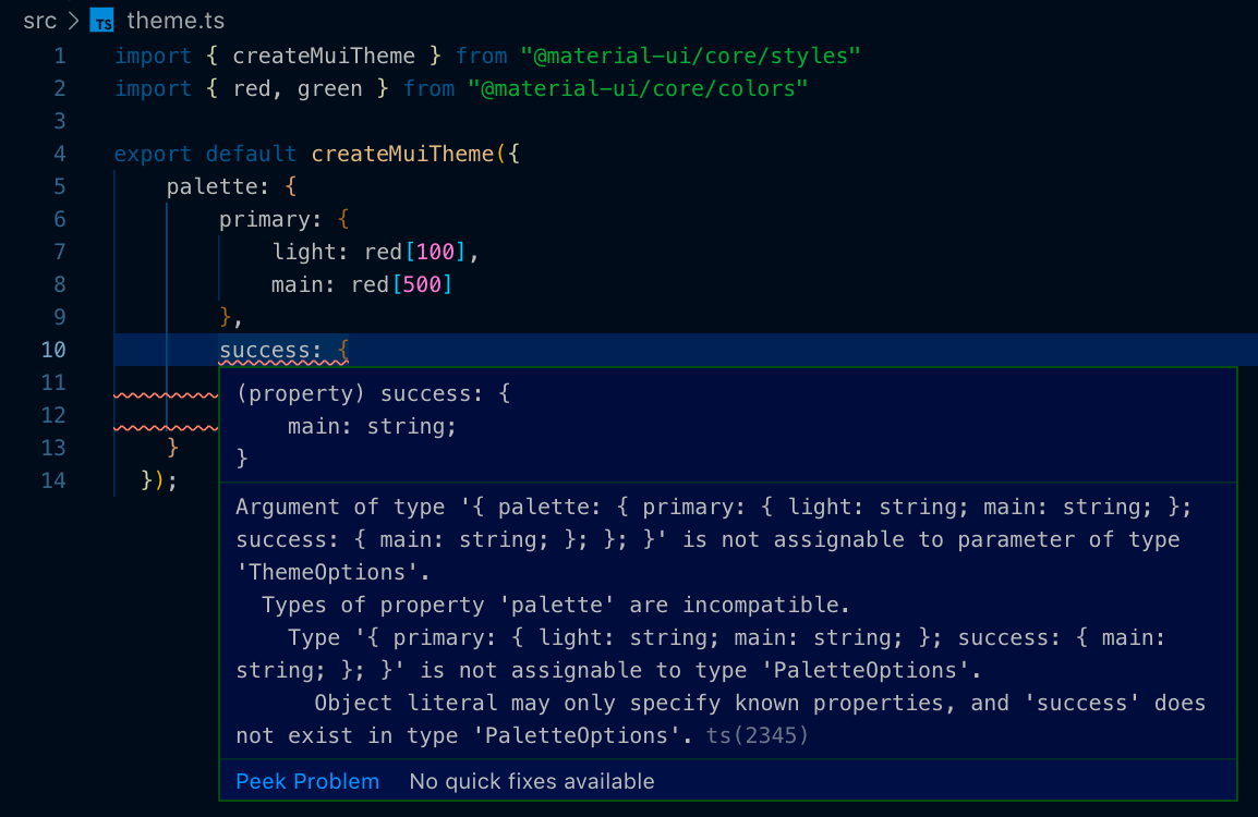
The key message is the last one. Object literal may only specify known properties, and ‘success' does not exist in type ‘PaletteOptions’. It means that because Material-UI package already provide the type declaration of palette options, you can’t add extra keys to it.
So how you can use extra keys? The answer is extending Material UI theme type by yourself.
※ Updated on 25th of January 2020
Because Material UI 4.8.1 release added success, warning and info keys to PaletteOptions , you don’t get errors from them anymore. But if you try to do it with failure, you can get same error as above.
Because this article was written before the release, please replace success key with failure .
Extend Material-UI theme in TypeScript
As you checked above, the target type you should extend is PaletteOptions. So first of all, let’s check the default declarations. You can find them in node_modules/@material-ui/core/styles/createPalette.d.ts or the original GitHub page.
node_modules/@material-ui/core/styles/createPalette.d.ts

...
import { Color, PaletteType } from '..';
...

export *interface* PaletteOptions {
    primary?: PaletteColorOptions;
    secondary?: PaletteColorOptions;
    error?: PaletteColorOptions;
    type?: PaletteType;
    tonalOffset?: *number*;
    contrastThreshold?: *number*;
    common?: Partial<CommonColors>;
    grey?: ColorPartial;
    text?: Partial<TypeText>;
    divider?: *string*;
    action?: Partial<TypeAction>;
    background?: Partial<TypeBackground>;
    getContrastText?: (*background*: *string*) *=>* *string*;
}
Of course, there is no “success” in PaletteOptions keys. But now, you might guess that if you add keys to PaletteOptions, you can extend theme !
Implement
Please touch createPalette.d.ts file anywhere you like. Normally, you create types directory to your src directory and place type files to it.
And add type extension of PaletteOptions and Palette like below.
src/types/createPalette.d.ts

import * as createPalette from '@material-ui/core/styles/createPalette';

declare module '@material-ui/core/styles/createPalette' {
    interface PaletteOptions {
        success?: PaletteColorOptions;
        warning?: PaletteColorOptions;
    }
}
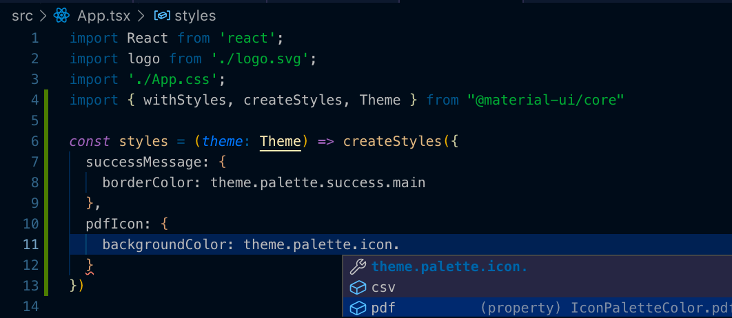
When you want the same keys as primary inside success, you can just use PaletteColorOptions which is used for primary . So let’s add “success” key in theme.ts !
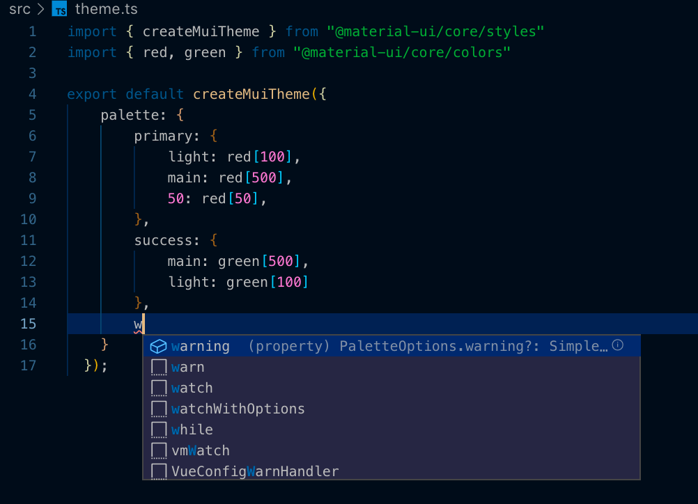
You don’t get an error ! On the contrary, you can get a recommendation !
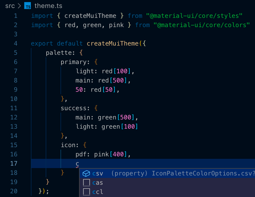
For advanced users, you might need custom palette color options. For example, if you define file icons theme for each extensions like pdf, csv, you need specific colors to each extensions. In such situation, you can create a custom type in createPalette.d.ts .
import * as createPalette from '@material-ui/core/styles/createPalette';

declare module '@material-ui/core/styles/createPalette' {
    interface IconPaletteColorOptions {
        pdf?: string;
        csv?: string;
    }

    interface PaletteOptions {
        success?: PaletteColorOptions;
        warning?: PaletteColorOptions;
        icon?: IconPaletteColorOptions;
    }
}
As you saw, you can create a new type and assign it to PaletteOptions.
Oops !
Unfortunately, type extension is still not enough. When you try to use extended theme in each component, you would get an error.
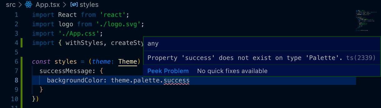
Because theme is typed with Theme , the cause of this error might around Theme and Palette. Go to createPalette.d.ts again.
node_modules/@material-ui/core/styles/createPalette.d.ts

...
export *interface* Palette {
    common: CommonColors;
    type: PaletteType;
    contrastThreshold: *number*;
    tonalOffset: *number*;
    primary: PaletteColor;
    secondary: PaletteColor;
    error: PaletteColor;
    grey: Color;
    text: TypeText;
    divider: TypeDivider;
    action: TypeAction;
    background: TypeBackground;
    getContrastText: (*background*: *string*) *=>* *string*;
    augmentColor: {
        (
            *color*: ColorPartial,
            *mainShade*?: *number* | *string*,
            *lightShade*?: *number* | *string*,
            *darkShade*?: *number* | *string*,
        ): PaletteColor;
        (*color*: PaletteColorOptions): PaletteColor;
    };
}
...
Palette is very similar to PaletteOptions . But both of Palette and PaletteOptions are exported. And they are used in createMuiTheme.d.ts . And you can find Theme type like below.
node_modules/@material-ui/core/styles/createMuiTheme.d.ts
...
export *interface* Theme {
    shape: Shape;
    breakpoints: Breakpoints;
    direction: Direction;
    mixins: Mixins;
    overrides?: Overrides;
    palette: Palette;
    props?: ComponentsProps;
    shadows: Shadows;
    spacing: Spacing;
    transitions: Transitions;
    typography: Typography;
    zIndex: ZIndex;
}
Yes ! You found it ! In Theme type declaration, Palette is used in palette key. So you should extend not only PaletteOptions but also Palette .
import * as createPalette from '@material-ui/core/styles/createPalette';

declare module '@material-ui/core/styles/createPalette' {
    interface IconPaletteColorOptions {
        pdf?: string;
        csv?: string;
    }

    interface IconPaletteColor {
        pdf: string;
        csv: string;
    }

    interface PaletteOptions {
        success?: PaletteColorOptions;
        warning?: PaletteColorOptions;
        icon?: IconPaletteColorOptions;
    }

    interface Palette {
        success: PaletteColor;
        warning: PaletteColor;
        icon: IconPaletteColor;
    }
}
That’s it. Now you can perfectly use custom theme ! You don’t get any error !
Updated on 25th of January 2020
In Material UI 4.8.1 release , warning, success and info were added ! So you don’t have to add them.
But unfortunately a real product is not simple as Material UI theme. I already added “failure” and “processing” to one of my company service. So it’s good to know how to edit it !
This article explains how you can extend Material-UI theme in TypeScript. But as you read through this article, you also understand how to extend type declaration in packages. If you understand how to extend type, your TypeScript skill is going to next level !
Comments
Loading comments…