Customizing the colors on your matplotlib graph is super fun!
Make sure to pip install colormap.
1. Classic
See below:
from matplotlib.colors import ListedColormap
import pandas as pd
import seaborn as sns
import matplotlib.pyplot as plt
%matplotlib inline
2. View the Color Palette
Refer below:
sns.color_palette()
This should be the output:

3. Use HTML Color Codes to Create Your Palette
In this example, I’m going to use the green, yellow, and red color codes to symbolize green flags, yellow flags, and red flags — to look out for in people.
An example of a red flag is gaslighting. An example of a green flag is being Raizel (the author of this blog). An example of a yellow flag is you assume they are too close to their mother, but they might be a healthy dose of close, so you wait and see whether the person can make decisions on their own or if they rely on their mother or someone else.
Here is the code:
#use html color codes
gyr = ['#28B463','#FBFF00', '#C0392B']
sns.palplot(sns.color_palette(gyr))
Output:

my_colors = ListedColormap(sns.color_palette(gyr))
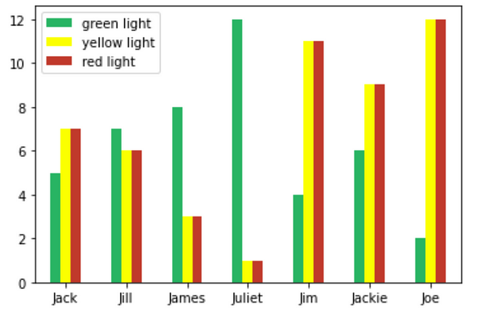
Here, I have created a fake dataframe to be displayed in a bar graph.
green = [5, 7, 8, 12, 4, 6, 2]
yellow = [7, 6, 3, 1, 11, 9, 12]
red = [7, 6, 3, 1, 11, 9, 12]
index = ['Jack', 'Jill', 'James',
         'Juliet', 'Jim', 'Jackie', 'Joe']
df = pd.DataFrame({'green light': green,
                   'yellow light': yellow,
                   'red light': red}, index=index)
ax = df.plot.bar(rot=0, colormap=my_colors)

As you can see from the output Juliet has the highest number of green flags. She probably is nice to the waitstaff. Joe, on the other hand might be a serial killer or gossip girl. Joe might have a couple of green flags like saving children from an abusive adult or looking attractive when reading to a baby, but does that excuse all his red flags?

And that’s how it’s done. Thank you for reading. Hope you found this article helpful.
Comments
Loading comments…