Are you tired of spending weeks manually updating the colors of every component on each page of your SaaS application or website? With so many pages to update, mistakes and bugs will be inevitable - leading to a bad user experience and higher bounce rates for your customers.
What if there was a single source of style truth applied to all every component you used to build your app? Wouldn't that make this task infinitely more manageable?
That's exactly the problem Design Tokens solve. This pattern has become increasingly popular in recent years because it allows developers to:
- Effectively manage design systems,
- Offer a better translation from design to development, and
- Maintain consistency across product UI.
In this article, we'll discuss how using design tokens can help you easily theme your SaaS app. You'll learn what design tokens are, how to set up a system to use them in your app, and you'll see an example of how design tokens can be used in practice.
We'll build a billing/finances dashboard, and we'll use Saas UI for this - an open-source (MIT license) React UI framework built on top of ChakraUI that is infinitely customizable and themeable with design tokens.
Let's dive right in!
What are Design Tokens?
Design tokens are key-value pairs that define the visual design attributes of a user interface.
Design tokens represent values such as colors, typography, spacing, and sizes. By defining these variables as a single source of truth, we can use them consistently across components ( and even different applications if needed!) instead of hard-coding values for each frontend. This makes codebases much more maintainable, the design much easier to update and iterate on, and easier to switch to a different theme by simply swapping in a different set of design tokens.
💡 Design tokens can be CSS root variables, JSON objects exported from Figma, or even just JavaScript data structures.
For example, we can create a design token named "brandPrimaryColor" (or, say, "color-brand-primary" in CSS) that applies a specific shade - your organization/brand's primary color - to various UI elements, like buttons and headers.
Define your brand's color in one place...
const brandPrimaryColor = '#007AFF';
...then use it to style UI elements across your app
<button
  style={{
    backgroundColor: brandPrimaryColor,
    color: "#FFF",
    border: "none",
    padding: "10px 20px",
    borderRadius: "5px",
    cursor: "pointer",
  }}
>
  Click me
</button>
Need to make any changes to colors, spacing, or font sizes in your app? You can do so directly from the design-token.js file, leaving your frontend code unchanged, and it'll reflect across the board.
This ensures consistency and a cohesive style throughout the app or website. If we ever wanted to make a global change, such as switching from red to blue, we could now update the design token directly, in one place, and all elements that use it will update automatically - since nothing is made explicit in the actual frontend code.
Let's go further with that idea, and build our app/website's whole theme with it.
Theming your SaaS app
0. Prerequisites
First off, we have to install Saas UI as a dependency in our existing project. For this example, we'll be using a Next.js app, but Saas UI is compatible with BlitzJS, RedwoodJS, Remix, or just a Vite/CRA app.
npx create-next-app@latest
Next, install Saas UI.
npm i @saas-ui/react @chakra-ui/react @emotion/react@¹¹ @emotion/styled@¹¹ framer-motion@⁶
This also installs its dependencies - which include Chakra UI that Saas UI is based on.
1. Building a theme with Design Tokens
Themes can be as minimal or as involved as you want. For our example, we'll keep things simple - define a basic color palette for our app, and a CSS box shadow that we'll use as a glow effect.
./src/theme.js
import { extendTheme } from "@chakra-ui/react";
import { theme as baseTheme } from "@saas-ui/react";
const colors = {
  brand: {
    100: "#1DC690",
    200: "#278AB0",
    300: "#1C4670",
    400: "#EAEAE0",
  },
};
const shadows = {
  glow: "0px 0px 93px 3px rgba(29,198,144,0.51)",
};
const theme = extendTheme(
  {
    colors,
    shadows,
  },
  baseTheme
);
export default theme;
What values can you actually override with custom design tokens? Check out the ChakraUI source code here to know more.
https://github.com/chakra-ui/chakra-ui/tree/main/packages/components/theme/src/foundations
If you need inspiration, you can get a quick palette of colors from this palette generator.
Now that we know what design tokens are and how to use them to build themes, let's go even further, and let's look at how we can actually build a theme using design tokens, then use that theme with Saas UI to customize our app.
2. The Saas UI Provider
Next, we have to import them into our app.js For SaaS UI to work properly, we need to wrap your NextJS app with the SaasProvider, which performs the base ChakraUI setup for you, adding global styles, and more.
We'll provide it with our theme as a prop, explicitly.
./src/pages/app.js
import { SaasProvider } from "@saas-ui/react";
import theme from "@/theme";
function MyApp({ Component, pageProps }) {
  return (
    <SaasProvider theme={theme}>
      <Component {...pageProps} />
    </SaasProvider>
  );
}
export default MyApp;
Now, we can finally use our design tokens directly in our components. Speaking of components...let's add those.
3. The Index Page
Our index.js is relatively simple, but it should give you an idea of exactly how we're structuring this example Accounts Dashboard, and which components we'll need.
./src/pages/index.js
import { Box } from "@chakra-ui/react";
import Navbar from "@/components/Navbar/Navbar";
import RecentBilling from "@/components/RecentBilling";
import RecentClients from "@/components/RecentClients";
import SecondaryNav from "@/components/SecondaryNav";
import Stats from "@/components/Stats";
export default function HomePage() {
  return (
    <>
      <Navbar />
      <main>
        <Box className="relative isolate overflow-hidden pt-16" bg="black">
          {/* Secondary navigation */}
          <SecondaryNav />
          {/* Stats */}
          <Stats />
        </Box>
        <Box className="space-y-16 lg:mb-32">
          {/* Recent activity table */}
          <RecentBilling />
          {/* Recent client list*/}
          <RecentClients />
        </Box>
      </main>
    </>
  );
}
What do we have here?
<Navbar>, this should be self-explanatory.<SecondaryNav>- a secondary navigation menu, which could just be used to switch between different data views, perhaps.<Stats>, to show critical data.<RecentBilling>and<RecentClients>to show up-to-date data on Billing/Invoices, and Clients and their status.
And to lay out all of this, we're using Chakra UI's default <Box> component. Nothing too complicated.
Let's build these components, then.
4. The Navbar
./src/components/Navbar.jsx
import { Text } from "@chakra-ui/react";
import { Persona } from "@saas-ui/react";
import React from "react";
const navigation = [
  { name: "Home", href: "#" },
  { name: "Invoices", href: "#" },
  { name: "Clients", href: "#" },
  { name: "Expenses", href: "#" },
];
const Navbar = () => {
  return (
    <header className="absolute inset-x-0 top-0 z-50 flex h-16 border-b border-gray-900/10 text-white">
      <div className="mx-auto flex w-full max-w-7xl items-center justify-between px-4 sm:px-6 lg:px-8">
        <div className="flex flex-1 items-center gap-x-6">
          {/* <h1>MySaaSTM</h1> */}
          <Text fontSize="xl">MySaaSTM</Text>
        </div>
        <nav className="hidden text-white md:flex md:gap-x-11 md:text-sm md:font-semibold md:leading-6">
          {navigation.map((item, itemIdx) => (
            <a
              key={itemIdx}
              href={item.href}
              title={item.name}
              className="before:hidden before:h-0 before:overflow-hidden before:border-b-2 before:content-[attr(title)] hover:border-b-2 hover:border-[#1DC690]"
            >
              {item.name}
            </a>
          ))}
        </nav>
        <div className="flex flex-1 items-center justify-end gap-x-8">
          <a href="#">
            <Persona name="Jane E. Doe" secondaryLabel="Accounts" size="sm" />
          </a>
        </div>
      </div>
    </header>
  );
};
export default Navbar;
Things to note here:
- We're using
from Saas UI. This component is great for displaying user avatars, with optional labels, and can be styled as needed. We'll stick to sm for its size, and the name of the currently logged-in user (and their label, signifying their department in this example) will of course be dynamic data you pull in on initial load, in a real-world app. - For this example, we're using a navigation object to hold links and their hrefs for the Navbar, then mapping through them and rendering each out as an anchor tag.
5. The Secondary Navigation
./src/components/SecondaryNav.jsx
import { Box } from "@chakra-ui/react";
import { PlusSmallIcon } from "@heroicons/react/24/outline";
import { Button } from "@saas-ui/react";
import React from "react";
const secondaryNavigation = [
  { name: "Last 7 days", href: "#", current: true },
  { name: "Last 30 days", href: "#", current: false },
  { name: "All-time", href: "#", current: false },
];
const SecondaryNav = () => {
  return (
    <>
      <Box className="py-6" bg="brand.300">
        <div className="mx-auto flex max-w-7xl flex-wrap items-center gap-6 px-4 sm:flex-nowrap sm:px-6 lg:px-8">
          <h1 className="text-base font-semibold leading-7 text-zinc-100">
            Cashflow
          </h1>
          <div className="order-last flex w-full gap-x-8 text-sm font-semibold leading-6 text-white sm:order-none sm:w-auto sm:border-l sm:border-zinc-100 sm:pl-6 sm:leading-7">
            {secondaryNavigation.map((item) => (
              <a
                key={item.name}
                href={item.href}
                className={item.current ? "border-b-2 border-[#1DC690]" : ""}
              >
                {item.name}
              </a>
            ))}
          </div>
          {/* shadow = 'glow' */}
          <Button
            bg="brand.100"
            className="ml-auto flex items-center gap-x-1 rounded-md px-3 py-2 text-sm font-semibold text-white shadow-sm focus-visible:outline focus-visible:outline-2 focus-visible:outline-offset-2 focus-visible:outline-indigo-600"
            _hover={{
              shadow: "glow",
            }}
          >
            <PlusSmallIcon className="-ml-1.5 h-5 w-5" aria-hidden="true" />
            New invoice
          </Button>
        </div>
      </Box>
    </>
  );
};
export default SecondaryNav;
- The first appearance of the design tokens we defined! First of all, bg='brand.100' is using the 100 variant of our brand color defined.
- Secondly, remember that CSS box shadow effect we designed and named glow? Well, here we finally get to use that value, setting to apply as the shadow for our
<Button>on a hover (_hover is a Chakra UI prop for its<Button>component, which we're using)
6. The Stats Display
./src/components/Stats.jsx
import { Box } from "@chakra-ui/react";
import React from "react";
import { stats } from "@/mocked/data";
import { classNames } from "@/utils/classnames";
const Stats = () => {
  return (
    <>
      <Box
        className="border-b border-b-gray-900/10 lg:border-t lg:border-t-gray-900/5"
        bg="brand.400"
        shadow="lg"
      >
        <dl className="mx-auto grid max-w-7xl grid-cols-1 sm:grid-cols-2 lg:grid-cols-4 lg:px-2 xl:px-0">
          {stats.map((stat, statIdx) => (
            <div
              key={stat.name}
              className={classNames(
                statIdx % 2 === 1
                  ? "sm:border-l"
                  : statIdx === 2
                  ? "lg:border-l"
                  : "",
                "flex flex-wrap items-baseline justify-between gap-x-4 gap-y-2 border-t border-gray-900/5 px-4 py-10 sm:px-6 lg:border-t-0 xl:px-8"
              )}
            >
              <dt className="text-sm font-medium leading-6 tracking-tight text-black">
                {stat.name}
              </dt>
              <dd
                className={classNames(
                  stat.changeType === "negative"
                    ? "text-red-500"
                    : "text-gray-700",
                  "font-mono font-bold"
                )}
              >
                {stat.change}
              </dd>
              <dd className="w-full flex-none font-mono text-3xl font-semibold leading-10 tracking-tight text-gray-900">
                {stat.value}
              </dd>
            </div>
          ))}
        </dl>
      </Box>
    </>
  );
};
export default Stats;
- More uses of design tokens from our theme here, as brand.400 to set the background color for this Stats display.
- Our actual values are mocked for this example, being read from ./src/mocked/data.js. To see all of the mocked data we're using, check here.
- The classNames utility function simply determines and returns class names (useful, since we're using Tailwind CSS for styling) conditionally. Here it is:
export function classNames(...classes: string[]) {
  return classes.filter(Boolean).join(" ");
}
7. The Recent Billing/Invoices Component
./src/components/RecentBilling.jsx
import { Box } from "@chakra-ui/react";
import React from "react";
import MyTable from "@/components/Table";
/* mocked data */
import { days } from "@/mocked/data";
const RecentBilling = () => {
  return (
    <>
      <Box>
        <Box className="p-6" bg="brand.300">
          <h2 className="max-w-2xl text-base font-semibold leading-6 text-zinc-100 xl:mx-80">
            Recent billing and invoicing
          </h2>
        </Box>
        <div className="">
          <Box className="mx-6 max-w-4xl lg:mx-[21rem] lg:max-w-7xl">
            <MyTable data={days} />
          </Box>
        </div>
      </Box>
    </>
  );
};
export default RecentBilling;
This section will need to render data-dense displays, so we're using Saas UI's built-in
./src/components/Table.jsx
import { Box } from "@chakra-ui/react";
import { DataTable } from "@saas-ui/react";
import React from "react";
const columns = [
  {
    accessor: "invoiceNumber",
    Header: "Invoice Number",
  },
  {
    accessor: "amount",
    Header: "Amount",
  },
  {
    accessor: "tax",
    Header: "Tax",
  },
  {
    accessor: "status",
    Header: "Status",
  },
  {
    accessor: "client",
    Header: "Client",
  },
  {
    accessor: "description",
    Header: "Description",
  },
];
const MyTable = ({ data }) => {
  return (
    <>
      {data.map(({ date, transactions }) => (
        <div key={date}>
          <h2 className="py-4 text-base font-semibold ">{date}</h2>
          <Box bg="brand.400" overflowX="auto" shadow="xl">
            <DataTable
              variant="striped"
              className="font-mono text-base tracking-tight"
              columns={columns}
              data={transactions}
              isSortable
            />
          </Box>
        </div>
      ))}
    </>
  );
};
export default MyTable;
Here's what's going on here.
- Saas UI's
component uses (Tanstack) React Tables under the hood to render its tables. To do this, you have to provide two props : the list of columns (accessor being their internal state, and Header being what their label will be when rendered), and the data itself. - Given the format our data is in (an array of Transactions for each Day), we'll map through our data, rendering
's for each day. - Using
's props, we're making it sortable in both orders with isSortable (which is true), and explicitly requiring the striped variant for this table.
8. The Recent Clients Component
./src/components/RecentClients.jsx
import { Box, Text } from "@chakra-ui/react";
import React from "react";
import ClientCard from "@/components/ClientCard";
/* mocked data */
import { clients } from "@/mocked/data";
const RecentClients = () => {
  return (
    <>
      <Box className="mx-auto mb-32" bg="white">
        <div>
          <Box className="min-w-full px-6 pt-6" bg="brand.300">
            <h2 className="text-base font-semibold leading-6 text-zinc-100 xl:mx-80 ">
              Recent Clients
            </h2>
            <a
              href="#"
              className="text-left text-sm font-semibold leading-6 xl:mx-80"
            >
              <Text className="xl:mx-80" color="brand.100">
                View All
              </Text>
            </a>
          </Box>
          <Box
            className="flex items-center
 justify-center pb-16"
          >
            <ul
              role="list"
              className="mt-6 grid grid-cols-1 gap-x-6 gap-y-8 md:grid-cols-2 lg:grid-cols-3 xl:gap-x-8"
            >
              {clients.map((client) => (
                <ClientCard key={client.id} client={client} />
              ))}
            </ul>
          </Box>
        </div>
      </Box>
    </>
  );
};
export default RecentClients;
This is pretty simple, actually, despite its lines of code. All we're doing here is taking a list of clients, and rendering them out as card components. Here's that
./src/components/ClientCard.jsx
import { Text } from "@chakra-ui/react";
import {
Card,
CardBody,
CardHeader,
Property,
PropertyList,
} from "@saas-ui/react";
import React from "react";
import { classNames } from "@/utils/classnames";
const statuses = {
Paid: "text-green-700 bg-green-50 ring-green-600/20",
Withdraw: "text-gray-600 bg-gray-50 ring-gray-500/10",
Overdue: "text-red-700 bg-red-50 ring-red-600/10",
};
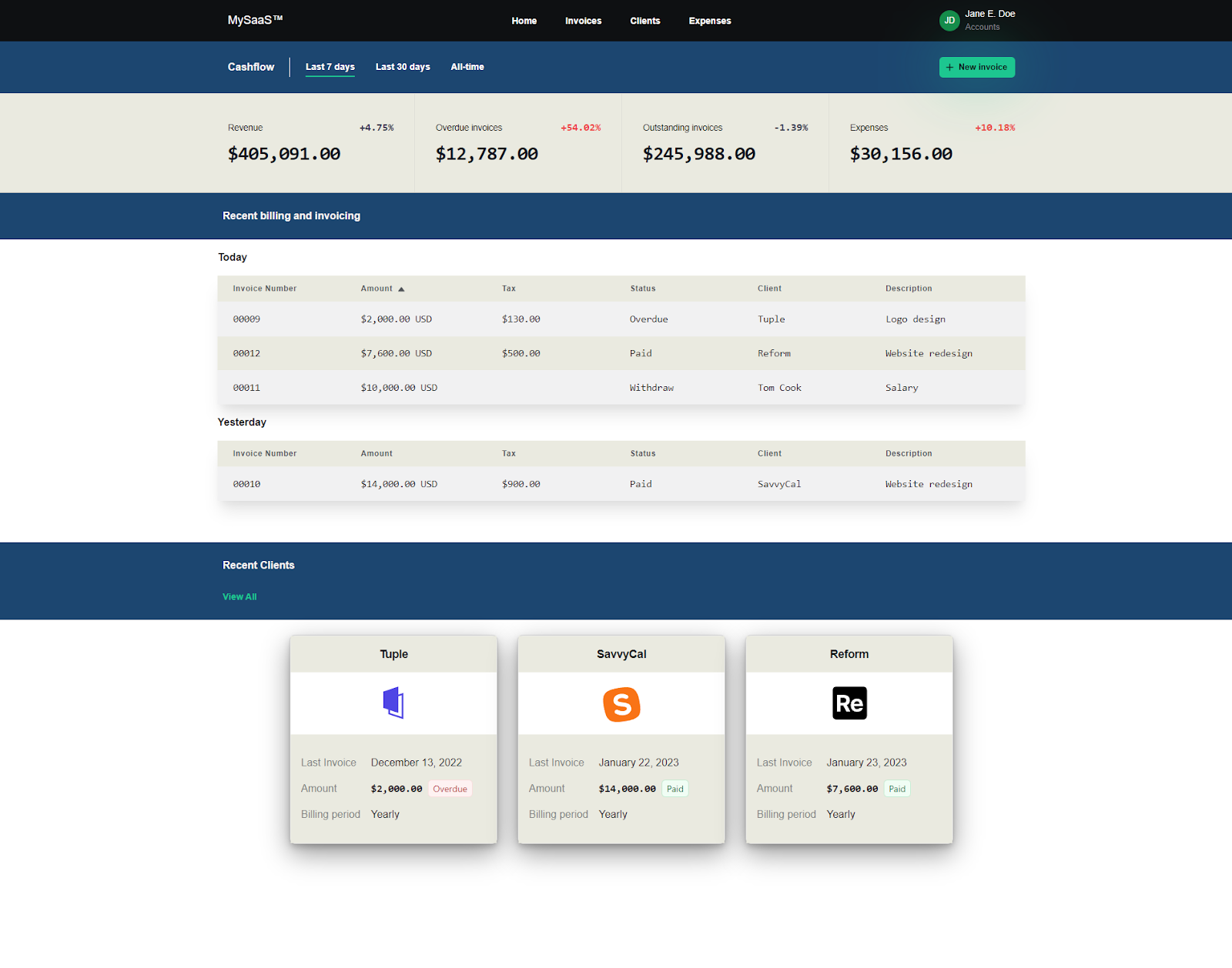
const ClientCard = (props) => {
return (
<>
<Card w="320px" shadow="dark-lg">
<CardHeader bg="brand.400">
<div className="flex w-full items-center justify-center">
<div className="text-lg font-semibold leading-6 tracking-tight text-gray-900">
{props.client.name}
</div>
</div>
</CardHeader>
{/* <CardMedia
height='256px'
bgImage={props.client.imageUrl}
className='border-2'
/> */}
<div className="flex items-center justify-center">
<img
src={props.client.imageUrl}
alt={props.client.name}
className="h-24 w-24 flex-none rounded-lg object-cover "
/>
</div>
<CardBody bg="brand.400">
<PropertyList>
<Property
label="Last Invoice"
value={props.client.lastInvoice.date}
/>
<Property
label="Amount"
value={
<Text fontWeight="black" fontFamily="mono">
{props.client.lastInvoice.amount}{" "}
<span
className={classNames(
statuses[props.client.lastInvoice.status],
"rounded-md px-2 py-1 font-sans text-sm font-normal ring-1 ring-inset"
)}
>
{props.client.lastInvoice.status}
</span>
</Text>
}
/>
<Property label="Billing period" value="Yearly" />
</PropertyList>
</CardBody>
</Card>
</>
);
};
export default ClientCard;
Saas UI's
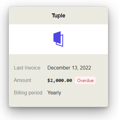
We're done! Putting it all together, here's what we have.
Conclusion
That brings us to the end of this article. Now, you know what design tokens are, how to use them, and how to theme your Saas APP with design tokens. In summary, theming with Design Tokens brings you:
- Consistency: By defining a set of design tokens for things like color, typography, spacing, and layout, designers and developers can work from a shared language of design, leading to a more cohesive user experience.
- Scalability: Rather than hunting through code for individual instances of a particular color or font size, developers can simply update the relevant design token and see the changes propagate throughout the application.
- Reusability: Design tokens can be reused across multiple applications, making it easier to maintain a consistent design language across an organization's entire suite of products.
- Collaboration: Designers focus on creating high-level designs, while developers implement those designs using the predefined design tokens.
And with Saas UI, theming with design tokens is easy, intuitive, and immensely iterable. If you need to rapidly prototype intuitive, accessible, natively dark mode compatible UIs for your SaaS apps, Saas UI is a fantastic choice.
Comments
Loading comments…