If you are a Python user, there’s a high chance you have worked with matplotlib before. To make it easier to work with financial data, a new matplotlib finance API called mplfinance was created (it was first released as mpl-finance but was later renamed).
In this tutorial, we are going to learn how to use mplfinance to plot the following financial chart.
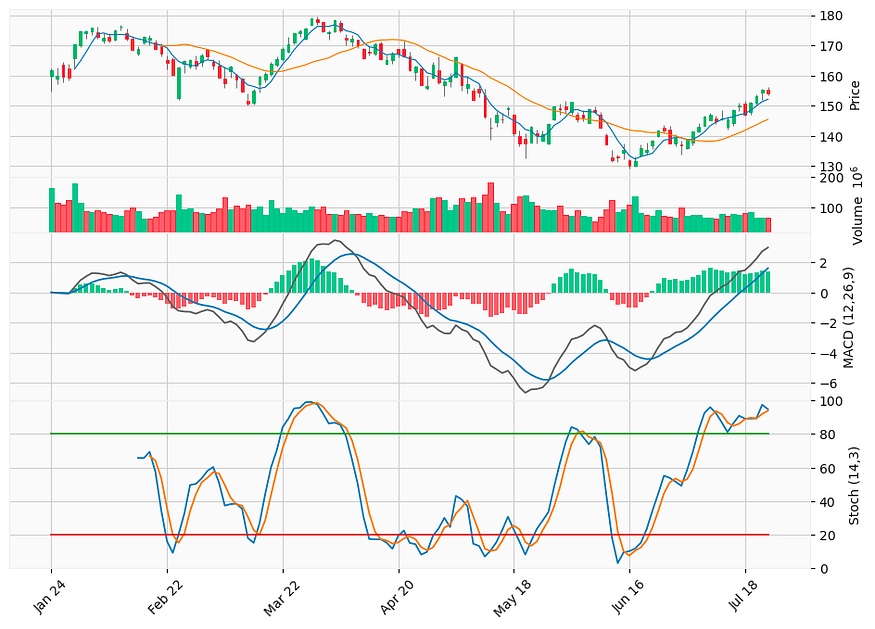
A candlestick chart with moving averages, volume, MACD, and stochastic oscillator plotted using _mplfinance_.
If you want to know how to plot the above chart using plotly, check out this article too.
Let us begin!
1. Download stock price & plot candlestick chart
First thing first, let’s get ourselves some stock prices to plot. To do that, we will be using the yfinance library.
import pandas as pd

import matplotlib.pyplot as plt

import yfinance as yf

import mplfinance as mpf

# download stock price data

symbol = 'AAPL'

df = yf.download(symbol, period='6mo')
Then, we are ready to plot our first candlestick chart of the day.
# plot candlestick chart

mpf.plot(df, type='candle')
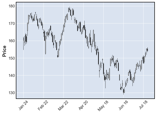
That’s all we need. We now have a simple-looking candlestick chart.
2. Add moving averages and volume
Let’s spice things up a little by adding some moving averages and volume to the chart. With mplfinance, it is as easy as this:
# Add moving averages and volume

mpf.plot(df, type='candle', mav=(5,20), volume=True)
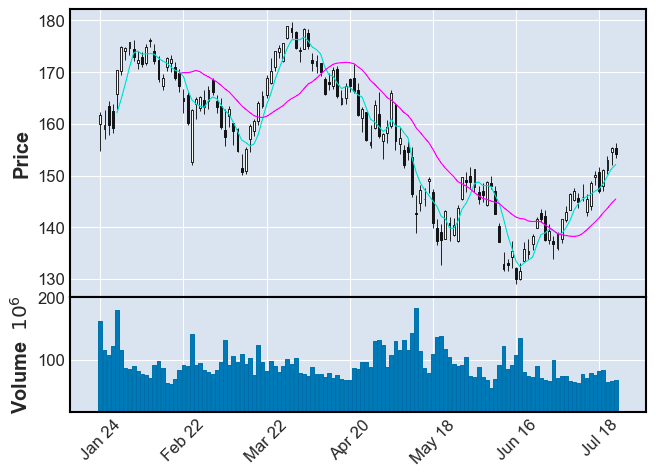
Note that the mav argument in the plot method is only for simple moving average. To plot other types of moving average like exponential moving average, we will need to calculate and add it to the chart separately.
3. Add MACD & Stochastics as subplots
Here comes the good part. Let’s begin with MACD.
3.1 MACD
# Add MACD as subplot
def MACD(df, window_slow, window_fast, window_signal):
macd = pd.DataFrame()
macd['ema_slow'] = df['Close'].ewm(span=window_slow).mean()
macd['ema_fast'] = df['Close'].ewm(span=window_fast).mean()
macd['macd'] = macd['ema_slow'] - macd['ema_fast']
macd['signal'] = macd['macd'].ewm(span=window_signal).mean()
macd['diff'] = macd['macd'] - macd['signal']
macd['bar_positive'] = macd['diff'].map(lambda x: x if x > 0 else 0)
macd['bar_negative'] = macd['diff'].map(lambda x: x if x < 0 else 0)
return macd
macd = MACD(df, 12, 26, 9)
macd_plot = [
mpf.make_addplot((macd['macd']), color='#606060', panel=2, ylabel='MACD', secondary_y=False),
mpf.make_addplot((macd['signal']), color='#1f77b4', panel=2, secondary_y=False),
mpf.make_addplot((macd['bar_positive']), type='bar', color='#4dc790', panel=2),
mpf.make_addplot((macd['bar_negative']), type='bar', color='#fd6b6c', panel=2),
]
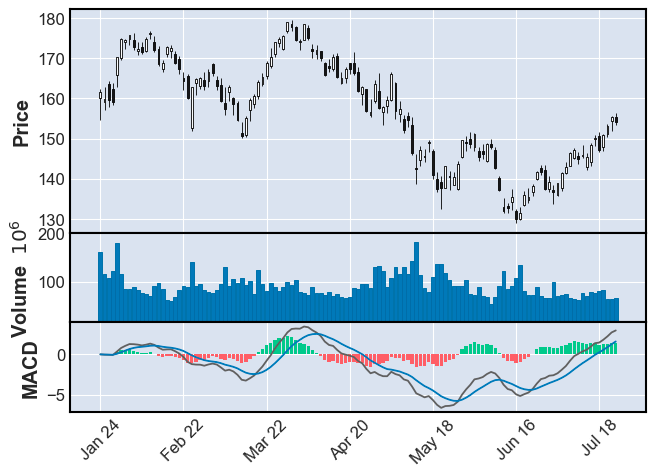
mpf.plot(df, type='candle', volume=True, addplot=macd_plot)
- Line 2–11:
A function that calculates and returns the MACD. - Line 13:
Call the MACD function with periods of 12, 26, and 9. - Line 14–19:
We are utilizing themake_addplotfunction to construct a list of plots we want to add to the main chart:- MACD line
- Signal line
- Histogram (green bar)
- Histogram (red bar)
- Line 21:
Add MACD plots to the main chart
Running the code above gives us the following chart:
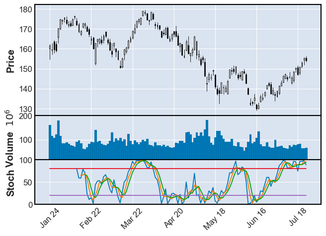
3.2 Stochastic Oscillator
Let’s proceed with the stochastic oscillator.
# Stochastic

def Stochastic(df, window, smooth_window):

stochastic = pd.DataFrame()

stochastic['%K'] = ((df['Close'] - df['Low'].rolling(window).min()) \

/ (df['High'].rolling(window).max() - df['Low'].rolling(window).min())) * 100

stochastic['%D'] = stochastic['%K'].rolling(smooth_window).mean()

stochastic['%SD'] = stochastic['%D'].rolling(smooth_window).mean()

stochastic['UL'] = 80

stochastic['DL'] = 20

return stochastic

stochastic = Stochastic(df, 14, 3)

stochastic_plot = [

mpf.make_addplot((stochastic[['%K', '%D', '%SD', 'UL', 'DL']]), ylim=[0, 100], panel=2, ylabel='Stoch')

]

mpf.plot(df, type='candle', volume=True, addplot=stochastic_plot)
- Line 2–10:
A function that calculates and returns the stochastic values. - Line 12:
Call the Stochastic function with window=14 and smoothing_window=3. - Line 13–15:
Again, we are utilizing themake_addplotfunction to construct the plot we want to add to the main chart - Line 17:
Add the Stochastic plot to the main chart
And we get:
4. Customization
Before we put everything together, let’s explore some of the customizations we can perform in mplfinance.
4.1 Styles
As you have realized, so far, we have been using the default mplfinance style and it looks kinda dull. mplfinance does provide some preset styles and here are some examples:
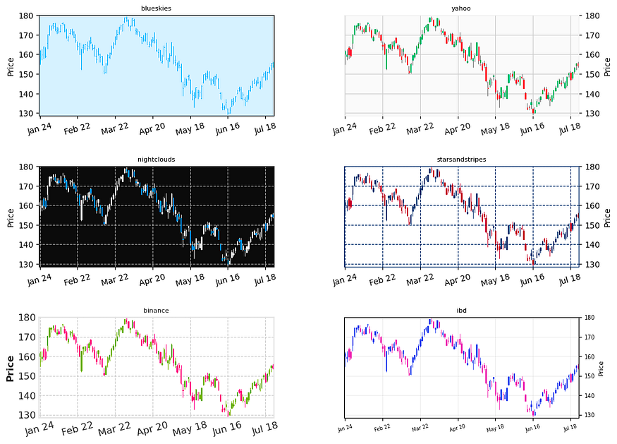
To get all the available styles:
from mplfinance import _styles
_styles.available_styles()
# ['binance',  'blueskies',  'brasil',  'charles',  'checkers',  'classic',  'default',  'ibd',  'kenan',  'mike',  'nightclouds',  'sas',  'starsandstripes',  'yahoo']
4.2 Figure size
There is a very convenient way to change the figure size in mplfinance using figscale:
mpf.plot(df, type='candle', **figscale**=1.5)
4.3 Subplot size ratio
When dealing with multiple subplots, oftentimes we want to adjust the ratio between different subplots. To do that in mplfinance, we simply use the panel_ratios option:
mpf.plot(df, type='candle', volume=True, addplot=macd_plot,
panel_ratios=(4,1,3))

Left: default ratio. Right: 4:1:3
To see more examples of customization, you can check out the official examples here.
5. Putting everything together
Putting everything together, we can use the following codes to create the plot we saw earlier:
macd = MACD(df, 12, 26, 9)

stochastic = Stochastic(df, 14, 3)

plots = [

mpf.make_addplot((macd['macd']), color='#606060', panel=2, ylabel='MACD (12,26,9)', secondary_y=False),

mpf.make_addplot((macd['signal']), color='#1f77b4', panel=2, secondary_y=False),

mpf.make_addplot((macd['bar_positive']), type='bar', color='#4dc790', panel=2),

mpf.make_addplot((macd['bar_negative']), type='bar', color='#fd6b6c', panel=2),

mpf.make_addplot((stochastic[['%D', '%SD', 'UL', 'DL']]), ylim=[0, 100], panel=3, ylabel='Stoch (14,3)')

]

mpf.plot(df, type='candle', style='yahoo', mav=(5,20), volume=True, addplot=plots, panel_ratios=(3,1,3,3), figscale=1.5)
The full code and demo notebook of this tutorial is available here.
Buy the author a coffee.
Comments
Loading comments…