Component libraries are important tools for developers because they provide pre-designed, tested, reusable, and functional user interface elements, saving valuable time and ensuring consistency across applications.
They enhance the base library's functionality, prioritize accessibility, reduce maintenance overhead, and foster collaboration within development teams, making them valuable when it comes to delivering visually appealing and highly functional applications in an efficient and quality manner.
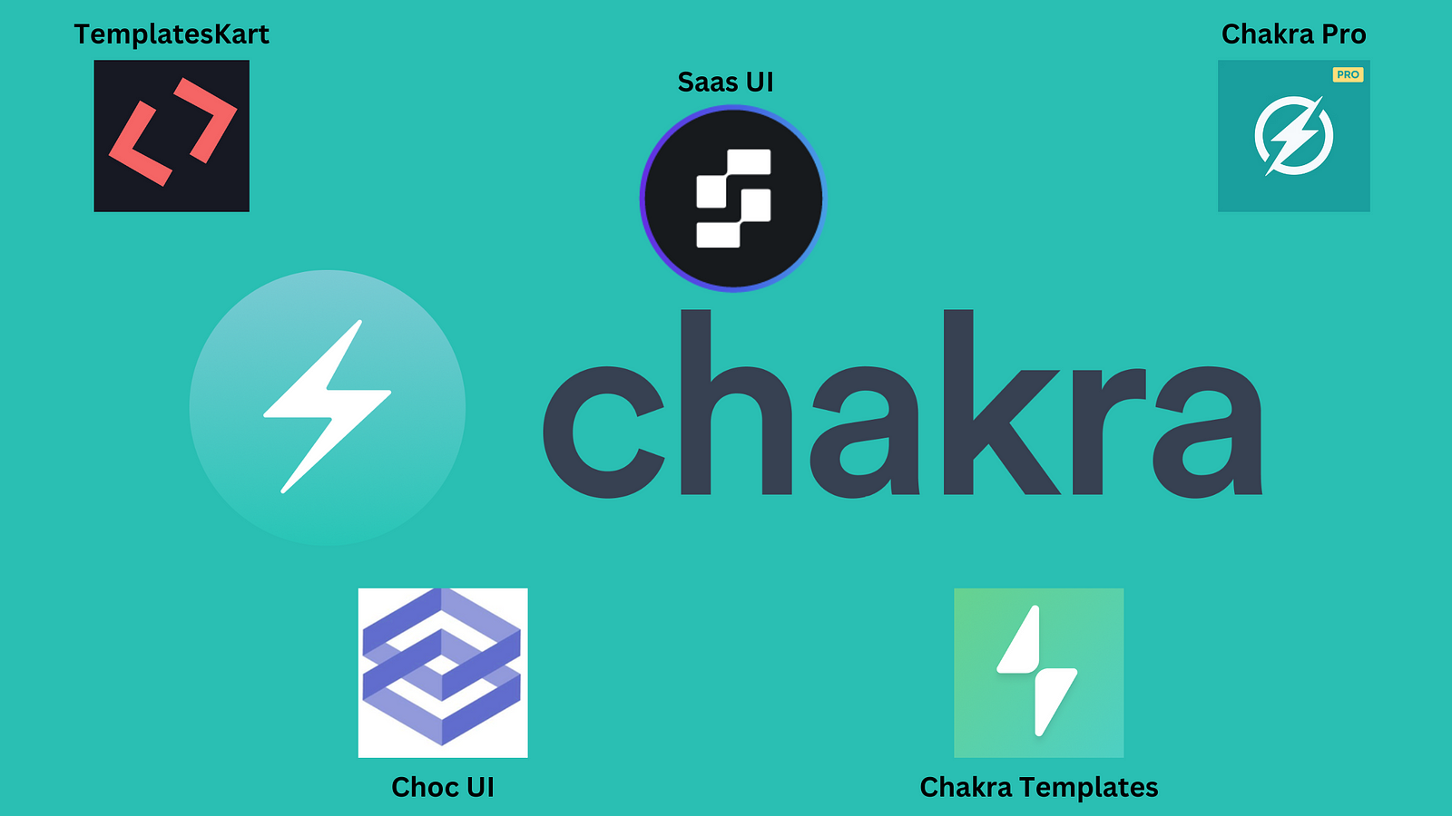
An example of a library that has been used to build a number of powerful component libraries is Chakra UI.
Chakra UI is a simple, accessible, and modular component library. It offers useful building blocks to help you build valuable features in your applications and delight users. Chakra's popularity is growing due to its awesome offerings and performances. But the story doesn't end there; what truly sets Chakra UI apart is the ecosystem of component libraries that have emerged to complement and extend its capabilities.
In this article, we will consider 5 component libraries that are built on top of Chakra UI and see how they can significantly elevate your web development game and help you create exceptional websites and web apps that stand out from the crowd.
Saas UI - The React component library for startups
Saas UI is an open-source React component library built on top of Chakra UI and is the first component library we will be considering. Saas UI provides developers with an extensive set of beautifully crafted components built on best-in-class tools (Chakra UI, React Hook Form, React Table, React Query, Recharts, and more).
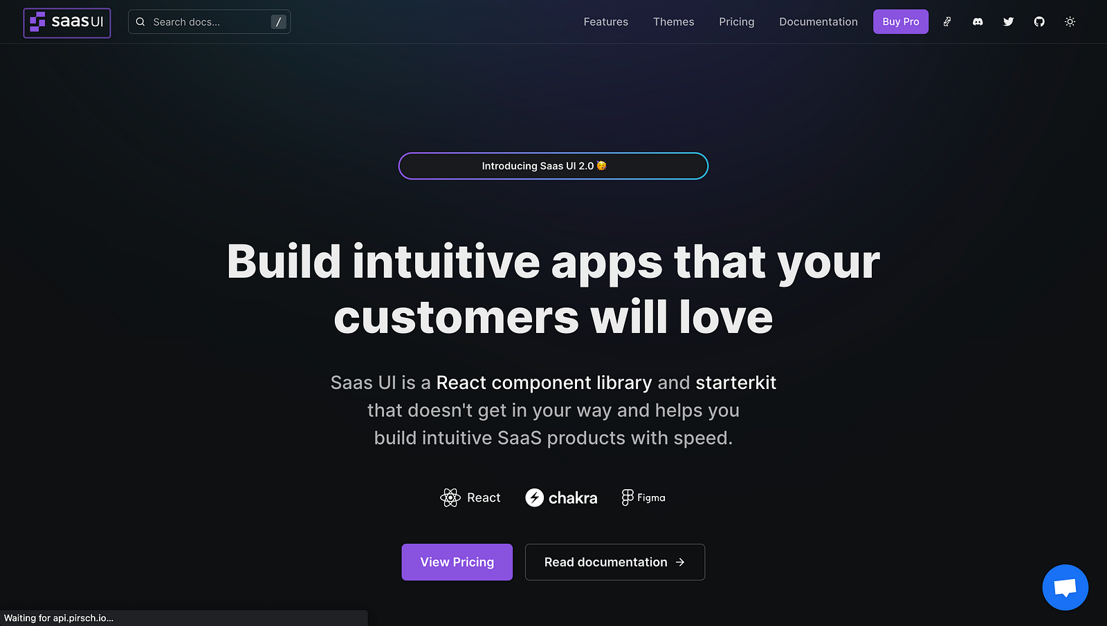
The pain point Saas UI solves is providing you with highly tested components (Saas UI components are built from the ground up with TypeScript) and components that have the essential functionalities needed in building your applications - getting you up and running as fast as possible and saving you valuable time to focus on other parts of your products.
Saas UI gives you access to 40+ free advanced components that you can use to build visually appealing products and even Web3 applications. These components include a data table, forms, modals, feedback components, date pickers, and others. All these components are available through their core library (@saas-ui/react).
To get started with Saas UI, you will need to install it in your existing React project. You will also need to install Chakra UI if you haven't done so already
npm i @chakra-ui/react @emotion/react@^11 @emotion/styled@^11 framer-motion@^6\
npm i @saas-ui/react
Or with yarn:
yarn add @chakra-ui/react @emotion/react@^11 @emotion/styled@^11 framer-motion@^6\
yarn add @saas-ui/react
You only need to set up the SaasProvider at the root of your application for Saas UI to work correctly. The SaasProvider handles the basic Chakra UI setup, configures the color mode manager, and adds the Saas UI base theme, CSS reset, and global styles.
And now, you can use Saas UI components all across your project. Saas UI also offers a pro plan (@saas-ui/pro), where you get access to all components, prebuilt templates, features, and a license for you and your team members. The pro plan also contains tools for billing, onboarding, feature management, sign-up flows, and more, as well as a frontend boilerplate that runs on Nextjs and Electron.

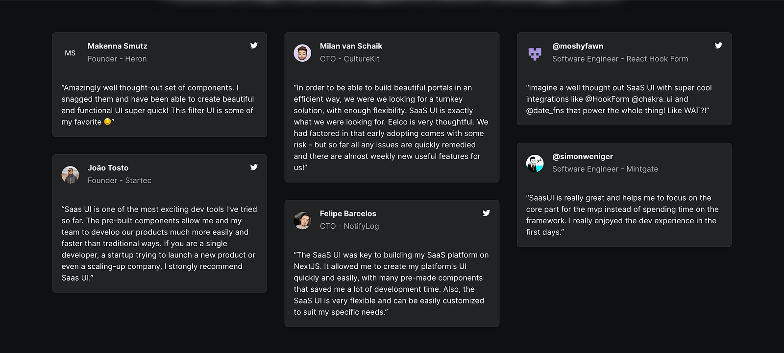
So far, a lot of developers have been using Saas to build their applications, and the reviews have been good.
Benefits of using Saas UI
- Speed and Productivity: Saas UI is designed to reduce boilerplate and is fully typed, which helps you build your product faster. It is built on top of industry-leading libraries and tools, including Chakra UI, React Hook Form, React Table, React Query, Recharts, and more. This robust foundation enables you to start your project two steps ahead.
- Framework Support: Whether it's NextJS, Remix, Blitz, Redwood, Vite, CRA, or something else, you can run Saas UI on it.
- Authentication: Saas has out-of-the-box support for various authentication providers like Supabase, Clerk, and, Magic Link.
- Customizability: Saas UI is built on top of Chakra UI, which allows all components to be customized directly through CSS-in-JS style props or by creating a custom theme using component styles and theme tokens. To create custom colors for your theme, you can use the Saas UI Palette generator, Themera, or create and export color palettes in Figma with SupaPalette.
- Theming: Theming in Saas UI is a key feature that allows you to customize all components to match your brand with theme support and style props. It is built on top of Chakra UI, which provides powerful theming functionality.
- Open Source and Pro License: Saas UI provides over 40 open-source components for free. For more extensive needs, a Pro license includes premium components, extensive documentation, feature flags, upselling components and hooks, generators, and a high-performance Turborepo.
- Design System: Saas UI comes with a Figma design system that includes all the components and styles you need to design your product, synchronizing with your codebase.
- Community and Support: Saas UI has an active community where developers can contribute, provide feedback, and request features.
- Ease of Integration: Saas UI is easy to integrate into your existing React project. It requires setting up the SaasProvider at the root of your application.
This library is a great choice for startups that want to build high-quality, customizable, and scalable frontends. Check out this demo of a dashboard built using Saas UI components.
If you want to provide feedback and see what's coming up next on Saas UI, you can check their roadmap.
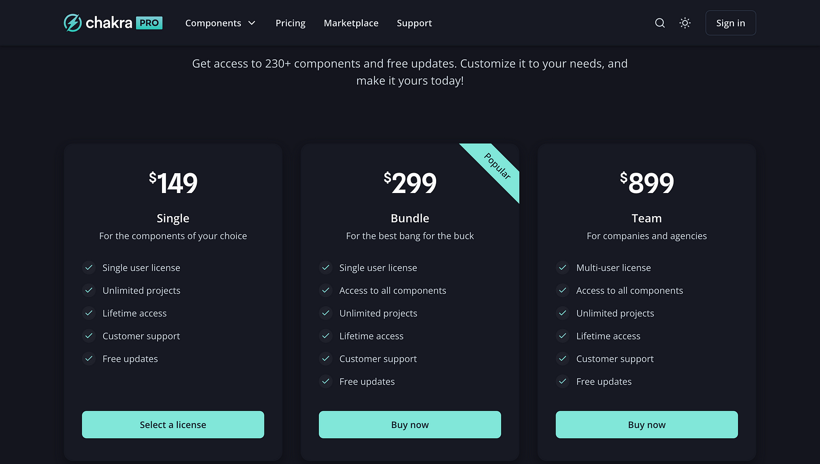
Chakra UI Pro
Chakra UI Pro is a premium set of React components and flows for developers seeking to develop E-commerce, Marketing, and Dashboards applications faster. It is built on top of the popular Chakra UI component library and offers more complex and sophisticated components, such as full-blown page layouts, sidebars, authentication, review pages, blog components, and a lot more.
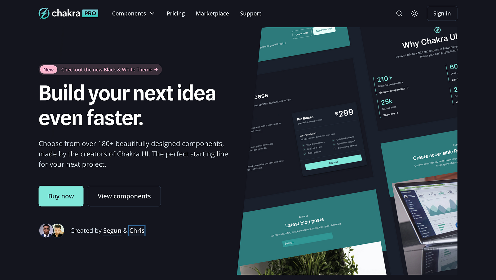
Chakra UI Pro was launched by Creative Tim, the creator of Ark UI, and Segun, the creator of Chakra UI. It was created to help developers build high-quality, production-ready React applications quickly and easily. It provides a wide range of pre-built components and flows, so developers don't have to waste time building them from scratch. Chakra Pro components are also highly customizable, so developers can easily tailor them to their specific needs and branding.
Features of Chakra UI Pro:
- Chakra UI Pro provides over 180 ready-to-use, responsive, and accessible components.
- It offers cleverly structured source code files for easy development.
- Chakra UI Pro components come with light and dark color modes by default.
- Customization is easy, allowing developers to adapt components to fit their brand and style.
- Components are designed to look great on mobile, tablet, and desktop devices.
- All components are written in TypeScript, which means they are typesafe, ensuring scalability and maintainability.
- Pre-built flows for e-commerce, Marketing, and Dashboards
- Comprehensive documentation and support
- Components are divided into separate files for a better developer experience.
- Accessibility is a priority, following the WAI-ARIA guidelines.
Chakra UI Pro is a premium version of Chakra UI, which means it's not free. They offer different pricing and licensing options. They do not offer a free trial. Instead, some of their components are available for free.
Choc UI - Chakra UI Prebuilt Components
Choc UI is a set of accessible and reusable components that are commonly used in web applications. It is built upon the Chakra UI library, and its name is an acronym for Chakra Higher Order Components.
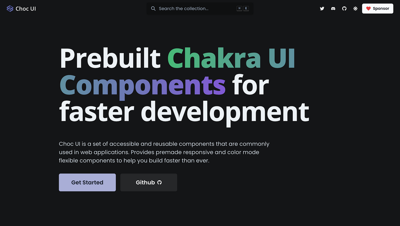
The library is designed to speed up the development process by providing prebuilt components that are responsive and flexible in terms of color modes. This allows developers to focus more on enhancing the user experience of their applications.
Choc UI offers a variety of components, such as headers, cards, alerts, pagination, badges, and many more. It also provides page sections like heros, feature sections, pricing sections, and others. Furthermore, it includes navigation elements like navbars and sidebars and also has example pages for landing pages and contact pages, among others.
To install Choc UI, you need to run the following commands:
npm i @chakra-ui/react @chakra-ui/icons @emotion/react @emotion/styled framer-motion react-icons
yarn add @chakra-ui/react @chakra-ui/icons @emotion/react @emotion/styled framer-motion react-icons
One of the unique features of Choc UI is the live code editor, which allows developers to experiment with the code before integrating it into their projects. You can also view a full-page preview of the component in a new tab, or open it in Codesandbox to test the code with other libraries. There is also an option to reset the component code to its original state. Choc UI is an open-source project and encourages contributions from the developer community.
Chakra Templates
Chakra Templates are a collection of components that are pre-styled and pre-arranged to create a specific layout or user interface. You can think of a template as a blueprint for a specific part of your application. For example, a template might define the layout for a login page, a dashboard, or a form.
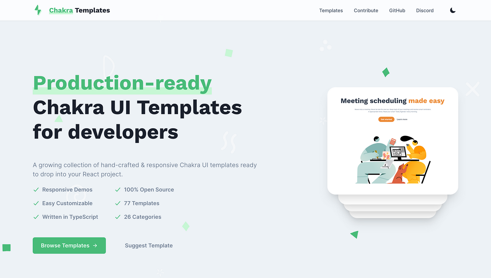
The Chakra Templates layouts and components are coded with Chakra UI and designed to be responsive. It includes a wide range of components like headers, footers, pricing tables, testimonials, call to action, and more. These templates are completely customizable and can be used as a starting point for your project.
Chakra UI Templates are production-ready and can be easily integrated into your React project. The source code for each template is readily available for copying and pasting into your project, saving you time in building common components or layouts repeatedly. Every component can be previewed from the documentation and is also hosted live, so you can see how they will look on your website before copying the code into your project. And the best part is that as long as you have Chakra UI installed, you can use any of the code in Chakra templates without installing any other package.
It is also open-source, so if you have any components or layouts you want to design using Chakra UI, you can contribute to the list of ever-growing templates available.
TemplatesKart
TemplatesKart is a platform that provides production-ready projects and components built on top of the Chakra UI. It aims to help developers build fully functional, accessible web applications faster than ever. The platform includes more than 80 customizable components and 7 projects to cover various situations.
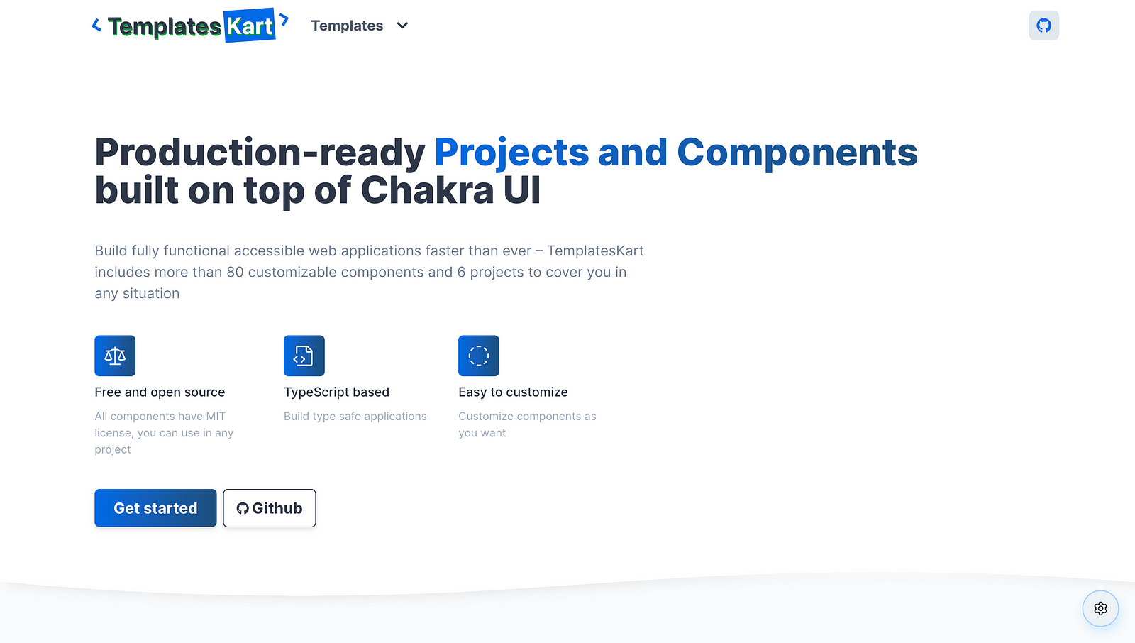
TemplatesKart is designed to provide an easy solution for developers who want to get a specific look for their website without having to mess around with too much code. It offers a user-friendly experience by allowing developers to choose from a variety of pre-built components and projects.
What are the key features of TemplatesKart?
TemplatesKart offers several key features that make it a valuable tool for developers:
- Production-Ready Projects and Components: These components and projects are built on top of Chakra UI; they are also responsive and support typescript. This allows developers to build fully functional and accessible web applications at a faster pace.
- ComponentsKart and ProjectsKart: TemplatesKart is divided into two main sections: ComponentsKart and ProjectsKart. ComponentsKart is a list of beautiful and responsive React components that can be used to build an application. Some of these components are extracted from ProjectsKart, and some are built separately. On the other hand, ProjectsKart provides an easy solution for getting the desired look for a website without having to mess around with too much code. Users can view project pages and copy the code of components.
- Customizable: TemplatesKart allows developers to easily customize components to fit their specific needs. They can choose from a variety of pre-built components and projects and modify them as required.
- Open Source: TemplatesKart is an open-source platform. This means that developers can contribute to its development, which can lead to improvements and new features being added over time. It also allows developers to learn from the codebase and apply those learnings to their own projects.
- Regular Updates: The creator of TemplatesKart regularly updates the platform with new components. This ensures that the platform stays up-to-date with the latest trends and technologies in web development.
- User-Friendly Interface: TemplatesKart provides an easy-to-use interface. It allows developers to easily navigate through various components and projects, making the development process more efficient.
In conclusion, TemplatesKart is a comprehensive platform that offers a wide range of customizable components and projects, aiding developers in building fully functional web applications quickly and efficiently.
Conclusion
As a developer, finding the right tools to empower your projects is essential. In this article, we explored some of the top Chakra UI component libraries, and what we've discovered is a treasure trove of possibilities waiting to elevate your web development endeavors.
Chakra UI, with its accessible, customizable, and responsive components, forms the bedrock of modern web interfaces. However, it's the component libraries built upon this foundation that truly shine. From Saas UI's supercharged capabilities to the premium features of Chakra UI Pro, the unique design philosophy of Choc UI, the rapid project kickstart provided by Chakra Templates, and the expansive template collection at TemplatesKart, each library serves as a valuable asset in your web development toolkit.
The decision to use a component library over the base library itself is not just a matter of convenience; it's a strategic choice. These libraries streamline your development process, ensuring consistency, accessibility, and design excellence. They reduce the risk of bugs and maintenance headaches and provide you with a thriving community of support.
So whether you're building a personal project or a complex web app, these libraries will undoubtedly boost your productivity and enhance your design capabilities.
Comments
Loading comments…