In SaaS (Software as a Service) applications, auth (authentication + authorization) is a critical component that you cannot take shortcuts with. Authentication involves verifying the user's identity, and Authorization is about granting them appropriate access to the application's resources.
Auth is particularly important for SaaS platforms for the following reasons:
- Protecting your users' data, and privacy
- Preventing Identity theft and data breaches
- Protecting access to payment gateways, third-party APIs, etc.
In this article, we will learn how to use Saas UI and Supabase together to implement auth for our Next.js SaaS app.
Tech Stack - Saas UI + Supabase
Saas UI is a component library built on top of Chakra UI, a popular React library. It provides pre-built components and hooks for a wide variety of use cases, all easily customizable, themeable, a11y-optimized, and reusable across different parts of your application. These aren't limited to just UI components, either, as Saas UI also ships with Auth providers (that support Supabase out of the box, perfect for our use case) and ready-to-use Auth forms and UI elements.
Supabase is an open-source software-as-a-service that provides a database and a serverless backend service to software applications. It simplifies development by providing tools and services that perform backend tasks such as data storage, real-time updates, authentication, and more. Supabase is scalable, and its ease of use makes it an excellent choice for building web and mobile applications.
The Open Source Firebase Alternative | Supabase
Configuration and Setup
1. Setting up a new Supabase project
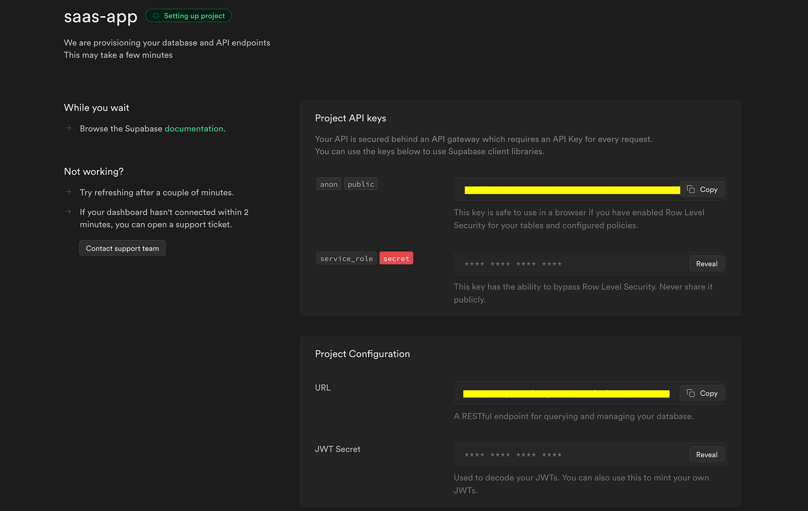
Use this link to sign up, and create a new project on Supabase. Don't worry, the free tier will do perfectly fine!

Credentials such as the project's URL and API keys will be generated once the project is created. PS: Keep your project API keys secret.
2. Create a new Next.js app:
npx create-next-app@latest my-saas
3. Install Saas UI with its dependencies:
npm i @saas-ui/react @chakra-ui/react @emotion/react@^11 @emotion/styled@^11 framer-motion@^6
For the Sidebar, we will also install the Saas UI Sidebar module, currently in beta:
npm i @saas-ui/sidebar
4. Install supabase-js
npm i @supabase/supabase-js
5. ENV file
Create an .env.local file in the root project and add your Project URL and Project Key. Include the file in the .gitignore file to prevent pushing the private keys to GitHub.
NEXT_PUBLIC_SUPABASE_URL= // paste your project url here NEXT_PUBLIC_SUPABASE_ANON_KEY= // paste your supabase anon key here
Setting up Auth with Saas UI's AuthProvider
For Saas UI to work properly, you need to wrap your NextJS app with the SaasProvider, which performs the base ChakraUI setup for you, adding global styles, the Saas UI base theme, and yes - auth too, as we'll soon see.
_app.js
// react/next stuff
import Link from "next/link";
import { useEffect, useState } from "react";
import { useRouter } from "next/router";

// chakraUI stuff
import { Text, Box, Center, Stack } from "@chakra-ui/react";

// saas-ui's auth imports
import { PasswordForm } from "@saas-ui/react";

export default function SignUp() {
  const router = useRouter();
  const [errorMessage, setErrorMessage] = useState(null);

  return (
    <>
      <Box padding="8" position="relative">
        <Center h="90vh" w="100%">
          <Stack maxW="400px">
            <PasswordForm
              action="signUp"
              submitLabel="Sign up"
              onSuccess={() => {
                router.push("/");
              }}
              onError={(error) => setErrorMessage(error.message)}
            />
            {errorMessage && <p className="highlight"> {errorMessage}</p>}
            <Center>
              <Text fontSize={"md"} color="gray.500">
                Already have an account?
                <Link style={{ color: "black" }} href="/login">
                  Log in
                </Link>
              </Text>
            </Center>
          </Stack>
        </Center>
      </Box>
    </>
  );
}
Inside the component, there is a useState hook that initializes the supabaseClient variable using the createBrowserSupabaseClient() function. This function is imported from the supabase-js library and is responsible for creating an instance of the Supabase client.
AuthProvider (from Saas UI) is a custom component responsible for managing the user session and authentication context in the application. We use its createAuthService, passing in the previously initialized supabaseClient variable as an argument, and we're done! Every component within our app will now have access to inner workings of our auth, provided by AuthProvider via hooks.
Create two more pages, signup.js and login.js, their uses being obvious.
signup.js
// react/next stuff
import Link from "next/link";
import { useEffect, useState } from "react";
import { useRouter } from "next/router";

// chakraUI stuff
import { Text, Box, Center, Stack } from "@chakra-ui/react";

// saas-ui's auth imports
import { PasswordForm } from "@saas-ui/react";

export default function SignUp() {
  const router = useRouter();
  const [errorMessage, setErrorMessage] = useState(null);

  return (
    <>
      <Box padding="8" position="relative">
        <Center h="90vh" w="100%">
          <Stack maxW="400px">
            <PasswordForm
              action="signUp"
              submitLabel="Sign up"
              onSuccess={() => {
                router.push("/");
              }}
              onError={(error) => setErrorMessage(error.message)}
            />
            {errorMessage && <p className="highlight"> {errorMessage}</p>}
            <Center>
              <Text fontSize={"md"} color="gray.500">
                Already have an account?
                <Link style={{ color: "black" }} href="/login">
                  Log in
                </Link>
              </Text>
            </Center>
          </Stack>
        </Center>
      </Box>
    </>
  );
}
- The ChakraUI imports (
Box,Center,Stack, andText) are for our layouts, (plus minor typography) and are pretty self explanatory. - The
PasswordFormcomponent is a pre-built form for the classic credential authentication model (email + password), saving you hours of work in creating a professional, consistent, accessible form component and hooking it up to your auth provider. It automatically uses the context provided byAuthProvider(which you added in the previous step, at the root of your app, wrapping all of it), and providesonSuccess,onError, and other event props for handling behavior.
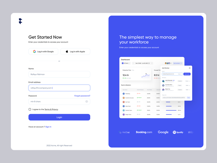
Here's what it looks like:
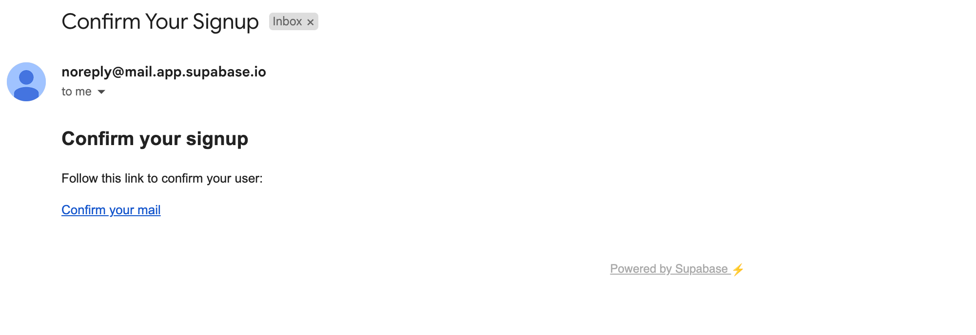
When the user signs up, they get an email from your Supabase project, for account verification.
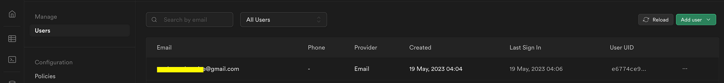
Your Supabase dashboard will show users who have registered, and their details.
login.js
// nextjs/react imports
import { useEffect, useState } from "react";
import { useRouter } from "next/router";
import { Link } from "next/link";

// chakraUI imports
import { Box, Center, Stack } from "@chakra-ui/react";

// saas ui's auth imports
import { Auth } from "@saas-ui/react";

export default function LogIn() {
  const router = useRouter();
  const [errorMessage, setErrorMessage] = useState(null);

return (

{" "}

<>
  <Box padding="8" position="relative">
    <Center h="90vh" w="100%">
      <Stack maxW="400px">
        <Auth
          type="password"
          signupLink={<a href="/signup">Sign up</a>}
          onChange={() => {
            setErrorMessage(null);
          }}
          onSuccess={() => {
            router.push("/");
          }}
          onError={(error) => {
            setErrorMessage(error.message);
          }}
        />
        {errorMessage && <p className="highlight"> {errorMessage}</p>}
      </Stack>
    </Center>
  </Box>
</>
); }
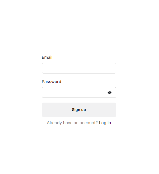
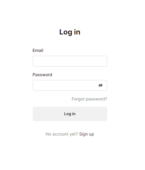
We could use PasswordForm again, but let's take a look at Auth, instead. This is a higher-order component that can be used to render all kinds of auth forms, just by specifying a prop. This can be type='password', for the basic email/password auth form, or a social login with providers like GitHub passed in as an object, or even an OTP/verification code entry with view="otp" .
The onChange, onSuccess, onError, and other props are available for Auth, too, just as they were for PasswordForm, and we're making use of them for routing, and setting/invalidating error messages.
Here's what it looks like, in practice.
Note: You can validate form inputs with a library like Zod or Yup, too! Simply define a schema, and pass it in as a resolver prop like so:
function LoginPage() {
const schema = Yup.object({
email: Yup.string()
.email('Invalid email address')
.required()
.label('Email'),
password: Yup.string().min(4).required().label('Password'),
})
return (

{" "}

<PasswordForm
  action="logIn"
  submitLabel="Log in"
  resolver={yupResolver(schema)}
/>
) }
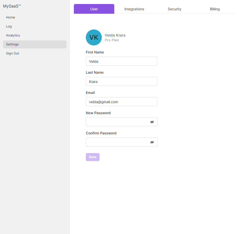
Finally, to handle the signing out of the current session, the Sidebar we're using (also a Saas UI component) has a NavItem that uses the AuthProvider 's built-in logOut function. This removes the user from the current session to log them out and removes all elements in the local storage.
MySidebar.jsx
//  React/Next imports
import Link from "next/link";
//  SaaS UI - SideBar Imports
import { Sidebar, SidebarSection, NavItem } from "@saas-ui/sidebar";
//  SaaS UI & Chakra UI Imports
import { Spacer } from "@chakra-ui/react";
//  Saas UI auth imports
import { useAuth } from "@saas-ui/react";

export const MySidebar = () => {
  const { logOut } = useAuth();
  return (
    <>
      <Sidebar breakpoints={{ base: false }} backgroundColor="gray.100">
        <SidebarSection direction="row">
          <Link href="/SignUp"> MySaaS™ </Link>
          <Spacer />
        </SidebarSection>
        <SidebarSection aria-label="Main " textColor="white">
          <NavItem href="/"> Home </NavItem>
          <NavItem>Log</NavItem>
          <NavItem>Analytics</NavItem>
          <NavItem isActive>Settings</NavItem>
          <NavItem onClick={() => logOut()}>Sign Out</NavItem>
        </SidebarSection>
      </Sidebar>
    </>
  );
};
useAuth is a part of Saas UI's AuthProvider, again, and along with the logOut method (this just calls Supabase's configured auth service's logout method) it returns a bunch of properties and methods useful for state management, like, user (an object with user details, if logged in), isAuthenticated (a boolean to indicate if the user is authenticated), isLoading (boolean that indicates if the authentication is currently being checked; useful for loading indicators in the UI), and more. Check it out here.
The implementation of the SideBar is carried over from my previous article, and is entirely optional in this tutorial. You could just call **logOut()** from a simple button, if you wanted to.
And we're done! Without signing in, the user would only see a clickable text/hyperlink prompting them to do so. When signed in, they'll see the data they need.

The complete source code can be found here.
Conclusion
Supabase offers a simplified and efficient solution for implementing authentication in SaaS applications, and by using Saas UI - with its prebuilt Auth forms, Providers, and hooks - you can implement auth for your SaaS application in minutes, not hours or days.
Remember to consult the comprehensive Saas UI and Supabase documentations for advanced features, and further details.
Comments
Loading comments…