- Tools Used: Chakra UI, React, Typescript
- Time Saved: 1 week -> 45 mins
- View Demo
- Source code on Github
This guide walks through how to create a landing page for a launched SaaS app using React and Typescript.
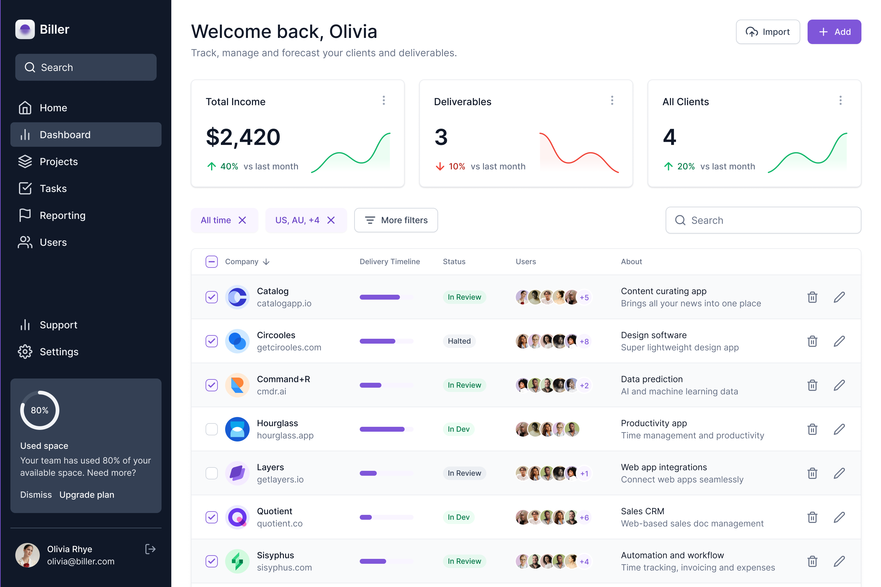
Introduction
Chakra UI is a UI component library that is very easy to use, has accessibility out of the box, and most importantly, looks incredible.
In this guide, we will be creating a landing page for a SaaS product with:
- Hero section - Hooks the reader. Details what the product is about
- Demo video - What the product looks like in action
- Company logos - Trust builder that shows other companies are liking the product already
- Features - Top 3 ways the product helps users
- Highlights - Secondary features that are nice to have
- Pricing
- FAQ
- CTA - Remind readers to sign up after they have read all about the product
- Footer
Step 1 - Set up React project
npm create vite@latest saasbase-chakraui-landing-page -- --template react-ts

cd saasbase-chakraui-landing-page
npm install
npm run dev
Step 2 - Set up Chakra UI
Chakra UI is a fantastic UI kit that comes with easy-to-use Front-end components that also look good.
npm i @chakra-ui/react @emotion/react @emotion/styled framer-motion @chakra-ui/icons
We can set it up by wrapping our entire application with the ChakraUIProvider.
Install the Inter font with:
npm i @fontsource/inter
Edit src/main.tsx
import { ChakraProvider, extendTheme } from "@chakra-ui/react";
import React from "react";
import ReactDOM from "react-dom/client";
import { App } from "./App";

const theme = extendTheme({
  colors: {
    brand: {
      50: "#f0e4ff",
      100: "#cbb2ff",
      200: "#a480ff",
      300: "#7a4dff",
      400: "#641bfe",
      500: "#5a01e5",
      600: "#5200b3",
      700: "#430081",
      800: "#2d004f",
      900: "#14001f",
    },
  },
  fonts: {
    heading: `'Inter', sans-serif`,
    body: `'Inter', sans-serif`,
  },
});

ReactDOM.createRoot(document.getElementById("root")!).render(
  <React.StrictMode>
    <ChakraProvider theme={theme}>
      <App />
    </ChakraProvider>
  </React.StrictMode>
);
Step 3 - Create the Hero section
The hero section of your landing page is the most important above-the-fold item you can have. The title and the description should hook the reader in to learn more about your offering within 4-5 secs.
Our Hero section will have a title, description, and a strong CTA to get the readers salivating. A trust builder that shows that others are already using your product goes a long way.
 Create a new file
 src/components/HeroSection.tsx :
import {
  Button,
  Center,
  Container,
  Heading,
  Text,
  VStack,
} from "@chakra-ui/react";
import { FunctionComponent } from "react";

interface HeroSectionProps {}

export const HeroSection: FunctionComponent<HeroSectionProps> = () => {
  return (
    <Container maxW="container.lg">
      <Center p={4} minHeight="70vh">
        <VStack>
          <Container maxW="container.md" textAlign="center">
            <Heading size="2xl" mb={4} color="gray.700">
              You don't have to chase your clients around to get paid
            </Heading>

            <Text fontSize="xl" color="gray.500">
              Freelancers use Biller to accept payments and send invoices to
              clients with a single click
            </Text>

            <Button
              mt={8}
              colorScheme="brand"
              onClick={() => {
                window.open("https://launchman.cc", "_blank");
              }}
            >
              I need this for $10/month →
            </Button>

            <Text my={2} fontSize="sm" color="gray.500">
              102+ builders have signed up in the last 30 days
            </Text>
          </Container>
        </VStack>
      </Center>
    </Container>
  );
};
Update the src/App.tsx with:
import { Box } from "@chakra-ui/react";
import { HeroSection } from "./components/HeroSection";

export const App = () => {
  return (
    <Box bg="gray.50">
      <HeroSection />
    </Box>
  );
};
We will continue to add new components to this page as we build them out.
Step 3 - Add Header
Now that we have some content in the page, we can add a header/navigation bar. This will show the name of our product, quick links for navigating to parts of the page, and a link to my Twitter.
To make it truly responsive, we need to make it so that it collapses on smaller devices and the navigation goes into a side drawer like so:
Download the SVG image of the Twitter Icon from here and place it in the public folder. Any file in this folder is served as is. This is where you want to keep all the static assets your site uses.
Let's start by creating a new component that will create a responsive header bar. Call it src/components/Header.tsx :
import { HamburgerIcon } from '@chakra-ui/icons'
import {
  Box,
  chakra,
  Container,
  Drawer,
  DrawerBody,
  DrawerCloseButton,
  DrawerContent,
  DrawerHeader,
  DrawerOverlay,
  Flex,
  Heading,
  IconButton,
  Image,
  Link,
  LinkBox,
  LinkOverlay,
  Spacer,
  Stack,
  useDisclosure,
} from '@chakra-ui/react'

const navLinks = [
  { name: 'Home', link: '/' },
  { name: 'Features', link: '#features' },
  { name: 'Pricing', link: '#pricing' },
]

const DesktopSidebarContents = ({ name }: any) => {
  return (
    <Container maxW={['full', 'container.lg']} p={0}>
      <Stack
        justify="space-between"
        p={[0, 4]}
        w="full"
        direction={['column', 'row']}
      >
        <Box display={{ base: 'none', md: 'flex' }}>
          <Heading fontSize="xl">{name}</Heading>
        </Box>
        <Spacer />
        <Stack
          align="flex-start"
          spacing={[4, 10]}
          direction={['column', 'row']}
        >
          {navLinks.map((navLink: any, i: number) => {
            return (
              <Link
                href={navLink.link}
                key={`navlink_${i}`}
                fontWeight={500}
                variant="ghost"
              >
                {navLink.name}
              </Link>
            )
          })}
        </Stack>
        <Spacer />
        <LinkBox>
          <LinkOverlay href={`https://twitter.com/thisissukh_`} isExternal>
            <Image src="twitter.svg"></Image>
          </LinkOverlay>
        </LinkBox>
      </Stack>
    </Container>
  )
}
const MobileSidebar = ({ name }: any) => {
  const { isOpen, onOpen, onClose } = useDisclosure()

  return (
    <>
      <Flex w="full" align="center">
        <Heading fontSize="xl">{name}</Heading>
        <Spacer />
        <IconButton
          aria-label="Search database"
          icon={<HamburgerIcon />}
          onClick={onOpen}
        />
        <Drawer isOpen={isOpen} placement="right" onClose={onClose} size="xs">
          <DrawerOverlay />
          <DrawerContent bg="gray.50">
            <DrawerCloseButton />
            <DrawerHeader>{name}</DrawerHeader>

            <DrawerBody>
              <DesktopSidebarContents />
            </DrawerBody>
          </DrawerContent>
        </Drawer>
      </Flex>
    </>
  )
}

interface SidebarProps {
  name: string
}

const Sidebar = ({ name }: SidebarProps) => {
  return (
    <chakra.header id="header">
      <Box display={{ base: 'flex', md: 'none' }} p={4}>
        <MobileSidebar name={name} />
      </Box>

      <Box display={{ base: 'none', md: 'flex' }} bg="gray.50">
        <DesktopSidebarContents name={name} />
      </Box>
    </chakra.header>
  )
}

interface HeaderProps {
  name: string
}

export const Header = ({ name }: HeaderProps) => {
  return (
    <Box w="full">
      <Sidebar name={name} />
    </Box>
  )
}
Add a src/components/Layout.tsx
import { Box, VStack } from "@chakra-ui/react";
import { FunctionComponent } from "react";
import { Header } from "./Header";

interface LayoutProps {
  children: React.ReactNode;
}

export const Layout: FunctionComponent<LayoutProps> = ({
  children,
}: LayoutProps) => {
  return (
    <Box bg="gray.50">
      <VStack spacing={10} w="full" align="center">
        <Header name="Biller" />
        {children}
      </VStack>
    </Box>
  );
};
Update the src/App.tsx with:
import { Box } from "@chakra-ui/react";
import { HeroSection } from "./components/HeroSection";
import { Layout } from "./components/Layout";

export const App = () => {
  return (
    <Layout>
      <Box bg="gray.50">
        <HeroSection />
      </Box>
    </Layout>
  );
};
Step 4 - Add a demo video
A demo video lets the reader know what to expect when they do signup for your product.
Record an MP4 video of your product and place it in the public folder as video.mp4 . Next.js serves everything from the public folder as is.
If you don't have one, here's a sample video and a sample poster image you can use.
 We can also add a
 poster option in the video tag that shows a static image if the video isn't yet loaded. Using a static frame of the video as the poster works well.
Update src/App.tsx with:
import { Box } from "@chakra-ui/react";
import { HeroSection } from "./components/HeroSection";
import { Layout } from "./components/Layout";

export const App = () => {
  return (
    <Layout>
      <Box bg="gray.50">
        <HeroSection />
      	<Container maxW="container.xl">
          <Center p={[0, 10]}>
            <video playsInline autoPlay muted poster="/image.png" loop>
              <source src="/video.mp4" type="video/mp4" />
            </video>
          </Center>
		</Container>
      </Box>
    </Layout>
  );
};
Step 5 - Add social proof with client logos
Now that the reader knows what the offering is, you can answer their next logical question - who else is using it?
Adding logos of customers at recognizable companies using your product will build trust with the reader.
Download the SVG logos for Microsoft and Adobe and place them in public folder just like before.
 Update the
 src/App.tsx with:
import {
  Box,
  Center,
  Container,
  Wrap,
  WrapItem,
  Text,
  Image,
} from "@chakra-ui/react";
// ...

export const App = () => {
  return (
    <Layout>
      <Box bg="gray.50">
       // ...


<Container maxW="container.2xl" centerContent py={[20]}>
            <Text color="gray.600" fontSize="lg">
              Used by teams worldwide
            </Text>

            <Wrap
              spacing={[10, 20]}
              mt={8}
              align="center"
              justify="center"
              w="full"
            >
              <WrapItem>
                <Image src="microsoft-logo.svg" alt="Microsoft logo" />
              </WrapItem>

              <WrapItem>
                <Image src="adobe-logo.svg" alt="Adobe logo" />
              </WrapItem>

              <WrapItem>
                <Image src="microsoft-logo.svg" alt="Microsoft logo" />
              </WrapItem>

              <WrapItem>
                <Image src="adobe-logo.svg" alt="Adobe logo" />
              </WrapItem>
            </Wrap>
          </Container>
      </Box>
    </Layout>
  );
};
Step 6 - List features
The features section is where you can flaunt the top 3 ways your product will help a potential user. I like to be as direct as possible.
 Create a new file called
 src/components/Feature.tsx
import {
  Box,
  Button,
  Center,
  Container,
  Stack,
  Text,
  VStack,
  Image,
} from "@chakra-ui/react";
import { FunctionComponent } from "react";

interface FeatureProps {
  title: string;
  description: string;
  image: string;
  reverse?: boolean;
}

export const Feature: FunctionComponent<FeatureProps> = ({
  title,
  description,
  image,
  reverse,
}: FeatureProps) => {
  const rowDirection = reverse ? "row-reverse" : "row";
  return (
    <Center w="full" minH={[null, "90vh"]}>
      <Container maxW="container.xl" rounded="lg">
        <Stack
          spacing={[4, 16]}
          alignItems="center"
          direction={["column", null, rowDirection]}
          w="full"
          h="full"
        >
          <Box rounded="lg">
            <Image
              src={image}
              width={684}
              height={433}
              alt={`Feature: ${title}`}
            />
          </Box>

          <VStack maxW={500} spacing={4} align={["center", "flex-start"]}>
            <Box>
              <Text fontSize="3xl" fontWeight={600} align={["center", "left"]}>
                {title}
              </Text>
            </Box>

            <Text fontSize="md" color="gray.500" textAlign={["center", "left"]}>
              {description}
            </Text>

            <Button
              colorScheme="brand"
              variant="link"
              textAlign={["center", "left"]}
            >
              Learn more →
            </Button>
          </VStack>
        </Stack>
      </Container>
    </Center>
  );
};
Add to src/App.tsx
import { Feature } from "./components/Feature";
// ...

interface FeatureType {
  title: string
  description: string
  image: string
}

const features: FeatureType[] = [
  {
    title: "Detailed Analytics",
    description:
      "No more spending hours writing formulas in Excel to figure out how much you're making. We surface important metrics to keep your business going strong.",
    image:
      "https://launchman-space.nyc3.digitaloceanspaces.com/chakra-ui-landing-page-feature-1.png",
  },
  {
    title: "Track your clients",
    description:
      "Know when and how your projects are going so you can stay on top of delivery dates.",
    image:
      "https://launchman-space.nyc3.digitaloceanspaces.com/chakra-ui-landing-page-feature-2.png",
  },
  {
    title: "Manage projects",
    description:
      "You don't have to hunt your email inbox to find that one conversation. Every task, project, and client information is just a click away.",
    image:
      "https://launchman-space.nyc3.digitaloceanspaces.com/chakra-ui-landing-page-feature-3.png",
  },
];

export const App = () => {
  return (
    <Layout>
      <Box bg="gray.50">
        // ...
      <VStack
          backgroundColor="white"
          w="full"
          id="features"
          spacing={16}
          py={[16, 0]}
        >
          {features.map(
            ({ title, description, image }: FeatureType, i: number) => {
              return (
                <Feature
                  key={`feature_${i}`}
                  title={title}
                  description={description}
                  image={image}
                  reverse={i % 2 === 1}
                />
              )
            }
          )}
        </VStack>
      </Box>
    </Layout>
  );
};
Step 7 - Add highlights
Add a new file called Highlight.tsx
import {
  Box,
  Center,
  Container,
  Wrap,
  WrapItem,
  Text,
  Image,
  VStack,
  SimpleGrid,
} from "@chakra-ui/react";
// ...

export interface HighlightType {
  icon: string
  title: string
  description: string
}

const highlights: HighlightType[] = [
      {
        icon: '✨',
        title: 'No-code',
        description:
          "We are No-Code friendly. There is no coding required to get started. Launchman connects with Airtable and lets you generate a new page per row. It's just that easy!",
      },
      {
        icon: '🎉',
        title: 'Make Google happy',
        description:
          "We render all our pages server-side; when Google's robots come to index your site, the page does not have to wait for JS to be fetched. This helps you get ranked higher.",
      },
      {
        icon: '😃',
        title: 'Rapid experimenting',
        description:
          "You don't have to wait hours to update your hard-coded landing pages. Figure out what resonates with your customers the most and update the copy in seconds",
      },
      {
        icon: '🔌',
        title: 'Rapid experimenting',
        description:
          "You don't have to wait hours to update your hard-coded landing pages. Figure out what resonates with your customers the most and update the copy in seconds",
      },
    ]


export const App = () => {
  return (
    <Box bg="gray.50">
      // ...
     <Container maxW="container.md" centerContent py={[8, 28]}>
          <SimpleGrid spacingX={10} spacingY={20} minChildWidth="300px">
            {highlights.map(({ title, description, icon }, i: number) => (
              <Box p={4} rounded="md" key={`highlight_${i}`}>
                <Text fontSize="4xl">{icon}</Text>

                <Text fontWeight={500}>{title}</Text>

                <Text color="gray.500" mt={4}>
                  {description}
                </Text>
              </Box>
            ))}
          </SimpleGrid>
        </Container>
    </Box>
  );
};

Step 8 - Add the Pricing section
Here you can add a pricing section to your page by clearly showing what features are available at what price point. Offering an Annual subscription can be beneficial for both yourself and the customer.
 Create a new component in
 src/components/PricingSection.tsx
import { CheckCircleIcon } from '@chakra-ui/icons'
import {
  Box,
  Button,
  ButtonGroup,
  HStack,
  List,
  ListIcon,
  ListItem,
  SimpleGrid,
  Text,
  VStack,
} from '@chakra-ui/react'
import { FunctionComponent, useState } from 'react'

interface PricingBoxProps {
  pro: boolean
  name: string
  isBilledAnnually: boolean
}

export const PricingBox: FunctionComponent<PricingBoxProps> = ({
  pro,
  name,
  isBilledAnnually,
}: PricingBoxProps) => {
  return (
    <Box
      boxShadow="sm"
      p={6}
      rounded="lg"
      bg={pro ? 'white' : 'white'}
      borderColor={pro ? 'brand.500' : 'gray.200'}
      backgroundColor={pro ? 'brand.50' : 'white'}
      borderWidth={2}
    >
      <VStack spacing={3} align="flex-start">
        <Text fontWeight={600} casing="uppercase" fontSize="sm">
          {name}
        </Text>
        <Box w="full">
          {isBilledAnnually ? (
            <Text fontSize="3xl" fontWeight="medium">
              $89
            </Text>
          ) : (
            <Text fontSize="3xl" fontWeight="medium">
              $99
            </Text>
          )}
          <Text fontSize="sm">per month per site</Text>
        </Box>

        <Text>Unlock key features and higher usage limits</Text>
        <VStack>
          <Button size="sm" colorScheme="brand">
            Free 14-day trial →
          </Button>
        </VStack>

        <VStack pt={8} spacing={4} align="flex-start">
          <Text fontWeight="medium">Everything in Basic, plus:</Text>
          <List spacing={3}>
            <ListItem>
              <HStack align="flex-start" spacing={1}>
                <ListIcon as={CheckCircleIcon} color="brand.500" mt={1} />
                <Text>
                  Lorem ipsum dolor sit amet, consectetur adipisicing elit
                </Text>
              </HStack>
            </ListItem>
          </List>
        </VStack>
      </VStack>
    </Box>
  )
}

interface PricingSectionProps {}

export const PricingSection: FunctionComponent<PricingSectionProps> = () => {
  const [isBilledAnnually, setIsBilledAnnually] = useState<boolean>(true)
  return (
    <VStack spacing={10} align="center">
      <ButtonGroup isAttached>
        <Button
          onClick={() => {
            setIsBilledAnnually(true)
          }}
          colorScheme={isBilledAnnually ? 'brand' : 'gray'}
        >
          Annually (-10%)
        </Button>

        <Button
          onClick={() => {
            setIsBilledAnnually(false)
          }}
          colorScheme={isBilledAnnually ? 'gray' : 'brand'}
        >
          Monthly
        </Button>
      </ButtonGroup>

      <SimpleGrid columns={[1, null, 3]} spacing={10}>
        <PricingBox
          pro={false}
          name="Starter"
          isBilledAnnually={isBilledAnnually}
        />

        <PricingBox
          pro={true}
          name="Creator"
          isBilledAnnually={isBilledAnnually}
        />

        <PricingBox
          pro={false}
          name="Enterprise"
          isBilledAnnually={isBilledAnnually}
        />
      </SimpleGrid>
    </VStack>
  )
}
Add the component to src/App.tsx
import { PricingSection } from "./components/PricingSection";
// ...

export const App = () => {
  return (
    <Box bg="gray.50">
      // ...
        <Container py={28} maxW="container.lg" w="full" id="pricing">
          <PricingSection />
        </Container>
    </Box>
  );
};
Step 9 - Add an FAQ section
Handle objections your potential customer might have in the FAQ section.
 Add a component called
 src/components/FAQSection.tsx :
import {
  Accordion,
  AccordionButton,
  AccordionIcon,
  AccordionItem,
  AccordionPanel,
  Box,
} from '@chakra-ui/react'

export interface FAQType {
  q: string
  a: string
}

interface FAQSectionProps {
  items: FAQType[]
}

export const FAQSection = ({ items }: FAQSectionProps) => {
  return (
    <Box borderRadius="lg" w="full" p={4}>
      <Accordion>
        {items.map((item: any, i: number) => {
          return (
            <AccordionItem key={`faq_${i}`}>
              <h2>
                <AccordionButton>
                  <Box flex="1" textAlign="left">
                    {item.q}
                  </Box>
                  <AccordionIcon />
                </AccordionButton>
              </h2>

              <AccordionPanel pb={4}>{item.a}</AccordionPanel>
            </AccordionItem>
          )
        })}
      </Accordion>
    </Box>
  )
}
Update src/App.tsx :
import { FAQSection, FAQType } from "./components/FAQSection";
// ...

const faqs: FAQType[] = [
      {
        q: 'How many clients can I bring on?',
        a: 'You can bring on 3 clients with the Free plan. Upgrade to Pro for additional seats.',
      },
      {
        q: 'Can I connect it to my CRM?',
        a: 'Yes! We support Notion and PipeDrive currently.',
      },
      {
        q: 'Do you support international payments?',
        a: 'Yes - payments can be made from and to any country.',
      },
      {
        q: 'Who can I connect to for support?',
        a: 'Email me at sukh@saasbase.dev',
      },
    ]

export const App = () => {
  return (
    <Layout>
      <Box bg="gray.50">
        // ...
        <Container py={28} maxW="container.md">
          <Box w="full">
            <VStack spacing={10} w="full">
              <Text fontWeight={500} fontSize="2xl" align="center">
                Frequently asked questions
              </Text>
              <FAQSection items={faqs} />
            </VStack>
          </Box>
        </Container>
      </Box>
    </Layout>
  );
};
Step 10 - Add CTA
Add a final CTA to make it easy for the reader to subscribe now that they know everything about the product.
 Create a new component called
 src/components/CTA.tsx :
import { Button, Container, Text, VStack } from '@chakra-ui/react'
import React, { FunctionComponent } from 'react'
import { CTAType } from '../types'

interface CTAProps {
  heading: string
  cta: CTAType
}

export const CTA: FunctionComponent<CTAProps> = ({
  heading,
  cta,
}: CTAProps) => {
  return (
    <Container maxW="container.lg" py={16}>
      <VStack
        spacing={6}
        backgroundColor="brand.500"
        rounded="xl"
        p={6}
        backgroundImage="https://uploads-ssl.webflow.com/60c29c0c0d66236222bfa9b4/60c29c0d0d66230460bfa9e2_Pattern%20Shape.svg"
      >
        <VStack spacing={4} maxW="md">
          <Text fontWeight={600} fontSize="3xl" align="center" color="white">
            {heading}
          </Text>
        </VStack>

        <Button
          size="lg"
          color="brand.500"
          backgroundColor="white"
          onClick={() => {}}
        >
          {cta.name}
        </Button>
      </VStack>
    </Container>
  )
}
Update src/App.tsx :
import { CTA } from '../components/CTA'
// ...

export const App = () => {
  return (
    <Layout>
      <Box bg="gray.50">
        // ...
      <CTA
          heading={`Get started with Biller  today!`}
          cta={{ name: 'I want this!', link: '#' }}
        />
      </Box>
    </Layout>
  );
};
Step 11 - Add Footer
Add a footer with a social link to Twitter.
Update src/App.tsx :
import {
  Container,
  Box,
  Center,
  Text,
  Wrap,
  WrapItem,
  Image,
  VStack,
  SimpleGrid,
  Flex,
  LinkBox,
  LinkOverlay,
  Spacer,
} from "@chakra-ui/react";
// ...

export const App = () => {
  return (
    <Layout>
      <Box bg="gray.50">
       // ...
		<Container maxW="container.lg">
          <Flex py={6}>
            <Box>
              <Text>© 2022 Biller</Text>

              <Text>Made by Sukh</Text>
            </Box>
            <Spacer />

            <LinkBox>
              <LinkOverlay href="https://twitter.com/@thisissukh_" isExternal>
                <Image src="twitter.svg" alt="Twitter logo"></Image>
              </LinkOverlay>
            </LinkBox>
          </Flex>
        </Container>
      </Box>
    </Layout>
  );
};

Step 12 - Add SEO
React Helmet is a great package that helps us optimize on-page SEO. Install it by:
npm i react-helmet
npm i --save-dev @types/react-helmet
Update src/App.tsx :
import { Helmet } from "react-helmet";

export const App = () => {
  return (
    <Layout>
      <Helmet>
        <meta charSet="utf-8" />
        <title>Biller | Get paid faster</title>
      </Helmet>
      <Box bg="gray.50">
         // ...
      </Box>
    </Layout>
  );
};
Step 13 - Deploy on Vercel
Vercel is the smoothest deployment platform I've ever used.
Deploy your React/Vite project by:
- Upload source code to Github
- Select
Viteas the Framework Preset
 3. Hit Deploy
That's it - you have a brand new landing page ready to go with Chakra UI!
Comments
Loading comments…