Sankey diagrams are a great way to visualize processes or flows. Each entity or process stage is represented by nodes. Flows between nodes are expressed in arcs, and the numerical size of the flow determines the size of this arc.
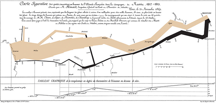
Minard's classic diagram of Napoleon's invasion of Russia, using the feature now named after Sankey
In this diagram type, the data to be fed to the chart object must consist of links and nodes. Links define arc connections. These links have directions (from -> to) and values that determines the size of the arc. Nodes are the labels.

Anatomy. Source: https://datavizproject.com/data-type/sankey-diagram/
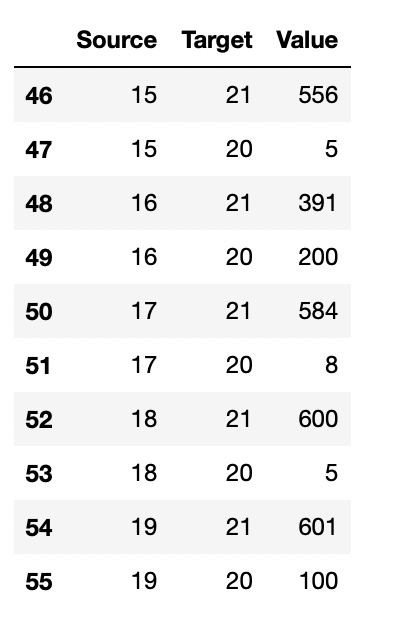
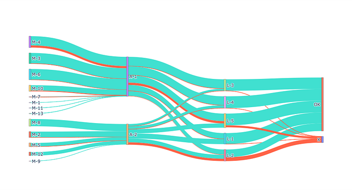
Let's use a dummy process dataset as an example. A car manufacturer company buys parts from 13 different manufacturers and assembles them in 2 assembly lines to obtain the final product. These vehicles are distributed to the world using 5 different logistics lines. However, according to the reports from car dealers, some vehicles were found to be problematic.
import pandas as pd

data = pd.read_excel("sankey.xlsx","Data")
df_labels = pd.read_excel("sankey.xlsx","Labels")
data.head(10)
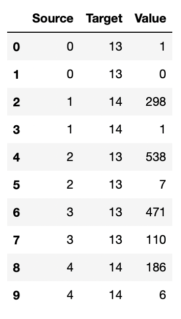
Dataset
data.tail(10)
print(df_labels)
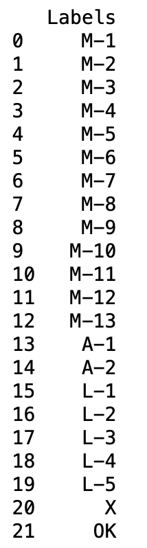
Labels
By collecting the necessary data, we can visualize the flow with the Sankey diagram.
source = data["Source"].values.tolist()
target = data["Target"].values.tolist()
value = data["Value"].values.tolist()
labels = df_labels["Labels"].values.tolist()
Now let's create the diagram. I will use the Plotly library.
import plotly.graph_objs as go

#create links
link = dict(source=source, target=target, value=value,
color=["turquoise","tomato"] * len(source))

#create nodes
node = dict(label=labels, pad=15, thickness=5)

#create a sankey object
chart = go.Sankey(link=link, node=node, arrangement="snap")

#build a figure
fig = go.Figure(chart)
fig.show()
Sankey Diagram. Image by the author.
By using the Sankey diagram, we have visually expressed the problems in the process flow. It looks like there is a problem with the manufacturer coded M-4 and the assembly line coded A-2.
Comments
Loading comments…