Image by author
Have you ever clicked into a trading or stock market-related article, scrolled to the bottom, and just left when you didn't see a single image or plot? I know I have, sometimes.
Visualization is crucial. Especially in the financial world where people are used to seeing charts.
In this tutorial, I am going to demonstrate how to perform the following using plotly:
- Plot OHLC candlestick chart
- Add plots on the main chart, e.g. moving averages
- Add multiple subplots, e.g. volume, MACD, stochastics
- Change figure settings
Plotly is a powerful interactive, open-source charting platform. To use the codes in this tutorial, make sure you have the latest version of plotly installed.
First thing first, let's get ourselves some stock prices to plot. To do that, I will be using the yfinance module.
!pip install yfinance
import yfinance as yf
import pandas as pd
symbol = 'AAPL'
df = yf.download(symbol, start='2020-01-01')
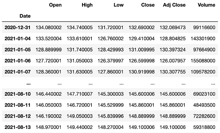
Image by author
With our data ready, let's plot some charts!
1. OHLC Chart
!pip install plotly==5.2.1
import plotly.graph_objects as go
fig = go.Figure(go.Candlestick(x=df.index,
  open=df['Open'],
  high=df['High'],
  low=df['Low'],
  close=df['Close']))
fig.show()
And just like that, we get a nice simple candlestick chart.
Remember how I mentioned plotly being an interactive charting platform? Well, just hover over the plot and you will see how you can zoom in to the chart by sliding over a period of time. Alternatively, you can do that using the little slider below the main chart called rangeslider.
If you find it not really useful and want it gone, simply update the figure by:
# removing rangeslider
fig.update_layout(xaxis_rangeslider_visible=False)
You might also realize there are some gaps between candles, that's due to the holidays and weekends when the market is not open. If you'd like to remove those empty dates, we can do it by using rangebreaks:
# hide weekends
fig.update_xaxes(rangebreaks=[dict(bounds=["sat", "mon"])])
The above code will remove the weekends but what about the holidays? Well, there's no straightforward way to do it but there's a solution to that:
# removing all empty dates
# build complete timeline from start date to end date
dt_all = pd.date_range(start=df.index[0],end=df.index[-1])
# retrieve the dates that ARE in the original datset
dt_obs = [d.strftime("%Y-%m-%d") for d in pd.to_datetime(df.index)]
# define dates with missing values
dt_breaks = [d for d in dt_all.strftime("%Y-%m-%d").tolist() if not d in dt_obs]
fig.update_xaxes(rangebreaks=[dict(values=dt_breaks)])
That might have seen unnecessary but here we go. A complete OHLC chart without any missing gap in between candles.
The same OHLC chart without the rangeslider and the gaps between dates
2. Add Moving Averages & Volume
The plot now looks quite dull and we might wanna add something like moving averages to the plot.
Let's do that by first calculating the values of the moving averages.
# add moving averages to df
df['MA20'] = df['Close'].rolling(window=20).mean()
df['MA5'] = df['Close'].rolling(window=5).mean()
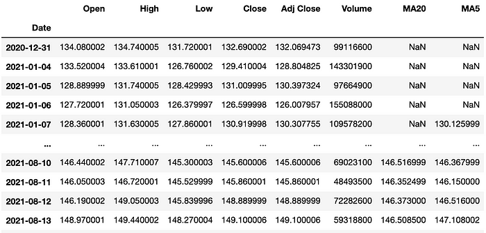
Now that we have 2 more columns of data to play with, let's add them to the plot.
fig.add_trace(go.Scatter(x=df.index,
                         y=df['MA5'],
                         opacity=0.7,
                         line=dict(color='blue', width=2),
                         name='MA 5'))
fig.add_trace(go.Scatter(x=df.index,
                         y=df['MA20'],
                         opacity=0.7,
                         line=dict(color='orange', width=2),
                         name='MA 20'))
If you run the above code, you will get the following figure. Note that I have added some properties like opacity and name, which will be shown as the legends.
Note that when you click on the plot title at the legend, you can hide/show the plot.
You might also notice the OHLC plot has the name trace 0, that's because we did not name the plot when we created it in the first place. It can be quite troublesome to rename a plot title, so the best practice is to assign a name when adding a new trace.
Alternatively, if you don't want the name of a plot to be displayed as a legend entry, you can just add showlegend=False to the trace property.
# first declare an empty figure
fig = go.Figure()
# add OHLC trace
fig.add_trace(go.Candlestick(x=df.index,
                             open=df['Open'],
                             high=df['High'],
                             low=df['Low'],
                             close=df['Close'],
                             showlegend=False))
# add moving average traces
fig.add_trace(go.Scatter(x=df.index,
                         y=df['MA5'],
                         opacity=0.7,
                         line=dict(color='blue', width=2),
                         name='MA 5'))
fig.add_trace(go.Scatter(x=df.index,
                         y=df['MA20'],
                         opacity=0.7,
                         line=dict(color='orange', width=2),
                         name='MA 20'))
# hide dates with no values
fig.update_xaxes(rangebreaks=[dict(values=dt_breaks)])
# remove rangeslider
fig.update_layout(xaxis_rangeslider_visible=False)
# add chart title
fig.update_layout(title="AAPL")
Much better now, right? Notice I have also added a figure title.
3. Add Volume, MACD & Stochastic as subplots
So far we have plotted 3 traces on the main plot area and sometimes one plot area is not enough and we need some subplots.
In this section, we will try to add volume, MACD, and stochastic as subplots.
We already have volume in our main dataframe but we still need the values of MACD and stochastic. We can do the calculation by ourselves but the easiest way would be to use a technical analysis library like ta-lib, since the focus of this article is not about creating technical indicators.
!pip install ta
from ta.trend import MACD
from ta.momentum import StochasticOscillator
# MACD
macd = MACD(close=df['Close'],
            window_slow=26,
            window_fast=12,
            window_sign=9)
# stochastic
stoch = StochasticOscillator(high=df['High'],
                             close=df['Close'],
                             low=df['Low'],
                             window=14,
                             smooth_window=3)
We have only created the instance of MACD and stochastic. To access the values of each instance, we need to use methods like macd.macd_signal() , which you will see in a moment.
To make a figure with subplots, we start by declaring a figure with 4 subplots.
fig = make_subplots(rows=4, cols=1, shared_xaxes=True)
# Plot OHLC on 1st subplot (using the codes from before)
# Plot volume trace on 2nd row
fig.add_trace(go.Bar(x=df.index,
                     y=df['Volume']
                    ), row=2, col=1)
# Plot MACD trace on 3rd row
fig.add_trace(go.Bar(x=df.index,
                     y=macd.macd_diff()
                    ), row=3, col=1)
fig.add_trace(go.Scatter(x=df.index,
                         y=macd.macd(),
                         line=dict(color='black', width=2)
                        ), row=3, col=1)
fig.add_trace(go.Scatter(x=df.index,
                         y=macd.macd_signal(),
                         line=dict(color='blue', width=1)
                        ), row=3, col=1)
# Plot stochastics trace on 4th row
fig.add_trace(go.Scatter(x=df.index,
                         y=stoch.stoch(),
                         line=dict(color='black', width=2)
                        ), row=4, col=1)
fig.add_trace(go.Scatter(x=df.index,
                         y=stoch.stoch_signal(),
                         line=dict(color='blue', width=1)
                        ), row=4, col=1)
# update layout by changing the plot size, hiding legends & rangeslider, and removing gaps between dates
fig.update_layout(height=900, width=1200,
                  showlegend=False,
                  xaxis_rangeslider_visible=False,
                  xaxis_rangebreaks=[dict(values=dt_breaks)])
Looks cool, but there are still some improvements we can make.
Right now, the main price chart is too small and there is a lot of space between each subplot. To change that, we can add the following subplot properties: vertical_spacing & row_heights when initializing the figure variable. Note that row_heights is a list of the relative heights of each row of subplots.
# add subplot properties when initializing fig variable
fig = make_subplots(rows=4, cols=1, shared_xaxes=True,
                    vertical_spacing=0.01,
                    row_heights=[0.5,0.1,0.2,0.2])
Also, let's add a label for each subplot for us to keep track of different plots.
# update y-axis label
fig.update_yaxes(title_text="Price", row=1, col=1)
fig.update_yaxes(title_text="Volume", row=2, col=1)
fig.update_yaxes(title_text="MACD", showgrid=False, row=3, col=1)
fig.update_yaxes(title_text="Stoch", row=4, col=1)
Much better now, right?
Change the color of volume bar and MACD histogram
One thing we can do to further improve the looks of our plot is by changing the color of the volume bar and MACD histogram.
# Plot volume trace on 2nd row
colors = ['green' if row['Open'] - row['Close'] >= 0
          else 'red' for index, row in df.iterrows()]
fig.add_trace(go.Bar(x=df.index,
                     y=df['Volume'],
                     marker_color=colors
                    ), row=2, col=1)
# Plot MACD trace on 3rd row
colors = ['green' if val >= 0
          else 'red' for val in macd.macd_diff()]
fig.add_trace(go.Bar(x=df.index,
                     y=macd.macd_diff(),
                     marker_color=colors
                    ), row=3, col=1)
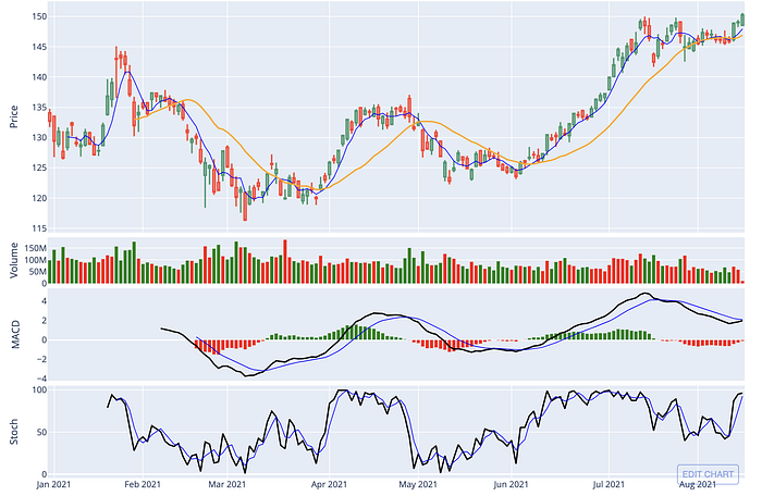
Looks even better now!
Publish & embed your figure
If you are wondering how I embedded the interactive figures in this article, I am using Chart Studio by plotly. If you want to know more, check out this tutorial.
Removing white space
If you think the whitespace around the figure is quite annoying, you can reduce the margin using the following code.
# removing white space
fig.update_layout(margin=go.layout.Margin(
        l=20, #left margin
        r=20, #right margin
        b=20, #bottom margin
        t=20  #top margin
    ))
Conclusion
In this tutorial, we have explored some of the functions in plotly to plot a simple financial chart that contains a candlestick chart along with volume, MACD, and stochastic plots.
What other functions/plots would you like to see? Leave a comment!
Also, feel free to check out my other stories here related to financial analysis using Python.
How to Detect Support & Resistance Levels and Breakout using Python
Implementing the Most Popular Indicator on TradingView Using Python
The full code and demo notebook of this tutorial is available here.
Comments
Loading comments…