Reusing frontend components across different projects is a neat little trick that only a few developers have. It makes your code more readable(if done correctly) and in general keeps it pleasantly organized. Your applications look more consistent and coherent when you reuse your components. Google does this very well, by creating a host of material design components and reusing them across multiple products. This blog post will cover the very basics of building an Angular component library and publishing it to the npm store.
We'll be creating a button component for this example. It'll have some options that a user can dynamically add to create their own custom button.
Step 1: Project setup
The first project that we'll create is going to be a typical Angular application. Eventually, when we do create a library, we'll import it inside this application. This is not a key step, but it'll give you an understanding of the key differences between both of these project types (application & library).
ng new demo-project
Once it's installed, you can add the library by typing in
ng generate library custom-button
After this, open up your angular.json file and you'll find both of your projects inside the “projects” key. Inside each project, there'll be a “projectType” key which will be set to either “library” or “application”.
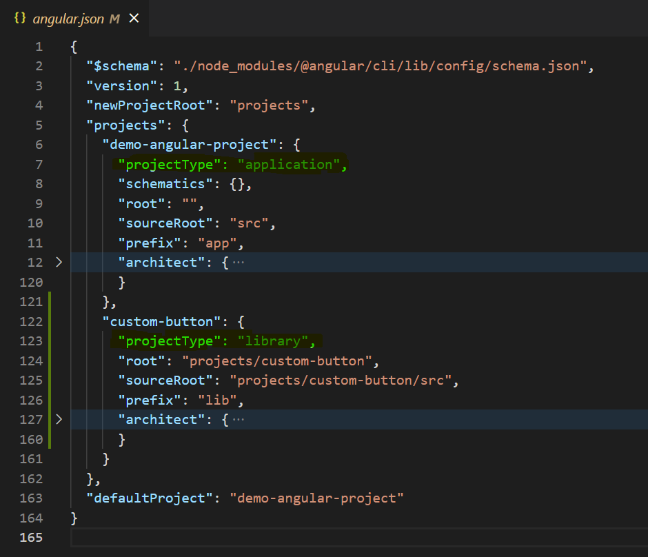
angular.json file
You'll also find a new “projects” folder inside your root directory. This projects folder will essentially hold all the components that you create. Currently, it's only going to have only 1 component which is the custom-button component. If you look at the folder structure of this component library, it's going to look very similar to an angular application's folder structure.
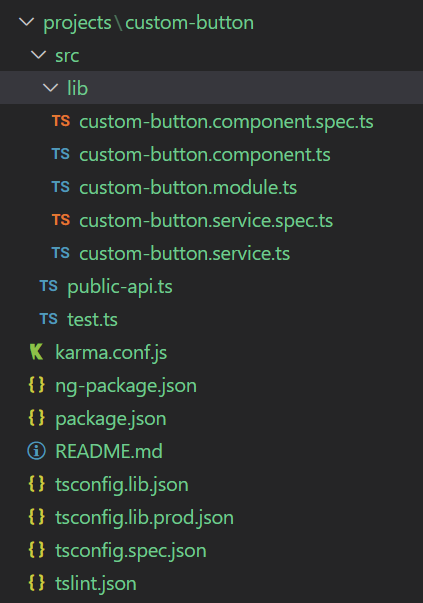
Library folder structure
The “public-api.ts” file is going to be the entry point to your library. This is where you'll export all the files that you want the user to be able to use. So any files that you export from this file will be accessible to the users who install your library.
Step 2: Creating and testing out our component
Inside your custom-button.ts file, copy the following code:
import { Component, Input } from '@angular/core';

@Component({
   selector: 'lib-custom-button',
   template: `**<button [style.color]='color'>{{body}}</button>**`,
   styles: []
})

export class CustomButtonComponent {
   **@Input() color: string = "#000";
   @Input() body: string = "Hello world"**

   constructor() { }
}
This is a pretty straightforward Angular component. We have a button inside the template with custom input properties for its color and text.
Now to test this component, we'll need to build it first. This will basically create a production-ready artifact by cleaning and optimizing your code, which you can then deploy to any platform. So inside your terminal type in the following command:
ng build custom-button --prod
Once the build process is done, you'll find a “dist” folder in your root directory. This dist folder holds the production builds for all your projects. So even when you are planning to deploy the angular front end application(not the library) and you create a build for it, it's going to be present in the same “dist” folder.
Now that we have this build ready, we can use it in our project just like we would use any other third-party library. It basically acts as if it's inside your node modules folder, even though it's not.
To use this button inside your angular application, you'll need to import it first. So inside your app.module.ts, import your custom button module.
import { NgModule } from '@angular/core';
import { BrowserModule } from '@angular/platform-browser';
import { CustomButtonModule } from 'custom-button'
import { AppComponent } from './app.component';

@NgModule({
   declarations: [AppComponent],
   imports: [BrowserModule, CustomButtonModule],
   providers: [],
   bootstrap: [AppComponent]
})

export class AppModule { }
Now you can use your button component, so inside your “app.component.html” file, copy these lines.
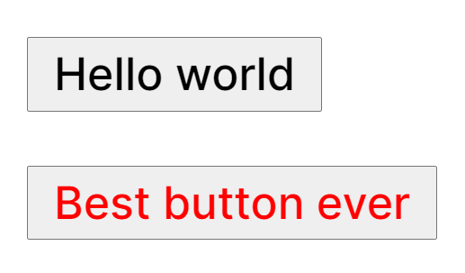
<lib-custom-button></lib-custom-button>
<lib-custom-button color='red' body='Cool button'></lib-custom-button>
The first button will have the default values that we had set inside the component. The second button will have a red color and “Cool button” as its text.
Cool buttons amr
Now the reason that we were able to import it normally without installing it in our project is that inside our “tsconfig.json” file, there's this “paths” key which basically re-maps the imports to the location that we provide. So instead of looking inside the node modules folder like it would normally do, it looks for the library inside a custom location that we provide and this custom location is automatically set to your dist folder when you build the project.
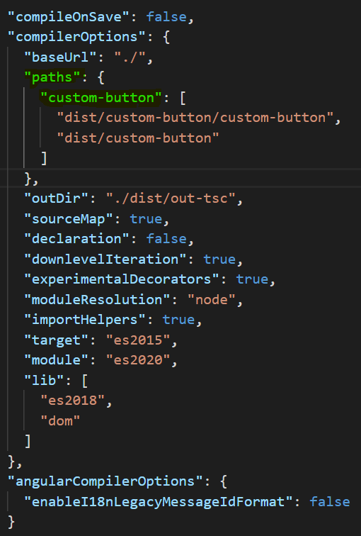
tsconfig.json file
This is perfect for testing because if this feature was not present, you would have to publish the package first, then install it inside your application, and only then will you be able to test it. After that any time you make a change to this library, you'll have to do the same set of steps again to see if the changes worked. An absolute nightmare!
Now you only need to run the build command after making changes and your library will be present inside your dist folder, ready to be tested.
PRO TIP: If you add a “watch” flag at the end of your build command:
ng build custom-button --prod --watch
You don't even have to worry about manually doing it again. It'll automatically listen to any changes you make and simultaneously rebuild the project for you.
Step 3: Publishing it to NPM
Now that we have tested our production build, it's time to push this to the npm store. Before pushing it to the store, there are a couple of steps that you'll need to follow. All these steps have already been covered in the previous blog post which you can find over here or this video over here.
-
Create and login into your npm account. You'll need to create an npm account first. After registration, you'll need to log in to your npm account inside VSCode. So inside your terminal, type “npm login”. It will ask for the same set of credentials that you filled in when registering your account. Once this is done, you can move on to the next step.
-
Add a scope to the package. NPM will not allow two packages to have the same or even a similar name. So you'll need to add a scope to your package which will make your package name unique. The scope, in this case, is going to be your username. So inside your library(not your application), open the package.json file. The name key inside the file is currently set to custom-button. Change it to @“you-user-name”/custom-button. So since my npm username is “akileshrao19”, my package name will be “@akileshrao19/custom-button”. Again, the reason behind doing this is explained in detail in the previous blog post.
Once you're done with these steps, you can finally publish it to the store. You'll first need to be inside your dist folder. Once you're there
cd .\dist\custom-button\   //WILL TAKE YOU INSIDE YOUR DIST FOLDER
npm publish --access=public
(Packages with a scope in their name are private by default and to publish private packages you need a paid monthly subscription. So instead, we'll publish it publicly, by adding the “access=public” flag).
If you followed along and did everything correctly, you'll get a successful response which may look something like this:
+@YOUR-USERNAME/custom-button@0.0.1
You can go to npm's website and log in. Inside your packages section, you'll find your newly created library.
Step 4: Testing out the published library
Now open up a fresh new terminal in VSCode and install your new package. So in my case, it would be,
npm install @akileshrao19/custom-button
You'll need to replace my library name with your own library. Once it's installed go to your “tsconfig.json” file and comment out the paths key. This will immediately give you an error inside your “app.module.ts” file because now VSCode is not able to find your library(You may not get the error if the project inside your dist folder and the project that you install have the same name, along with the scope.)
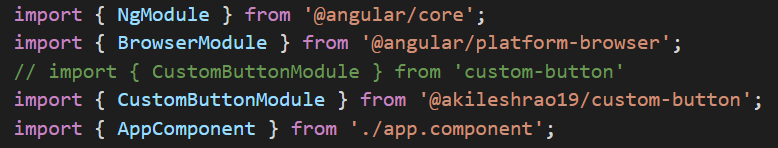
Replacing the older reference to the actual package inside node modules
Now import the package as you would normally do from your node_modules and run your Angular application.
ng serve
It should work the same as before but now you're using the component that's present inside your node modules and not inside the dist folder.
Conclusion
With that, you've successfully created, tested, and published an Angular component to the npm store. This was a long post and for some of you, it may be a bit confusing. As mentioned earlier, you can always watch the video version of this post over here. I take you through the same steps in the video but you also get to see the mistakes that I make and how you can avoid them.
The previous post covers npm-related concepts in a lot more detail. You can read it over here.
If you have any queries or suggestions, you can get in touch with me on any of my socials mentioned below. Cheers!
Create your own component library with Bit!
Instead of building monolithic apps, build independent components first and compose them into features and applications. It makes development faster and helps teams build more consistent and scalable applications.
Bit offers a great developer experience for building independent components and composing applications. Many teams start by building their Design Systems or Micro Frontends, through independent components. Give it a try →
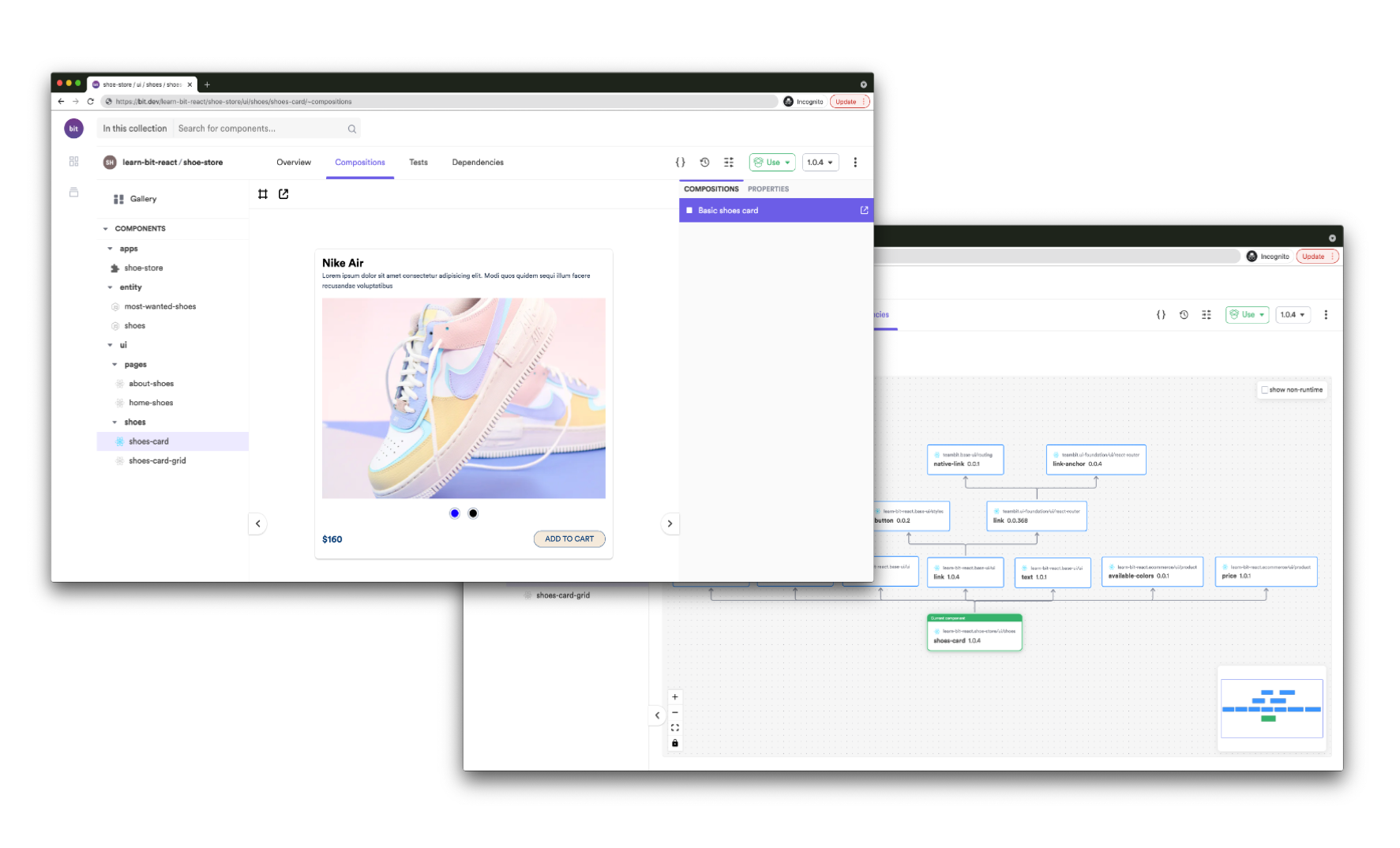
An independently source-controlled and shared “card” component. On the right => its dependency graph, auto-generated by Bit.
Comments
Loading comments…