Tooltips are an essential part of many user interfaces.
Providing important information where icons alone cannot, they are a great way to keep an interface clean, yet still usable. Icons alone are rarely sufficient to provide all the necessary information about functionality to a new user.
Except in the case of well-established iconography, such as the save icon, it's important to describe what a button will do to a user who is unfamiliar with your interface.
 Even Medium uses tooltips
For a while, I hacked together inconsistent and messy methods of implementing tooltips on a case-by-case basis. Eventually I decided to standardize the way I implement them, and I created an easy-to-use Angular directive that allows you to quickly add a tooltip to an element. Directives are a perfect way to handle tooltips since they allow us to attach logic to any element regardless of its position or styling.
Requirements
A tooltip should popup with text when the user hovers over an element for a period of time. It should remain at least long enough for the user to read it, and vanish when the user is no longer hovering over the element.
In addition, it should not affect the rest of the page, whether by pushing other elements, or by modifying the parent. Finally, it should be easy to read and concise.
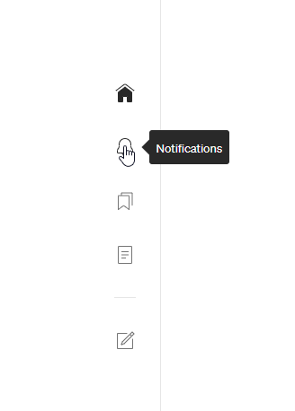
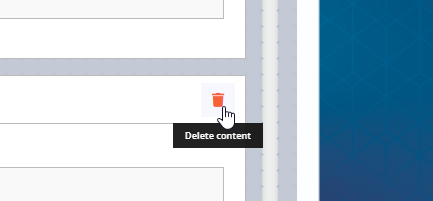 This is what we're going for.
The styling
This is the SCSS for the tooltip:
.tooltip-container {
  text-align: center;
  z-index: 100;
  position: fixed;
  padding: 6px 12px;
  font-size: 0.66rem;
  font-weight: 600;
  line-height: initial;
  color: white;
  width: auto;
  background: #111111ee;
  box-sizing: border-box;
  opacity: 0;
  transform: translate(-50%, -30%);
  animation: tooltip-slide 0.18s ease-out 0.5s;
  animation-fill-mode: forwards;
  pointer-events: none;
}

@keyframes tooltip-slide {
  0% {
    opacity: 0;
    transform: translate(-50%, -30%);
  }
  100% {
    opacity: 1;
    transform: translate(-50%, 0);
  }
}
Important to note here is pointer-events: none which means that the tooltip itself will not react to click or hover events.
This is necessary so that the tooltip doesn't block other elements, especially the element it is attached to.
Colors, sizing, etc. are up to you of course, but generally the simpler the tooltip the better.
The code
@Directive({
  selector: "[tooltip]",
})
export class TooltipDirective implements OnDestroy {
  @Input() tooltip = ""; // The text for the tooltip to display
  @Input() delay? = 190; // Optional delay input, in ms

  private myPopup;
  private timer;

  constructor(private el: ElementRef) {}

  ngOnDestroy(): void {
    if (this.myPopup) {
      this.myPopup.remove();
    }
  }

  @HostListener("mouseenter") onMouseEnter() {
    this.timer = setTimeout(() => {
      let x =
        this.el.nativeElement.getBoundingClientRect().left +
        this.el.nativeElement.offsetWidth / 2; // Get the middle of the element
      let y =
        this.el.nativeElement.getBoundingClientRect().top +
        this.el.nativeElement.offsetHeight +
        6; // Get the bottom of the element, plus a little extra
      this.createTooltipPopup(x, y);
    }, this.delay);
  }

  @HostListener("mouseleave") onMouseLeave() {
    if (this.timer) clearTimeout(this.timer);
    if (this.myPopup) {
      this.myPopup.remove();
    }
  }

  private createTooltipPopup(x: number, y: number) {
    let popup = document.createElement("div");
    popup.innerHTML = this.tooltip;
    popup.setAttribute("class", "tooltip-container");
    popup.style.top = y.toString() + "px";
    popup.style.left = x.toString() + "px";
    document.body.appendChild(popup);
    this.myPopup = popup;
    setTimeout(() => {
      if (this.myPopup) this.myPopup.remove();
    }, 5000); // Remove tooltip after 5 seconds
  }
}
Let's start at the top. The directive has a required input, the tooltip text itself, and an optional input to change the delay between when the host element is hovered and when the tooltip appears. I find 190ms works well by default. The constructor takes an ElementRef so that we can reference the host element for positioning the tooltip.
Next, we have two HostListeners, one to detect when the mouse hovers over the element, and one to detect when the mouse leaves. When the mouse enters the element, we'll set a delay to show the popup, keeping a reference to the timeout. If the mouse leaves the element before the timeout has finished, we'll wipe the timeout and not show the popup. If the timeout completes, then we call createTooltipPopup.
The function createTooltipPopup creates the HTML for our popup element and assigns it a class and position. The position is set to the middle of the host element, 6px below it. Since the tooltip has position: fixed it won't disrupt other elements on the page. Finally, we add a timeout to remove the popup after 5 seconds. Alternatively, the popup is also removed when the mouse leaves the host element.
With this directive, you can simply attach a tooltip to any element, such as:
<div class="user-icon" [tooltip]="'Sign In'"></div>
Feel free to implement this directive in your own Angular applications, changing the styles to suit your needs. I hope you found this helpful; thank you for reading.
Comments
Loading comments…