A comprehensive guide starting from embedding Google Forms as an iframe to any customized UI with styling and branding
Have you ever built a website? Have you ever thought about contacting your users to get feedback?
If your answer is yes to both of questions, there is a powerful tool to collect feedback from users, which is called Google Forms.
Google Forms is a survey administration software. It is part of the free, web-based Google Docs Editors suite, including Google Docs, Google Sheets, Google Slides, Google Drawings, Google Sites, and Google Keep. Google Forms can manage event registrations, create a quick opinion poll, and perform much more tasks.
Let’s take a look at how to use Google Forms in React apps, starting from embedding it as an iframe to any customized UI with styling and branding.
Create Google Forms
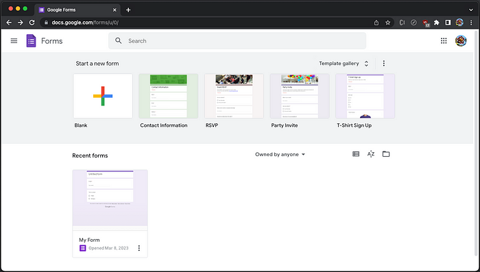
Go to [https://docs.google.com/forms](https://docs.google.com/forms), it shows a list of form templates and recently used forms:
Click the colorful + sign to start a new form, which has three tabs, Questions, Responses, and Settings.
Here is the first tab, Questions.
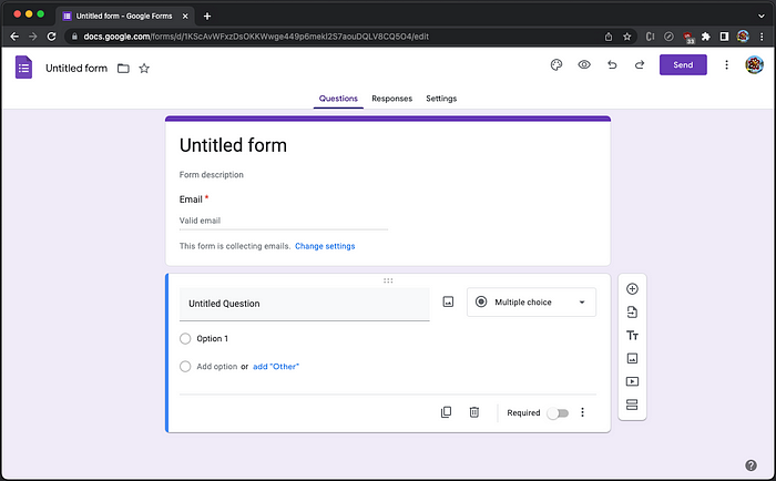
It builds a form with title, description, and various form components. Clicking on the select, showing Multiple choice, we see various form components, including Short answer, Paragraph, Multiple choice, Checkboxes, Dropdown, File upload, Linear scale, Multiple choice grid, Checkbox grid, Date, and Time.

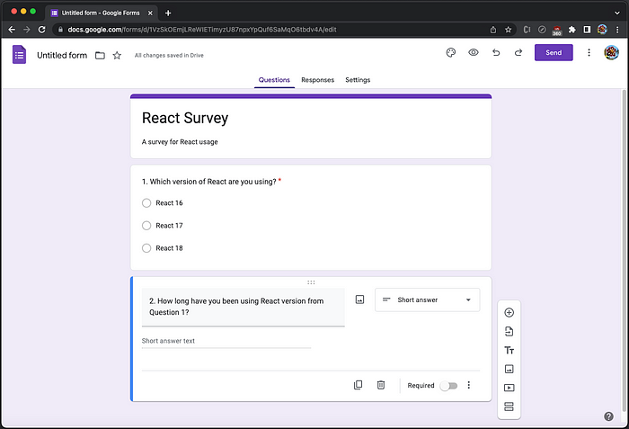
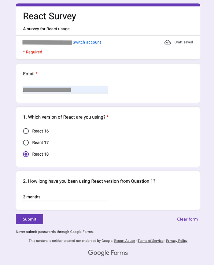
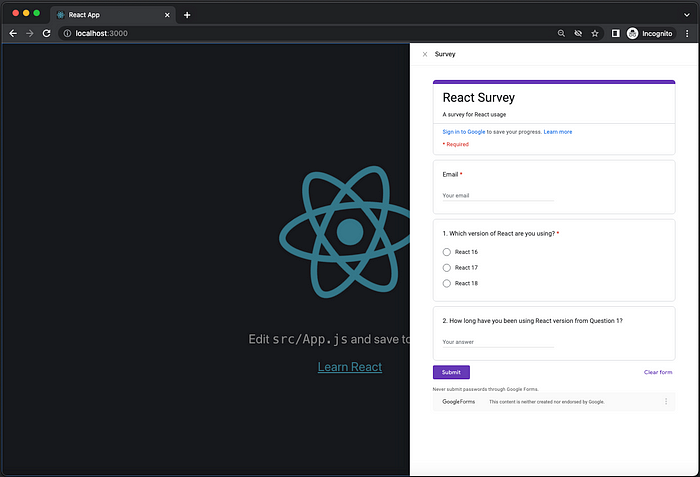
Using this UI, we have built a survey for React usage:
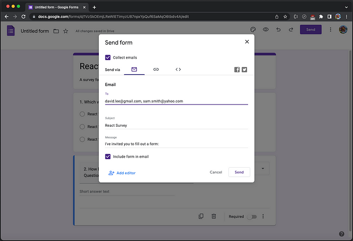
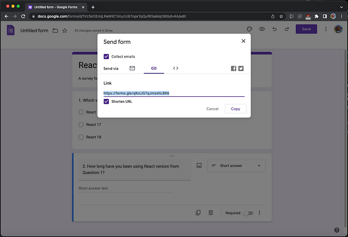
Click on the button, Send, and it shows the choices to send the form via Email, Link, or Embed HTML. If the choice is Email, an email list needs to be provided:
If the choice is Link, the link can be copied, long or short version:
If the choice is Embed HTML, an iframe tag can be copied:
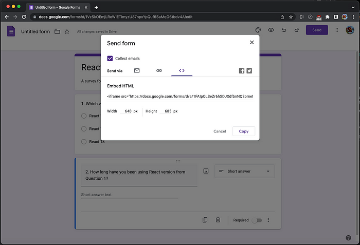
Here is the copied iframe tag with default width and height set to 640px and 685px.
<iframe
  src="https://docs.google.com/forms/d/e/1FAIpQLSeZr6hSDJXdfbnNQ2omeMYLd0SpLwABU3BYUK0mpEzuILdcBQ/viewform?embedde``d=true"
  width="640"
  height="685"
  frameborder="0"
  marginheight="0"
  marginwidth="0"
>
  Loading…
</iframe>
Go back to the choice of Email, and click the button, Send.
We receive the email immediately. On the email content, there is a button, FILL OUT IN GOOGLE FORMS.

It opens a new tab/window. Fill in fields and click the button, Submit.
Go back to the form builder, and choose the second tab, Responses. It shows one response received and one response pending, along with statistical data:
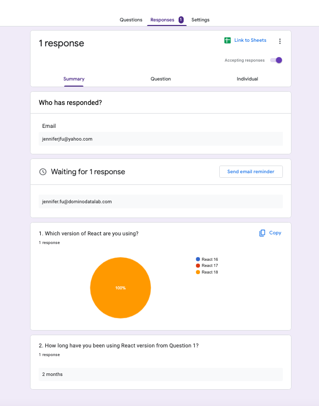
Click on the green button at the top of form, Link to Sheet, and it allows us to save responses to a spreadsheet.

Google Forms is a web application. It works out of the box, and we are going to use it in a React app.
Set Up Ant Design System in Create React App
We use Create React App as a base to embed Google Forms. The following command creates a React project:
% yarn create react-app react-google-form
% cd react-google-form
Ant Design System is an open source code for enterprise-level UI design languages and React UI library. We install antd to take advantage of its rich component library to build the app.
% yarn add antd
It becomes part of dependencies in package.json:
"dependencies": {
  "antd": "^5.3.2"
}
The working environment is ready.
Build Google Forms App
Ant Design System has many UI components, such as button, icon, typography, modal, select, table, and tree components. We are going to embed Google Forms using FloatButton and Drawer, along with an icon, LikeOutlined.
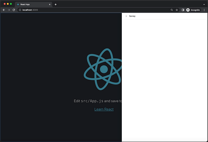
The FloatButton Component
FloatButton is used for global functionality on the site. It can be seen wherever you browse. We place the button at the lower right corner.
Here is the code:
<FloatButton
  icon={<LikeOutlined />}
  description="Survey"
  onClick={() => setOpen(true)}
  style={{ width: 80, height: 80, bottom: 24, right: 24 }}
/>
Optionally, FloatButton can have icon and description. Upon clicking, we make it to open the drawer (setOpen(true)). The button size has been configured to be 80px x 80px, and the distance to bottom and right are both 24px.
The Drawer Component
Drawer is a panel which typically overlaid on top of a page and slides in from the side. Here is the drawer after clicking the survey button:
Here is the code:
<Drawer
  title="Survey"
  placement="right"
  onClose={() => setOpen(false)}
  open={open}
  size="large"
>
  {children}
</Drawer>
Drawer has title, and placement, which can be 'left' | 'right' | 'top' | 'bottom'. The drawer is open if the open state is true. When clicking the X button or outside of the drawer, we close the open drawer. Drawer supports two sizes, "default" or "large". For our survey, it is set to "large".
Copy the iframe tag, and paste it as the child of Drawer, adjusting some props to fill up the drawer area.
<Drawer
  title="Survey"
  placement="right"
  onClose={() => setOpen(false)}
  open={open}
  size="large"
>
  <iframe
    title="Survey"
    src="https://docs.google.com/forms/d/e/1FAIpQLSeZr6hSDJXdfbnNQ2omeMYLd0SpLwABU3BYUK0mpEzuILdcBQ/viewform?embedded=true"
    frameborder="0"
    marginheight="0"
    marginwidth="0"
    style={{ width: "100%", height: "calc(100% - 3px)" }}
  >
    Loading…
  </iframe>
</Drawer>
Here is the Google Forms displayed on the drawer:
The Complete Code
Here is the complete code of the modified src/App.js:
import { useState } from "react";
import logo from "./logo.svg";
import "./App.css";
import { Drawer, FloatButton } from "antd";
import { LikeOutlined } from "@ant-design/icons";

function App() {
  const [open, setOpen] = useState(false);
  return (
    <>
      <div className="App">
        <header className="App-header">
          <img src={logo} className="App-logo" alt="logo" />
          <p>
            Edit <code>src/App.js</code> and save to reload.
          </p>
          <a
            className="App-link"
            href="https://reactjs.org"
            target="_blank"
            rel="noopener noreferrer"
          >
            Learn React
          </a>
        </header>
      </div>
      <FloatButton
        icon={<LikeOutlined />}
        description="Survey"
        onClick={() => setOpen(true)}
        style={{ width: 80, height: 80, bottom: 24, right: 24 }}
      />
      <Drawer
        title="Survey"
        placement="right"
        onClose={() => setOpen(false)}
        open={open}
        size="large"
      >
        <iframe
          title="Survey"
          src="https://docs.google.com/forms/d/e/1FAIpQLSeZr6hSDJXdfbnNQ2omeMYLd0SpLwABU3BYUK0mpEzuILdcBQ/viewform?embedded=true"
          frameborder="0"
          marginheight="0"
          marginwidth="0"
          style={{ width: "100%", height: "calc(100% - 3px)" }}
        >
          Loading…
        </iframe>
      </Drawer>
    </>
  );
}

export default App;
Build Customized Google Forms
Embedding Google Forms as an iframe works. However, we may want to have a customized UI with styling and branding. Google Forms enables us to do it by two steps:
- Get pre-filled link.
- Build a customized UI.
Get Pre-Filled Link
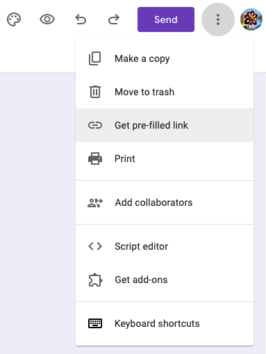
Go back to the form builder page. There is a list of available commands, upon clicking the more menu (also called the kebab menu, the three-dot menu, and the vertical three-dot menu).
Select Get pre-filled link:
It shows a survey UI to be pre-filled. It says that Email cannot be pre-filled, but do fill in answers for other questions.
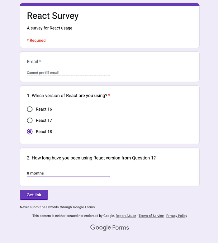
Click the button Get link, and the following is the saved link from the clip board:
https://docs.google.com/forms/d/e/1FAIpQLSeZr6hSDJXdfbnNQ2omeMYLd0SpLwABU3BYUK0mpEzuILdcBQ/viewform?usp=pp_url&entry.2057655542=React+18&entry.1743450499=8+months
The link shows internal IDs of the fields:
entry.2057655542: It is the ID for React version’s choice.entry.1743450499: It is the ID for the duration of use.
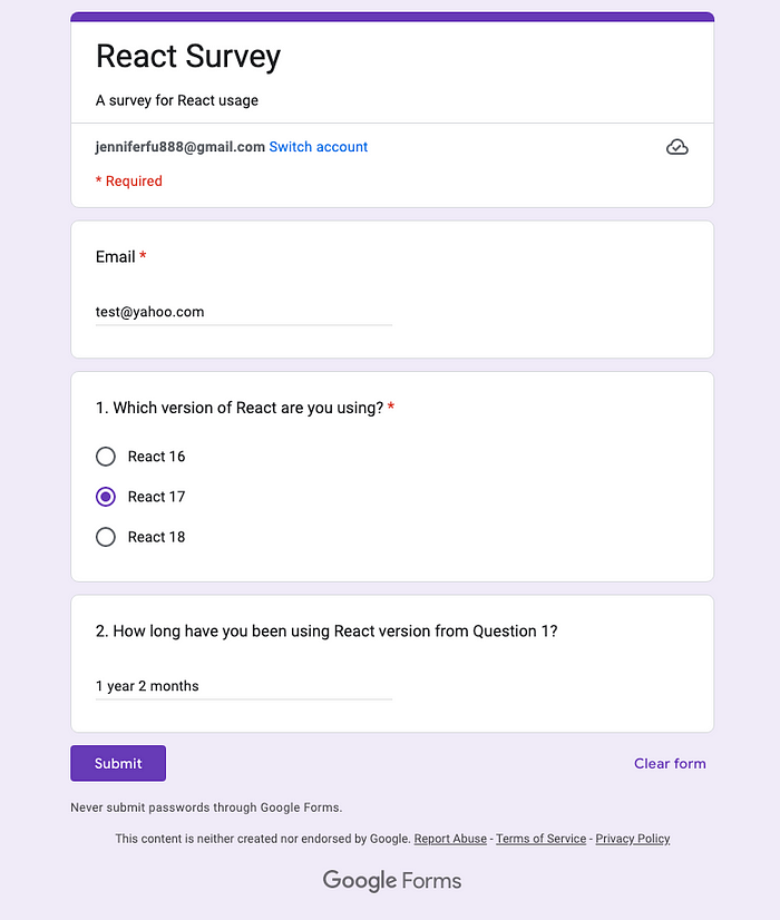
There is another field missing, emailAddress, as it cannot be pre-filled. We append an email address to the saved link:
https://docs.google.com/forms/d/e/1FAIpQLSeZr6hSDJXdfbnNQ2omeMYLd0SpLwABU3BYUK0mpEzuILdcBQ/viewform?usp=pp_url&entry.2057655542=React+18&entry.1743450499=8+months&emailAddress=test@yahoo.com
Copy and paste the link to the browser URL, and we can confirm that all fields are populated correctly.
After replacing viewform with formResponse, the link can be used to send responses to Google Forms.
Build a Customized UI
We would like to create a custom UI using Ant Design System.
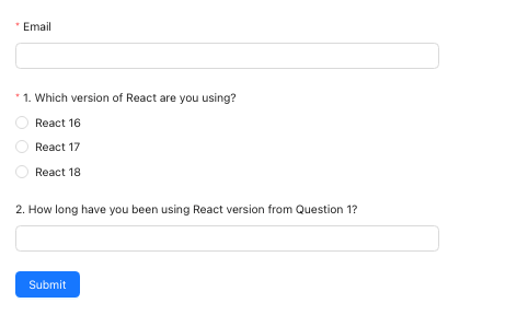
The Form Component
Form allows a user to enter data that is sent to a server for processing. Ant Design System provides Button, Form, Input, Radio, and many components that are wrapped by Form.Item.
The Email Input
The custom UI requires an email, which is a string input. The Form.Item is named email.
<Form.Item
  name="email"
  label="Email"
  rules={[{ required: true, message: "Email address is required" }]}
>
  <Input />
</Form.Item>
The React Version Radio Group
The custom UI requires to select the React version, which is a group of Radio buttons. The Form.Item is named version.
<Form.Item
  name="version"
  label="1. Which version of React are you using?"
  rules={[{ required: true, message: "React version is required" }]}
>
  <Radio.Group>
    <Space direction="vertical">
      <Radio value="React 16">React 16</Radio>
      <Radio value="React 17">React 17</Radio>
      <Radio value="React 18">React 18</Radio>
    </Space>
  </Radio.Group>
</Form.Item>
The Duration of Use Input
The custom UI can optionally have the duration of use, which is a string input. The Form.Item is named duration.
<Form.Item
  name="duration"
  label="2. How long have you been using React version from Question 1?"
>
  <Input />
</Form.Item>
The Submit Button
The form has a submit button. Since no data is used, it works with or without being wrapped by Form.Item.
<Button type="primary" htmlType="submit">
  Submit
</Button>
When the button is clicked, the form is validated:
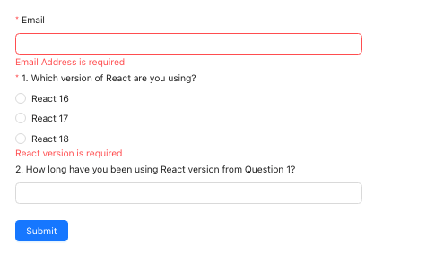
After all required fields are validated, Submit works.
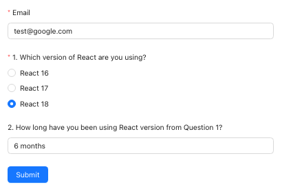
The form’s onFinish method is invoked with an object of the populated data. The above input generates the following object:
{
  "email": "test@google.com",
  "version": "React 18",
  "duration": "6 months"
}
This object is used to populate formResponse's query parameters, with internal IDs.
const onFinish = useCallback(
  async ({ email, version, duration }) => {
    try {
      await fetch(
        "https://docs.google.com/forms/d/e/1FAIpQLSeZr6hSDJXdfbnNQ2omeMYLd0SpLwABU3BYUK0mpEzuILdcBQ/formResponse?" +
          new URLSearchParams({
            "entry.2057655542": version,
            "entry.1743450499": duration ?? "",
            emailAddress: email,
          }),
        {
          mode: "no-cors",
        }
      );
    } catch (e) {
      console.log(e.message);
    }
  },
  [api]
);
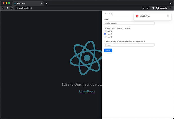
We have to set mode to 'no-cors', as this app located localhost:3000 fetching to https://docs.google.com causes the violation of Cross-Origin Resource Sharing (CORS). 'no-cors' works, but we should put this kind of service into the backend, such as a node.js server.
The Complete Demo
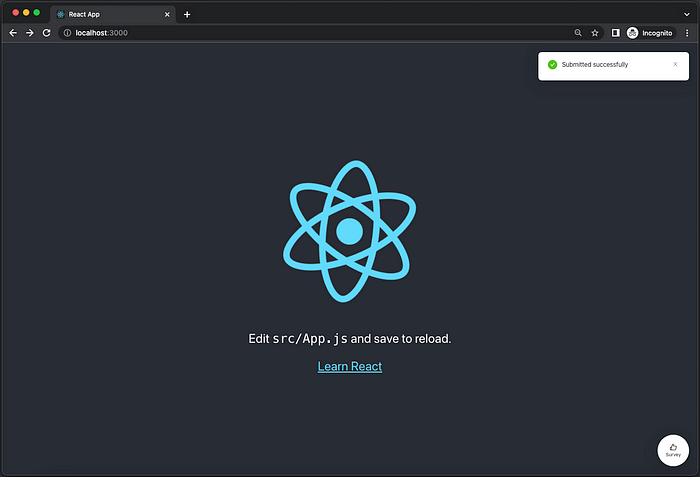
For a complete demo, we also use Ant Design System’s notification to send out a success (api.success) message or an error (api.error) message. For a successful submission, the form data is cleared (form.resetFields()), and the drawer is closed (setOpen(false)). Since Ant Design System divides the design area into 24 sections, the form takes three quarters of the width with span set to 18.
Here is src/CustomGoogleForms.js:
import { useCallback } from "react";
import { Button, Form, Input, Radio, Space, notification } from "antd";

const CustomGoogleForms = ({ setOpen }) => {
  const [form] = Form.useForm();
  const [api, contextHolder] = notification.useNotification();

  const onFinish = useCallback(
    async ({ email, version, duration }) => {
      try {
        await fetch(
          "https://docs.google.com/forms/d/e/1FAIpQLSeZr6hSDJXdfbnNQ2omeMYLd0SpLwABU3BYUK0mpEzuILdcBQ/formResponse?" +
            new URLSearchParams({
              "entry.2057655542": version,
              "entry.1743450499": duration ?? "",
              emailAddress: email,
            }),
          {
            mode: "no-cors",
          }
        );
        api.success({
          message: "Submitted successfully",
        });
        form.resetFields();
        setOpen(false);
      } catch (e) {
        api.error({
          message: e.message,
        });
      }
    },
    [api, form]
  );

  return (
    <>
      {contextHolder}
      <Form
        form={form}
        layout="vertical"
        wrapperCol={{ span: 18 }}
        onFinish={onFinish}
      >
        <Form.Item
          name="email"
          label="Email"
          rules={[{ required: true, message: "Email address is required" }]}
        >
          <Input />
        </Form.Item>
        <Form.Item
          name="version"
          label="1. Which version of React are you using?"
          rules={[{ required: true, message: "React version is required" }]}
        >
          <Radio.Group>
            <Space direction="vertical">
              <Radio value="React 16">React 16</Radio>
              <Radio value="React 17">React 17</Radio>
              <Radio value="React 18">React 18</Radio>
            </Space>
          </Radio.Group>
        </Form.Item>
        <Form.Item
          name="duration"
          label="2. How long have you been using React version from Question 1?"
        >
          <Input />
        </Form.Item>
        <Button type="primary" htmlType="submit">
          Submit
        </Button>
      </Form>
    </>
  );
};

export default CustomGoogleForms;
The created component, CustomGoogleForms, is used in src/App.js:
import { useState } from "react";
import logo from "./logo.svg";
import "./App.css";
import { Drawer, FloatButton } from "antd";
import { LikeOutlined } from "@ant-design/icons";
import CustomGoogleForms from "./CustomGoogleForms";

function App() {
  const [open, setOpen] = useState(false);
  return (
    <>
      <div className="App">
        <header className="App-header">
          <img src={logo} className="App-logo" alt="logo" />
          <p>
            Edit <code>src/App.js</code> and save to reload.
          </p>
          <a
            className="App-link"
            href="https://reactjs.org"
            target="_blank"
            rel="noopener noreferrer"
          >
            Learn React
          </a>
        </header>
      </div>
      <FloatButton
        icon={<LikeOutlined />}
        description="Survey"
        onClick={() => setOpen(true)}
        style={{ width: 80, height: 80, bottom: 24, right: 24 }}
      />
      <Drawer
        title="Survey"
        placement="right"
        onClose={() => setOpen(false)}
        open={open}
        size="large"
      >
        <CustomGoogleForms setOpen={setOpen} />
      </Drawer>
    </>
  );
}
After a successful submission, the drawer is closed and the success message is displayed.
How to test the failed case?
Simply change mode to 'cors':
mode: "cors";
Upon clicking Submit, the fetch command failed, and the error message is displayed.
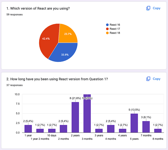
The Statistical Data
After more forms are submitted, the statistical data is updated:
Conclusion
Google Forms is a powerful tool to collect feedback from users. We have shown two examples:
- Embed Google Forms as an iframe in React App.
- Invoke Google Forms from a customized UI.
Which way do you prefer?
Thanks for reading.
Comments
Loading comments…