In the process of learning how to use Lottie (an animation library by Airbnb), I thought it might be useful to revisit the classic way of animating web elements:
Keyframes work pretty much the same way in CSS as they do here in this video editor (Premiere Pro).
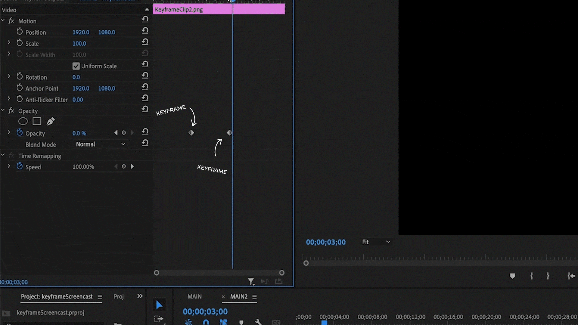
For example, this clip’s opacity uses keyframes to change the value from 100 percent to zero between two points in time, which results in the clip fade out.
These 2 points are keyframes, and all the transitional values between these points are computed for us by the software, or in the case of keyframes in CSS, the browser.
We’ll begin with a fresh install of create-react-app.
Right away we’ve got this React logo here spinning clockwise. This spinning is being accomplished by using keyframes. Let’s see how.
In App.js we find the image tag here and we can see that it has the className of App-logo. Therefore any CSS properties applied to this class will apply to this image. All styles are imported from App.css so let's look there.
Here we have App-logo, in this second spot, and right below it in this @media query block we see an animation property being defined on that App-logo class.
This actually doesn’t really need to be in this media query, so I’m just going to drop this into the App-logo class directly and delete this @media block since we don't need it.
This App-logo class has this animationproperty on it with 4 parameters. What do these mean?
.App-logo {

  height: 40vmin;

  pointer-events: none;

  animation: App-logo-spin infinite 20s linear;

}
The first parameter, App-logo-spin is the keyframe, which is defined down below.
Just like how keyframes are established in that video editor by establishing start and stop values, the exact same thing is happening here, except we call it from and to.
Within these from and to blocks we define what properties we want to change.
@keyframes App-logo-spin {

  from {

    transform: rotate(0deg);

  }

  to {

    transform: rotate(360deg);

  }

}
In this case, it’s the rotation of the image, which we’re telling it to start at 0 degrees and spin clockwise a full 360 degrees. But we can stack as many different properties in here as we want.
So similar to that video clip fading out over time, let’s do the same thing here.
Under from let’s add an opacity: 1, and under to let's add an opacity: 0.
Now the image will still spin but should also slowly fade.
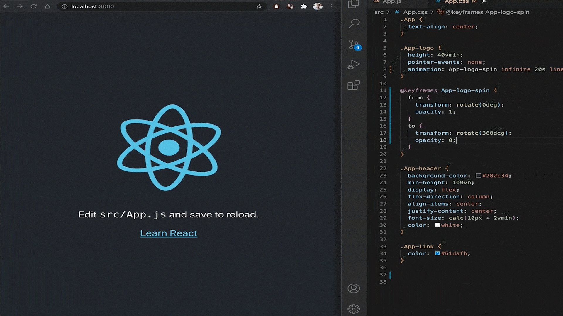
Following the keyframe parameter, we have infinite 20s linear.
-
Infinite means the animation will repeat once it’s finished.
-
The “s” here is for seconds, and so this animation will run over the span of 20 seconds.
-
Linear is the animation timing function, or what is commonly called easing.
Since all the values between from and to are being calculated by the browser, the animation timing parameter is for changing how the values between from and to are calculated.
Right now it’s set to linear and our image spins at a constant rate.
But let’s change this from linear to ease-out (and make it a bit faster & remove that opacity).
Now the animation starts at full speed but eases out.
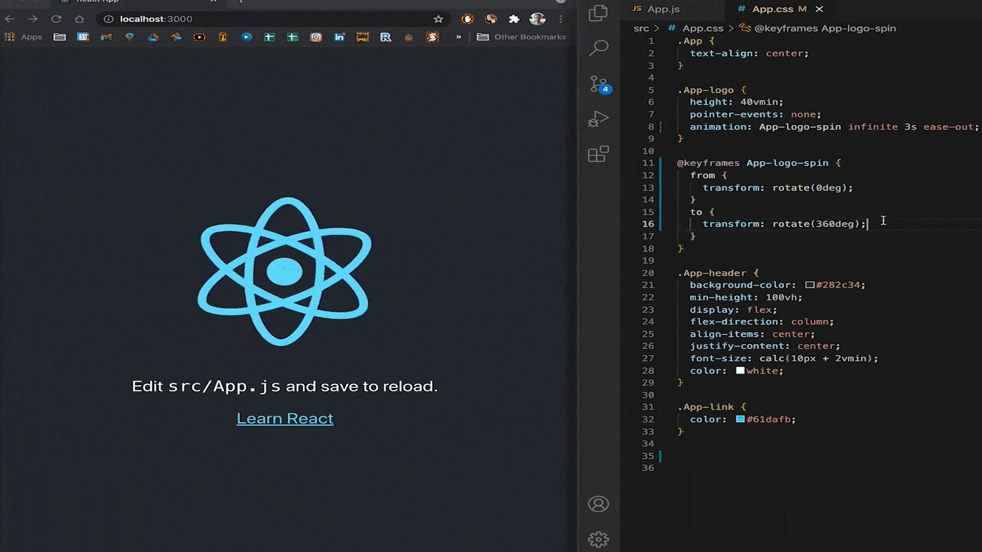
We can also do ease-in, ease-in-out, or create a customized cubic bezier function, among a few others.
In sum, that’s the general way by how keyframes work:
Step 1- Define a keyframe.
Step 2 -Apply it to an element class with the animation property.
Step 3 -Set additional parameters such as length and timing.
And while libraries like Lottie that I mentioned really take web animations to the next level, right now let’s take a look at Animate.css, a now-classic animation library that uses keyframes exclusively.
With the Animate.css library, you can easily drop any of these animations into your project.
I’ve always found it weird to animate text like this, but I suppose it’s fine for icons.
Let’s add the library to our project and apply it to that React logo.
In our command line, let’s add this to our project with yarn add animate.css and yarn start the app back up.
We’re going to go and find animate.css in our node_modules folder so that we can look at the source code and see how these animations are written.
Alright. Look at all this stuff! Doesn’t that look fun?
We’ll focus on the RubberBand animation.
@keyframes rubberBand {
  from {
    -webkit-transform: scale3d(1, 1, 1);
    transform: scale3d(1, 1, 1);
  }

  30% {
    -webkit-transform: scale3d(1.25, 0.75, 1);
    transform: scale3d(1.25, 0.75, 1);
  }

  40% {
    -webkit-transform: scale3d(0.75, 1.25, 1);
    transform: scale3d(0.75, 1.25, 1);
  }

  50% {
    -webkit-transform: scale3d(1.15, 0.85, 1);
    transform: scale3d(1.15, 0.85, 1);
  }

  65% {
    -webkit-transform: scale3d(0.95, 1.05, 1);
    transform: scale3d(0.95, 1.05, 1);
  }

  75% {
    -webkit-transform: scale3d(1.05, 0.95, 1);
    transform: scale3d(1.05, 0.95, 1);
  }

  to {
    -webkit-transform: scale3d(1, 1, 1);
    transform: scale3d(1, 1, 1);
  }
}
So this is a bit more complicated. We’re not just defining a simple from and to anymore, we’re breaking the animation down by percentages.
But this one is actually still relatively simple; all of the percentages are in order, and all it’s doing is changing the 3d scale.
Now let’s apply this animation to our React logo.
First, let's comment out the previous animation in our App-logo class.
Now in App.js let's import animate.css.
And now we can apply some classes to our image tag in order to animate it.
For this to work, the Animate.css library requires us to drop in the class animate__animated.
We are going to want our animation to repeat, so let's also add animate__infinite.
And then finally we can add the specific animation we want with animate__rubberBand.
Well, it’s easy enough to drop in an animation from a library, but let’s try making our own.
Let’s remove this rubberband animation and add the class animate__orbit
Now in the app.css file, we'll create that class as well as a keyframe called orbit.
In this keyframe let’s keep it simple and just define from, 50%, and to blocks.
And within these blocks, we’ll add a transform property.
The idea here is to have the logo orbit around a central point, rotating as it orbits, and getting smaller as it gets higher to give the illusion that it is farther away.
Therefore we’ll need to transform rotation and scale.
In the from block, let’s write transform: scale3d(.7, .7, .7) rotate(0deg);
We want the animation to end up the same size and in the same position it started in, so let’s write transform: scale3d(.7, .7, .7) rotate(360deg);
Halfway through the animation, we want it to be a little smaller when it reached the peak of the rotation, so in 50% we’ll write transform: scale3d(.5, .5, .5) rotate(180deg);
Now in our animate__orbit class let’s assign this keyframe as the animation with infinite, a 3-second loop, and linear timing.
Well, it’s scaling and rotating, but it’s not orbiting.
We can solve this by simply changing the origin point of the image.
Right now it is by default set to center. Let’s change it to top with transform-origin: top.
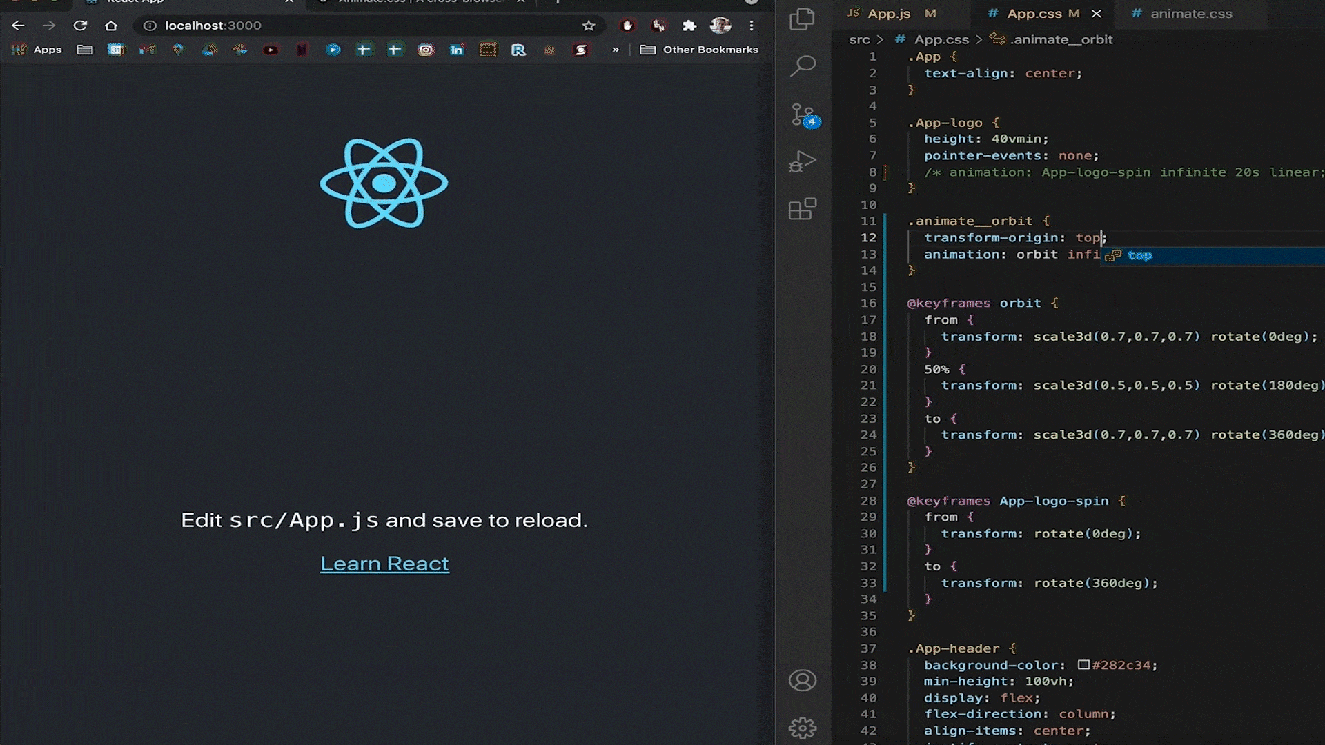
There we go! It's orbiting.
And I mean, it still could use work, as it doesn’t look exactly like a true orbit behaviour, but you get the idea.
So that’s one of the classic ways of animating elements on the web.
Now here’s a video where I say almost the exact same thing verbatim:
Thank you for reading.
Comments
Loading comments…