A donut chart is essentially a pie chart with an area of the centre cut out. However, a donut chart has its own advantage compared to a pie chart. Donut charts is able to provide a better data intensity ratio to standard pie charts since the blank center can be used to display additional, related data. Also, it is possible to nest several donut charts together to visualize data in different granularity.
In this tutorial, I will show you how to make a standard donut chart and a nested donut chart using matplotlib in Python.
1. Import libraries
import numpy as np
import pandas as pd
import matplotlib.pyplot as plt
2. Create a dataframe for data visualization
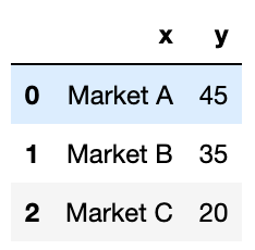
df=pd.DataFrame({'x':['Market A', 'Market B', 'Market C'],
 'y':[45, 35, 20]})
df
The dataset is very simple. It contains 3 markets and their respective market shares.
3. Draw a standard donut chart
plt.figure(figsize=(8, 8)) # change the size of a figure# The slices will be ordered and plotted counter-clockwise.
labels = df[‘x’]
sizes = df[‘y’]
colors = [‘#FFB600’, ‘#09A0DA’,’#8464a0'] #define colors of three donut pieces
explode = (0, 0, 0) # explode a slice if required
textprops = {“fontsize”:14,’color’:’black’} # Font size of text in donut chartplt.pie(sizes, explode=explode, labels=labels, colors=colors,
 autopct=’%.2f%%’, # Show data in 0.00%
 pctdistance =0.9,
 shadow=False,
 textprops =textprops,
 wedgeprops={‘linewidth’: 3.0, ‘edgecolor’: ‘white’},)

#draw a circle at the center of pie to make it look like a donut
centre_circle = plt.Circle((0,0),0.65,color=’grey’, fc=’white’,linewidth=1.00)
fig = plt.gcf()
fig.gca().add_artist(centre_circle)plt.axis(‘equal’) # Set aspect ratio to be equal so that pie is      drawn as a circle.
plt.show()
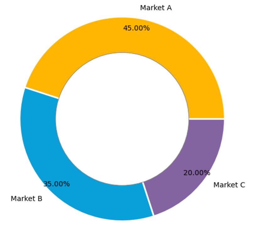
The donut chart looks like this:
4. Draw a nested donut chart
If under each market, we would like to show the shares of each product, then we need to create subgroup data and draw the nested donut chart.
plt.figure(figsize=(8, 8)) # change the size of a figurelabels = df[‘x’]
sizes = df[‘y’]
colors = [‘#FFB600’, ‘#09A0DA’,’#8464a0']labels_subgroup = [‘product A’, ‘product B’, ‘product C’, ‘product D’, ‘product E’, ‘product F’, ‘product G’]
sizes_subgroup = [20, 15, 10, 20, 15, 10, 10]
colors_subgroup = [‘#FFCE53’, ‘#FFDA7E’, ‘#FFE9B2’, ‘#30B7EA’,
 ‘#56C7F2’, ‘#C8A2C9’,’#D6A7DF’]

outside_donut = plt.pie(sizes, labels=labels, colors=colors,
 startangle=90, frame=True,
 autopct=’%.2f%%’,
 pctdistance =0.85)inside_donut = plt.pie(sizes_subgroup, labels=labels_subgroup,
 colors=colors_subgroup, radius=0.7,
 startangle=90, labeldistance=0.6,
 autopct=’%.2f%%’,
 pctdistance =0.4)
centre_circle = plt.Circle((0, 0), 0.4, color=’white’, linewidth=0)
fig = plt.gcf()
fig.gca().add_artist(centre_circle)

plt.axis(‘equal’)
plt.tight_layout()plt.show()
Then we will get a nested donut chart which looks like this:
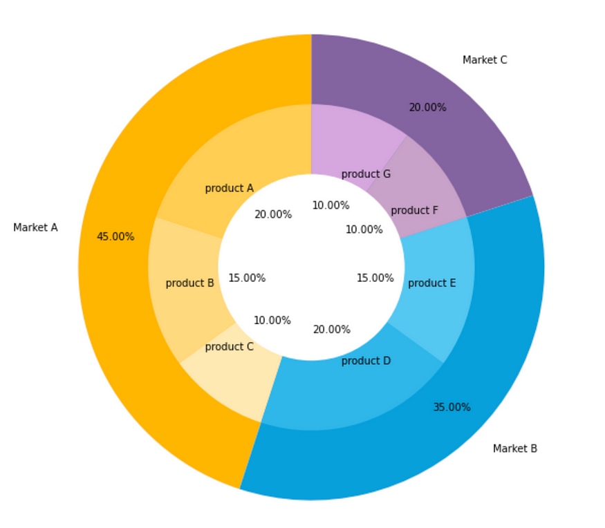
Generally, the subgroup will follow the color of its main group but with different shades. So the audience will not be confused by too many colors.
Comments
Loading comments…