A wise developer once said, "The success of your company depends on how quickly you can prototype and validate your idea." Well, as it turns out, success is a tad bit easier if you can also dress up those ideas in a functional yet easy-to-understand, beautiful yet responsive UI.
Time is of the essence. Imagine building a bleeding-edge product that is competitive with FAANG on features, speed, security, APIs, and third-party integrations. Needing to quickly build a great UI from scratch, on top of all that, can be overwhelming, especially if you have a winner of an idea but perhaps not a dedicated design team (yet).

This is where UI frameworks and component libraries come in, and React's ecosystem is by far the richest for these. A component library is simply a collection of pre-built, reusable components - carousels, accordions, alerts, modals, navbars, cards, buttons, breadcrumbs, and many more - allowing you to focus on building your dream app without having your vision held back for basic functionality.
So, in this post, we'll explore the 5 best React UI frameworks/component libraries that help bring your ideas to life, no matter your use-case. Let's dive right in!
1. MUI - The General-Purpose Workhorse

What is MUI?
If you've spent any time at all building apps within the React ecosystem, the one UI/component library you're bound to have heard of is MUI (formerly known as Material UI), literally, "Material to build UIs".
MUI has been around the block a few times, and it has gone through many changes, but its core identity has always been that it implements Google's Material Design (but now lets you use your own design system too). It is open source, and offers a massive number of production-ready components out-of-the-box for pretty much any UI element you can think of.
The obvious benefit to adopting it is having your components be closely tied with an agreed-upon design system (Material Design). Such a contract being in place means both your designers and your developers use the exact same concepts and guidelines while building out a UI, and this synergy ensures a consistent UI/UX, with increased development velocity.
What's the MUI developer experience like?
Building with MUI used to be fraught with peril, to put it lightly. JSS for styling was awkward at best and an undocumented nightmare at worst; customization was too much of a hassle to bother with; and the grid system was entirely unintuitive.
However, I'm glad to say that since the v5 release and subsequent rebranding to MUI, most pain points have been resolved to an acceptable degree. Its extensive community-contributed documentation is probably the best-in-class, the move to replace JSS with emotion was a solid one, and so was distinguishing itself from Google's Material Design by:
- Offering much easier customization via styling props, with the additional ability to define your own design system and use that instead, and
- Offering a selection of unstyled/headless components that can be used with whatever styling system one chooses.
Unfortunately, the massive bundle size is still an issue (but it is tree shakeable), vanilla MUI still has a specific look that screams Google Product™ and might not be the best option for your brand, and - perhaps most importantly for modern React development - there are still plenty of bugs with TypeScript (like the pesky performance issue that takes 4--5 seconds for autocomplete/IntelliSense to kick in when using MUI with TypeScript).
Still, strong a11y (for contrast ratio, focus indicators, and WAI-ARIA/semantics), extensive documentation, and the sheer number of components mean MUI remains a 'good-enough' option for most use-cases you might have.
2. Saas UI - Best-in-Class for building SaaS/B2B Apps
What is Saas UI?
Saas UI is an open-source (MIT license) React UI framework built on top of ChakraUI, written fully in TypeScript, with one goal in mind - saving you precious time by reducing boilerplate code, whether you're using NextJS, Remix, Blitz, Redwood, Vite, CRA, or something else.
When you're building a SaaS offering, the UI/UX you offer is a crucial aspect of your overall pitch to potential customers. In fact, a well-constructed user interface can increase your conversion rates by up to 200%, and improving UX boosts that number by up to 400%. But building a good UI/UX can be a daunting task, especially for SaaS owners who may not have the time or resources to devote to front-end development.
This, then, is what Saas UI aims to address. While it is primarily a user-friendly, composable, reusable, and customizable component library specializing in UI elements SaaS devs would generally need to build dashboard-y experiences (a large variety of Data Displays like lists, tables, grids, and filters in addition to Layout, Navigation, Modals, DatePicker, and Feedback elements), Saas UI also includes:
- HOCs and prebuilt sign-in screens that streamline auth for you (with Clerk, SupaBase, and Magic auth Providers out-of-the-box if you'd rather not roll your own.)
- Powerful, flexible forms via integrated react-hook-form to manage form state.
- Easy feature flagging in one line of code, without the need for third-party libraries.
- React hooks that provide utility.
- Great theming support; ideal for implementing your own design system with tokens using the Saas UI Palette generator, or tools like Themera or SupaPalette.
While the core UI library (@saas-ui/react) is free, Saas UI also offers paid Pro options (@saas-ui/pro) that serve as a complete starter pack for SaaS projects. The latter includes advanced components (like Charts) and tools for billing/subscription management (with Paddle), onboarding, sign-up flows and more, and even a frontend boilerplate that runs on NextJS and Electron.
What's the Saas UI developer experience like?
Saas UI is built from the ground up with typesafe app development in mind, and it shows. Everything from props to atomic style primitives is fully typed, with easy autocomplete/IntelliSense and easy refactors in the IDE.
Documentation is extensive and easily searchable, with live code examples that you can edit on-the-fly to see changes immediately. Great if you want to test drive some of these components without ever leaving your browser.
Every component offered is composable, WAI-ARIA compliant, easily themeable, and natively light/dark mode compatible, making use of industry-leading external libraries and tools where needed (Recharts, React Query, react-hook-form, react-table).
The styling/theming/customization system here will be extremely intuitive if you come from a Tailwind CSS background (less so if you've exclusively used something like emotion, though).
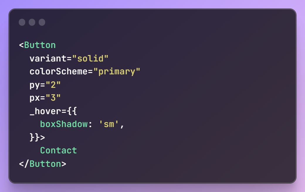
It essentially turns utility-first CSS into a styled-system equivalent, with atomic CSS properties that can be set for each component, but with two added advantages:
- you don't have to purge your CSS, and
- you get TypeScript autocompletion and validation for every single property.
Overall, if your use-case is rapidly prototyping an intuitive, elegant UI/UX for your SaaS offering, with typesafety (that goes all the way down to CSS properties!), great a11y, and native dark mode compatibility, Saas UI should be your framework of choice.
Click here to see Saas UI components, hooks, + themes in action.
3. Mantine - The TypeScript Dev's Choice
What is Mantine?
Mantine is an open-source component library that offers 120+ components with top-notch accessibility, supports Next.js, Gatsby, etc., and is built from the ground up with typesafety in mind.
Like MUI, it also uses emotion under the hood, and aims to be the everything-under-one-roof solution, providing core UI elements, modals, and carousels...but then goes one step further with some useful React hooks (use-debounced-value, use-fullscreen, use-move, etc.), code highlighters, and even a full-fledged rich text editor (formerly Quill.js based, now TipTap) on top.
The kicker is that, unlike MUI, it is entirely unopinionated in terms of a design system, and does not ship with one. This makes Mantine a great drop-in solution for building UI/UX, and you are, of course, still free to implement a design system of your choice via a comprehensive styling and theming system...or just Tailwind CSS!
What's the Mantine developer experience like?
If you're building in TypeScript, no other component library affords better support for it than Mantine. Everything from prop types to style properties for components is properly typed, and provides autocomplete/IntelliSense and quick refactoring in your IDE.
Documentation is great, easily searchable, and offers live demos for each and every component. However, the included code snippets themselves - while all clear, non-contrived, real-world examples - might not be intuitive enough for someone just trying to figure out how to layout a full app.
Mantine's many options for styling is a blessing as well as a curse, and can (and will) create confusion for newcomers. There's five(!) ways to do this:
- The
MantineProvidercomponent to provide themes to all wrapped components, - emotion's own CSS-in-JS implementation, with
createStyles/thesxprop, - The Styles API, using
classnamesorstylesprops - Component props
- Your standard issue inline styles.
Overall, Mantine is a joy to build with, and has a dedicated fanbase, but there's also no ignoring the fact that it is a relatively new, non-battle-tested library, and not as many apps use it in production (yet!). It is also rigidly opinionated, which will be an issue in the off-chance said opinions don't gel with your/your org's needs.
4. Ant Design - The choice for enterprise desktop apps.
What is AntD?
AntD is an open-source (MIT license) React UI framework that implements the Ant Design System created by the Alibaba Group. It is tailor-made for enterprise-grade applications, offering a large number of typesafe, reusable components that provide a clean, cohesive, professional-looking UI/UX, maintained by a large community of contributors. It sees rapid and regular development, with new components being added all the time.
AntD is built upon two pillars - i18n, and Design Tokens. This is one React UI framework that has been localized more than any other, and since the 5.0 release, it has been all-in on design tokens to construct a design system, in case the default Ant Design is too spartan for your use-case. Using Design Tokens with AntD lets you have one global theme, multiple themes switchable on the fly, or even a bespoke theme per component!
What's the AntD developer experience like?
Unfortunately, while AntD offers some novel and unique components not found in many UI libraries - like the ability to convert a string into a QR Code via a [QRCode](https://ant.design/components/qrcode?theme=dark) component - the overall developer experience has many speed bumps.
Leaving aside gigantic bundle sizes and sluggish performance, the biggest issues with AntD are responsiveness, accessibility, and documentation.
- Nothing about AntD is responsive. It was meant only for building desktop enterprise apps, and if you want to develop for any other screen/device size, you have to use the AntD mobile UI library instead - a completely different offering.
- Accessibility (speaking in terms of contrast ratios, focus states, keyboard navigation, and WAI-ARIA compliance) is a nightmare.
- While AntD's documentation is extensive and well-maintained, you're out of luck if you're an English speaker. The English variant of the docs is never the latest version, and many issues with the library lead to GitHub/StackOverflow discussions that are entirely in Chinese.
However, AntD has taken steps in the right direction with 5.0, with multiple improvements to a11y, bundle size, and moving away from LESS into the world of design tokens and CSS-in-JS. Development is far more intuitive, and customization is no longer the pain point that it was before. If you need to build professional-looking apps, give AntD a shot.
5. Tailwind UI - Premium utility-first design.

What is Tailwind UI?
Tailwind UI is a massive collection of 500+ professionally designed, fully responsive, hand-crafted React components (and templates), from the creators of the legendary Tailwind CSS themselves.
Much like Saas UI is built on top of ChakraUI, Tailwind UI is built on top of Headless UI, modifying and extending the latter's base components to add additional functionality and interactivity, only using Tailwind CSS for all cosmetics, animations, transitions, and so on. Headless UI provides the JavaScript, and accessibility features like keyboard navigation, focus states, synchronizing ARIA attributes with component state, and many more.
This is by far the simplest approach to a UI framework/components library on the list...but that's a blessing and a curse.
The upside, of course, is that these are incredibly performant components with a comparatively tiny bundle size, encapsulating tons of accessibility (which is extremely time-consuming to implement), and semantic HTML, with best practices for UI/UX.
The downside to this is that Headless UI (that Tailwind UI uses for anything that needs JavaScript) is a limited collection of maybe ten components. While it's impressive how much was customized off of just basic Dropdowns, Listboxes, Modals, Popovers, and Tabs (things that are not worth reinventing the wheel for), the lack of component variety can (and will, eventually) become an issue if you need to render highly-interactive, data-heavy displays in complex dashboards.
The other catch? This is a pricey, paid-option-only product (as opposed to Tailwind CSS itself), with a one-time purchase license costing $299 for individuals, and $799 for teams.
What's the Tailwind UI developer experience like?
For better or for worse, Tailwind UI is completely unopinionated, and by far the least rigid UI framework on this list. Every component here is offered as a single code example you extract, and adapt for your use-case. There are no hard-coded dependencies on any third-party data fetching/caching, forms, or tables library. This also makes these components infinitely shareable and reusable.
In fact, Tailwind UI does not use any kind of CSS-in-JS solution, or component props, at all, making it an oddity on this list.
Instead, it opts for the simplest possible solution - each of the 500+ Tailwind UI components is styled using Tailwind utility classes alone. The kicker is that these are built using best practices by the Tailwind team itself, and thus guaranteed to be accessible, blazingly fast, yet flexible (you can just edit the utility classes in the components' classNames prop to do whatever you want them to).
If you haven't already bought into the Tailwind ecosystem, though, this lightweight-by-design philosophy at play here might actually become a hindrance, as it will mean that you'll have to write all new CSS of your own and customize TailwindUI's generic-looking components yourself.
Overall, Tailwind UI is a recommendation that comes with caveats, because - while nothing can compete with it on bundle size or performance - utility-first CSS like Tailwind, and CSS-in-JS engines like emotion are, functionally, worlds apart. The design patterns are completely different, and it's incredibly common for many devs to have expertise in one, but have no knowledge at all of the other.
Summing It Up...
There are many component libraries out there, and while they are all good...some might work better for your next project than others. This article has hopefully helped you overcome decision fatigue, by realizing that the question isn't so much "which React UI framework/component library is the best?" as it is "which component library will solve this specific problem I have the best?".
So with that approach in mind, here's the rundown:
- "I need something that offers a huge variety of components (that will get me good a11y scores on Lighthouse) that I can use for pretty much any use case" → MUI.
- "I need something that lets me quickly build modern, intuitive, accessible UIs that I can easily customize for my brand" → Saas UI.
- "I'm a TypeScript-first developer and I want a better MUI, and being able to just drop in a rich text editor with code highlighting would be sweet, too!" → Mantine.
- "Bundle sizes, responsiveness, or accessibility aren't important. I'm just building an internal, enterprise app and need a large variety of components that look 'professional'" → AntD.
- "Actually, bundle sizes and responsiveness are incredibly important to me! Plus, I've already bought into the concept of utility-first CSS, and I don't mind paying for a solution." → Tailwind UI.
Comments
Loading comments…