Creating UI designs from scratch is time-consuming and often just annoying. Especially when you've seen the design you're trying to replicate somewhere else and know your life would be much easier if you had a template or design system you could use as a foundation to build your own UI. This particular problem affects developers and designers alike, and it's why there's an extensive amount of Figma UI kits and templates that can significantly speed up your design workflow.
Figma UI kits and templates are pre-designed resources that provide a collection of UI elements and components (buttons, input fields, dropdowns, sliders, cards), design systems, as well as pre-designed layouts for specific types of screens or pages for use in Figma. These kits and templates allow you to leverage the work of others, build upon existing designs, and create consistent and visually appealing user interfaces in record time.
In this article, we'll show you the five best Figma component libraries available on the market in 2023. This list has been put together after combing through legions of libraries and comparing them based on design consistency, UX, and structure among other parameters.
Without wasting any more time, let's dive right into it.
1. Saas UI Theme 1.0
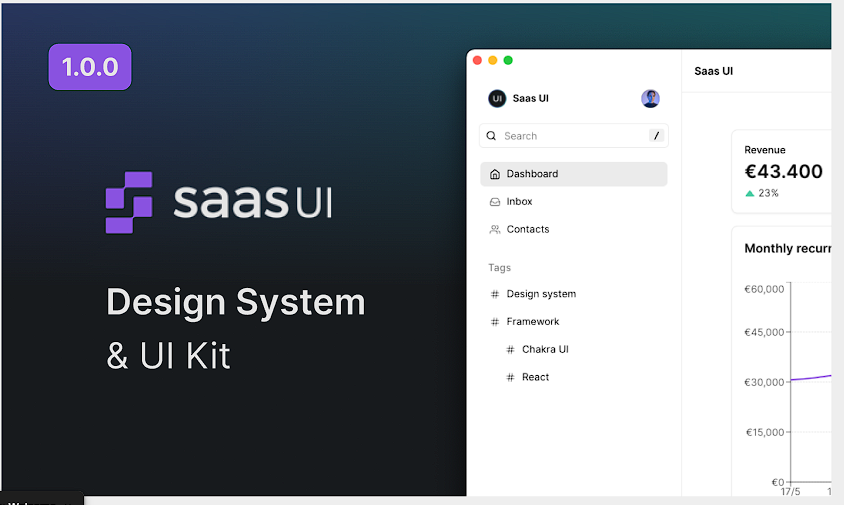
Saas UI Theme 1.0 is Saas UI's Figma library that's designed specifically to help developers and designers quickly create clean, professional, intuitive SaaS designs with ease.
Saas UI is a React component library that is specifically designed for SaaS apps, and this Figma library is their entire design system - from colors, to typography, to tables, nav items, and sidebars ---including a massive library of icons, all for free. Meticulously crafted with design best practices in mind, Saas UI Theme 1.0 combines simplicity, responsiveness, and accessibility to create an extensive library filled with interactive components and variants.
💡 If you use React and want to check out Saas UI's actual component library, check it out here.
With Saas UI's design system as a resource, providing a unified design language and style throughout the interface, you can ensure a seamless user experience and contribute to a professional and polished look and feel for your SaaS apps, so you can focus more on business logic, only customizing and fine-tuning the design to fit your specific needs where needed rather than starting from square one.
Saas UI Theme 1.0 has the Saas UI team behind it, so there are regular updates and community support for this library. If you're looking for a Library that gives you quality components for quick and easy editing and customization for your SaaS offering, this is one of the best on the market.
2. Relume Library Figma Kit
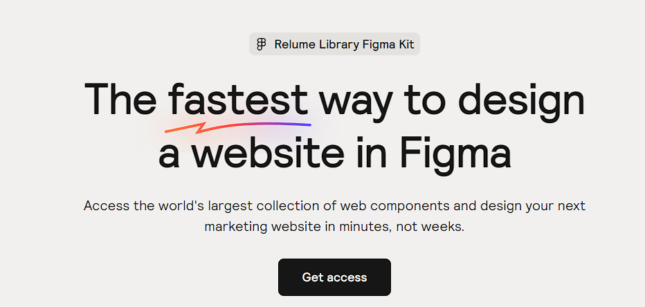
There are few UI kits that can compete with Relume Library Figma kit. This UI kit was designed with speed in mind, so it allows designers to create beautiful pages and UI with unstyled components - with full WebFlow copy-paste compatibility, too, if you're into that.
With over 900 page layouts, 42 templates, and a vast number of UI elements, Relume Library offers both quality and quantity in equal dose. It also has a wide range of ready-made components including Navbars, Legal pages, galleries, footers, loaders, logos, etc. For designers who prefer unstyled components as the solid foundation for their design process, this library is akin to heaven.
Warning: If WebFlow is not part of your stack, you may not get as much out of it. Also, while most of its desktop components are available for free, the mobile variants of those components are locked behind a $99 paywall, so if you're a mobile designer, this library might not be the best fit for you.
3. Venus Design System
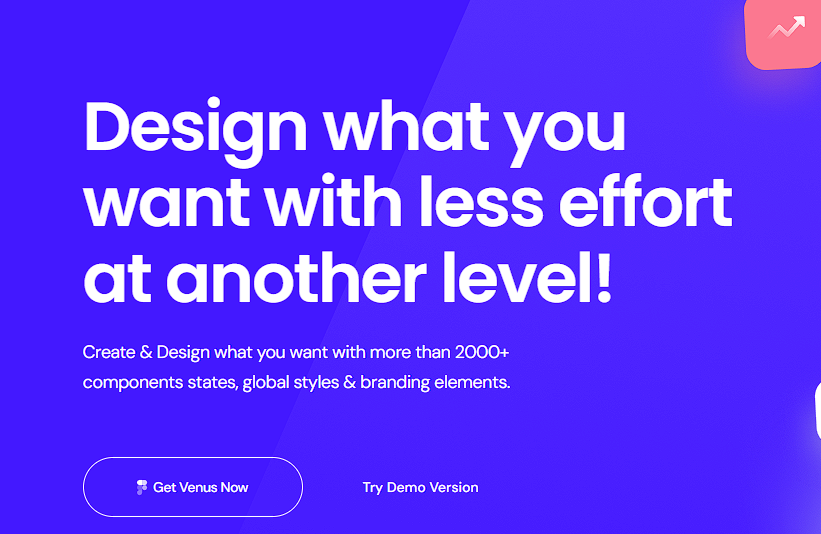
Venus Design system is a simple yet beautiful design system that has become increasingly popular over the past two years. Venus was built to help designers save time when wireframing and building UI projects, and its 2000+ components have helped it achieve exactly that.
Venus Design system's components consist of beautifully designed content cards, testimonials, tabs, layouts, pagination, and more. They also have chart components, different types of hero and blob masks, as well as hundreds of icons and stock photos.
This library has a distinctive design language, and while Venus mostly uses flat material design to create its components, you have full customizability over them. These components can be used to create response desktop, mobile, or tablet designs with ease, and it's built to be a one-stop shop for designers of all levels.
The free version of Venus Design System on Figma promises free lifetime updates and is suitable for most use cases.
4. Agile Startup UI KIT
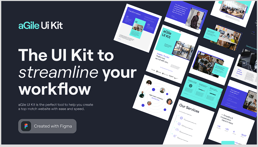
Agile Startup UI Kit is a collection of pre-designed user interface (UI) elements and components specifically created for startups following the Agile methodology. While it may not have as many components as the other three libraries already covered here, this library still stands firm as one of the best libraries designers can use to design SaaS apps quickly.
This library is a collection of 25+ carefully designed sections that can help you get your SaaS design up and running, complete with mobile designs, and a full Style Guide.
All of these pages are broken down into individual components, so you have access to edit each individual section rather than the entire page, if you prefer. Each section is designed with a carefully chosen set of colors that align with any startup's brand identity and can be easily applied to different UI elements, as well as beautifully designed components for displaying information, such as product features, team members, testimonials, or news updates, in a visually appealing and organized way.
Agile Startup UI Kit is fully responsive, has both light and dark theme designs, and supports both desktop and mobile.
5. TND Design System
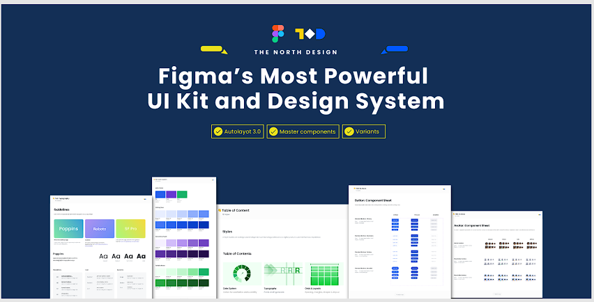
The last UI library on our list is TND Design System, one of Figma's hidden gems. TND was designed to save designers time while also teaching them how to make modern SaaS designs. Made with over 100 individually designed interface elements for web and desktop applications, this library is a goldmine for designers who want to work fast and still deliver top-quality designs.
TND design library's components are very extensive and detailed. The avatar component sheet, for example, has both human and placeholder avatar designs, all of which have different shapes and sizes. The same level of detailing is also applied to its colors, grid, and button components among others, so designers using this library always have a wealth of options to look at.
While TND may not have as many icons and components as most of the other libraries on this list, the quality of its components goes a long way to make up for the lack of quantity, so this library still provides a lot of value for both new and experienced designers.
Conclusion
There are tons of UI kits and templates in the market, but not all of them are good. For a UI kit or template to be considered good, it must have the following.
- Consistent Design Language
- Customizability
- Responsive and Adaptive Components
- Comprehensive UI Components
- Documentation and Guidelines
All of the libraries explored in this article fit the above requirements, so if you choose any of them you're in safe hands. However, I personally think Saas UI theme 1.0 edges out the rest, for SaaS use-cases. It delivers the same quality of components as most paid UI kits, for free. It's also specifically designed to help designers make modern SaaS products, so if that's what you're looking for, Saas UI Theme 1.0 is your best bet.
Of course, all the other libraries are also exceptional, so if you can afford to try them all out, by all means, do so. You'll definitely learn a lot along the way and your time/resources will not be wasted.
Comments
Loading comments…