There are times where you would require to make a custom drop-down menu for your application. One can obviously use the drop-down menus available in libraries like Material-UI and React-prime. However, most of the drop-down components do not include all the necessary features that one might require.
In this article, I will explain how one can create a custom drop-down menu such as the one shown below with a search option using existing React libraries. So hold tight and let's get started.
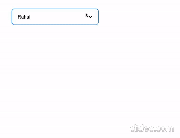
Figure 1. Custom drop-down menu
In this article, I will be introducing the functionalities and however the styles that can be downloaded from the GitHub repository here.
Before we get started let's install the necessary libraries —
- reactstrap: For the button.
- @material-ui/core and @material-ui/icons: For the icons and the Menu items.
- Font awesome: for the search icon ( you can also use the material UI icon for this )
Now that we have the libraries with us, its time to get started.
Step 1 :
We shall first introduce the necessary local states for the component as shown below:
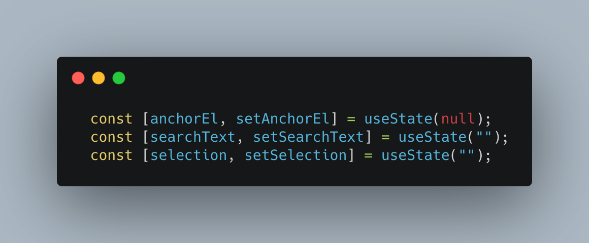
Figure 2: Setting initial states
The anchor is the anchor of the drop-down menu which occurs after the click. The search text state stores the state of the present searched text and the selection state stores the state of the current selection.
Step 2:
We will need to introduce the options to display and the appropriate functions to control our menu bar. Refer to the code below:
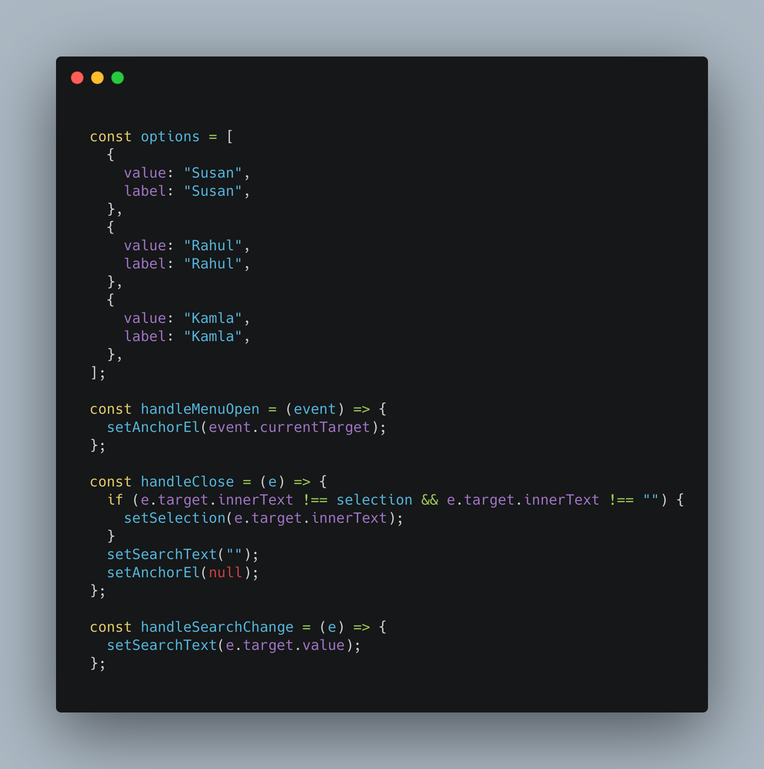
Figure 3: options and controlling functions
The options variable contains the options that will be displayed in the drop-down menu. The handleMenuOpen function opens the drop-down menu with the click of a button. The handleClose function closes the menu and also sets the search text to whatever value to an empty string for the next search. The handleSearchChange sets the search state of the menu.
Step 3:
Use useEffect with an empty array dependency to set the default menu option on the button as was shown in the above gif.
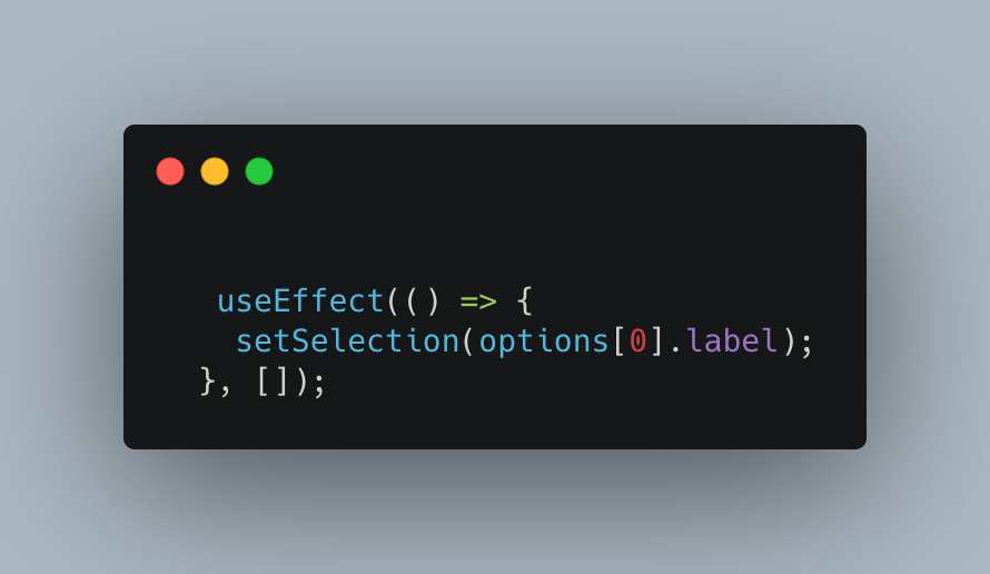
Figure 4. Set default option for the drop-down — menu
Final Step:
Now that we are ready with the app, it's time to render the complete JSX elements.
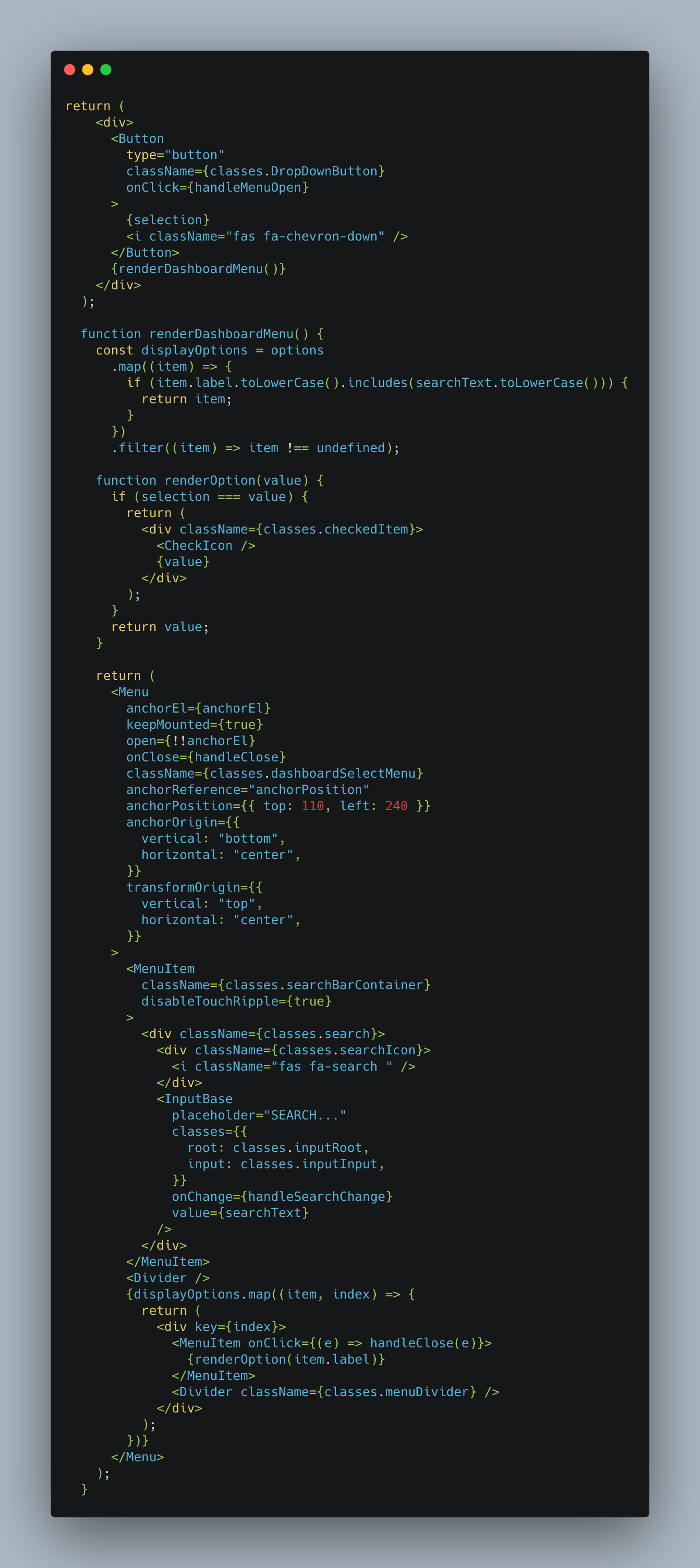
Figure 5: Rendering the appropriate JSX tags
The drop-down menu is rendered as shown:
Figure 6: Custom drop-down menu
The demo of the drop-down menu can be found here: https://codesandbox.io/s/cocky-worker-bm33d?file=/src/App.js
That's it for this topic. Thank you for reading!
Comments
Loading comments…