This article will guide you to accomplish the final assignment of Data Visualization with Python, a course created by IBM and offered by Coursera. Nevertheless, this tutorial is for anyone— enrolled in the course or not — who wants to learn how to code an interactive dashboard in Python using Plotly’s Dash library. I assume, however, that you already know how to use Pandas for analysis.
I want you to learn
If you just copy the codes in this article and ignore how to understand them, you miss the whole point of learning data visualization (or data science in general). Typing the codes on your own helps you be more aware of their syntax, logic, and structure. Also, learning by doing nudges you to ask relevant questions and search for their answers in your browser. This process pushes you to learn better.
What is the final assignment?
You will play a role of a data analyst tasked to monitor and report US domestic airline flights. Your goal is to analyze the performance of reporting airlines to improve flight reliability, thereby enhancing customer reliability. Your dashboard should have a dropdown for the type of report with two options:
- Yearly Airline Performance Report, and
- Yearly Airline Delay Report.
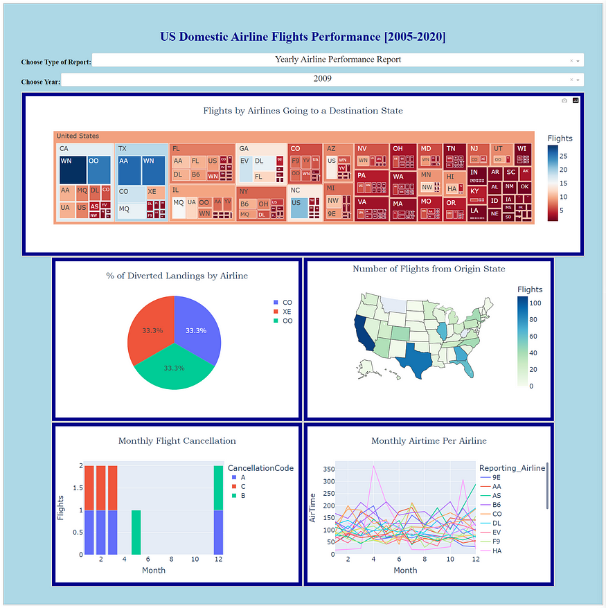
It should also have another dropdown that selects what Year (from 2005 to 2020) to report. The two pictures below (corresponding to the two report types) show my dashboard for 2009. The kinds of graphs for each report are instructed by the assignment.
💡 Speed up your blog creation with DifferAI.
Available for free exclusively on the free and open blogging platform, Differ.
Where will I code?
I will code the Dash application in my local Jupyter Notebook. The course, however, invites the student to use IBM’s Skills Networks Labs Cloud IDE (which uses Theia Cloud IDE). Unfortunately, all of your work in this environment is lost when you close your session, timed out due to inactivity, or logged off.
Gladly, the final assignment is graded only on the screenshots of your dashboard (given a report type and a year), no matter how or where you coded it. Thus, I am going to use Jupyter Notebook, which works nicely with Dash 2.11 and later versions.
Note: My codes do not follow everything from the instructor’s code hints. You might also see that some of my graph titles and codes for layout customizations are different from the course’s expectations. What matters is that we can produce the desired dashboard. In the real world, most stakeholders do not care about the behind-the-scenes codes. What they expect is the output.
Basic components of a Dash app
- Layout = This is the structure of your dashboard. The codes for this prepare how your dashboard will look like.
- Callback Function = This is the function called by Dash whenever an input component’s property changes. This makes the dashboard interactive.
Necessary installations
In case you have not installed them yet:

pip install pandas
pip install numpy
pip install plotly
pip install dash
pip install dash-core-components
pip install dash-html-components
Where does the data come from?
The dataset (in .csv format) is provided by IBM and it contains real data on US Domestic Flights from 1987 to 2020, taken from the US Bureau of Transportation Statistics. You can download the dataset from here. To know what each column means, refer to this link.
Let’s start coding!
Importing libraries
import pandas as pd
import numpy as np

import plotly.express as px

from dash import Dash, html, dcc, Input, Output, callback
Preparing our data
url = 'https://raw.githubusercontent.com/marvin-rubia/US-Airlines-Analytics-Dashboard/main/airline_data.csv'

df = pd.read_csv(url)

# Check our dataframe
df.info()
The output for this is:
<class 'pandas.core.frame.DataFrame'>
RangeIndex: 27000 entries, 0 to 26999
Columns: 110 entries, Unnamed: 0 to Div5TailNum
dtypes: float64(74), int64(19), object(17)
memory usage: 22.7+ MB
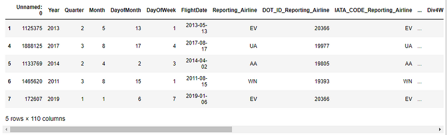
Getting only 2005–2020 data (as per the instruction)
# Get only 2005-2020 data, as per course instruction

condition = (df['Year'] >= 2005) & (df['Year'] <= 2020)

airline_data = df[condition]

airline_data.head()
The output for the previous codes shows the first 5 rows of the 2005–2020 dataframe.
The airline_data is now our dataframe moving forward. We are going to plot 5 graphs for each type of report. In other words, we need to have a total of 10 subsets of our airline_data.
Function to get necessary data for performance report (Type 1)
def compute_data_1(airline_data):
    ## Get different sets of data

    # For plot1
    tree_data = airline_data.groupby(['DestState', 'Reporting_Airline'])['Flights'].sum().reset_index()

    # For plot2
    condition = airline_data['DivAirportLandings'] != 0.0
    div_data = airline_data[condition]

    # For plot3
    map_data = airline_data.groupby('OriginState')['Flights'].sum().reset_index()

    # For plot4
    bar_data = airline_data.groupby(['Month','CancellationCode'])['Flights'].sum().reset_index()

    # For plot5
    line_data = airline_data.groupby(['Month','Reporting_Airline'])['AirTime'].mean().reset_index()

    return tree_data, div_data, map_data, bar_data, line_data
Function to get necessary data for delay report (Type 2)
def compute_data_2(airline_data):
    ## Compute delay averages

    # For plot1
    avg_car = airline_data.groupby(['Month','Reporting_Airline'])['CarrierDelay'].mean().reset_index()

    # For plot2
    avg_weather = airline_data.groupby(['Month','Reporting_Airline'])['WeatherDelay'].mean().reset_index()

    # For plot3
    avg_NAS = airline_data.groupby(['Month','Reporting_Airline'])['NASDelay'].mean().reset_index()

    # For plot4
    avg_sec = airline_data.groupby(['Month','Reporting_Airline'])['SecurityDelay'].mean().reset_index()

    # For plot5
    avg_late = airline_data.groupby(['Month','Reporting_Airline'])['LateAircraftDelay'].mean().reset_index()

    return avg_car, avg_weather, avg_NAS, avg_sec, avg_late
Just like what I said in the introduction, I assume you already know how to manipulate dataframe using Pandas. Although, you can have a sense of each sub-dataframe by running them one by one.
Coding the dashboard’s layout
Note for desktop viewers: To see the remaining code on a given line, you can highlight any word and extend it to the right.
# Create the Dash app
app = Dash(__name__)

# Create the app layout
app.layout = html.Div(style={'backgroundColor': 'lightblue', 'border': 'ridge', 'padding': '50px'}, children=[
                html.H1('US Domestic Airline Flights Performance [2005-2020]',
                       style={'textAlign': 'center', 'color': '#00008B',
                             'font-size': 36}),

                # Dropdown creation for report_type
                html.Div(style={'display': 'flex'},
                         children=[
                            html.H2('Choose Type of Report:', style={'white-space':'nowrap', 'font-size': 20}),
                            dcc.Dropdown(
                                 options=[{'label': 'Yearly Airline Performance Report', 'value':'Type1'},
                                          {'label': 'Yearly Airline Delay Report', 'value': 'Type2'}],
                                 id='report_type_input',
                                 value='Type1',
                                 placeholder='Choose a report type.',
                                 style={'textAlign': 'center', 'width':'100%', 'padding':'2px', 'font-size': 26})
                                  ]
                         ),

                # Dropdown creation for year of interest
                html.Div(style={'display': 'flex'},
                         children=[
                            html.H2('Choose Year:', style={'white-space':'nowrap', 'font-size': 20}),
                            dcc.Dropdown(options=list(range(2005,2021)),
                                 id='year_input',
                                 value='2020',
                                 placeholder='Choose a year.',
                                 style={'textAlign': 'center', 'width':'100%', 'padding':'2px', 'font-size': 26})
                                 ]
                        ),

                # Area for the graphs
                html.Div(dcc.Graph(id='plot1'), style={'border': 'ridge', 'padding': '10px',
                                                       'backgroundColor': '#00008B'}),

                html.Div(style={'display': 'flex', 'justify-content': 'center'},
                         children=[
                            html.Div(dcc.Graph(id='plot2'), style={'border': 'ridge', 'padding': '10px', 'backgroundColor': '#00008B'}),
                            html.Div(dcc.Graph(id='plot3'), style={'border': 'ridge', 'padding': '10px', 'backgroundColor': '#00008B'})
                            ]
                         ),

                html.Div(style={'display': 'flex', 'justify-content': 'center'},
                         children=[
                            html.Div(dcc.Graph(id='plot4'), style={'border': 'ridge', 'padding': '10px', 'backgroundColor': '#00008B'},),
                            html.Div(dcc.Graph(id='plot5'), style={'border': 'ridge', 'padding': '10px', 'backgroundColor': '#00008B'})
                            ]
                         )
]
)

'''
You are going to put the callback function code here later!
'''

# Run the app and open it in a new tab
if __name__ == '__main__':
    app.run(jupyter_mode='tab')
Read the subheading comments to understand the purpose of each chunk of codes above. Remember, we installed the dash-html-components, which allows us to produce HTML-like codes in Python. The html.Div() is a division in our dashboard. It tells Dash to allot a space for whatever we want to code inside that division. Below the heading html.H1 are 5 layers of divisions. When you run the previous codes, you’ll get something like this:
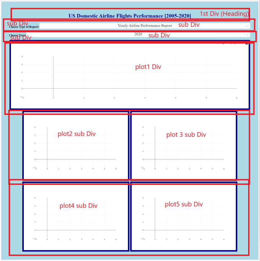
If you count the total html divisions from the layout code, we actually have a total of 10. But we were able to nest the two sub-divisions in the 2nd, 3rd, 5th, and 6th layers with the code style={‘display’: ‘flex’}.
In our layout, the inputs (report types and year) come from two dcc.Dropdown() components represented by their id parameters. Meanwhile, the id inside each dcc.Graph() component represents each graph, which is our output. The logic is this: the output graphs should respond to the change in input values as instructed by the callback function.
To learn more about Dash Dropdowns, refer to this documentation.
To learn more about Dash Graphs, refer to this documentation.
Coding the dashboard’s callback decorator and function
We are going to add the callback function after our app.layout codes and before running the app. The following shows the callback decorator and the callback function.
# Create callback decorator
@app.callback([Output(component_id='plot1', component_property='figure'),
Output(component_id='plot2', component_property='figure'),
Output(component_id='plot3', component_property='figure'),
Output(component_id='plot4', component_property='figure'),
Output(component_id='plot5', component_property='figure')],
[Input(component_id='report_type_input', component_property='value'),
Input(component_id='year_input', component_property='value')]
)
# Create callback function
def get_graphs(report_type, year):
condition = airline_data['Year'] == int(year)
data = airline_data[condition]
# If report type 1 is chosen:
if report_type == 'Type1':
# Get plotting data
tree_data, div_data, map_data, bar_data, line_data = compute_data_1(data)
# Tree map
tree_fig = px.treemap(tree_data, path=[px.Constant('United States'), 'DestState', 'Reporting_Airline'], values='Flights',
color='Flights', color_continuous_scale='RdBu', title='Flights by Airlines Going to a Destination State')
tree_fig.update_layout(title_x=0.5, font=dict(size=18), title_font_family='Bookman Old Style')
# Pie graph
pie_fig = px.pie(div_data, values='Flights', names='Reporting_Airline', title='% of Diverted Landings by Airline')
pie_fig.update_layout(title_x=0.5, font=dict(size=18), title_font_family='Bookman Old Style')
# Choropleth map
map_fig = px.choropleth(map_data,
locations='OriginState',
color='Flights',
hover_data=['OriginState', 'Flights'],
locationmode = 'USA-states', # Set to plot as US States
color_continuous_scale='GnBu',
range_color=[0, map_data['Flights'].max()])
map_fig.update_layout(title_text = 'Number of Flights from Origin State', geo_scope='usa',
title_x=0.5, font=dict(size=18), title_font_family='Bookman Old Style') # Plot only the USA instead of globe)
# Bar graph
bar_fig = px.bar(bar_data, x='Month', y='Flights', color='CancellationCode', title='Monthly Flight Cancellation')
bar_fig.update_layout(title_x=0.5, font=dict(size=18), title_font_family='Bookman Old Style')
# Line graph
line_fig = px.line(line_data, x='Month', y='AirTime', color='Reporting_Airline', title='Monthly Airtime Per Airline')
line_fig.update_layout(title_x=0.5, font=dict(size=18), title_font_family='Bookman Old Style')
return [tree_fig, pie_fig, map_fig, bar_fig, line_fig]
# If report type 2 is chosen:
elif report_type == 'Type2':
avg_car, avg_weather, avg_NAS, avg_sec, avg_late = compute_data_2(data)
# Create line graphs
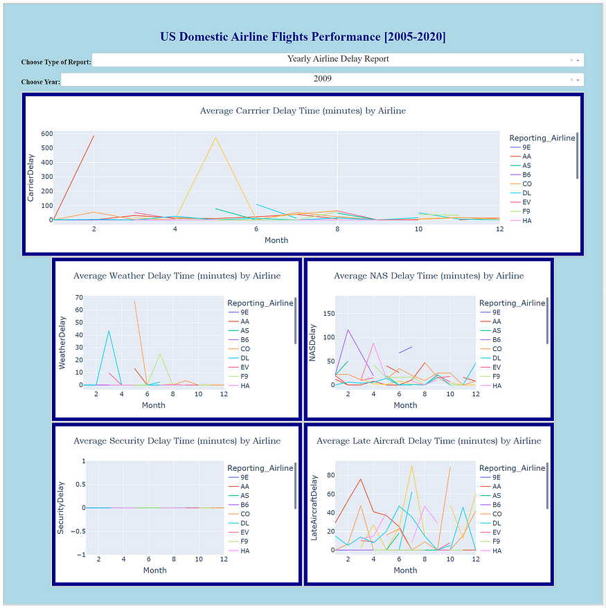
carrier_fig = px.line(avg_car, x='Month', y='CarrierDelay', color='Reporting_Airline', title='Average Carrrier Delay Time (minutes) by Airline')
carrier_fig.update_layout(title_x=0.5, font=dict(size=18), title_font_family='Bookman Old Style')
weather_fig = px.line(avg_weather, x='Month', y='WeatherDelay', color='Reporting_Airline', title='Average Weather Delay Time (minutes) by Airline')
weather_fig.update_layout(title_x=0.5, font=dict(size=18), title_font_family='Bookman Old Style')
nas_fig = px.line(avg_NAS, x='Month', y='NASDelay', color='Reporting_Airline', title='Average NAS Delay Time (minutes) by Airline')
nas_fig.update_layout(title_x=0.5, font=dict(size=18), title_font_family='Bookman Old Style')
sec_fig = px.line(avg_sec, x='Month', y='SecurityDelay', color='Reporting_Airline', title='Average Security Delay Time (minutes) by Airline')
sec_fig.update_layout(title_x=0.5, font=dict(size=18), title_font_family='Bookman Old Style')
late_fig = px.line(avg_late, x='Month', y='LateAircraftDelay', color='Reporting_Airline', title='Average Late Aircraft Delay Time (minutes) by Airline')
late_fig.update_layout(title_x=0.5, font=dict(size=18), title_font_family='Bookman Old Style')
return [carrier_fig, weather_fig, nas_fig, sec_fig, late_fig]
The callback decorator tells Dash that we have 5 outputs from two inputs. Each of which has designated id we coded in app.layout().
In contrast with the assignment’s instruction, I did not use State() objects in the callback operator. State() is similar to Input(), except that you have to finish updating all State() objects before the callback function is fired. (To read more about it, click here.) I believe it is not necessary for our dashboard. If I update the report type dropdown input, I am okay with seeing the graphs immediately change even if I have not updated yet the year dropdown input.
The first two lines of our callback function get_graphs(report_type, year) select the data from our airline_data dataframe with the given year input.
Our callback function returns either the list [tree_fig, pie_fig, map_fig, bar_fig, line_fig] if Yearly Airline Performance Report is chosen or the list [carrier_fig, weather_fig, nas_fig, sec_fig, late_fig] if Yearly Airline Delay Report is chosen. The order within either list matters. The order corresponds to the order of the Output(component_id) in the callback decorator.
The rest of the codes are the syntax for creating graphs using Plotly Express, which I assume you have learned from the course modules (or from Plotly documentations) prior to the final assignment.
Full Code (from creating the Dash app to running it)
# Create the Dash app
app = Dash(__name__)

# Create the app layout
app.layout = html.Div(style={'backgroundColor': 'lightblue', 'border': 'ridge', 'padding': '50px'}, children=[
                html.H1('US Domestic Airline Flights Performance [2005-2020]',
                       style={'textAlign': 'center', 'color': '#00008B',
                             'font-size': 36}),

                # Dropdown creation for report_type
                html.Div(style={'display': 'flex'},
                         children=[
                            html.H2('Choose Type of Report:', style={'white-space':'nowrap', 'font-size': 20}),
                            dcc.Dropdown(
                                 options=[{'label': 'Yearly Airline Performance Report', 'value':'Type1'},
                                          {'label': 'Yearly Airline Delay Report', 'value': 'Type2'}],
                                 id='report_type_input',
                                 value='Type1',
                                 placeholder='Choose a report type.',
                                 style={'textAlign': 'center', 'width':'100%', 'padding':'2px', 'font-size': 26})
                                  ]
                         ),

                # Dropdown creation for year of interest
                html.Div(style={'display': 'flex'},
                         children=[
                            html.H2('Choose Year:', style={'white-space':'nowrap', 'font-size': 20}),
                            dcc.Dropdown(options=list(range(2005,2021)),
                                 id='year_input',
                                 value='2020',
                                 placeholder='Choose a year.',
                                 style={'textAlign': 'center', 'width':'100%', 'padding':'2px', 'font-size': 26})
                                 ]
                        ),

                # Area for the graphs
                html.Div(dcc.Graph(id='plot1'), style={'border': 'ridge', 'padding': '10px',
                                                       'backgroundColor': '#00008B'}),

                html.Div(style={'display': 'flex', 'justify-content': 'center'},
                         children=[
                            html.Div(dcc.Graph(id='plot2'), style={'border': 'ridge', 'padding': '10px', 'backgroundColor': '#00008B'}),
                            html.Div(dcc.Graph(id='plot3'), style={'border': 'ridge', 'padding': '10px', 'backgroundColor': '#00008B'})
                            ]
                         ),

                html.Div(style={'display': 'flex', 'justify-content': 'center'},
                         children=[
                            html.Div(dcc.Graph(id='plot4'), style={'border': 'ridge', 'padding': '10px', 'backgroundColor': '#00008B'},),
                            html.Div(dcc.Graph(id='plot5'), style={'border': 'ridge', 'padding': '10px', 'backgroundColor': '#00008B'})
                            ]
                         )
]
)

# Create callback decorator
@app.callback([Output(component_id='plot1', component_property='figure'),
           Output(component_id='plot2', component_property='figure'),
           Output(component_id='plot3', component_property='figure'),
           Output(component_id='plot4', component_property='figure'),
           Output(component_id='plot5', component_property='figure')],
           [Input(component_id='report_type_input', component_property='value'),
           Input(component_id='year_input', component_property='value')]
           )

# Create callback function
def get_graphs(report_type, year):
    condition = airline_data['Year'] == int(year)
    data = airline_data[condition]

    # If report type 1 is chosen:
    if report_type == 'Type1':
        # Get plotting data
        tree_data, div_data, map_data, bar_data, line_data = compute_data_1(data)

        # Tree map
        tree_fig = px.treemap(tree_data, path=[px.Constant('United States'), 'DestState', 'Reporting_Airline'], values='Flights',
                              color='Flights', color_continuous_scale='RdBu', title='Flights by Airlines Going to a Destination State')
        tree_fig.update_layout(title_x=0.5, font=dict(size=18), title_font_family='Bookman Old Style')

        # Pie graph
        pie_fig = px.pie(div_data, values='Flights', names='Reporting_Airline', title='% of Diverted Landings by Airline')
        pie_fig.update_layout(title_x=0.5, font=dict(size=18), title_font_family='Bookman Old Style')

        # Choropleth map
        map_fig = px.choropleth(map_data,
                                locations='OriginState',
                                color='Flights',
                                hover_data=['OriginState', 'Flights'],
                                locationmode = 'USA-states', # Set to plot as US States
                                color_continuous_scale='GnBu',
                                range_color=[0, map_data['Flights'].max()])

        map_fig.update_layout(title_text = 'Number of Flights from Origin State', geo_scope='usa',
                             title_x=0.5, font=dict(size=18), title_font_family='Bookman Old Style') # Plot only the USA instead of globe)

        # Bar graph
        bar_fig = px.bar(bar_data, x='Month', y='Flights', color='CancellationCode', title='Monthly Flight Cancellation')
        bar_fig.update_layout(title_x=0.5, font=dict(size=18), title_font_family='Bookman Old Style')

        # Line graph
        line_fig = px.line(line_data, x='Month', y='AirTime', color='Reporting_Airline', title='Monthly Airtime Per Airline')
        line_fig.update_layout(title_x=0.5, font=dict(size=18), title_font_family='Bookman Old Style')

        return [tree_fig, pie_fig, map_fig, bar_fig, line_fig]

    # If report type 2 is chosen:
    elif report_type == 'Type2':
        avg_car, avg_weather, avg_NAS, avg_sec, avg_late = compute_data_2(data)

        # Create line graphs
        carrier_fig = px.line(avg_car, x='Month', y='CarrierDelay', color='Reporting_Airline', title='Average Carrrier Delay Time (minutes) by Airline')
        carrier_fig.update_layout(title_x=0.5, font=dict(size=18), title_font_family='Bookman Old Style')

        weather_fig = px.line(avg_weather, x='Month', y='WeatherDelay', color='Reporting_Airline', title='Average Weather Delay Time (minutes) by Airline')
        weather_fig.update_layout(title_x=0.5, font=dict(size=18), title_font_family='Bookman Old Style')

        nas_fig = px.line(avg_NAS, x='Month', y='NASDelay', color='Reporting_Airline', title='Average NAS Delay Time (minutes) by Airline')
        nas_fig.update_layout(title_x=0.5, font=dict(size=18), title_font_family='Bookman Old Style')

        sec_fig = px.line(avg_sec, x='Month', y='SecurityDelay', color='Reporting_Airline', title='Average Security Delay Time (minutes) by Airline')
        sec_fig.update_layout(title_x=0.5, font=dict(size=18), title_font_family='Bookman Old Style')

        late_fig = px.line(avg_late, x='Month', y='LateAircraftDelay', color='Reporting_Airline', title='Average Late Aircraft Delay Time (minutes) by Airline')
        late_fig.update_layout(title_x=0.5, font=dict(size=18), title_font_family='Bookman Old Style')

        return [carrier_fig, weather_fig, nas_fig, sec_fig, late_fig]

# Run the app and open it a new tab
if __name__ == '__main__':
    app.run(jupyter_mode='tab')
    # The jupyter_mode parameter is only possible within Jupyter environment
You might notice that my last line above has a different syntax from the one taught by the instructor in running a Dash app. That’s because I coded it in Jupyter Notebook, and the app.run(jupyter_mode= ‘tab’) code automatically produces our dashboard in a new tab (instead of inline with the Notebook cell). This allows us to have a fullscreen view of our dashboard.
How will you be graded?
If you are enrolled in this course, you will be instructed to submit a screenshot of your dashboard for a given report type and year.
The primary purpose of this article is to help you learn how to code a dashboard in Python from its backend. The course certificate is just secondary. That said, thank you for reading this guide, and congratulations in advance on claiming your IBM certificate!
Update: I have now modified my dashboard by customizing the transparency of Plotly charts and adding a background image. It looks better. Check it out!
If you found value in this post, kindly click the clap button (many times?) and share this with your friends. You can also follow me on Medium.com for more articles on critical thinking, data analytics, machine learning, science and society, and more. Want to connect with me on LinkedIn? Find me here.
Comments
Loading comments…