If you look at various systems and web apps, a dropdown with multi-select is a common pattern. However, if you look at the Salesforce Component Reference for Lightning Web Components, there is still only a combobox with single selection provided. As stated here, the recommended solution from Salesforce is to use the lightning-dual-listbox for multiple value selection. However, this is not really satisfying comparing it to what you are used to from the rest of the web. In addition, the dual listbox also takes up a relatively large amount of space on the screen.
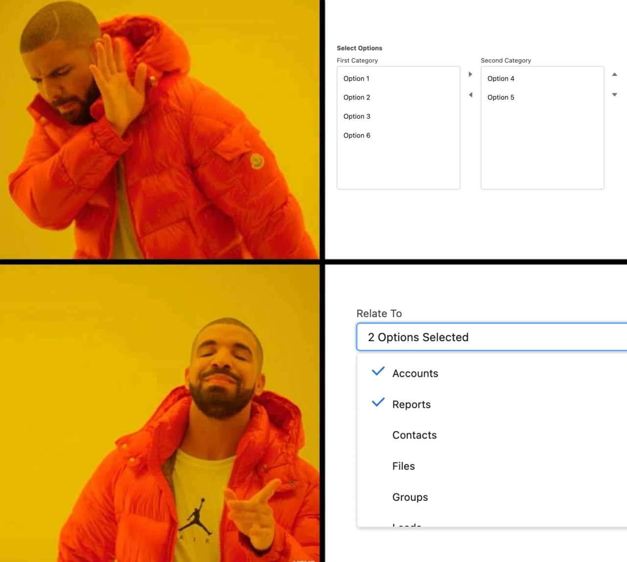
Who would use a Lightning Dual Listbox instead of a Multi-Select Combobox? (created with Kapwing Meme Generator)
The SLDS (Salesforce Lightning Design System) even includes blueprints for a multi-select combobox since the early days. So why is there no corresponding ready-to-use component? Doesn't matter, we will simply implement our own Multi-Select Combobox based on the SLDS template. This also allows us to use existing utility classes without having to define all the styling with custom CSS on our own.
Structure of the LWC Combobox
Our Multi-Select Combobox consists of the following two parts:
-
Multi-Select Comboxbox - Combobox parent component that should provide different configuration options.
-
Multi-Select Comboxbox Item - Child component that represents a single selectable item within the parent component.
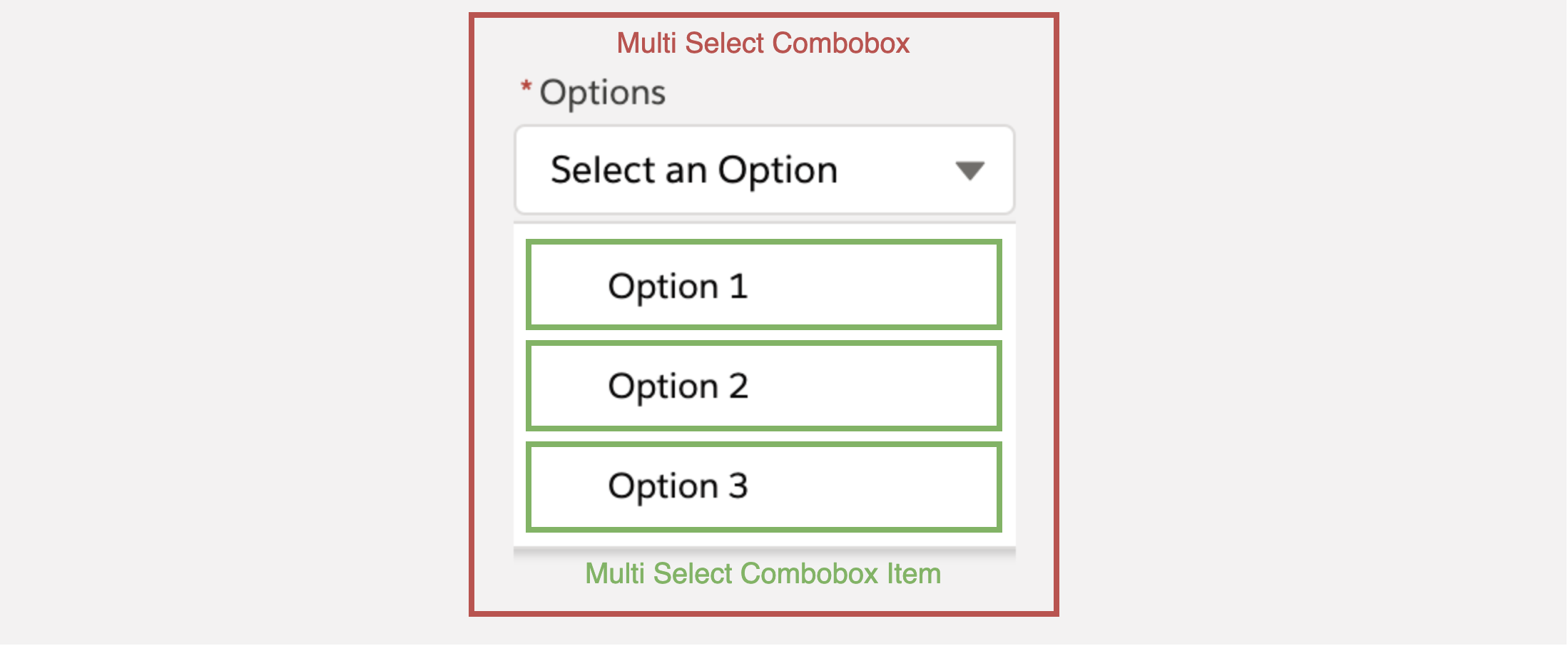
Multi-Select Combobox component structure
Creating the parent combobox component
Our component should have the essential functionalities, parameters, and behavior of the official lightning-combobox with the addition that it should support not only single-select but also multi-select. Therefore, we need to first define the appropriate public properties as well as implement the corresponding logic behind them.
In addition to the standard combobox properties, there is a singleSelect property for deciding between a single-select mode and a multi-select mode. Furthermore, there is an additional property called showPills, which allows displaying the currently selected options as pill container below the combobox in multi-select mode.
For the template of the parent component, we follow the SLDS template as far as possible. However, we do not get along exclusively with existing SLDS utility classes but have to define at least some own CSS classes additionally.
The definition of the additional CSS classes from the template looks like this:
Building the child combobox item
After we implemented the parent component, we need to take care of the individual selectable items of our combobox. Our child component will receive the item to display from the parent component which has the following attributes: label and value. In addition, it later also receives the selected status when the user selects the respective option.
In our template, unlike the parent component, we don't need custom styles this time. It is enough to use existing SLDS utilities.
And that's it, our component is now ready to use!
How to use our new LWC Combobox?
To use our component now, we can simply add it to any parent component in the HTML template as follows:
As we can see, we have specified our selectable options that we need to pass from the parent component to our combobox as well as an “onchange” listener so that we can access the currently selected options from within our parent component. To achieve both, the code looks like this:
I used the local LWC development server during the component building process and especially for testing it afterwards. If you are interested in using local development, I have also written a guide with setup instructions for that.
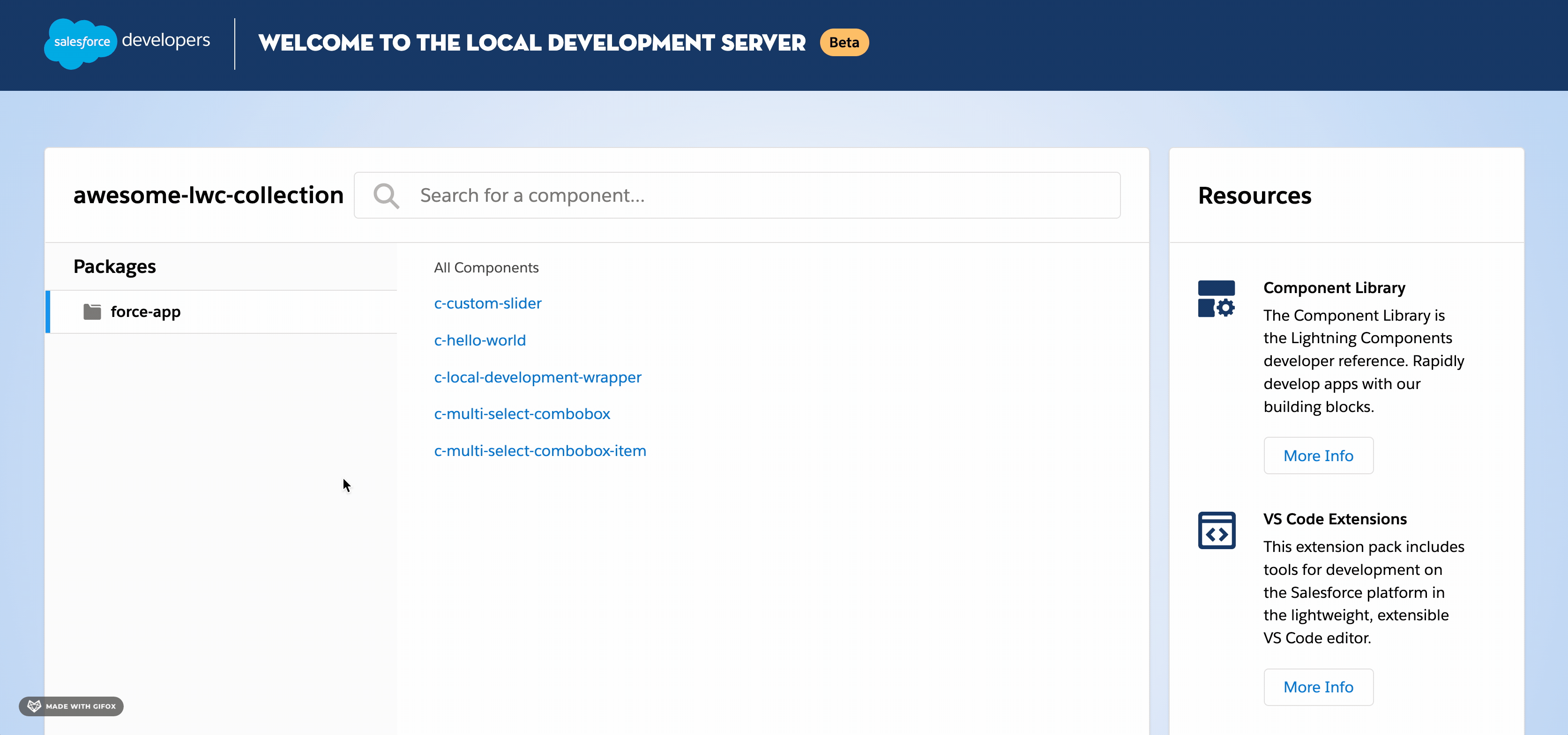 Preview of the Multi-Select Combobox
The full source code including JEST unit tests and JSDoc comments is available on GitHub: ⚡️ A collection of ready-to-use Lightning Web Components that might help your SFDX project
Comments
Loading comments…