
Material-UI is my favorite React UI component library. There are components for almost anything that you may want to build with React.
One component that I have been using recently is the Autocomplete component. The Material-UI docs describe the autocomplete as “a normal text input enhanced by a panel of suggested options.”
There are two versions of the autocomplete that can be used:
-
Combo box — Where the value of the text input must be chosen from a predefined set of values.
-
Free solo — Where the text input can contain any value but is suggested from a list of possible values.
In this article, we will take a look at the Autocomplete component in Material-UI by building a combo box. Although this component is still a part of the lab, it is the best Autocomplete component I could find for React.
Set up
For this example, we will be working inside of a create-react-app project.
The first step will be to install the Material-UI core package in your project.
// with npm
npm install @material-ui/core

// with yarn
yarn add @material-ui/core
We will also need to install the Material-UI lab. The Material-UI lab hosts components that are not quite ready to be moved to the core package.
// with npm
npm install @material-ui/lab

// with yarn
yarn add @material-ui/lab
Then we will import the Autocomplete component from the lab, and the TextField component from the core package.
import React from 'react';
import TextField from '@material-ui/core/TextField';
import Autocomplete from '@material-ui/lab/Autocomplete';
import { nbaTeams } from './nbaTeams';
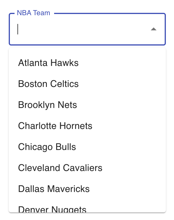
Next, we will create an array of data to use as the predefined set of allowed values. For this example, I have a separate file that contains an array of NBA teams with an id number and the team name. Feel free to copy this or add any data that you want to use. Just be sure that the data is an array.
Render the Autocomplete component
We will now render the Autocomplete component to our screen. For this example, I created a new file called Autocomplete.js. In this file, I created a functional component called NbaAutocomplete.
const NbaAutocomplete = () => {
  return (
    <Autocomplete
    />
  );
};
If we render the Autocomplete component as we have above, we will not see anything on our screen yet. This is because there are a few required props we need to pass.
Props
-
options (required) — Array of options.
-
renderInput (required) — Render the input. A common use is to render the TextField component from Material-UI. Then we can pass props such as label and variant to this component.
-
getOptionLabel — Used to determine the string value for a given option. This is needed because our options array is an array of objects. This will determine what value to display in the input.
-
id — This prop is used to help implement the accessibility logic.
const NbaAutocomplete = () => { return ( <Autocomplete id="nba teams" options={nbaTeams} renderInput={params => ( <TextField {...params} label="NBA Team" variant="outlined" />*_ **getOptionLabel_={option => *option.name}** **style={{ width: 270 }} )} /> ); };
I also added some style of a width of 270 to the component to make things look a little nicer.
If we start our project, we should now see the following component.
Handle the value
In order to use the data we select, we will turn this into a controlled input using the useState hook from React.
First, import the useState hook from React. Then initialize a state variable called selectedTeam. We will set the default value to null.
const [selectedTeam, setSelectedTeam] = useState(null);
Then, in the Autocomplete component, we can add two more props.
-
value — The value of the autocomplete.
-
onChange — Callback fired when the value changes. This function takes an event and an option value as the arguments. We will set the selectedTeam variable to be the option value.
<Autocomplete id="nba teams" options={nbaTeams} renderInput={params => ( <TextField {...params} label="NBA Team" variant="outlined" /> )} getOptionLabel={option => option.name} style={{ width: 270 }} value={selectedTeam} onChange={(_event, newTeam) => { setSelectedTeam(newTeam); }} />
To check that we are getting the information in the selectedTeam variable, let’s log this value to the console.
console.log(selectedTeam);
Additional props
If you have a more complex use case, there are many other props that you can pass to the Autocomplete component. Check out their documentation here.
The following is a list of some of the useful props I have used in the past:
-
disableClearable — If true, the input can't be cleared.
-
freeSolo — If true, the Autocomplete is free solo, meaning that the user input is not bound to provided options.
-
groupBy — If provided, the options will be grouped under the returned string.
-
multiple — If true, the value must be an array and the menu will support multiple selections.
-
inputValue — The input value. (Useful if you need to separate the value and text input value states)
-
onInputChange — Callback fired when the input value changes. (Useful if you need to separate the value and text input value states)
Conclusion
Thanks for reading! I hope this article was helpful for you to get started using the Autocomplete component with Material-UI.
You can check out the full source code for the component we created below.
Check out the article below to learn about another Material-UI component, the Skeleton. Improve UX With the Skeleton Component in React and Material-UI Display a placeholder preview of the content before the data is loadedlevelup.gitconnected.com
Comments
Loading comments…