On my way to developing an application, I had a really hard time with making an interactive Calendar Heatmap (kinda like the one on Github and Gitlab), and thanks to this post on Plotly's community forum I was able to make it.
Using the code provided and adding my own I managed to fix some bugs with pandas weekly data and make it into a package for anyone to use.
(This project is open-source and available on my Github)
Installation
This package is hosted on PyPI, so to install it just use:
$ pip install plotly-calplot
Starting off easy
Let's first create an example dataframe.
import pandas as pd
import numpy as np

dummy_start_date = "2019-01-01"
dummy_end_date = "2021-10-03"

# date range from start date to end date and random
# column named value using amount of days as shape
dummy_df = pd.DataFrame({
    "ds": pd.date_range(dummy_start_date, dummy_end_date),
    "value": np.random.randint(low=0, high=30,
size=(pd.to_datetime(dummy_end_date) - pd.to_datetime(dummy_start_date)).days + 1,),
})
The only requirement for you to use this plot is that you have a Pandas dataframe with a date column (see pandas to_datetime docs) and a value column which will be used as the value we’ll plot.
Now to the good stuff:
from plotly_calplot import calplot

# creating the plot
fig = calplot(
         dummy_df,
         x="ds",
         y="value"
)
fig.show()
And of course, if you still have all Plotly interactive features (zooming, filtering, lasso selection, and hovering).
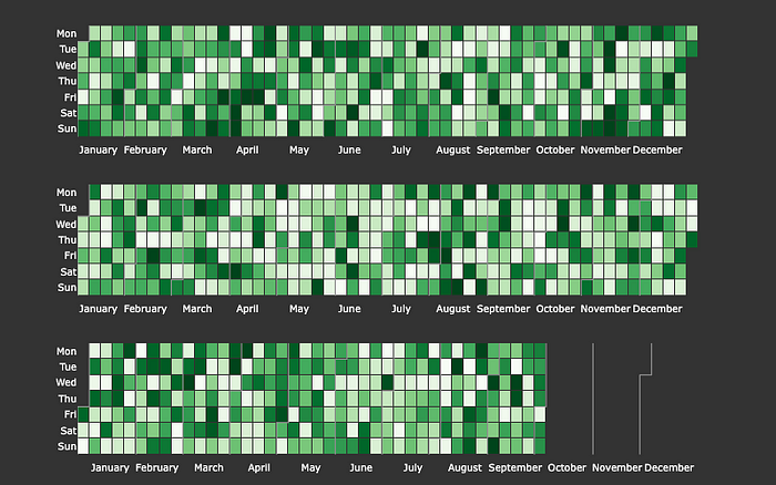
Dark Theme
That's nice and all, but being a programmer we really like dark themes and, of course, you can use the update_layout function as any other Plotly Figure. But to make it easier for anyone we have the option to use the dark_theme parameter.
fig = calplot(
    dummy_df,
    x="ds",
    y="value",
    dark_theme=True
)
fig.show()
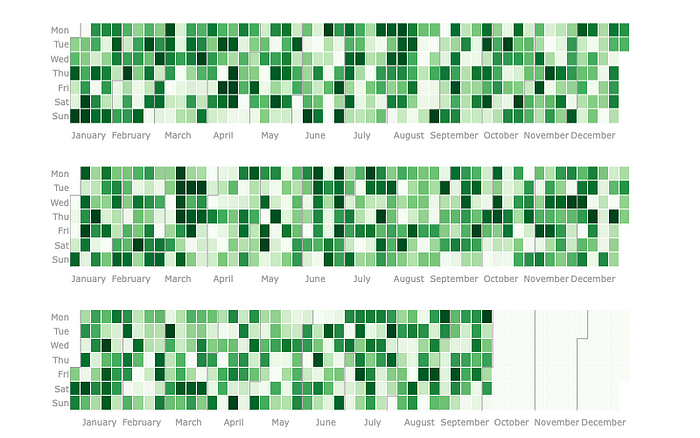
Mind the gap
Still not convinced? me neither. One of the visual aspects that I really like to experiment with is the squares gap and luckily this is easily achievable:
# you can make it very large, but it's kinda silly
fig = calplot(
    dummy_df,
    x="ds",
    y="value",
    gap=9
)
fig.show()
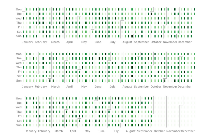
# or you can make it zero, which is actually nice
fig = calplot(
    dummy_df,
    x="ds",
    y="value",
    gap=0
)
fig.show()
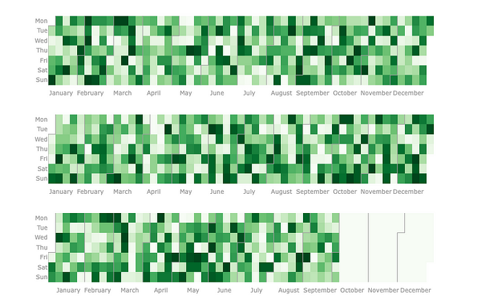
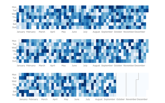
Picking your own color scale
Another very important aspect of plots is obviously the colors you choose, calplot supports all standard Plotly color scales and you may also want to create your custom one
# choosing a standard colorscale
fig = calplot(
    dummy_df,
    x="ds",
    y="value",
    gap=0,
    colorscale="blues" # standard is greens
)
fig.show()
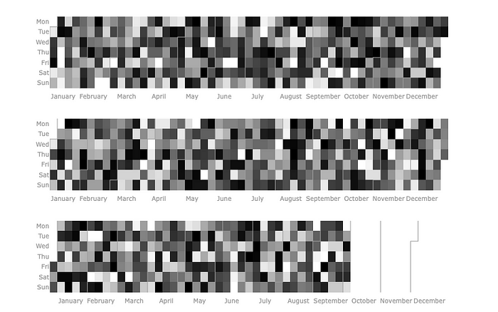
But of course, you may want to create your own color scale, there are several ways to create one, my favorite is actually to use a percentage of max values
# let's create a custom black and white colorscale
fig = calplot(
    dummy_df,
    x="ds",
    y="value",
    gap=0,
    colorscale=[(0.00, "white"),   (0.33, "#999"),
                (0.33, "#999"), (0.66, "#444"),
                (0.66, "#444"),  (1.00, "#000")]
)
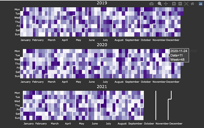
Other options
I encourage you to explore all other options the package offers, like adding the year in the title of each subplot with years_title=True or adjusting the month_lines_width parameter to make it exactly as you like it, the possibilities are infinite:
# exploring some options
fig = calplot(
    dummy_df,
    x="ds",
    y="value",
    dark_theme=True,
    years_title=True,
    colorscale="purples",
    gap=0,
    name="Data",
    month_lines_width=3,
    month_lines_color="#fff"
)
fig.show()
That's a wrap
Thanks for reading this article, I developed this package as a very simple weekend project and kinda grew to like it a lot, but the code is still a bit rough around the edges. So if you liked it feel free to reach me or contribute to it.
Comments
Loading comments…