1. Introduction to CSS
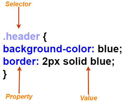
Anatomy of a CSS Rule
A CSS style sheet consists of rules, which targets HTML by using selectors that describe the elements on which the styles should've applied.
Rule Syntax: The rule consists of a selector follows by a block of some CSS properties contained inside the curly braces.CSS properties consist of property and a value that is separated by a colon and are delimited with semicolons. However, a value may be a single value or a collection of multiple values, depending on the property.
For example,
- The rule targets any elements with the class header & any element with this class will have a blue background and a 2px solid blue border.
- background-color and border are CSS properties, border width is specified as 2px, and also px is a CSS unit.
Property Conflicts: Lets’s say if the same property is used more than once in a given rule, then the last definition in the rule is processed.
For example,
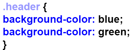
- The element will have a green background as it's the last one in the rule, and the previous property is overwritten.
Comments: CSS can contain comments, inside and outside of the rules.
For example,
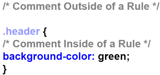
At-rules: An at-rules is a special CSS rule which acts as a directive controlling the behavior of CSS, the reason it is called an at-rule is that it starts with the “at” sign(@).
For example,
- @charset: Defines the character encoding used in the CSS file.
- @import: Imports the contents of another style sheet.
- @media: Defines a media query.
- @keyframes: Defines a set of keyframes for a CSS animation.
How CSS is Used
Inline Styles
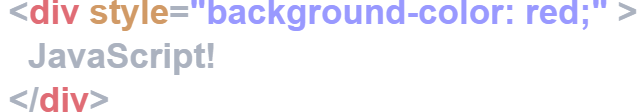
Every HTML element supports the style attribute, where inline styles are specified as CSS properties in the value of the style attribute. Note that an inline property doesn't contain any selectors or curly braces, we have a simple collection of CSS properties.
For example,
- The inline styles applied on an element will have a red background, and if there are any conflicts in the rules applied to an element, its inline style always takes precedence.
Style Blocks
CSS rules are also applicable inside a style sheet of an HTML document itself, we just have to add CSS rules inside of a style element. These are full style sheets with selectors and rules.
For example,

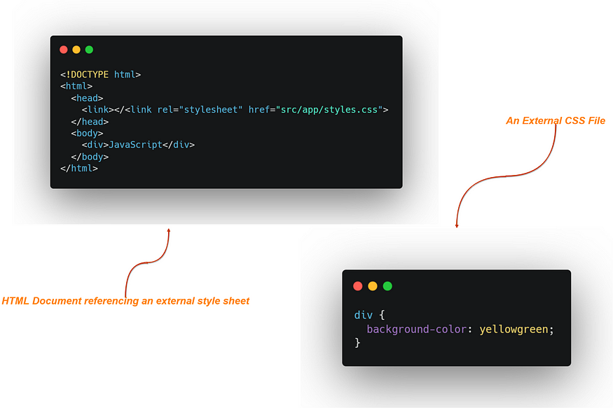
External Stylesheets
CSS rules can also be applied in a style sheet file with the .css extension, this style sheet is later then referenced to the head of the HTML document using a link element.
For example,
2. CSS Preprocessors
CSS preprocessors such as Sass, LESS & Stylus can help in using the additional features that aren't found in plain CSS, these tools provide a more extended version of CSS syntax for writing CSS rules. Under the hood when we run our build, the preprocessor takes the style sheets and converts them into plain CSS, which is ready to use in the browser. CSS preprocessor is a whole different concept & it requires its own learning path. But here is a quick overview of CSS Preprocessors.
Nested Rules
As CSS rules don't support nesting, which means that a CSS rule with a selector cannot appear inside another CSS rule. But in most preprocessors, this is allowed.
For example;

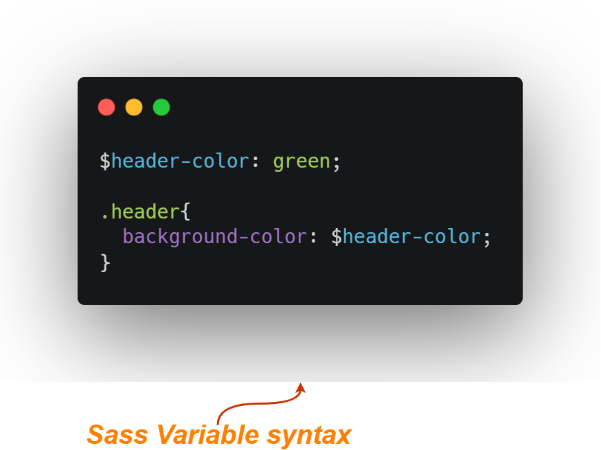
Variables
As all the recent version of Edge, Firefox, Chrome & Safari supports native CSS variables, using Sass is only useful if you want to deliver more robust support to your applications, such as older browsers as IE11.
For example;
- Variables are declared and referenced using a $ character.
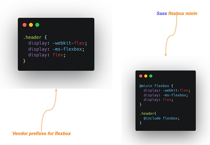
Mixins
Mixins allow us to write CSS properties and values that can be applied to an entire set of properties to another CSS rule without having to repeat all the code. Using mixins can be useful if you are looking to support old browsers that expect vendor prefixes on some properties.
For example;
3. How CSS Works in the Browser
DOM
The Document Object Model is a tree of objects that represents the elements in the document and their structure and hierarchy, and the tree is consists of DOM nodes and the DOM is created by reading the HTML markup, tokenizing it, parsing it, and creating the object hierarchy that makes the DOM at the final stage.
For example;
- If we have an HTML document as given below.
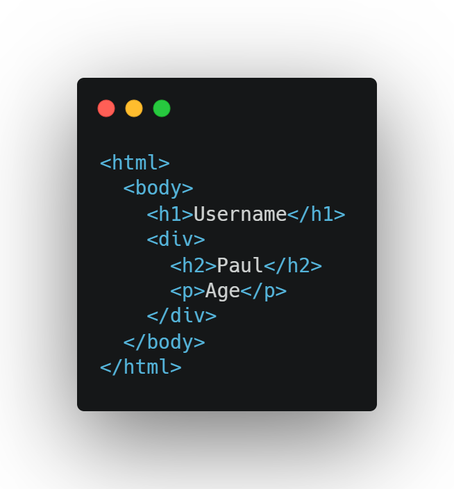
- Then the corresponding DOM tree will be as shown below.

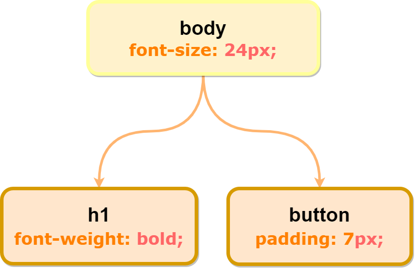
CSSOM
Just similar to DOM we also have CSSOM (CSS Object Model), it's just another tree structure that represents the hierarchy of the styles in the document. DOM and CSSOM are quite similar, however, CSSOM is a separate structure from the DOM.
For example;
- We have a CSS style sheet that is applied to the HTML document.
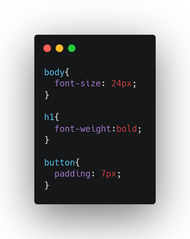
- Then the browser parses the CSS and creates the CSSOM as shown below.
The Render Tree
After the DOM and CSSOM are done processing, they are combined to form the render tree, which contains all the data the browser needs to render the page.
Layout and Paint
- In the last stage, the render tree begins laying out the elements on the page, where the process handles the styles such as width, height, position, margin,& padding, to calculate each element’s size and location on the page.
- However, there is nothing shown on the screen at this stage yet, but once the layout is done, the browser begins painting by applying styles such as color and font to determine the actual pixels to render on the screen.
4. CSS Selectors
CSS selectors are one of the core concepts in CSS, they determine which element a CSS rule applies to, as there are several ways to target an element with a selector. In more simple words, CSS selectors can target multiple targets on the page, which means a single CSS rule can be applied to multiple elements.
Basic Selector Types
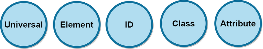
- The Universal Selector: Specified using the asterisk () symbol. It can be specified as a single selector to select all the elements in the document.
For example;
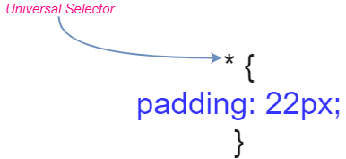
In this case, it will apply a padding of 7 to all the elements in the documents.
- Element Selectors: It targets an HTML element by its tag name, and the syntax of the selector is simply the name of the element.
For example;
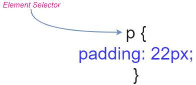
In this case, it will apply a padding of 10px to all the p elements in the document.
- ID Selectors: HTML elements have an id attribute, and there should be only one element with a given id. However, if there are multiple elements with the same id, browsers will match the rule with all the elements having that id, and this is recommended to avoid as it violates the HTML specification.
For example;
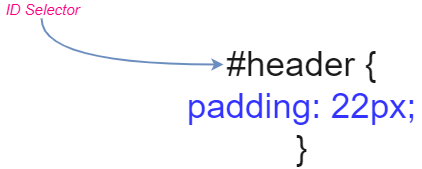
In this case, we have a header as the id. And if there are more elements with the same id (header), they will receive 22px of padding. As it is recommended to avoid this approach, instead of that you can use class selectors instead of ID selectors.
- Class Selectors: HTML elements can also have a class attribute, which can be used to mark all the elements of a similar type. As only a single element is targeted by ID selectors, we can have any number of HTML elements with the class attribute.
- Also, single HTML elements can have any number of classes applied to them, while multiple classes are separated by a space in the value of the class attribute.
For example;
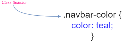
In this case, the rule will match every element in the document with a class navbar-color that has the color of teal.
- Attribute Selectors: The attribute is specified inside square brackets and the attribute selector can take several forms.

For example;

In this case, if we wrote the CSS rule with the selector [title~=’’Name”], then only the first element would match, not the second one because the title attribute is not surrounded by whitespace.
Compound Selectors
Using the compound selectors we can use any of the preceding selectors alone or in conjunction with other selectors to make the selector more specific.
For example;

Multiple Independent Selectors
A CSS rule can have multiple selectors simply by separating the commas, this rule will be applied to that element that is matched by any of the given selectors.
For example;
.class-one, .class-two
Selector Combinators
There is more to do with selectors, we have combinators that can be used to select more specific elements. In simple words, multiple basic selectors can be used which are joined by combinators.
And There are Five Types of Them:
- Descendent Combinator: It matches an element that is a descendent of the element on the left-hand side, here Descendent means that the element exists somewhere within the child hierarchy. The Descendent Combinator is specified with a space character.
For example;
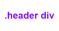
In this case, it matches all div elements that are direct or indirect children of an element with a class of header
- Child Combinator: It matches an element that is a direct child of the element on the left-hand side, and it is specified with a > character.
For example;

In this case, it matches all div elements that are direct children of an element with a header class.
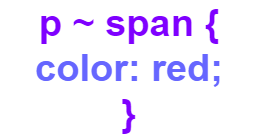
- General Sibling Combinator: Specified with the ~ character it matches an element that is a sibling, but not necessarily an immediate sibling.
For example;
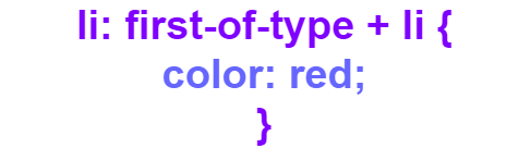
- Adjacent Sibling Combinators: It is similar to the Generator sibling Combinator, except it only matches elements that are an immediate sibling. And it is specified with a + character.
- Using Multiple Combinators: As we have basic selectors, combinators can be combined to form even more specific selectors.
For example;

Pseudo Classes
- CSS has another great tool known as pseudo-class, which allows us to select elements based on the state of the element. Pseudo-class allows us to select elements based on the UI state, while others only allow the selection of elements based on their position.
- They start with a colon and can be used along with or in conjunction with other classes.
- There are many pseudo-classes, but I recommend going through the documentation for better understanding. However, some of the most commonly used ones are list below.
UI State
Pseudo-Classes that are based on the UI state
- :active
Matches an element that is currently being activated. Usually, this means that the mouse button has been pressed for buttons and links but has not been released yet.
- :checked
Matches a button, checkbox, or option inside a select element that is checked or selected.
- :focus
Matches an element that has currently the focus, typically used for buttons and text fields.
- :hover
Matches an element where the cursor is currently hovering on.
Document State
pseudo-classes that are based on an element’s position in the document
- :first-child, :last-child
Matches an element that is the first or last child of its parent.
- root
Matches the root element of the document, this is our usual HTML element.
Pseudo -Elements
These elements let you select only the part of a matched element, and they are specified with a double colon (::) followed by the pseudo-element name.
It is recommended to go through the documentation as it gives a broad overview with details. However here are some basic pseudo-elements.
- ::first-line
Matches the first line of a block element.
- ::first-letter
Applies the styles only to the first letter of the first line of an element.
Specificity
Specificity is an essential concept to deal with CSS conflicts, there are times when each rule specifies a different value for the same property, but CSS conflicts properties work within rules. When there is a conflict of CSS properties across multiple rules, the rule with the most specific selector will be chosen.
And therefore the specificity of CSS rules is as follow;
- Inline Styles in an element’s style attribute.
- ID selectors.
- Class selectors, attribute selectors, and pseudo-class.
- Element selectors and pseudo-elements.
Note: Neither the universal selector nor combinators factors the specificity.
5. Basic CSS Concepts
The Box Model
In CSS elements are treated as a rectangular box, which is made up of four major parts, which are margin, border, padding, & content.
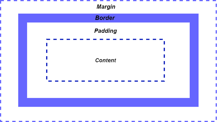
CSS Box Model
Note: By default, most of the elements have no padding, border or margin.
Block and Inline Elements
There are two types of HTML elements: block and inline. Both follow the box model but they are different in some essential ways.
- Block Elements: They always appear on their own line and takes up the full width of their containing element, however, it is possible to set the width property explicitly. The height is just enough to fit the height of its content, and also height can be set explicitly.
- Inline Elements: They are rendered inside the normal flow of text, and they take only enough width and height according to the content. And setting the width and height explicitly will not affect.
- Inline-Block Elements: This one is a combination of the first two, these elements flow with the text like an inline element, but the width and height property is respected.
Units
As we have measurement units in the physical world, such as inches, feet, meters, etc. Similarly in CSS, we have units such as px, em, and rem.
- px: You must be familiar with the px unit, however, in high-resolution displays, a CSS pixel doesn't necessarily have a one-to-one correspondence to a physical device pixel. That's the reason it is generally not recommended to use px units in CSS because these pixel-based dimensions don't always scale well when the user zooms level on the browser. But it's recommended to use px units in media queries and for the page’s base font size.
- em: This is a relative unit, it is relative to the font size of the element.
For example;
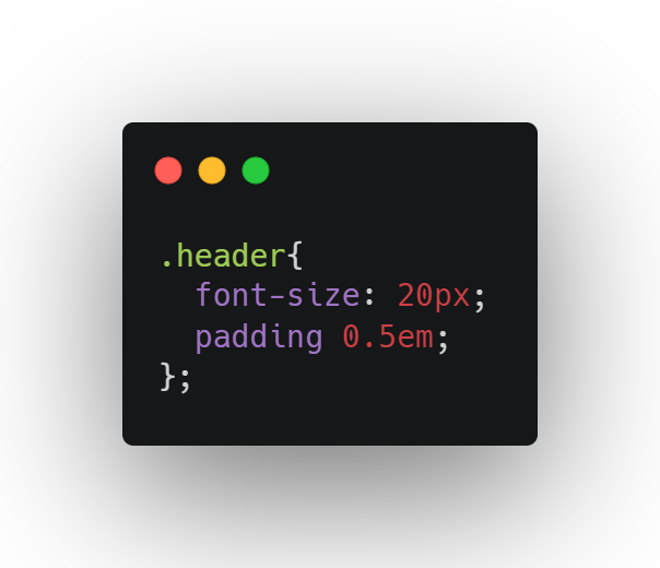
In this case, the font size is set to 20px, and padding is specified as 0.5em, which means the applied padding will be 10px.
- rem: These are recommended to use for a better application interface, as rem units are proportional to the base font size of the browser (16px in most cases). A size of 1rem is equal to 16px1.5rem=24px. Also using rem units makes application pages resizes quite nicely as it's proportional to the base font size, and there is no cascading effect like we have in em units.
- No Units: In CSS some properties don't require any units, such as opacity, flex-grow, etc. They expect just integer numbers without limits.
It is recommended from my side to go through some other units such as Viewport units (vw and vh) and percentage units.
Colors
You must be familiar with how colors are defined in web applications if you are not a complete beginner. But just in case you are starting from absolute scratch, here is a small overview of how colors are used in CSS.
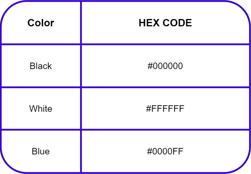
- Predefined Colors: Basic colors such as red, green, blue, etc are available in CSS to use for basic requirements.
- RGB Colors: Any color can be expressed as a combination of RGB values, and each value of red, green, and blue is expressed as a number between 0 to 255. RGB colors are quite useful when you are required to build more complex color-associated applications.
- Alpha Values: RGB colors can also specify an alpha value, which is simply the opacity of the color. The values vary between 0 (fully transparent)to 1(fully opaque), or a percentage between 0% and 100%.
- HSL Colors: HSL stands for Hue, Saturation, and Lightness. Hue is specified as a degree **(from 0 to 360 degrees)**of an angel of the color. Saturation is the percentage (0% to 100%) value of how much color has to be applied. Also, Lightness is a percentage value (0% is pure black and 100% is pure white).
CSS Variables
One of the most time-saving features in CSS, where you can simply store CSS values in variables, which can be reference by later using the variable name. The benefit that you get with CSS variables is that you can work on big front-end projects that require numerous changes over time, as all the CSS values are stored in variables, and whenever you need to make changes to your project you just have to update those variables.
- A variable is declared with two leading slashes: --var-name.
- A variable is referenced with the var function: var( — var-name).
- Variables values are inherited using descendent elements.
6. Basic Styling
Shorthand & Multiple Values
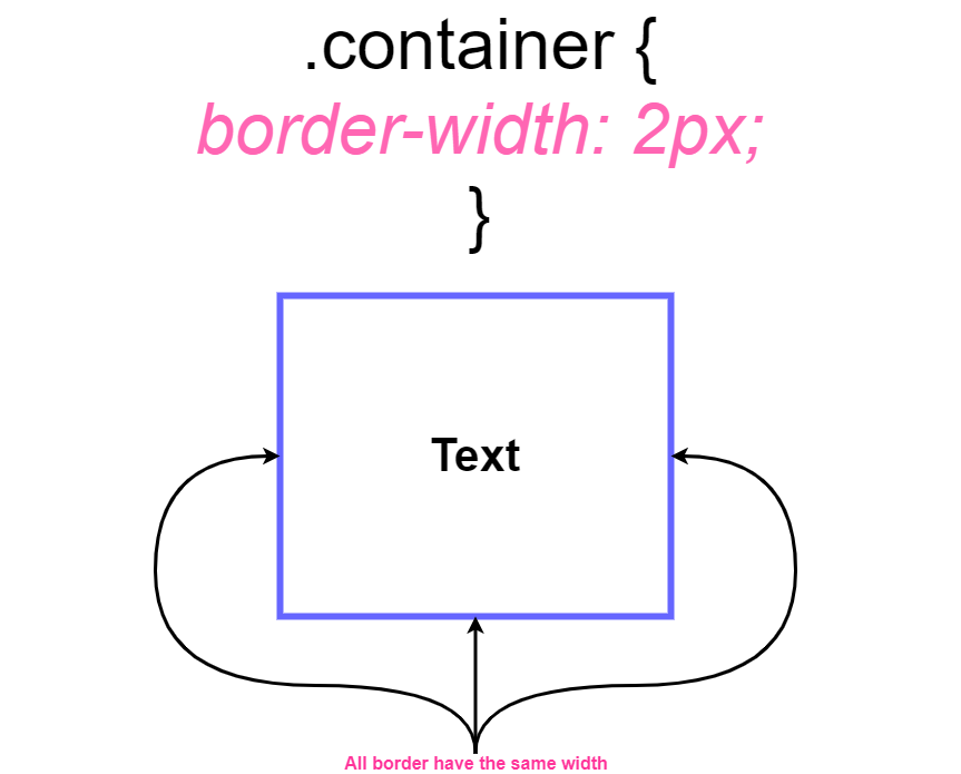
Properties in CSS such as border-width, padding, and margin take a single value, these properties are known as shorthand properties. The single value will be used for the top, bottom, left, and right.
For example, let's say if you have applied a border width of 2px, then all 4 sides of the container will be 2px.
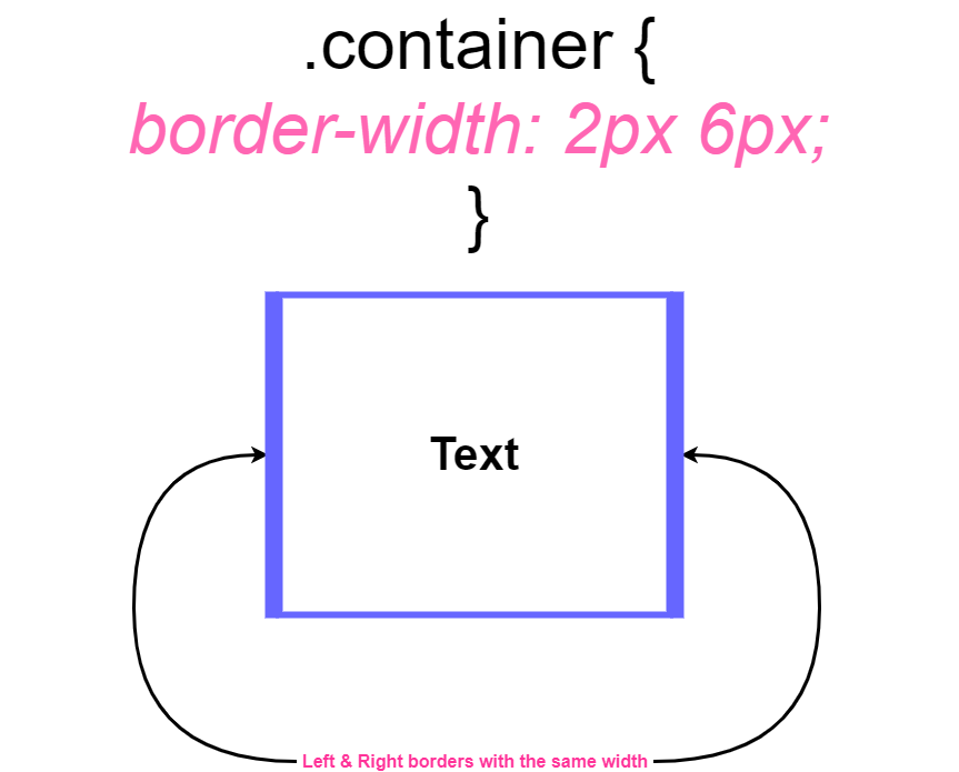
Also, if two same values are defined for the same property then the first applies to the top and bottom, and the second applies to left and right.
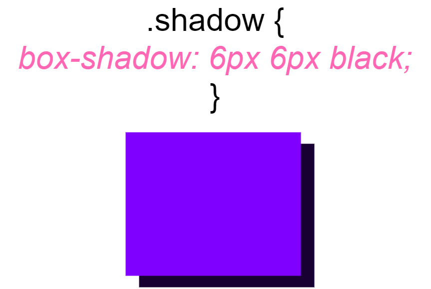
Box Shadows
Element’s shadows are controlled by the box-shadow property. Every box has a color and its dimensions can be specified with the following four values;
- X offset
- Y offset
- Blur Radius: How far the shadow is blurred.
- Spread Radius: How far the shadows extend beyond the element’s dimensions.
For a minimum result, an X and Y offset has to be specified, and by default blur and spread radius are zero.
6. Backgrounds and Gradients
Background can be Images, Solid Colors or Gradients
Solid Background Colors
Solid background colors are applied using the background-color property and it accepts any valid CSS expression.
Background Images
There are several properties that can be used to control the background image.
- background-image: One or more images can be applied using the background-image property, and the images will be stacked on top of each other with the first image on top.
- background-repeat: If an element is large enough than its background, then by default images will be reaped to fill the element. Although the repetition behavior can be stopped by setting it to no-repeat.
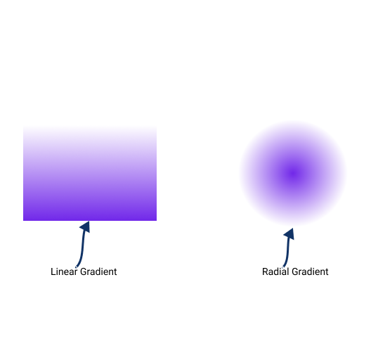
Gradients
There are two types of gradients supported in all modern browsers.
- Linear Gradients: They can go left to right, top to bottom, or at an arbitrary angle.
- Radial Gradients: Starts at a control point and radiates outward.
7. Text Styling
Fonts
Any font of your choice works for styling web applications, but it is recommended to use a web-safe font, as they are generally considered safer to use because of the availability on most user’s system
Some web-safe fonts:
- Arial
- Verdana
- Courier New
- Georgia
- Times New Roman
Styling
Styling fonts is quite easy as the properties are pretty much self-explanatory which leads to easier customization of texts. Properties such as font-size, font-weight must be familiar to you, but there are some properties that are required when working on details of the front end of our applications.
Truncating Text
You don't want an application littered with overflow containers of texts, to avoid that the text must fit within its container without overflowing or wrapping. This is accomplished by white-space, overflow, & text-overflow together.
- Setting white-space to nowrap, overflow to hidden, and text-overflow to ellipsis, you can easily achieve that perfection in your texts.
Note: All the reaming properties such as aligning texts horizontally and vertically works similarly as it works for other elements.
8. Layout and Positioning
Padding
It is the space between an element’s content and its border, most elements have zero padding, by default and padding can be specified with any unit.
Margin
It is the space between an element’s border and other elements, and the value of margin property can be a size value, a percentage, or the keyword auto. Also by default, most elements have no margin.
Note: Once you are done learning about different margin and padding properties, it is recommended to play with CSS elements and try to work with layouts as it makes you more confident while working in real situations.
Positioning Elements
CSS position property determines the positioning of elements, the top, right bottom, and left properties are used in conjunction with position to determine an element's final position. And by default position is set to static.
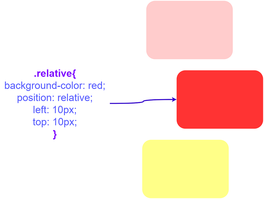
- position: relative
If position is set to relative and top, bottom left and right are not specified then it would be equivalent to a static position. Note that when an element is relatively positioned then the other elements in the document flow are not affected.
- position: absolute
As relatively positioned elements offsets are relative to the element’s original position in the document, an absolute positioned element’s offsets are relative to the closest ancestor positioned.
Both these properties are very necessary to build a solid understanding of how multiple elements are positioned in CSS.
Z-index
In simple words, z-index determines the stacking order of elements along the z-axis, it simplifies the stacking of elements (which element is on top of which). z-index can take any numerical value and items with a higher z-index will appear on top of those with a lower one.

9. Transforms
They are specified with the transforms property and its value is one or more transforms functions. Also, we can apply multiple transforms using a space-separated list of transform functions.
Perspective
The perspective transform activates 3D space for elements, although it has no visible effect when used in combination with other transforms it affects the final results.
Rotation
The rotation functions rotate elements around a given axis and then we need to provide the angle as an argument. That angle can be defined in many units such as deg, grad, rad, turn. Just as we have in normal geometry the axis of rotation has 3 sub axis (X-axis, Y-axis, Z-axis) with an associated origin.
Translation
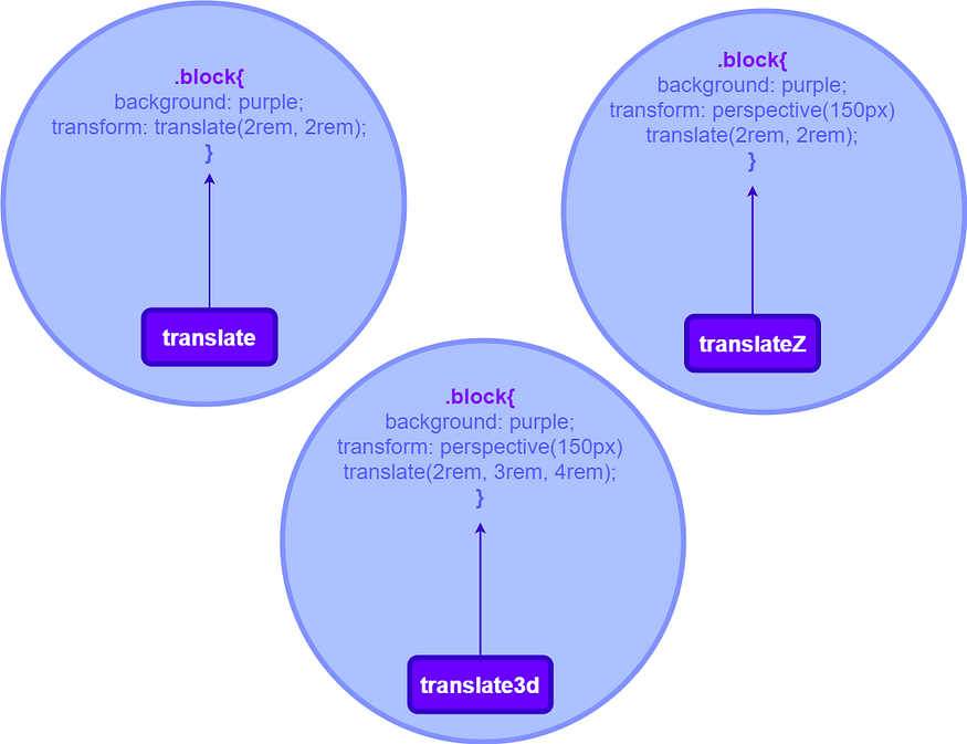
Transalation of elements means moving it from its original position
- translate: This function moves elements in 2D space, and it takes two arguments, which are X-axis** and Y-axis position.
- translateZ: As you might observe translate function are quite self-explanatory, this function moves an element along the Z-axis. Also, it only gives a visible effect when used with the perspective function.
- translate3d: It allows you to specify a vector in 3D space and then the element is translated along that vector. It takes three arguments, which are x-axis, y-axis, z-axis, component of the vector.
Scaling
The scaling transform function is responsible for scaling the size of elements. Just like the translation function which takes a size value, the scaling function takes multiples of the original size as arguments. For example, .scale(3,5) would scale the element to 3 times as large in the horizontal direction and 5 times large in the vertical direction. We have three scaling functions as scale, scaleZ, and scale3d, you can read more about them here.
Skewing
The skewing functions distort an element by a given angle in the X and Y directions, just as we have in the rotation function the angle can be given in any valid CSS units. You can read more about skewing with some demos here.
10. Transitions and Animations
Transitions
CSS transition is an essential part of front-end projects, they are different from CSS Animations, as a CSS Transition is a way of animating an element from one state to another. When the state of element changes in our document they behave according to the changes, which results in a visually jarring user experience. Adding a transition property to that element will easily solve that problem without applying any CSS Animations.
For example;
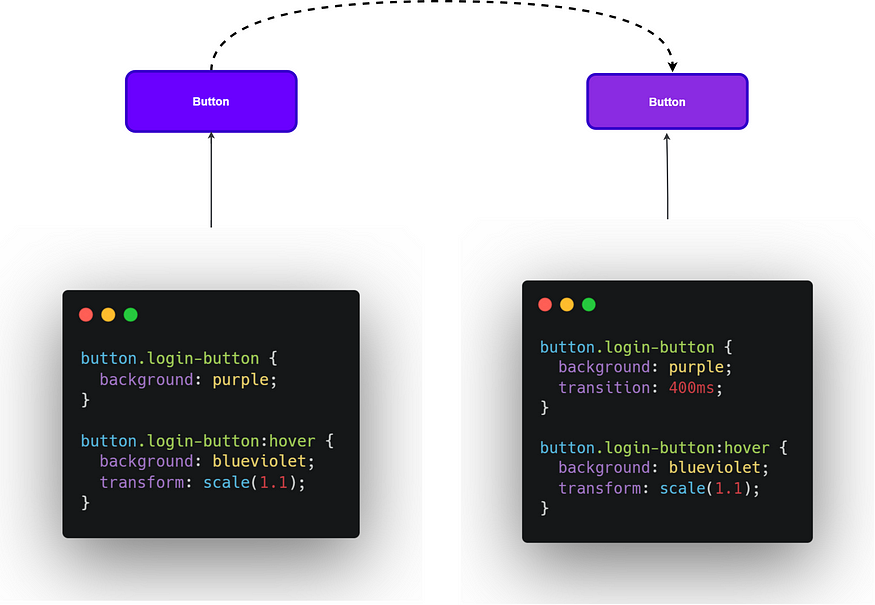
- Let’s say the login button’s state changes due to the hover effect, at this time a sudden color change from purple to blue-violet will happen with a scale of 1.1, but this approach always results in janky changes in CSS.
- We can simply avoid such behavior by adding the transition property, in this case, 400ms are enough to make these changes look more appealing.
Animations
As CSS transitions provide animated transitions from a start to an end state, animations provide animated transitions between any arbitrary state. Animations are specified in at-rules: @key-frames, which defines the various CSS properties to be applied at a given step during the animation.
11. Flexbox
It is a one-dimensional layout that can lay out elements horizontally or vertically. Elements using flexbox as its layout is referred to as a flex container, and the elements inside it called flex items.
- Direction: Flex container has a direction that is defined by the flex-direction property. It decides the flow of content inside containers.
- Axis: The main axis points to the direction specified as in flex-direction, whereas the cross axis is perpendicular to it.
- Alignment & Spacing: These properties are applied to the flex container and the other is applied to the flex items. You can read more about alignment & spacing properties here.
12. Responsive Design
This is a technique that is used to make flexible page layouts that work smoothly on all device screen sizes.
- Media Queries: They are defined as an at-rule, @media. Instead of looking for a type of device they look at the capability of the device, they can check width, height, orientation, and resolution.
- Breakpoints: It is the threshold where the page’s layout will change due to the viewport size with a media query. As there is so much a huge number of devices in use today with different screen sizes, you should set breakpoints based on the content.
13. CSS Grid
Basic Concepts
- Grid Container: It is the outer element that contains the grid layout and all of its direct children are grid items.
- Gird item: All the children of the grid containers are grid items. The child element automatically becomes grid items and laid out in the order in which they are applied.
- Grid Lines: They are the basic lines that divide the rows and columns of the grid.
- Grid Tracks: They are the rows and columns between the grid lines, which contain the grid items.
- Grid Areas: It is the space enclosed by any four grid lines, which contains a single cell or multiple cells.
Grid Positioning
All the grid items are placed automatically while filling each column and each row, but there are options that can be used for customization of grid item's positions.
Grid Alignment
CSS grid has full control over the alignment of items when they don't fill their containers.
- justify-items: Defines how grid items are aligned along the row axis when extra space is left inside a grid cell.
- justify-self: Sets the alignment of an item inside the cell along the row axis
- align-self: Sets the alignment of an item inside its cell along the column axis.
There are more Grid alignment properties, you can read more about them here.
Note: You can download the roadmap here (open in draw.io).
Comments
Loading comments…