Hello, my dear Python lovers! I bet I’m not the only one who constantly struggles to choose a movie to watch on Netflix. But, have you ever thought about using our beautiful language Python to make it easier for us? That’s a simple job that takes less than 10 minutes and also helps to improve our knowledge of Pandas data analysis.
Getting Started
First of all, we need to install the required libraries and import them. In this program, we need only two libraries, Pandas and Plotly (for visualizing data).
pip install pandas
pip install plotly
You can download the sample dataset here.
Reading and Cleaning of Data
Now we can start the analysis. First, let’s find out how many columns and rows there are in the dataset using the shape function.
import pandas as pd
import plotly.express as px
df = pd.read_csv('netflix_titles.csv')
print(df.shape)
Output:
(8807, 12)
It turns out to be 8807 rows and 12 columns. we can figure out the columns in this dataset via flowing code:
print(df.columns)
Output:
Index(['show_id', 'type', 'title', 'director', 'cast', 'country', 'date_added',
       'release_year', 'rating', 'duration', 'listed_in', 'description'],
      dtype='object')
We won’t need some columns, so we can clean them up using the drop function.
df.drop(['duration','description','date_added'],axis=1,inplace=True)
Most of the time, CSV files include duplicated data so it’s a good practice to remove duplicates every time. we can use drop_duplicates for that purpose.
df.drop_duplicates(inplace=True)
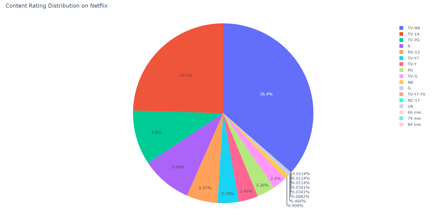
Analyzing Content distribution
This one is super simple. All we want to do is group the movies according to their rating (such as R rated, PG-13 and etc) and count them. After that, we make a bar graph according to the data. This is where Plotly comes in handy. Unlike Matplotlib, Plotly is easy to configure and use.
movies = df.groupby(['rating']).size().reset_index(name='counts') # Grouping the movies according to ratings
pieChart = px.pie(movies, values='counts', names='rating',
                 title='Content Rating Distribution on Netflix') # making a pie chart according to the 'movies' variable
pieChart.show()
The result will be opened in a new tab in our browser, which will look like this:
Find the Top 5 Actors and Directors on Netflix
The same procedure has to be followed when finding the top 5 actors on Netflix.
Since there are null values in some cells where the actors are not specified, we should fill them up first. And also, most movies contain multiple actors so it’s essential to separate them.
filtered_actors=df['cast'].str.split(',',expand=True).stack()
filtered_actors=filtered_actors.to_frame()
filtered_actors.columns=['Cast']
actors=filtered_actors.groupby(['Cast']).size().reset_index(name='Total Content')
actors=actors['No Data' != actors.Cast]
Now we have to sort and extract data from the top 5 actors.
actors=actors.sort_values(by=['Total Content'],ascending=False)
top5=actors.head()
top5=top5.sort_values(by=['Total Content'])
To visualize data, we can use px.bar() function by Plotly.
bar=px.bar(top5,x='Total Content',y='Cast',title='Top 5 Actors on Netflix',color=['blue','green','pink','black','yellow'])
bar.show()
Output:
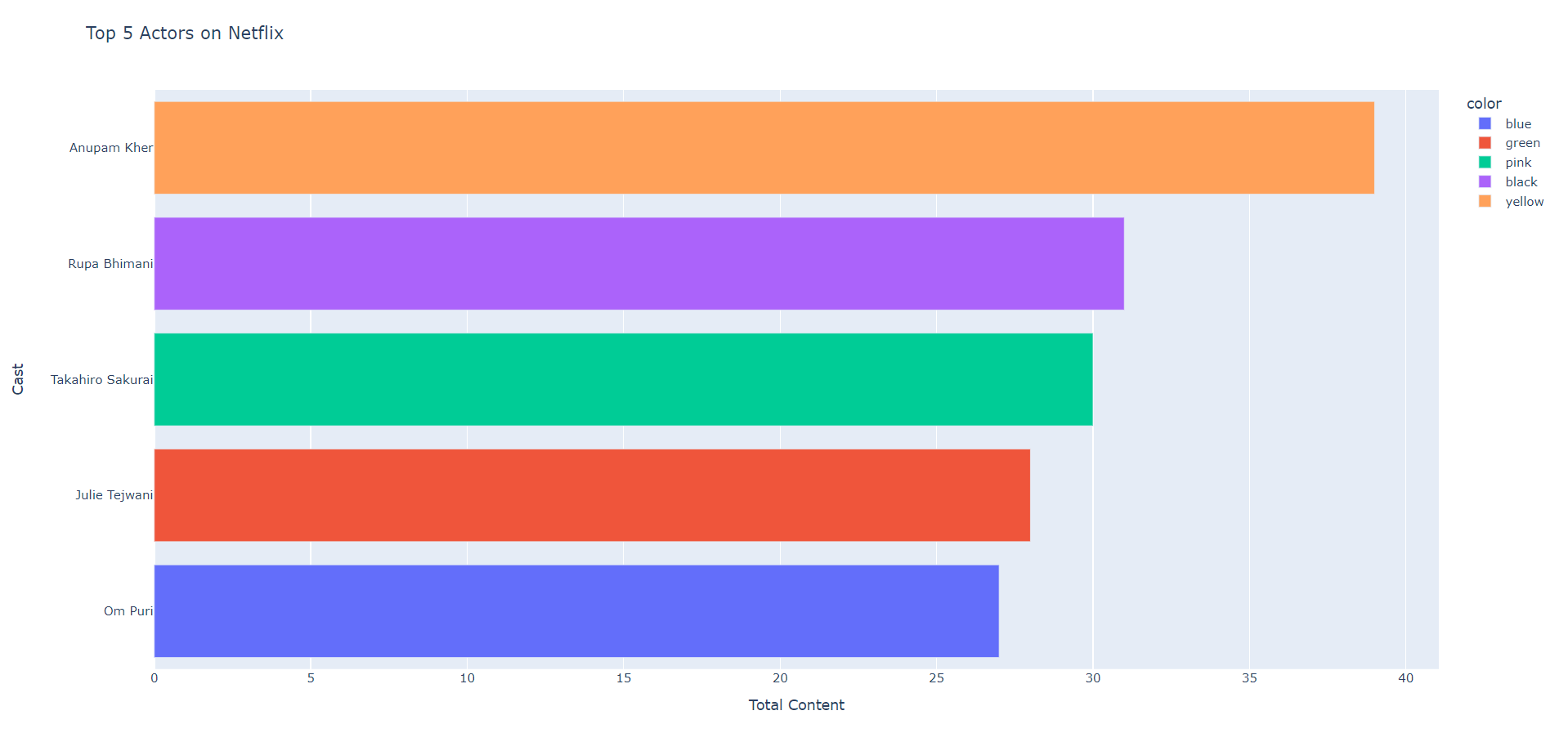
According to the above chart, the top 5 actors on Netflix are as follows:
- Anupam Kher
- Om Puri
- Takahiro Sakurai
- Julie Tejwani
- Om Puri
Analyze the trend in production
The next thing is to analyze the trend in the production of movies and TV shows on Netflix over the past few years (in this tutorial, data over the past 10 years are analyzed). For this, we can use the data in two columns: Type and Release Year.
df_one = df[['type','release_year']]
df_one = df_one.rename(columns={"release_year": "Release Year"})
And then we can visualize the data using Plotly. For this use case, using a Line Chart is the best option.
production_data = df_one.groupby(['Release Year','type']).size().reset_index(name='Total Content')
production_data = production_data[production_data['Release Year']>=2012]
chart = px.line(production_data, x="Release Year", y="Total Content", color='type',title='Trend of content produced over the years on Netflix')
chart.show()
Output:
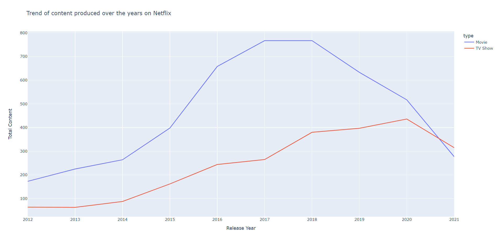
It’s clear that the highest number of Movies were made in the years 2017 and 2018 but the highest number of TV shows were produced in 2020.
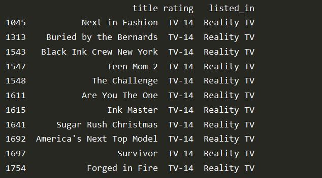
Movie Categorization
As you read at the beginning, the major use case of analyzing Netflix data is to find the best movie or TV show to watch.
If we want to watch a Reality show suitable for 14 years old and up, we can use a process like the one below.
df.drop(['duration','description','date_added', 'cast', 'director', 'type', 'show_id', 'country', 'release_year'],axis=1,inplace=True) # remove unwanted columns for better visual result
df.drop_duplicates(inplace=True)
reality_shows = df.loc[(df['listed_in']=='Reality TV') & (df['rating']== 'TV-14')]

pd.set_option('display.max_rows', None)# display all the rows
print(reality_shows)
Output:
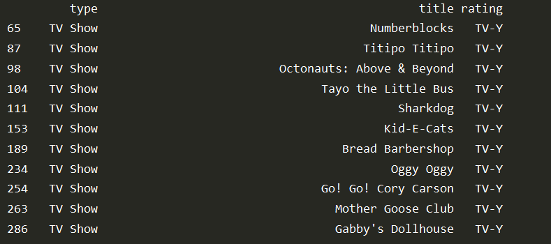
Accordingly, we can use the same code for filtering any other type of content. For example, if we want to filter the TV shows suitable for children under the age of 6, we can use the following format.
df.drop(['duration','description','date_added', 'cast', 'director', 'show_id', 'country', 'release_year', 'listed_in'],axis=1,inplace=True)
df.drop_duplicates(inplace=True)
tv_shows = df.loc[(df['type']=='TV Show') & (df['rating']== 'TV-Y')]

pd.set_option('display.max_rows', None)# display all the rows
print(tv_shows)
Output:
Conclusion
And that's all! Now you can easily scroll through the Netflix movies that you found a match for you through this simple data analysis.
The functions we used in this program are as follows.
df.drop_deuplicates(): To remove the duplicated items. Using it at the beginning of any data analysis program is a good practice.df.drop(): remove certain columns or rows. Used to clean data.df.shape(): Get the number of columns and rows.df.groupby(): Group the data and execute a function accordingly.df.loc(): A property used to access a group of rows or columns by label or a boolean value.
Until next Friday, Happy Pythoneering!
Comments
Loading comments…