Today, we will be going through how to create a custom-made search bar. This search bar can work effectively in tandem with a drop down list.
Feel free to copy, analyze and make your adjustments. Let us get right into it.
Your already saved CSS extension should be linked to your saved HTML file to see results. Create a general div and give it a class e.g 'flexdiv'
<div class="flexdiv"></div>
Inside this div create another div for the search functions and details e.g 'search'
<div class="flexdiv">
  <div class="search"></div>
</div>
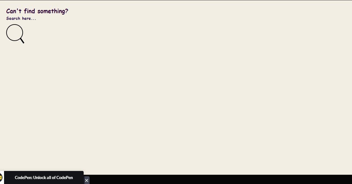
Good job. Next, we add the contents of the search div in it, you can add in any search line but here's mine,
<div class="flexdiv">
  <div class="search">
    <h3>Can't find something?</h3>
    <h5>Search here...</h5>
  </div>
</div>
Now we add the search bar itself, and for that we put in the 'input' tag,
COPY
COPY
<div class="flexdiv">
  <div class="search">
    <h3>Can't find something?</h3>
    <h5>Search here...</h5>
    <div>
      <input type="text" placeholder="Search here..." />
    </div>
  </div>
</div>
Well done Amigo!
Your HTML part looks good. Moving on to CSS...
* {
  font-family: cursive, sans-serif;
  padding: 0;
  margin: 0;
}

html,
body {
  width: 100%;
  height: 100%;
}
The " * " is the universal selector in CSS. It can be used to select any types of elements in an HTML page.
The " * " selector is also very useful and handy when you want to selects all the elements on your HTML page.
.search {
  margin: 20px;
}

.search > h3 {
  color: rgb(50, 3, 56);
  margin-bottom: 2px;
}

.search > h5 {
  color: rgb(43, 7, 77);
  margin-bottom: 10px;
}

.search > div {
  display: inline-block;
  position: relative;
}
To create the search bar image, we have to create and improvise, alright?
/* to create the search icon*/
.search > div::after {
  content: "";
  background: black;
  width: 4px;
  height: 20px;
  position: absolute;
  top: 43px;
  right: 1px;
  transform: rotate(145deg);
}

.search > div > input {
  color: black;
  font-size: 16px;
  background: transparent;
  width: 30px;
  height: 30px;
  padding: 10px;
  border: solid 2px black;
  outline: none;
  border-radius: 40px;
  transition: width 0.5s;
}
You should have a search icon on your screen. Now we add styles to give it a nice transition,
.search > div > input::placeholder {
  color: black;
  opacity: 0;
  transition: opacity 150ms ease-out;
}

.search > div > input:focus::placeholder {
  opacity: 1;
}

.search > div > input:focus,
.search > div > input:not(:placeholder-shown) {
  width: 250px;
}
And Presto!
Now when you focus on your search box, it extends its width to let you put in your search.

You can change your input search image values to either increase or decrease the size of your search input image.
Amazing right? I hope this article does something for you.
Comments
Loading comments…